When I submitted my work for feedback point #8, I had just completed the first illustration about Greenwich (Project 3: Make connections and create a series of editorial illustrations).
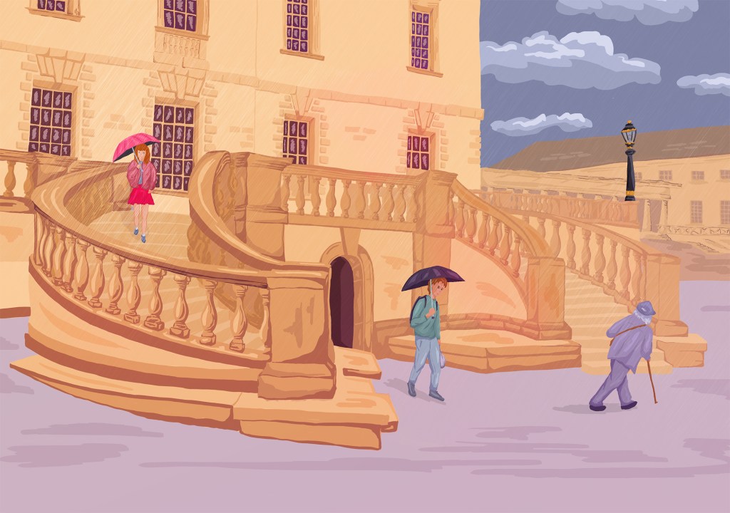
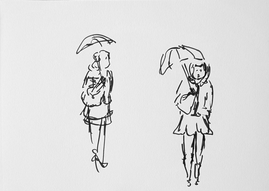
After reading my tutor’s feedback, I decided to experiment further around the idea of the staircase and its history. I remembered that I had done a similar exercise with the sketch of a period house in Greenwich for the unit “Responding to a Brief” (https://catherinerouxillustrationdegree.uk/illustration-year-2/responding-to-a-brief/coursework/part-2/exercise-architectural-illustration/). At the time, I mixed sketches from the past and the present to tell different stories: The first option shows the people from the past as translucent as if they have left a faint trace, the second could be a film set, the third could take place in the past and the fourth in the present.
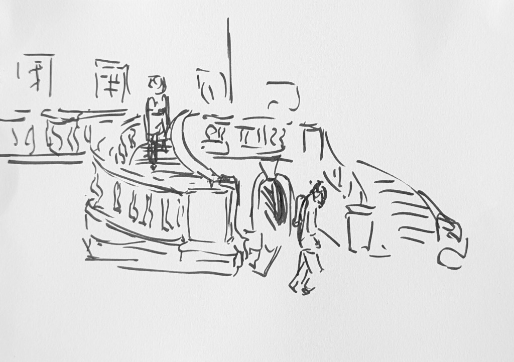
I intended to create some quick mock ups with characters from different times, but I have not done it yet. I have just had time to insert drawings of people I sketched recently and drawings of people in historical costumes that I created for the exercise mentioned above to look at the potential. This is the work in progress:

I can see how I could create many stories around this staircase. It could be about the potential meeting between the man and the woman. If I added only people in period costumes, it would be a story about the past. If I positioned the guard looking at the scene at night, it would be a bit surreal. And in fact, it might be interesting to include everyone.
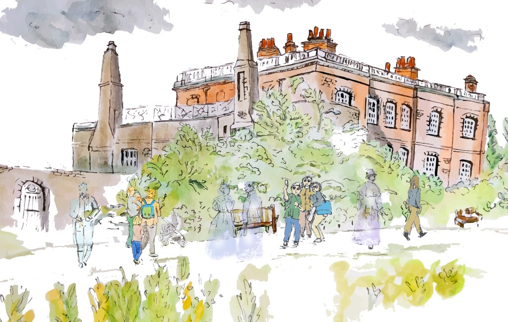
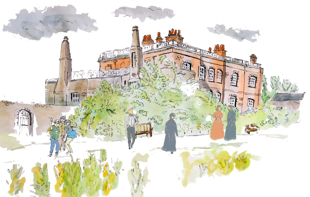
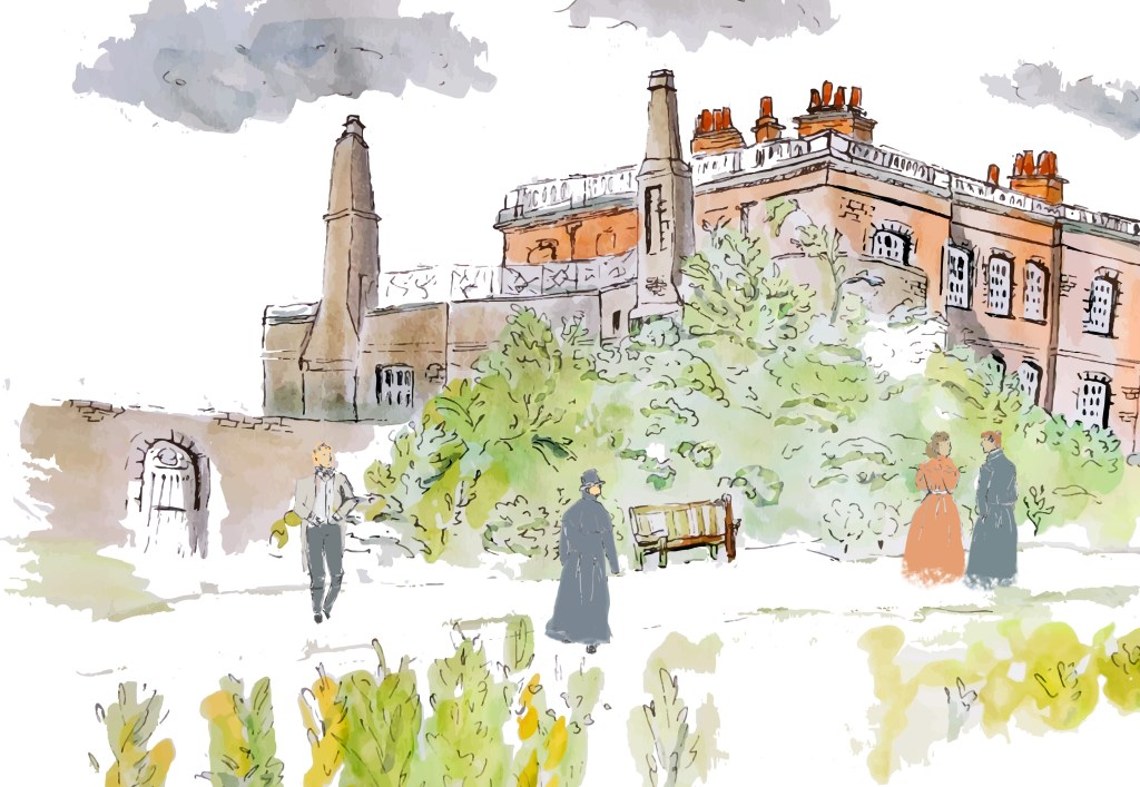
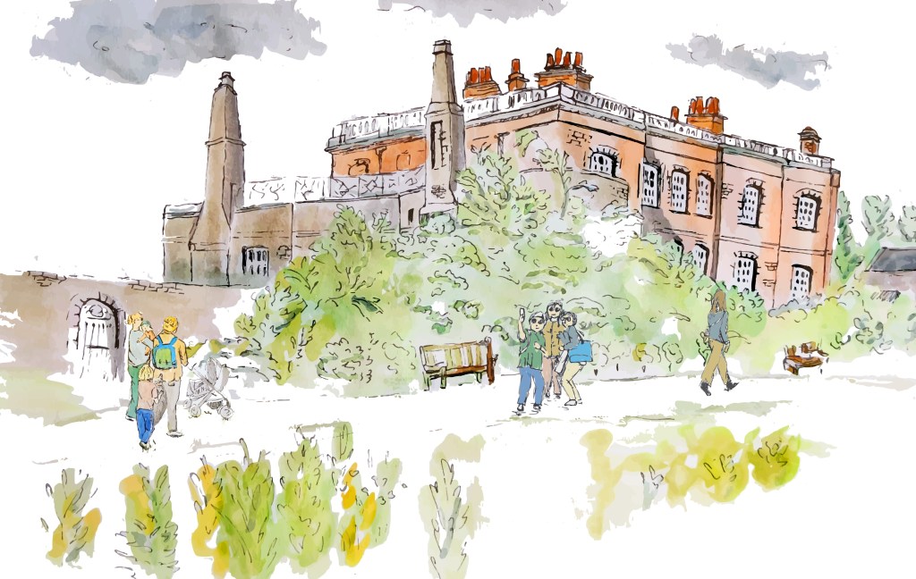
Following my tutor’s suggestion, I tried to create a quick watercolour sketch as I wondered what details I would keep if I used that technique. I did not add watercolour as I was not so happy with the sketch.
However, I have realised a few things thanks to this exercise. I should have fewer details at the edges of the illustration to draw the attention further to the staircase. I will try to experiment and see if I can fade some of the details. I was not happy with the way I rendered the woman, and I think that it is because I tried to add too many details to a small silhouette.
I will play further with mock ups in Photoshop to explore the potential of the illustration and finalise one or two versions.
While waiting for feedback and in order to take some distance from the first illustration, I created a second one.
I was inspired by a picture I took in the staircase on my way out. There was a tiny grasshopper on the floor (no more than 2cm). When I took the picture, I was amazed at all the details captured in the photo and I wanted to draw this grasshopper. As I had intended to create illustrations about scale and the concept of past and present, I thought that it would be a good opportunity to use this photo. To show how small the grasshopper is, I positioned a coin, and I selected a coin with the face of the queen. The illustration is a reflection on the past and present. The grasshopper seems to be contemplating the portrait of the queen. The grasshopper represents the present moment while the monarch represents history and longevity.
This is the work in progress:
And this is the final version:

I like the metaphors contained in this image. The queen represents grandeur and history while the grasshopper is a tiny insect who lives in the moment. And yet, at that particular moment, the story is about the grasshopper. There is also the fact that money does not mean anything to the grasshopper.
I tried a few colours for the background, but the illustration looked a bit dull. I then chose a bold complementary colour and both the coin and the grasshopper stood out.
As usual, I still feel that I lose a bit of energy when I concentrate too much on accuracy. I wonder if I could play a bit with the position of the head.
Initially I intended to render the illustration differently and use a painted effect, but I felt that this illustration would work well with solid colours. I might try the painted technique to compare the two.
The coin is supposed to be a 5p coin but that is not obvious. As a result, the idea of scale might be partially lost.
I now need to reflect on the original plan for this part of the project and decide on how I want to proceed. I would like to create some sketches with a brush pen and watercolour and turn this into an illustration to see if this approach makes a difference. The idea would be that working with watercolour first might encourage me to make different choices in terms of composition or selection of details. It would also be interesting to create an alternative in a minimalist style, trying to keep as few details as possible.
