When I last submitted my work, I was in the process of creating an illustration for this project.
This was the work in progress:
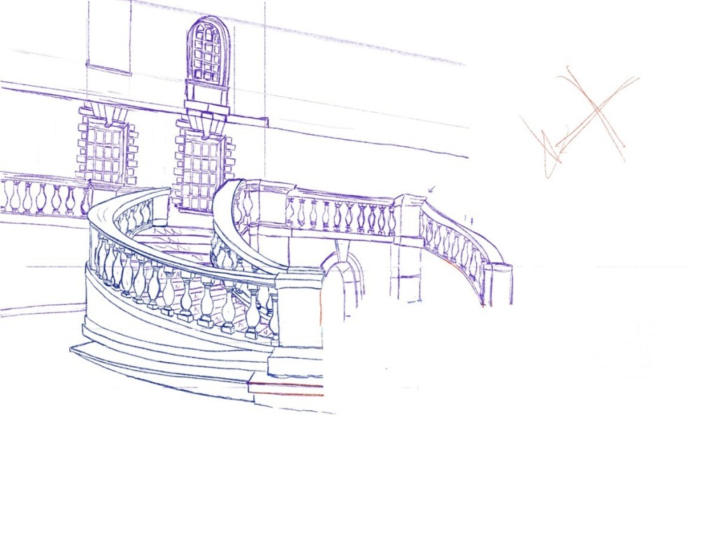
I carried on working on the background. When I draw initial sketches, I often use different colours than black because it helps me to see the difference between different versions. I often use blue because I can see the lines better.
I then drew the people that would be part of the story. I thought of different compositions, and I first wanted to add three lonely figures under the rain.
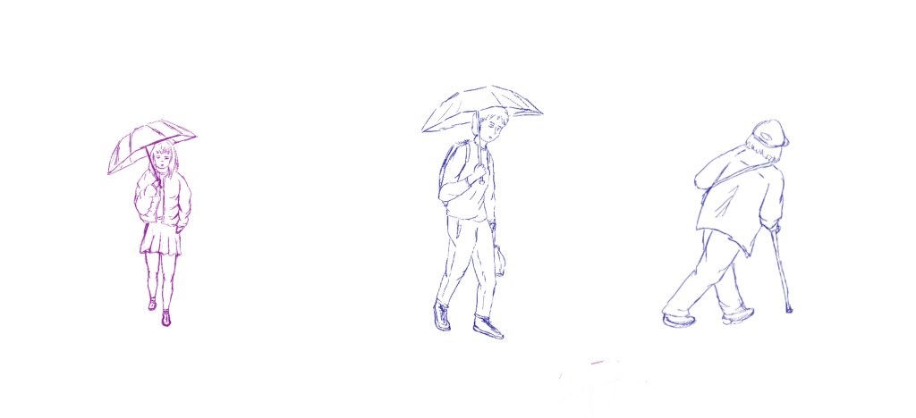
I took inspiration from quick sketches I had created from photos taken in the area, especially for the figure on the right. It helps me to create sketches of people very fast without any pressure regarding the outcome. I find that some interesting poses emerge.
I had decided to create a vector with flat colours. However, inspired by the research I had been carrying out for the literature review about stylisation and artists such as Colin Elgie (https://www.illustrationx.com/artists/ColinElgie) and Paul Cox (https://chrisbeetles.com/artist/34/paul-cox), I realised that what I kept trying to achieve was more fluidity. I chose the staircase because of all the rounded shapes and movement in the structure and I wanted to highlight that aspect.
I knew that if I worked in Illustrator, a lot of that movement would be lost. I therefore decided to use Procreate because it allows me to draw in a more fluid way. However, I would use only solid colours as if I wanted to convert the image to a vector. This part was important because until now, I have used flat solid colours only when I work with vectors.
This is the work in progress in Procreate.
I transferred the image to Photoshop to add a few finishing touches. I prefer to work in Procreate but I find it easier to make certain edits in Photoshop.
This the final illustration.
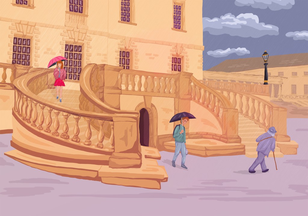
I have really enjoyed using this technique. It is similar to many other experiments I had done but there are some significant differences. When I added details (the columns on the left are a good example), I tried to use the same kind of gesture I use when I create a fast sketch of a complex building with a black fine liner in order to keep that fluidity. I have realised that it is sometimes more important than absolute accuracy.
I am still learning to leave details out in the background and to have less contrast so that the foreground stands out. However, I could have added a bit more contrast with a few elements in the background.
In that composition, the main character is the staircase. It could be a story about how people share the same space but never meet.
I intend to try different compositions around the place. In this instance, I wanted to keep the entire staircase because I like the pattern it creates but it means that the people are somewhat lost and it would be interesting to test other compositions.
I also would like to use the sketches that I have created of other people to show how the place could tell a different story in a different light.
I am not happy with the way I drew and rendered the girl with the umbrella. I tried to colour the character twice but it does not really work, partly because the initial sketch is too static, partly because I was trying to add too many details even though the character is very small.
This illustration has taken much longer than anticipated as the background is very complex. However, I like the potential and will experiment further with that technique. It is also interesting to notice that I now feel confident to create an illustration where part of the background is the hero whereas in the past, I often neglected that part.
