After creating the first illustration for this project about a historical staircase in Greenwich, I followed my tutor’s suggestion and tried to create some sketches around that scene to compare the outcome with the digital illustration. I was not very successful, but I noticed that when I created a quick sketch, I focussed on what was important and found it easier to leave out details that did not matter.
I therefore decided to take inspiration from this experiment to create a new illustration. Instead of drawing a few thumbnails and commit to a composition, I created a few sketches with a brush pen and watercolour about the subject I was interested in, namely the concept of past and present and Greenwich historical buildings.
I focussed on working fast in order to be spontaneous with my choices.
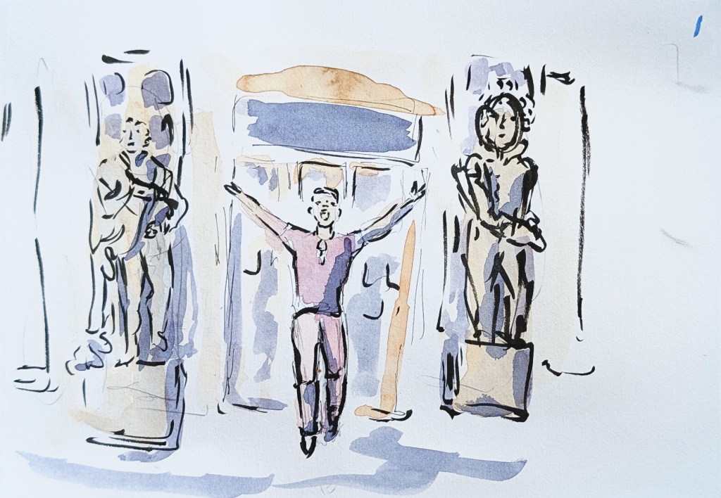
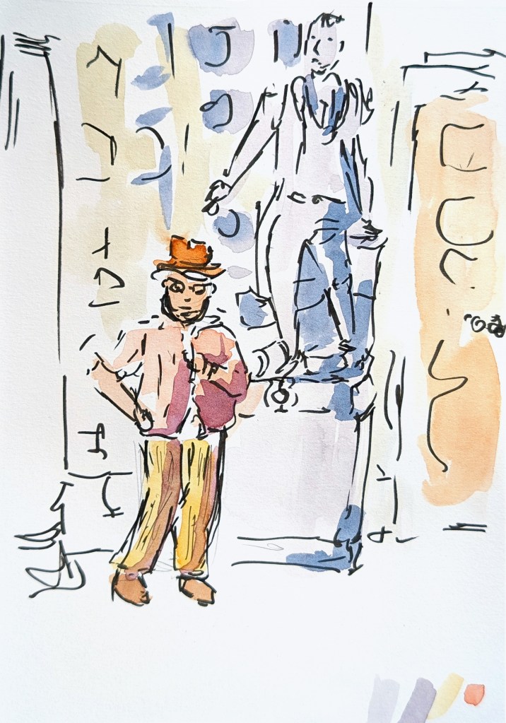
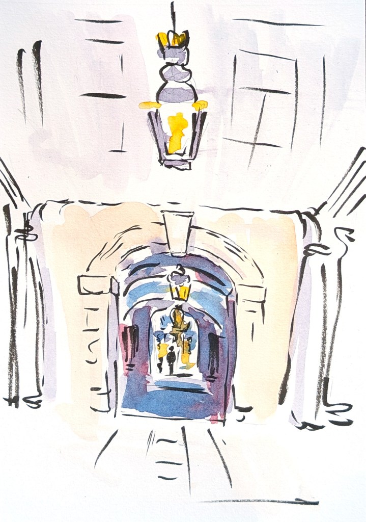
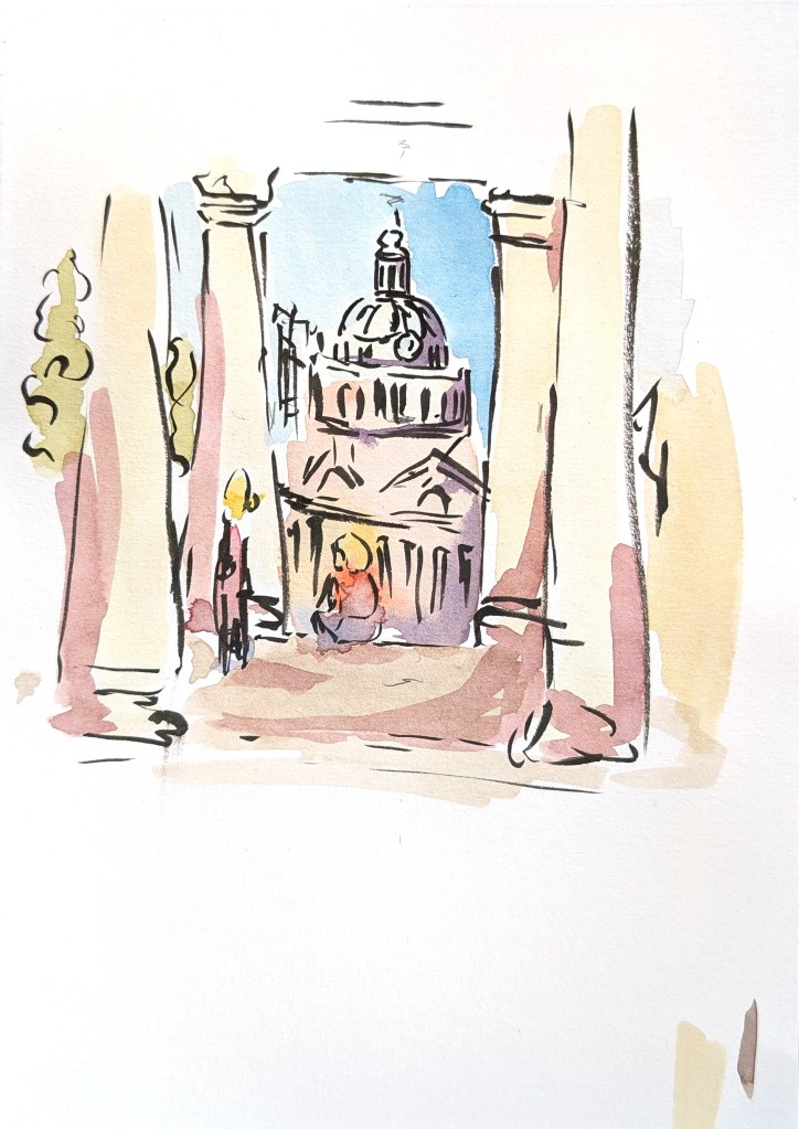
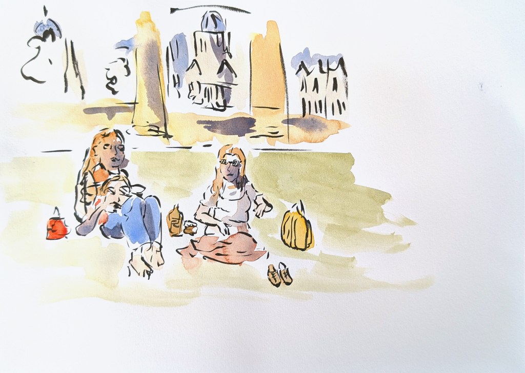

Some of these sketches are combinations of several photos. In all of them, I kept elements I was interested in and changed some proportions if it helped with the composition. I used the photos as inspiration only.
Images #4 and 5 illustrate the same area but with a different focus. The first one shows a solitary figure, who is sitting on the ground, while the second one is about friends who are having fun on a summer afternoon.
I chose to sketch these compositions because they tell a story. In image #3 for instance, an adult and a child are walking away in the distance. There is a sense of mystery in that scene. I like the repetitions of arches and lamps from the ceiling.
I decided to use the second image to create a digital illustration. I took elements from several pictures for this composition and positioned the man in front of the statue, so that it looks as if the statue is pointing at him. In the digital version, I changed the pose, so that the man is looking at his phone. The idea is that nowadays, we can sometimes be unaware of the present moment and our surroundings because of digital media. Moreover, the way we look at the past is often mentioned in the news, and in this image the past interacts with the present.
When I drew the statue, I did not want it to look exactly like the original, as the illustration is about the concept of a historical figure and not about this statue in particular.
This is the work in progress.
And this is the final version.
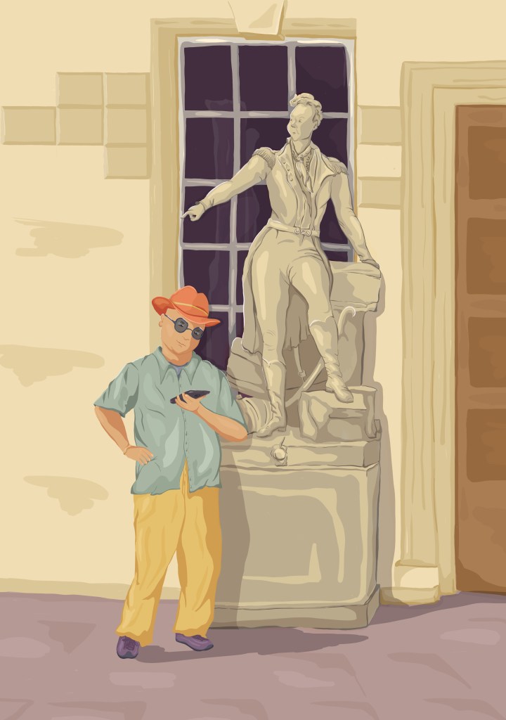
I really wanted to bring some life to the statue, and I was happy with the outcome.
It helped to create a sketch with watercolour beforehand. Every time I paid too much attention to accuracy, I looked at the sketch to remember that it was more important to draw dynamic lines. The initial sketch also showed that, in that case, the background is only there to give some context, but it is not so important. I therefore tried not to include too many details. I have used the window to frame the statue.
I tried a different version where I simplified the details as I wanted to experiment with a more minimalist option. I used Photoshop first to see if the idea would work. I added an adjustment layer to obtain only light and dark tones. I then recoloured the illustration in Procreate manually, so as to be able to choose the area that should be darker. I swapped the man who was looking at his phone with a security guard who now looks straight at the statue. It is as if the past and present are looking at each other.
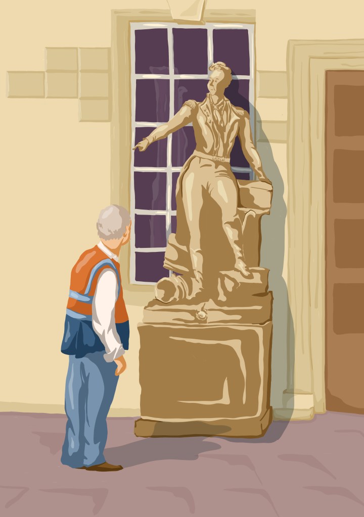
I enjoyed creating a new version with strong contrasts and few colours. I like how some of the shapes of the statue disappear and yet, we can imagine what we cannot see.
I also finalised the first illustration I had created with the staircase at the centre. I redrew the woman and fixed a few little things.
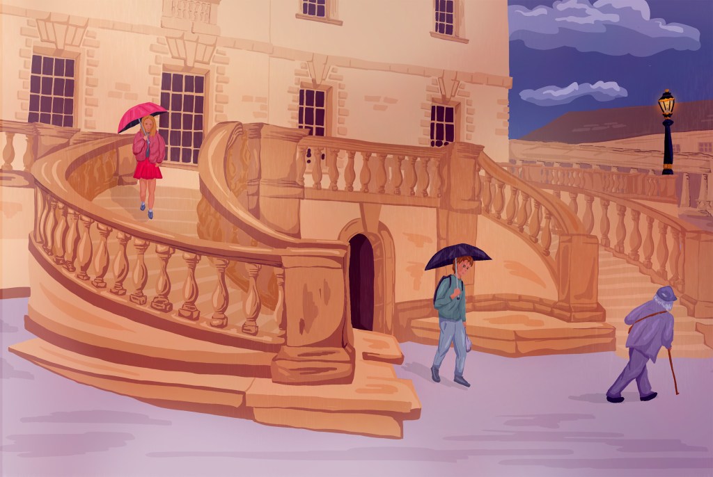
I had done some tests with that illustration before, where I added sketches of people in period costumes in Photoshop as a quick mock up. This time, I drew these characters in Procreate and recoloured the illustration with layers in Photoshop. I opted for a moody atmosphere to illustrate the fact that this is about people who might have been using this staircase in the past. It is not very clear whether these people are real people, who are outside the building at night, or if they are an evocation of the past.
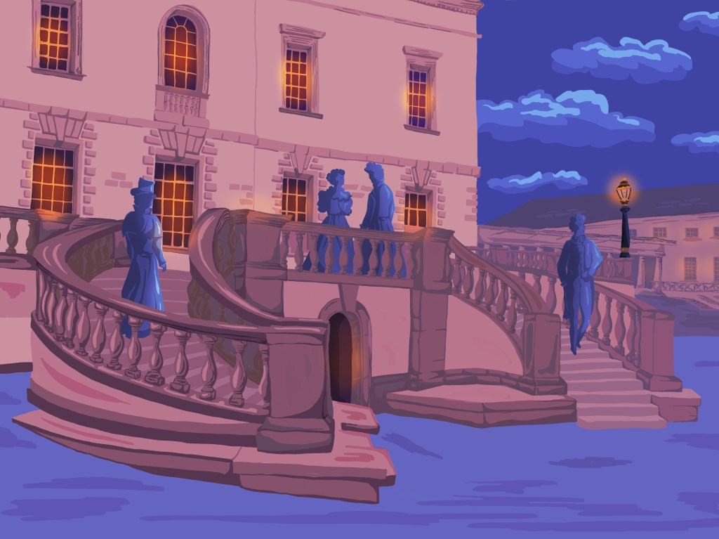
In my first composition, I felt that I had not made the most of the shape of the staircase. In this one, I emphasised the idea of a cycle by positioning people around the staircase.
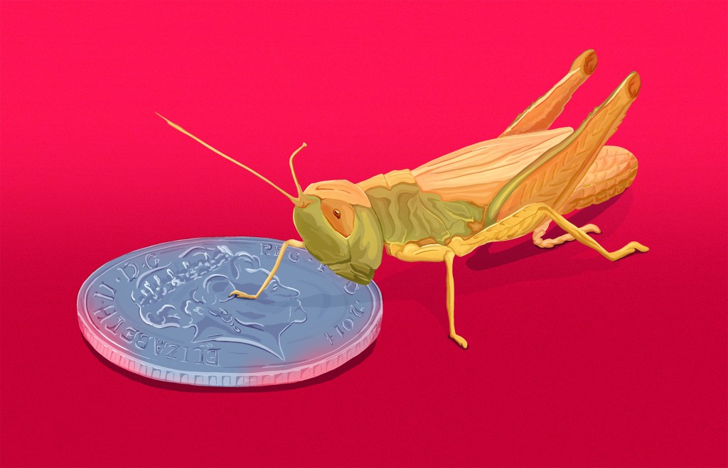
Finally, I tried to add the original lines to the illustration with the grasshopper as suggested by my tutor. Unfortunately, because I had changed some proportions as I went along, it did not work very well. In the end, I added a bit of texture to the grasshopper and some “colour contamination” to both the grasshopper and the coin as if the colour of the background is reflected on them. It brings more cohesion to the whole image.
The initial plan for this part of the course was to create illustrations about Greenwich, that could be used as editorial illustrations. I wanted to explore the notion of time and scale and I meant to try a few different digital styles.
I ended up creating fewer illustrations that I intended because I tested different ways of working (such as starting with watercolour sketches), and I experimented with variations around the same illustrations.
I did explore the notion of time, especially the relationship between past and present. The illustration with the grasshopper and the coin is about opposites.
In terms of style, my experimentation took me in a different direction than I had anticipated. However, I was prepared to be flexible. I developed a way of working digitally that works better for me than what I had tried previously, and I wanted to spend more time creating illustrations in that style to see what happened.
I feel that I have made some progress and that my digital illustrations are more dynamic and balanced. It might be because I have developed stronger connections between my sketches and my digital work.