I wanted to spend more time on researching characters to understand how to make important elements in my illustrations stand out. When I use the term character, I do not necessarily mean the main character or even a person or an animal. It could be a house, a tree or any significant element that is part of an illustration.
I already had the opportunity to study characters in the course of this degree. For instance, I did an exercise where I drew a character from different angles. My approach in this instance is slightly different. It is more about understanding what makes an element in the illustration part of the story and how to make sure that it brings something to that story.
For this section, the plan is to follow the following steps: Research the theory, look at the work of artists to understand what makes their illustrations special in that regard, revisit some of my work and reflect on how I could have done things differently, and create a series of characters to apply what I have learned.
Research on theory
Below are the articles and courses I found particularly interesting and why.
(1) 10 Principles of Character Illustration by Emily Melling (www.yesimadesigner.com/10-principles-of-character-illustration/): I had already researched the subject to a certain extent in the past but this article is a good reminder of the main principles to apply to create interesting characters (exaggeration, distortion, focus on the character’s expression, storytelling, importance of shapes,..). The article also contains some good examples that help to understand and remember main points.
(2) 33 expert character design tips by Rosie Hilder (www.creativebloq.com/character-design/tips-5132643): the author recommends to develop a line of action and concentrate on the posture first as it gives some indication on the mood and personality of the character.
(3) Expressive Character Design with Watercolor & Dip Pen by Agnès Ernoult (Domestika course): I bought this course a while ago but never found the time to complete it. The author gives some good advice and an interesting demonstration on how to design a character. She explains where she finds her inspiration: shapes, animal anatomy,.. She also recommends creating thumbnails to check the silhouette and composition.
(4) 7 pro tips for creating stylised art by Alice Pattillo (www.creativebloq.com/illustration/pro-tips-creating-stylised-art-91516795): The artist insists on the fact that “Form is Key” and how important it is to understand the structure of an animal, an object or a person well before drawing from imagination.
Study of Artists’ work
I selected artists that are very different from each other as I wanted to observe what they might have in common in their approach.
Alexis Dormal (https://www.dargaud.com/bd-en-ligne/ana-ana-tome-24/17507/abdb62ad038fe5244163f03b25b89799)
I saw Alexis Dormal’s illustrations for the first time when visiting the Comic Art Museum in Brussels. His characters are instantly recognisable. It is interesting to see how he simplifies and stylises the characters. Every element in his illustrations has personality including the trees with interesting foliage, the houses with intricate structures and flowers at the windows or the vehicles will little comic details. The postures of his characters are very dynamic, resulting in very joyful illustrations.
John Tenniel (Alice in Wonderland) (https://www.alice-in-wonderland.net/resources/pictures/alices-adventures-in-wonderland/)
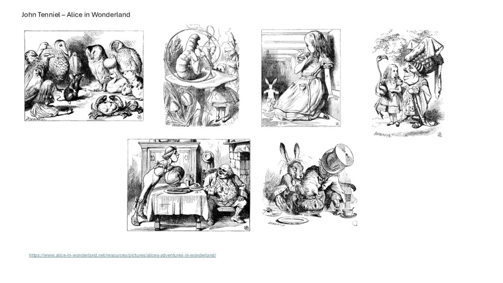
I chose to analyse Alice in Wonderland’s illustrations by John Tenniel as they successfully evoke an entire world.
Alice is always recognisable because of her outfit and hair. Her outfit includes many details and layers, adding depth to the character. Tenniel uses distortion and contrast with other characters (elongated shape vs round,…). Everything is thoughtfully drawn with a high level of details: for example, the teapot evokes luxury with a delicate pattern.
Pierre Brissaud (https://illustratorslounge.com/fashion/pierre-brissaud-1885-1964/)
I like Art Deco illustrations with the simplicity of lines and the linear shapes.
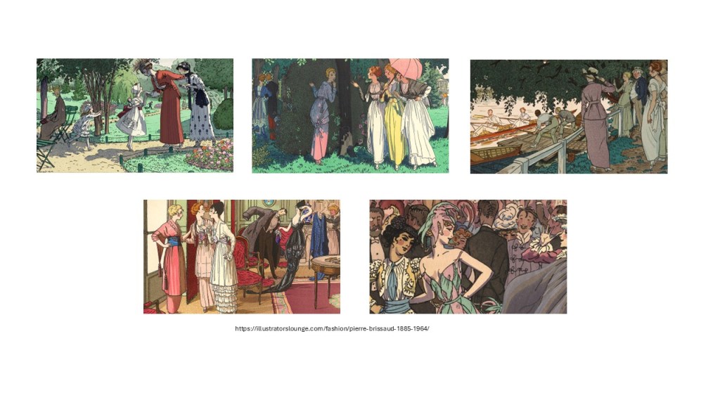
In Pierre Brissaud’s illustrations, the details in the outfits and hairstyles tell us a lot about the characters and the context: if they are in the park or at a social event for instance. His drawings are stylised, and that makes his illustrations unique. Colours and patterns are used to put the emphasis on one person. Again, every element in the foreground has personality, whether this is a piece of furniture like a rug or a chair, or a flower bed in the park.
Toulouse Lautrec (https://www.artelino.com/articles/toulouse_lautrec.asp)

Toulouse Lautrec’s illustrations are interesting as his style is very personal and make the illustrations very special. The characters are very stylised and the movement and general impression is more important than realism. As a result, there is a lot of energy in his work.
Analysis of my work
I selected a few pieces I had created and looked at what I could have done differently.

Design Characters
For this exercise, I mainly used the sketches I had created for the previous section on backgrounds and created characters that could tell a story based on these backgrounds. I also looked at elements often used in an illustration such as trees, flowers or houses and wondered how I would approach the design of these elements.
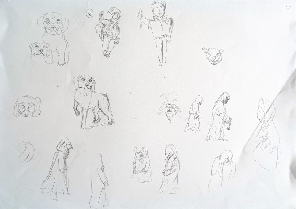
I used my sketchbook to look at potential characters I could create.

Characters based on the bridge background
When I walk on that bridge, it is always full of tourists who are taking pictures. I wondered how I could make my characters interesting if I created an illustration about tourism in London for instance.
I first explored ideas on a large sheet of paper and created several characters in Procreate.

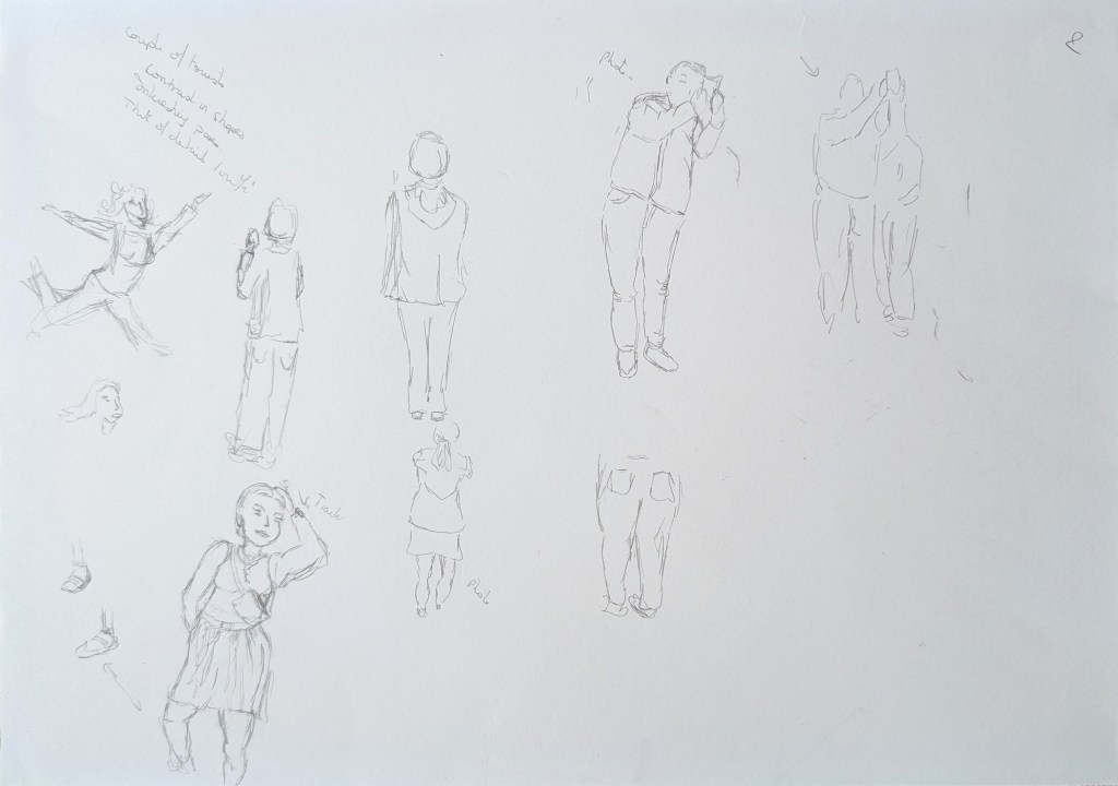
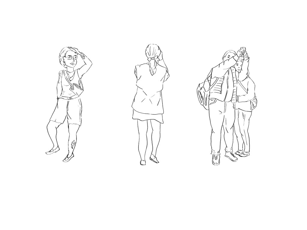
I used two different approaches to create these characters. The first on the left was drawn from imagination. I really struggled to find the right pose, and this has encouraged me to focus more on how to draw people as part of my daily sketching project. For the other two, I relied more on pictures I had taken as reference. I chose the pictures because I like the variety of outfits and the poses.
Characters based on the scene with the railway arch
When I drew this background, the scene reminded me of Dicken’s novels and there was something a bit mysterious about it due to the fact that it is darker under the arch. I thought of a story of a boy/man who would come to check the streets or bring some light. He might be accompanied by a dog.
I used the same approach as before to create these characters.
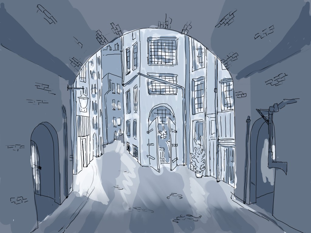

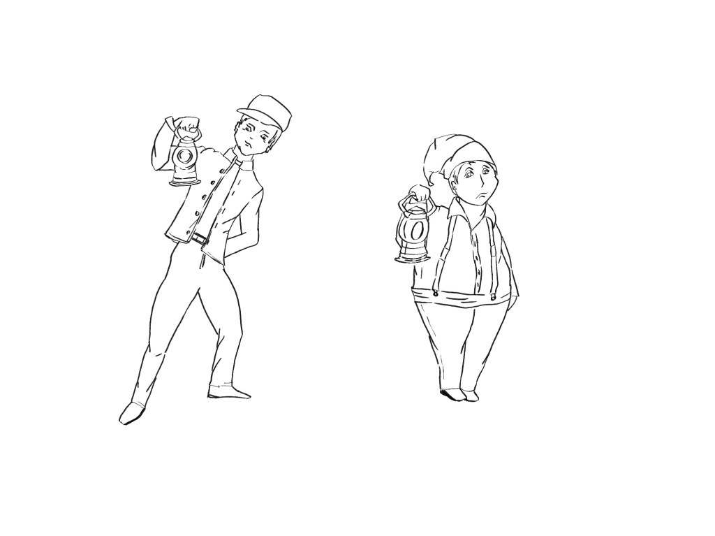

When I drew the man with the lantern, I wondered how I could use distortion and exaggeration to create a comic effect. The first pose is more dynamic as if the man is taking a step back after having seen something. I drew these characters from imagination after looking at images on Google to get some inspiration in terms of uniforms, lanterns,..
I checked a lot of dogs online and thought that the expression and pose had to be interesting and say something about the story. Is the dog alert, scared or bored?
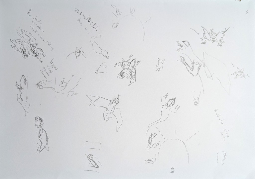
I wondered how I would create fantastic characters and remembered the course I had completed on Domestika. I looked at inspiration from insects, bats, lizards and explored how I could use elements from different animals.
Common elements in illustration
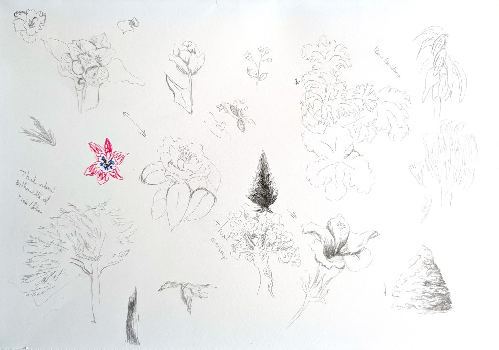
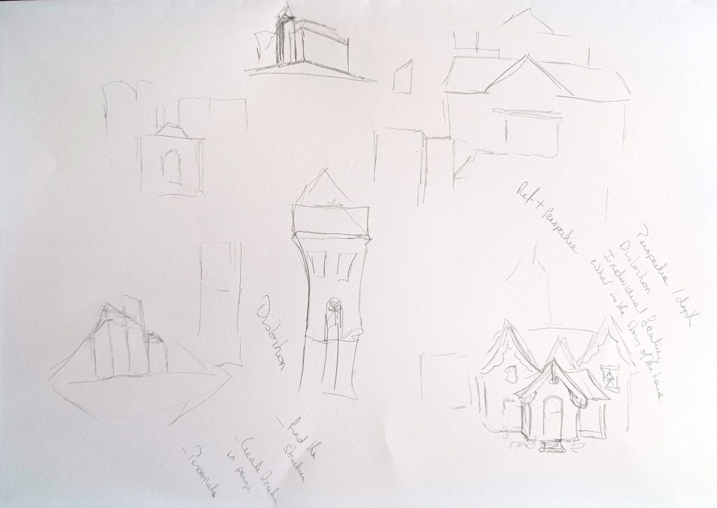


I looked at flowers and trees and analysed what makes a tree or a flower memorable. I then drew a few examples in Procreate. I spent less time on the house because I realised that I was more comfortable with architecture, and I had already started to pay more attention to that aspect in previous illustrations.
Below are all the characters I designed for potential illustrations. I have not added colours or shading as this is something I want to explore in the next session:
I wanted to reflect on what I learned when I researched the subject and how I applied the principles when I created the characters.
Distortion/Exaggeration/Stylisation: I have used some distortion with one character in particular (man holding the lantern). I find this easy to do this when I doodle but as soon as I draw consciously, I freeze and struggle to let go. As a result, I have not used this technique enough.
Pose/Expression: When I drew the dogs, I have focussed on their expression to try to convey their state of mind.
Shapes: Again, this is something I have partly used for the men holding the lantern, but it is part of letting go of reality and maybe accuracy to create more interesting silhouettes.
Reference: I have used references more for this exercise and it has been useful. For instance, I often take pictures of flowers and foliage, and have used these as reference in this case.
Details that tell a story: I feel I should go further, but I have started adding accessories, details to outfits,… Sometimes, it can be about small details like the length of a garment or the way it is worn.
Conclusion
I had already explored many concepts around creating characters, but it has helped to look at every element as a character. I could go further in applying the principles I have learned and feel that I am now better equipped to keep making progress in this area.
