I enjoy creating colourful palettes. However, when I apply the colours to an image, the outcome can be disappointing as the final illustration often lacks contrast and subtlety. I also struggle to apply highlights and shadows effectively. This is why I wanted to carry out more research on the subject, in order to understand how to create more harmony and contrast, both with a better combination of colours and a better use of tonal values. In this section, my aim was not to look at aspects of colour theory such as the colour wheel, as I had done this before. It was more about understanding how artists create successful colour palettes and what is missing in mine.
I decided to divide the research process in the following steps:
- Analyse pieces of work I like and try to understand why the colour combination works and how to achieve contrast.
- Do some more research on the theory of colours and contrast.
- Revisit some research I carried out previously on highlights and shadows to understand better the way lighting interacts with an object.
- Look at my own work and reflect on what worked and what did not.
I then planned to colour some illustrations and apply what I had learned.
Research phase
Sample from book about patterns and colour palettes called:
Spectrum: heritage patterns and colours Book
(Ros Byam Shaw and And, V&A. (2018). Spectrum : heritage patterns and colours. London: Thames & Hudson.)
This book is particularly helpful to look at the interaction of colours on a piece. The pattern is on the right-hand side and the colour palette is on the left-hand side. I selected a few of these patterns to analyse them in more details:
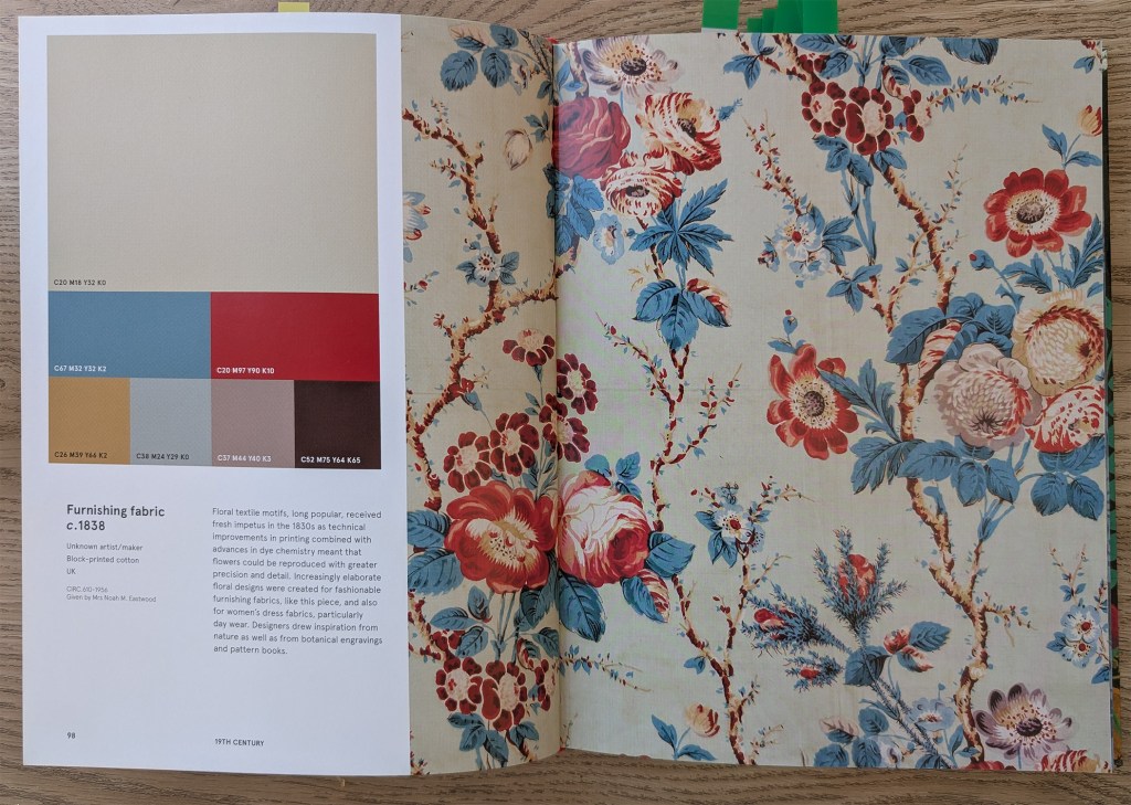


I noticed some recurrent techniques that had been applied to some or all the patterns.
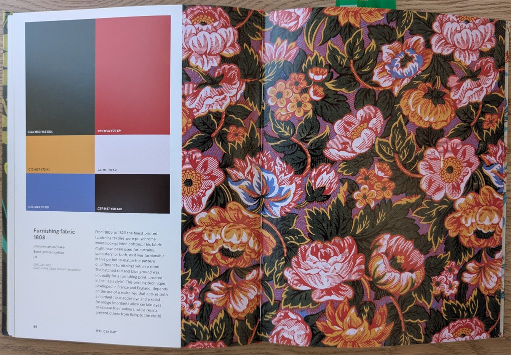
Because of the way colours interact with each other, we can see colours that are not there. For instance, in image #1, it looks as if the pattern contains a lot of orange, when in fact, there is no orange at all. The red interacts with the yellow in such a way that it looks like orange.
The contrast is often achieved with a very dark or very light background. The colour of the background is usually muted so that the pattern stands out.
The artists often play with colours that contrast well with each other, such as yellow and blue (#2) or green and red (#5).
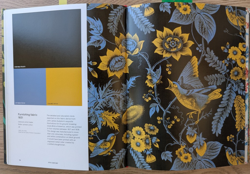
In some cases, the colour palette is limited to a few colours that contrast sharply with each other and make the image easy to read. For example, in image #2 the yellow is used for the flowers and the highlights of the birds. With this technique, the viewer can identify the different elements straight away.
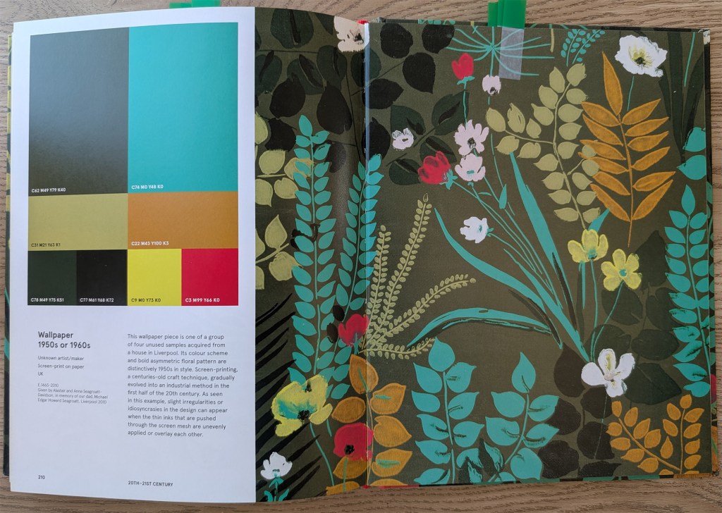
Vibrant colours are often limited to small areas, and stand out more as a consequence. In image #5 for instance, there are a few touches of bright yellow. In Image #4, the turquoise really stands out because of the large areas of muted greens. In fact, if I had chosen the turquoise for one of my illustrations, I probably would have made the mistake of associating it with other strong colours. The small flowers in vivid yellow and red attract the viewer’s attention.
I like the way the branches are painted in image #3 with mainly two colours. One of the colours is similar to the background, while the other one is dark. It makes the branches look delicate with intricate shapes.
Analysis of illustrations
I collected a few examples of illustrations on a Pinterest board and reflected on the colour combinations.
I noticed again how some artists apply a limited palette of colours that contrast with each other such as blue and yellow, purple and yellow or orange and blue. In some of Christoph Niemann’s illustrations, he uses only 2 colours (https://www.christophniemann.com/detail/london-drawings/). It is a very effective way of directing the eye of the viewer.
When artists work with larger colour palettes, they tend to apply muted colours to larger areas and more vibrant colours to smaller areas to create contrast. I find Alex Green’s colour palettes interesting (https://www.alexgreen-illustration.co.uk/). His illustrations contain a wide range of colours that create a subtle and harmonious outcome. This is something I find challenging when I work with a complex colour palette. He tends to choose more muted colours in the background and plays a lot with complementary colours, with the opposition between oranges/browns and blues/greys to create contrast.
I like how Mike Kowalski (https://www.mikekowalskifineart.com/collections/27116) creates watercolour paintings with lots of muted colours, resulting in soft and subtle images. He often uses purples for the shadows, and warmer colours for lighter areas.
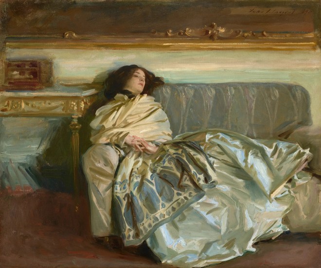
At first sight, we might not notice that some of the highlights in this painting by John Singer Sargent are painted in bright blue, because of the way we unconsciously mix colours when we look at an image.
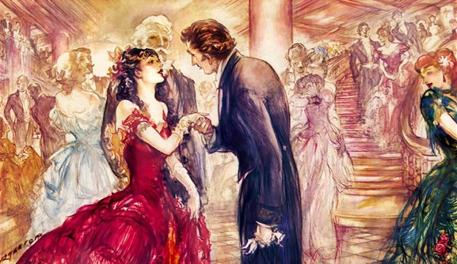
This piece by Patrick Raleigh is a good example of how to use vibrant colours to bring the focus to a given area. The main character wears a bright red dress with touches of vivid pinks and oranges, while in the background, the colours are lighter with less contrast.
More research on colour theory
I then did more research on how to improve contrast in an image. I particularly looked at how contrast is not only about tonal values but also about colours.
Tim Mcburnie demonstrates in a YouTube video how both types of contrast can be complementary and how some images will rely on one more than the other (https://www.youtube.com/watch?v=qxqcP4dLdhU – Give Your Art Impact…Understand Tonal Contrast Vs Color Contrast). He explains that too much contrast results in no contrast and I now realise that this is often the problem with my illustrations. I can use so many vibrant colours that there is nowhere for the eye to focus.
Tyler Edling (https://www.youtube.com/watch?v=5Xjcxw-WkPo – UNLOCKING VIBRANT ART: Why your colors fall flat) explains how colours should be layered to add depth. He mainly talks about digital work, but the technique is similar to traditional painting.
In this video (angrymikkowww.youtube.com/watch?v=xP0_DHZUkCY – Guide to COLOR for artists – angrymikko), the artist explains why it can be better to add more saturation at the end as it is then easier to see where to add emphasis. He also suggests spending some time to reflect on the colours of the light (what is the source, which colour does it interact with). This is also true for shadows.
Daniel Ang Art’s video (https://www.youtube.com/watch?v=7LirbJEu81Q – Hilda’s Brilliant Use of Colour | Art Analysis) analyses the colour palette of the animated series Hilda. It helped me to understand better how to paint a night scene. In this case, the palette for night scenes is nearly monochromatic.
In this video, Proko (https://www.youtube.com/watch?v=0FjjJha7HMI – The Secret to Painting the Right Color) demonstrates how colours interact with each other by picking colours on a piece. He shows that what we might think is green could turn out to be brown because of the interaction with other colours and explain how to select colours with this in mind.
Finally, I revisited a course I did with Domestika (Daily Sketching for Creative Inspiration – Sorie Kim) to remind myself of the different types of shading and highlight (Terminator line, core shadow, cast shadow, bounce light, etc.). I now have the diagram on my wall with the different lights and shadows/shades so that I can check it when I create an illustration.
Reflection on my work

I like the warmth of this colour palette but the foliage at the back could have been darker, especially around the bird in order to frame it. I could also have found a better way to add touches of red and yellow to direct the eye to the two main characters.

There is a lack of subtlety in the choice of colours. One of the main issues is the green area. The colour is too vivid and does not reflect nature. There is only one green, so that there is no depth in the landscape. Moreover, this area should have been more muted, so that the focus could be on the king who is turning his back and looking at the scene and the people in the background who are reacting to his arrival.
I tried to rectify the contrast of this image at the end but was not very successful. I should have used a more complex palette for the shadows instead of making the area darker. The ground and the sky lack depth as well.
Applying what I have learned
I decided to use the sketches I had created when I studied backgrounds and characters as part of this project and create three coloured illustrations: one scene would be set during the day, another one would be a night scene and the last one would be more focussed on the main character.
The aim was to concentrate on the colours rather than the technique of digital painting at that stage.
Illustration #1
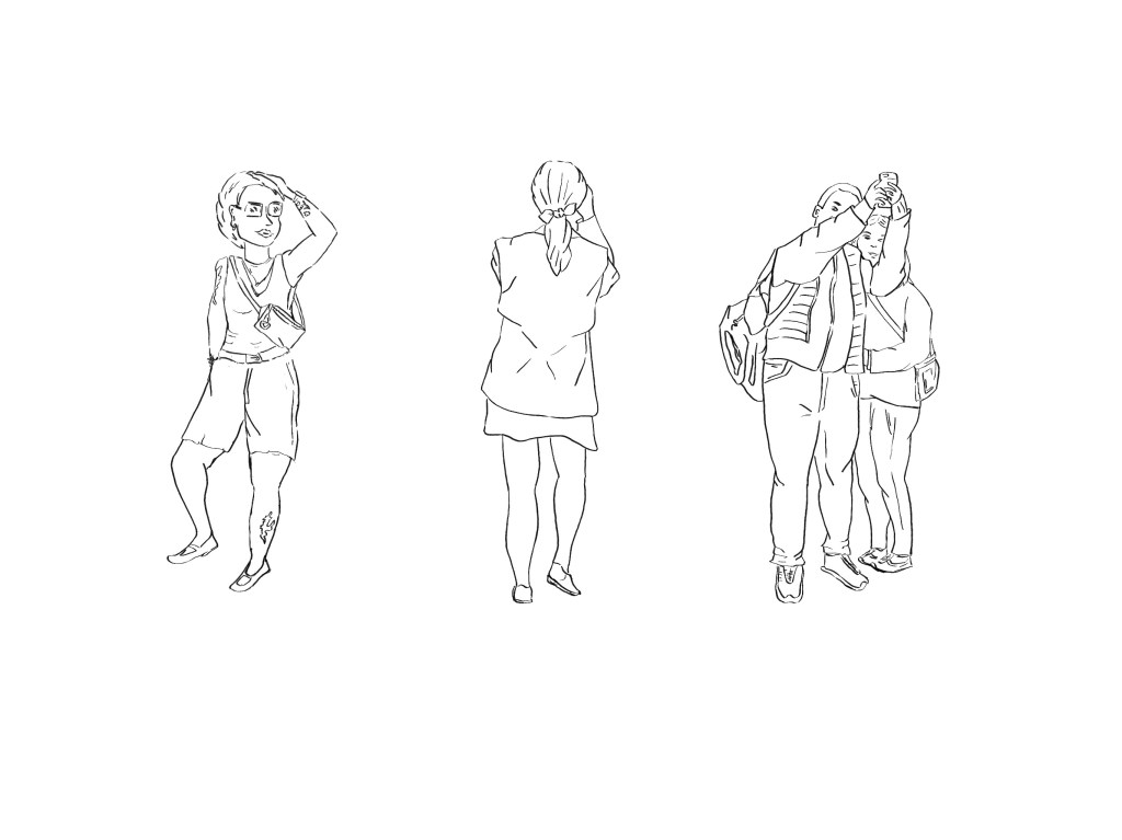
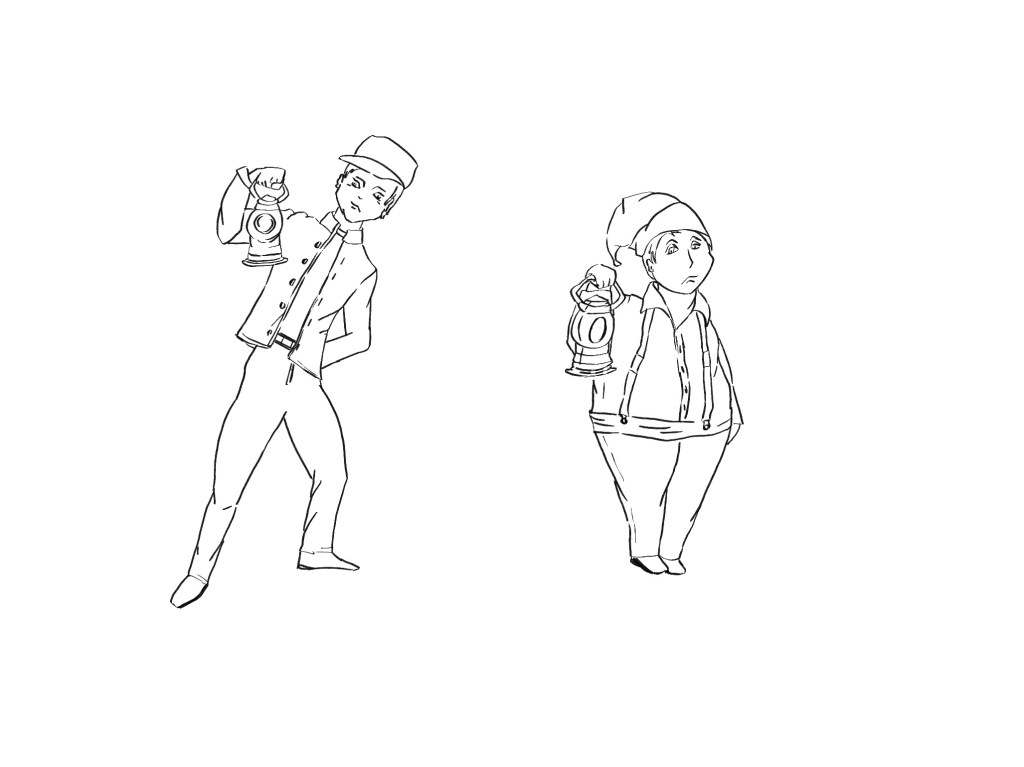
I combined some of the following images:

This is the work in progress in Procreate that shows how I selected the colours and painted the illustration:
and this is the final illustration:

I first created a loose colour palette and painted the piece a bit like I would have done with watercolour paint. I tried to keep the background more neutral with less details and focus on the main characters and that include the bridge and St Paul’s Cathedral. I avoided using a lot of bright colours from the start. However, I went a bit too far and the piece lacked vibrancy. That is especially true for the two characters at the front. I added some saturation at the end. It is easier to add saturation rather than the opposite but I still need to find a better balance. The structure of the bridge stands out, highlighting the geometry of the scene. Before choosing a colour palette, I looked for many images of the bridge in Google to see how the light can reflect on the glass depending on the weather and the time of day.
Illustration #2
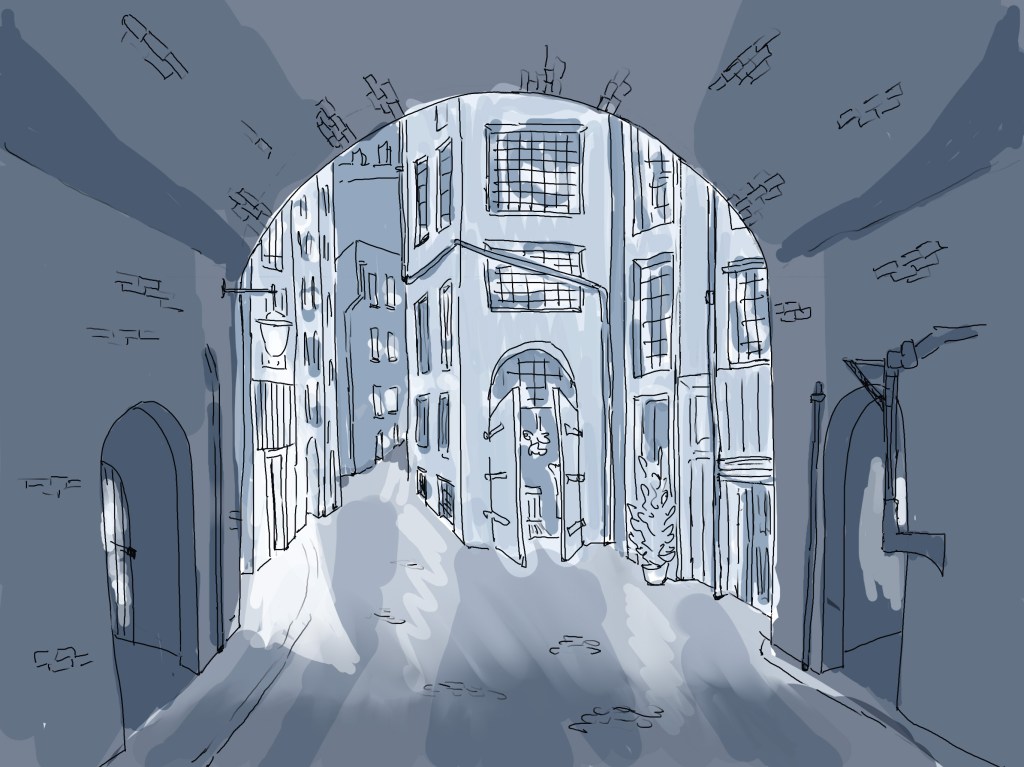
I combined some of these images to create a night scene:

This is the work in progress in procreate:
And this is the final version, once I added some contrast in Photoshop:
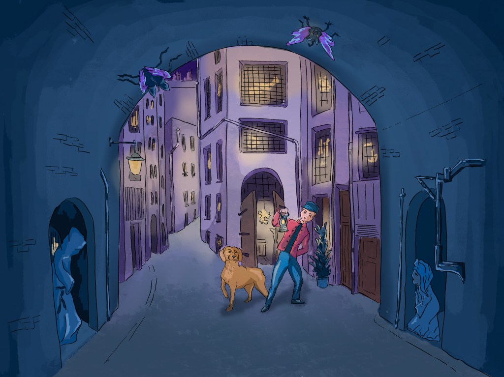
After carrying out some research in the first part of this section, I understood better how to paint a night scene. I selected three main colours. The dark blue, the purple for the city behind the arch and the yellow for the highlights. I then only coloured the main characters (the man and the dog). I was aware that the colours of the outfit and the fur should be less saturated as it is night time.
I added some overlay in Photoshop to emphasise the contrast between what happens under the arch and the city beyond.
I feel that I have made some progress with this piece although I am still struggling a bit with the contrast in darker areas. I tend to either go to dark or the opposite.
Illustration #3
I used the following images:
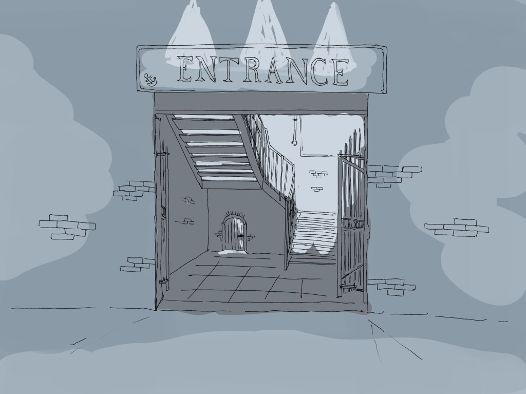
And created this illustration:
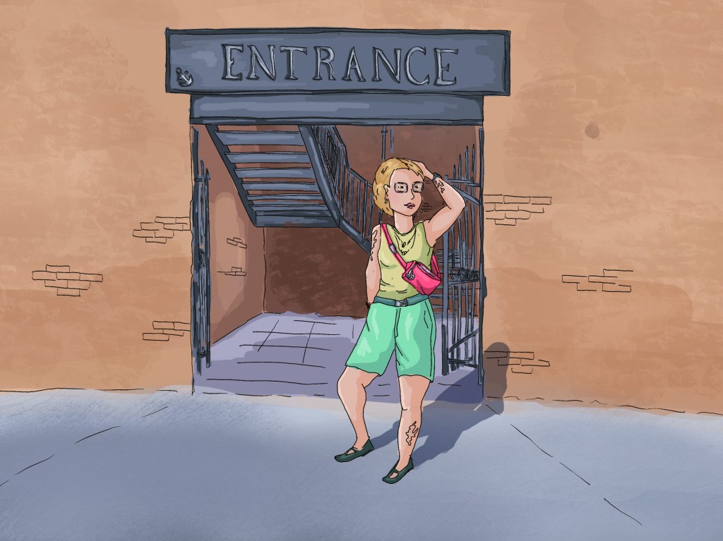
With this illustration, I wanted to experiment with vibrant colours used in small amount (the t-shirt, the shorts and the bag). Contrary to other illustrations I did in the past, I kept the background in more neutral colours, and I like the outcome. The character really stands out. the staircase could have been slightly darker to add more contrast.
I found the first two illustrations more challenging as they are quite complex and contain many elements to take into consideration (buildings, people, animals,…). However, I feel that I have made some progress in the way I approached the colouring process.
I understand better what I need to do to add contrast to my illustrations and to create more dynamic and harmonious palettes. I can see how colours interact with each other and how I can use the colours and tones to tell the story and add depth.
Maybe more importantly, I have a better idea of ways I can carry on improving in that area.
