As part of this section of the course, that has consisted in focussing on specific areas of the creative process, I have explored backgrounds, characters, colours and contrast as well as digital painting.


The time had come to reflect on what I had learned and to think of how I could put everything together to design better illustrations.
I revisited my log and focussed on the research I had carried out for each category in order to refresh my memory. It was an opportunity to look at elements I had already put into practice and aspects I could explore further. I also read notes I took when I made some research on every day sketching and checked again my tutor’s feedback.
Some important points stood out:
Composition: As my tutor noted in the feedback report, I focussed a lot on compositions based on a central focus and should consider other alternatives. It would also be interesting to play more with scales to add drama and contrast.
Depth: In the course of my research, I have learned a lot about ways to create depth. Overlapping elements give a sense of depth and this can be as part of a background or while drawing a character (having the limbs overlapping part of the body for instance). Layering colours also creates a feeling of depth.
Telling a story: every decision contributes to tell a story (the colours, the background, the characters,…) and it is worth wondering every time how a particular detail will impact that story.
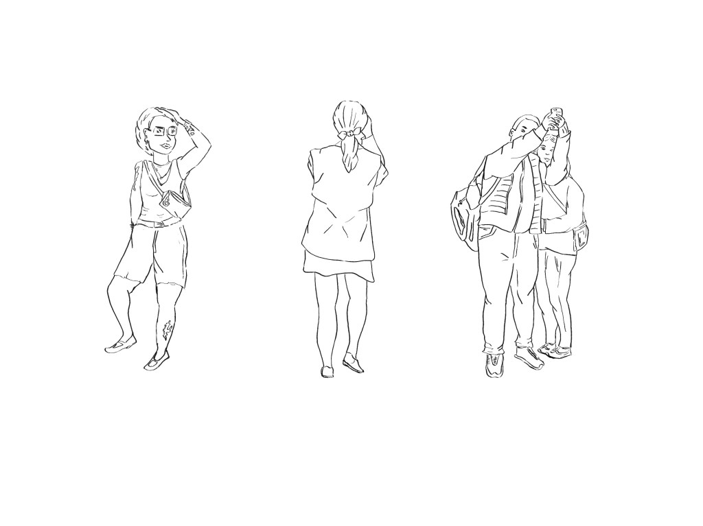
I looked at the work I had created, including the sketches I had completed for this unit as part of the project “Everyday sketching”. I also checked photos I had taken for inspiration.
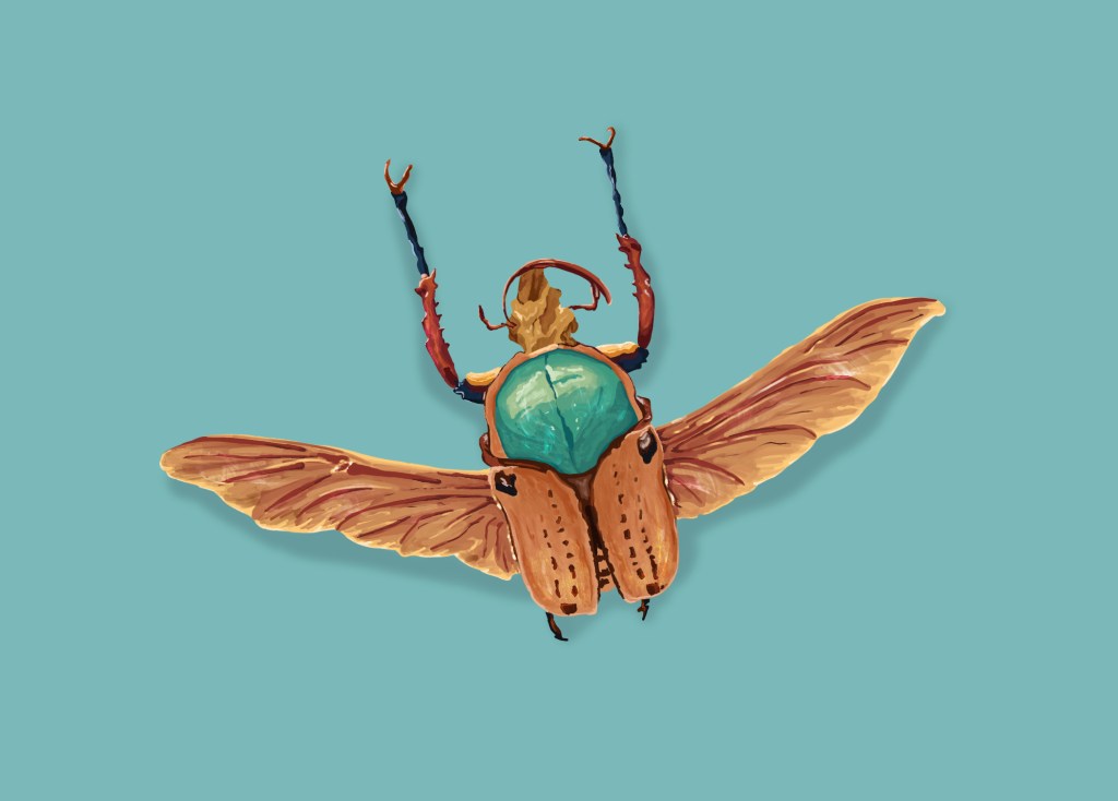
I came to the conclusion that it would be beneficial to create illustrations with a different focus. I liked the idea of creating an illustration centred on a main character where the background would matter but would be more secondary. I enjoyed painting the bug as part of my experimentation with digital painting techniques and wondered how I could have used a similar close-up as part of an illustration. I also wanted to keep exploring with colours and digital painting.
Illustration #1
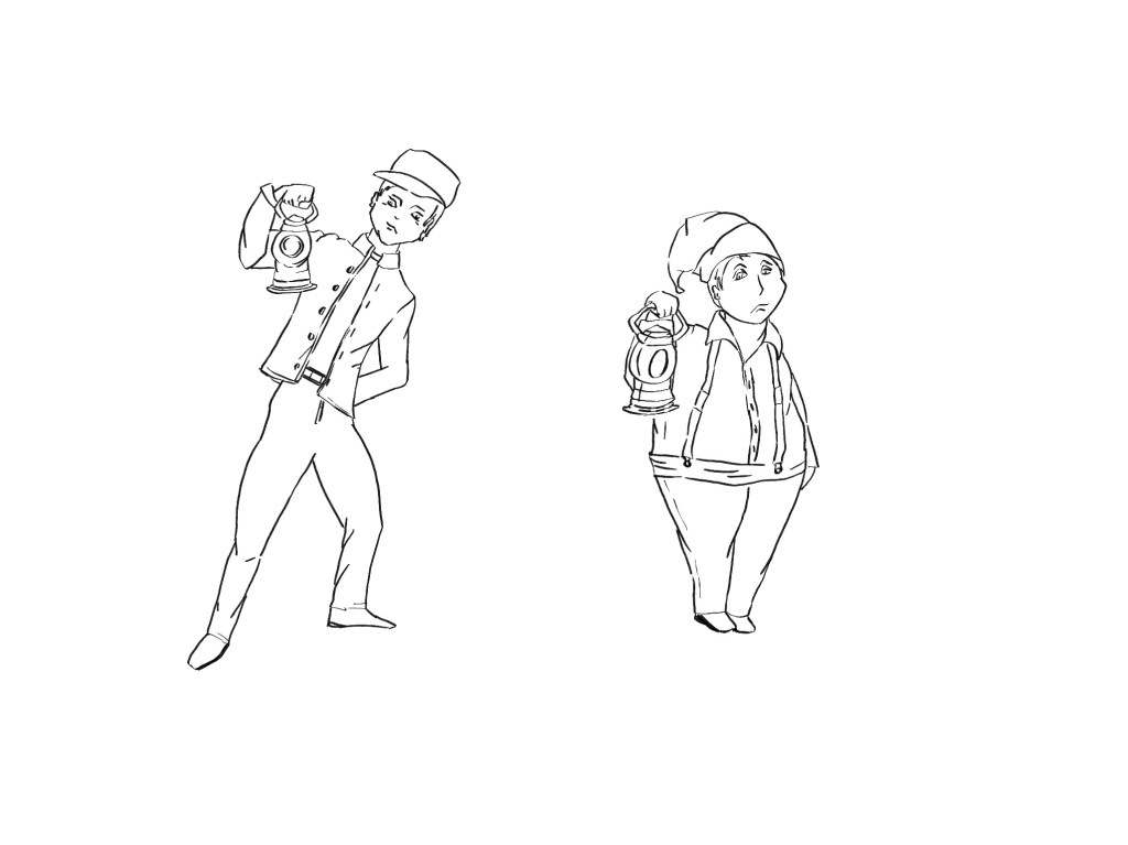
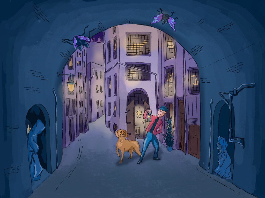
I had taken more pictures of beetles when I visited the Natural History Museum and chose to tell a story with a stag beetle as the main character.
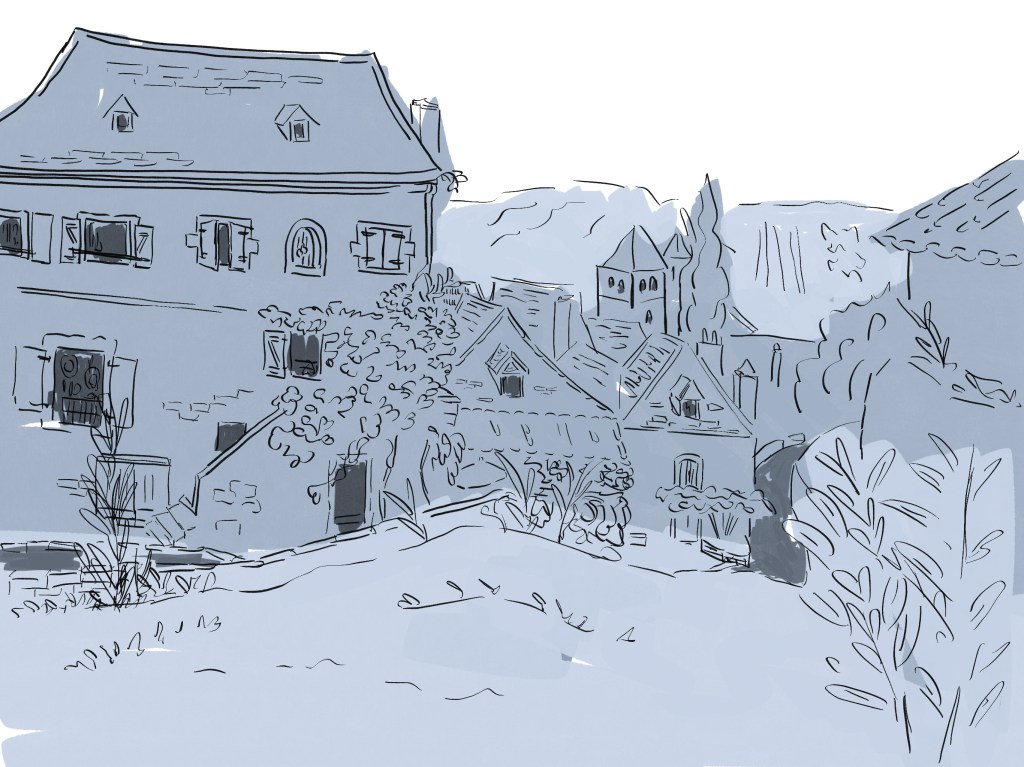
I wondered how I could create a background with some depth that would also be interesting. At first, I considered having some foliage. I went for a walk in search of inspiration, and, after a while, I saw a broken tree trunk that seemed perfect for a background. I decided to add a vibrant flower to add colour to the illustration.
Below are the pictures I have used for inspiration (I also looked at stag beetles online to understand better how the animal moves and behaves).
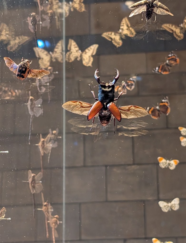
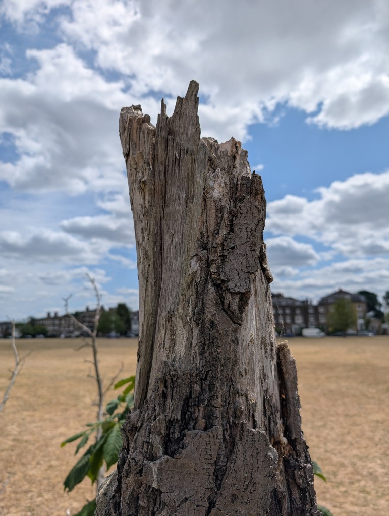
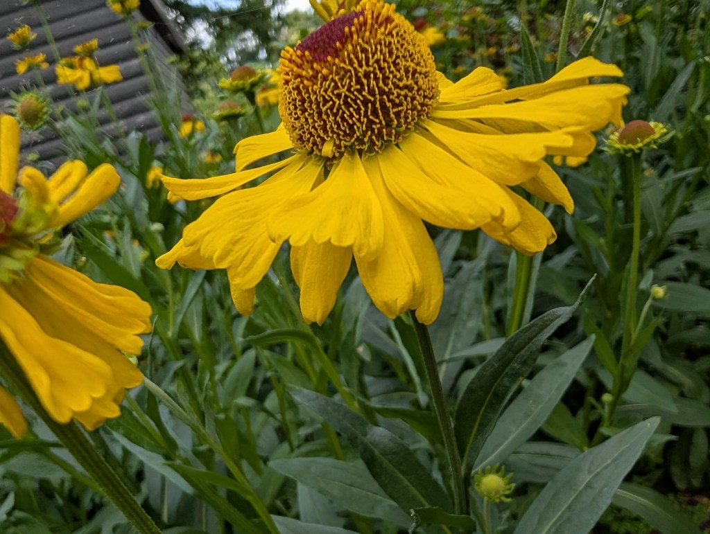
When I saw the three pictures together, I imagined how the beetle could be reaching for the sun that turns out to be a big yellow flower.
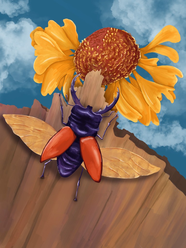
This is the work in progress.
And below is the illustration created in Procreate (left-hand side) and the image after it was edited in Photoshop (right-hand side):
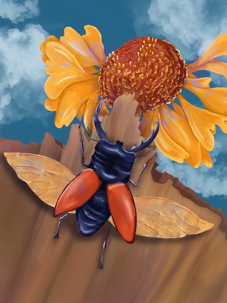
I reflected on what I had achieved with this illustration, taking into consideration the different points I had studied previously.
Background: Having created complex backgrounds has given me some confidence. The background in this illustration is fairly simple but it contributes to the story.
The character: I would change slightly the posture of the beetle, especially the limbs. I tried to show movement with the position of the legs, but I am still too timid with posture. I could have exaggerated the movement further to show how the beetle really wants to reach the top. I spent some time on drawing the petals of the flower so that it has personality and it is not just any flower. It looks too much as if the stem is missing though. I wanted it to be hidden behind, but maybe I should have added more petals at the bottom.
Colours: I found that the colours were too strong and lacked harmony. It ended up being a bit too cartoony. I tried to make some changes in Photoshop, but I am still not satisfied with the outcome. It is all about finding the right balance with colours and I still do not get it entirely right. A possible approach in that situation would have been to pick colours from nature and compare various options. Once I had coloured the main shapes, I should have stopped to reflect before adding highlights and shadows.
Digital painting: I am making some progress in a sense that I am more aware of what I am trying to achieve. However, I need more practice. There are too many brush strokes in some places. The tree trunk in particular lacks definition and depth.
Illustration #2:
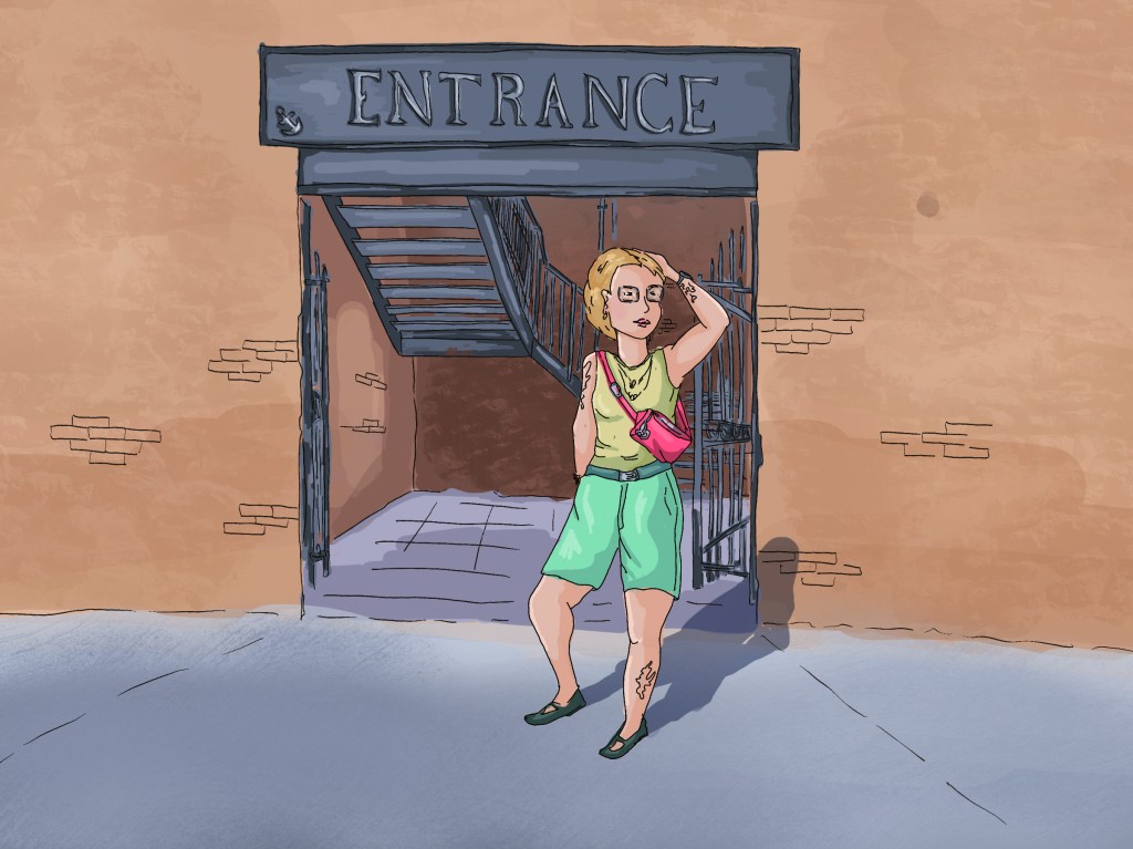
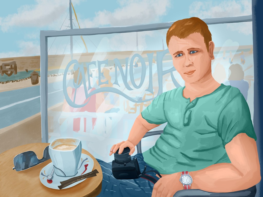
For this illustration, I chose to focus on a person, with the background disappearing behind. I looked at many photos I had taken to find some inspiration and chose this one:

I was not interested in painting a portrait of the person in the picture and only used the photograph as a very loose reference, but I liked the posture and thought that it could tell a story of someone on holiday in a French cafe by the ocean. The place where the picture was taken is in Noirmoutier, so the name of the cafe “Café Noir” refers to the island and could be relevant to the story.
This is the work in progress in Procreate.
and this is the illustration I created in Procreate, edited in Photoshop.

Background: I brought the bar partition with the name “Café Noir” forward as I wanted it to be part of the story. I have learned that the background does not always need to be drawn into details, and in this case the idea was to evoke sailing boats and people sitting at the terrace of the next bar. I think that sketching scenes quickly in my sketchbook has helped me with the background even if I was still a bit hesitant.
The cup on the table felt important to the story (someone relaxing with a cup of coffee) and I spent time adding details to it.
Characters: The main character could have been more interesting. I tend to worry about the accuracy of the posture, perspective and proportions, and as a result the outcome can lack personality. The outfit does not say much about that person. The character could have worn an interesting shirt, a t-shirt with an eye-catching graphic or anything else that would tell the audience about the taste of that person. The features are not very strong. In fact, when I looked at the work in progress, I realised that the sketch of the face was probably more interesting initially.
Colours and contrast: The whole illustration was too light once I had finished painting it in Procreate and I had to add some contrast in Photoshop with some darker areas.
Digital painting: Again, I need more practice. I struggled to render the folds of the T-shirt for instance. I experimented with several options before painting the illustration and I am not entirely sure that I chose the best one. If I keep creating digital illustrations, I will gain confidence with various techniques and will be in a better position to select the techniques that work best for the situation.
With these two illustrations, I have started implementing what I have learned in this section. I have not always been successful, but, when the outcome has not been quite what I had in mind, I have been able to understand better why and think of potential solutions for future illustrations.
