The original plan was to focus on backgrounds and understand how I could add more character and depth to the environment surrounding the characters in my illustrations.
When I started researching the subject, I learned that backgrounds are also called environments. Studying backgrounds includes looking at composition, contrast, colours… However, As I want to dedicate a section of this project to colours and contrast, I have focussed more on composition in this part.
I heard several artists online mention how creating a background is a bit like creating a stage for the main character(s).
Research
Theory
For that part of the research, I essentially watched a lot of YouTube videos as I found some incredibly useful tutorials. A lot of artists who talk about backgrounds on YouTube come from the gaming industry, probably because creating an environment that tells the right story and evokes the right mood is essential in that industry.
Below is a list of the videos I watched.
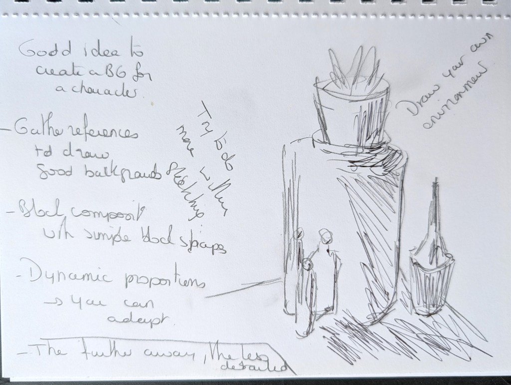
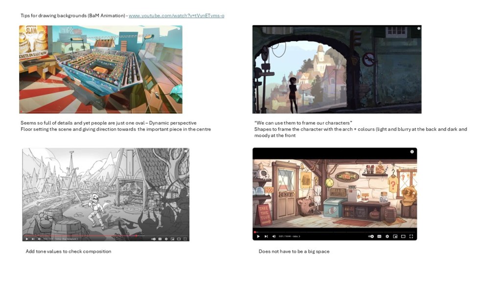
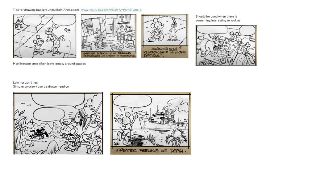
1. Tips for drawing backgrounds (BaM Animation) – www.youtube.com/watch?v=tVynETvms-o
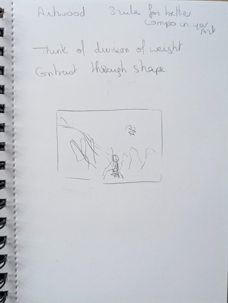
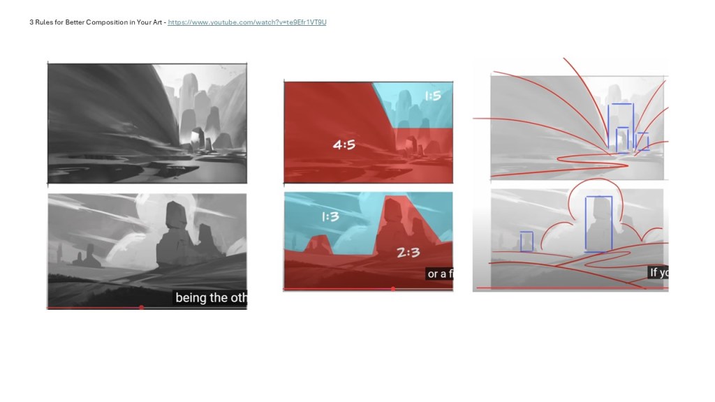
2. 3 Rules for Better Composition in Your Art (Artwod) – www.youtube.com/watch?v=te9Efr1VT9U
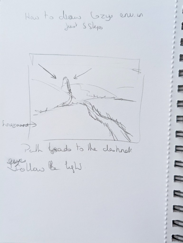
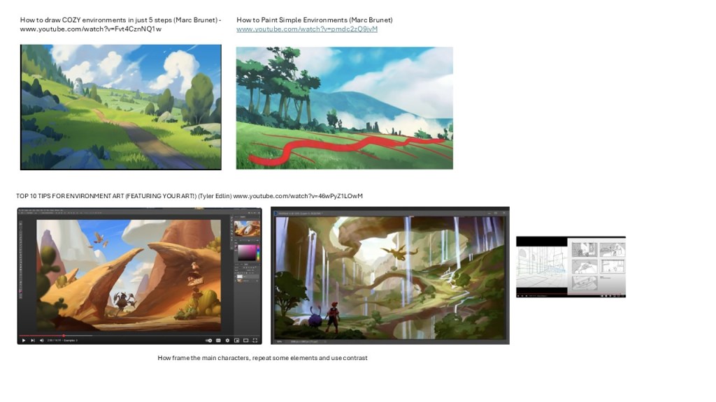
3. How to draw COZY environments in just 5 steps (Marc Brunet) – www.youtube.com/watch?v=Fvt4CznNQ1w
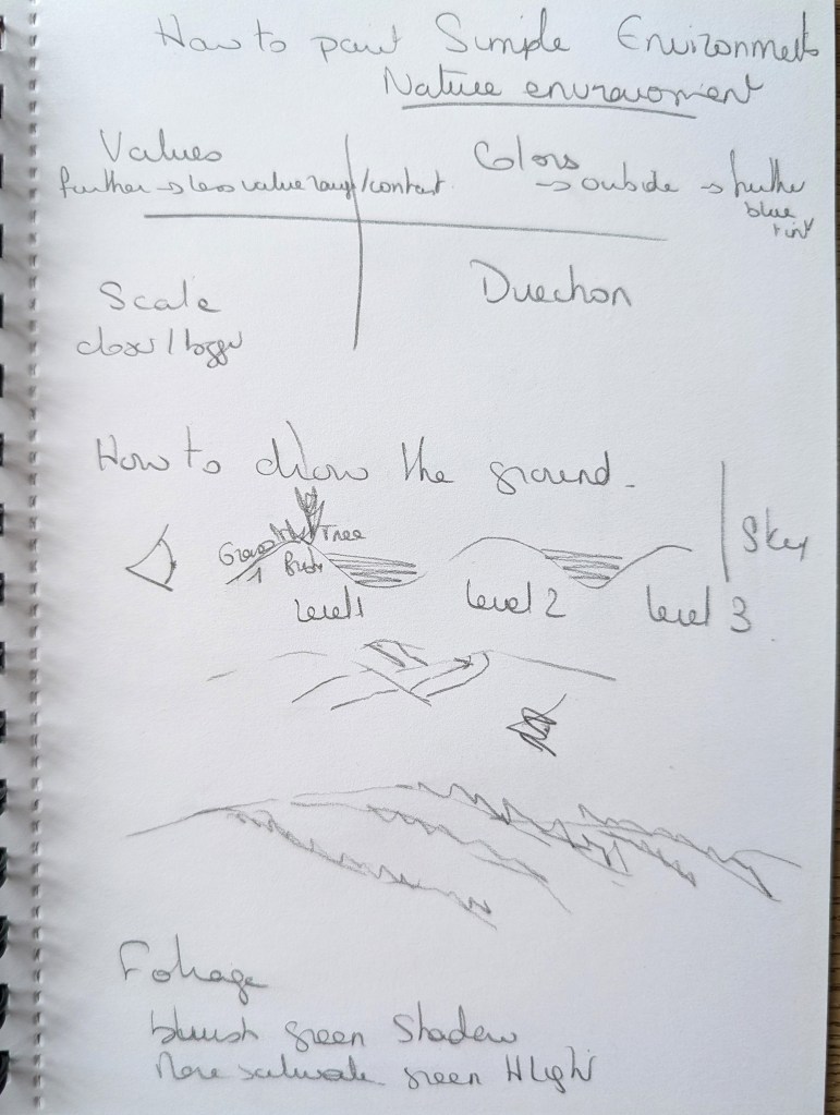
4. HOW TO PAINT SIMPLE ENVIRONMENTS (Marc Brunet) – www.youtube.com/watch?v=pmdc2zQ9jvM
5. TOP 10 TIPS FOR ENVIRONMENT ART (FEATURING YOUR ART!) (Tyler Edlin) – www.youtube.com/watch?v=46wPyZ1LOwM
6. LANDSCAPE ART for Beginners [Procreate Process] (angrymikko) www.youtube.com/watch?v=6Rd1X-tUMFQ
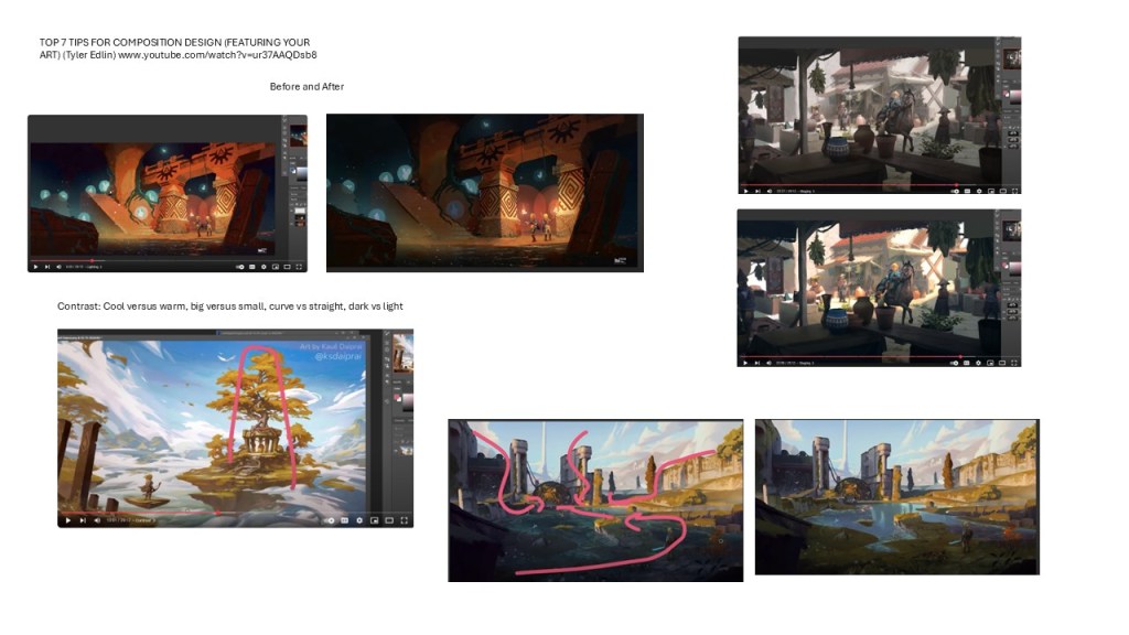
7. TOP 7 TIPS FOR COMPOSITION DESIGN (FEATURING YOUR ART) (Tyler Edlin) www.youtube.com/watch?v=ur37AAQDsb8
As I watched the videos, I took some notes in my sketchbook and in a digital format.
Below is a list of the most important things I have learned from this research (the numbers in parentheses indicate the video that was the source of the information):
- Add details in the foreground, there is no need to add details in the background (it would only distract the viewer). (1)
- Using environment to frame characters can be very effective. It can be an arch or some foliage for instance. (1)
- Try to have a foreground, middle ground and background to add layers and depth. (1)
- Consider where to have your horizon line: a high viewpoint should be used to show something in particular, a low viewpoint makes it easier to include details. (1)
- Block your composition with simple block shapes. (1)
- Think of of the division of weight on your page to balance the composition. (2)
- Make sure that you indicate a sense of direction for the eye to follow. (2 & 3) – Consider how you would describe the place and how to get there – This would be a way to identify what makes the place different and what is interesting about it. (6)
- Contrast is not only about tone values, it can be about shapes (e.g. round vs square, tall vs small). (2) (7) – Use different scales to add drama. (7)
- When drawing landscapes, think of the different levels and what you can see or not see. (4)
- Use odd numbers for repetitive elements. (5)
- Think of visual hierarchy: the framed character should be the main one. (5)
- Interesting technique: “Triangulate key elements” as triangle is a dynamic shape. (5)
- Maximise overlap to add depth. (5)
- Use a perspective grid to check that the perspective is right. (5)
- Use highlights to direct the eye. (5) (6)
- Consider the flow of the composition. (7)
Research of artists and illustrations
I chose various artists and looked at their work to understand how the backgrounds were structured. I observed very different styles of illustrations on purpose to compare the various techniques employed by the artists.
I used my sketchbook to analyse the compositions.
Alex Green – www.alexgreen-illustration.co.uk
I chose to look at Alex Green’s illustrations because I really like his work and he always creates rich and interesting backgrounds.
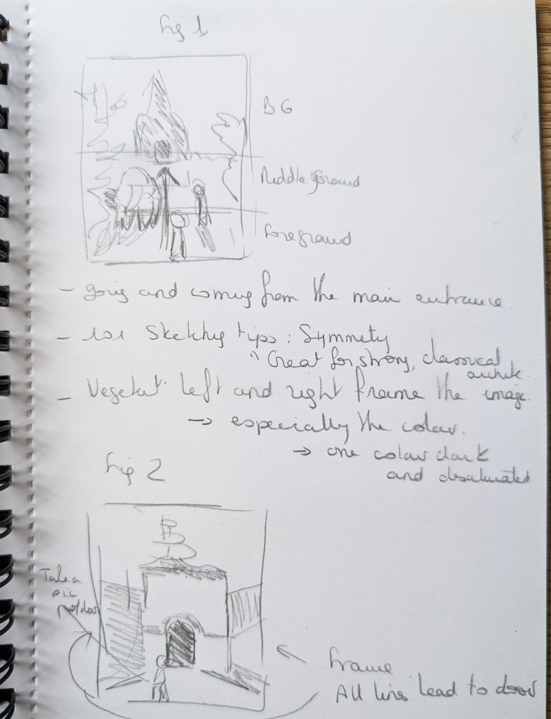
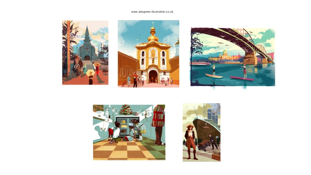
In the first illustration, the elephant, the people, the stairs and the perspective all lead to the main entrance of the building in the background. We can see how the environment is used in all the compositions to give a sense of direction. The walls in the second illustration on the left and right lead to the main building. In the kitchen, the cabinets on both sides have the same effect.
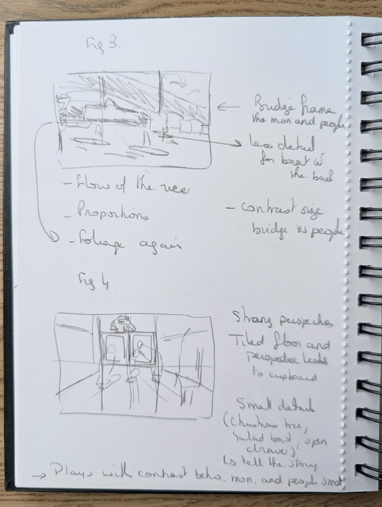
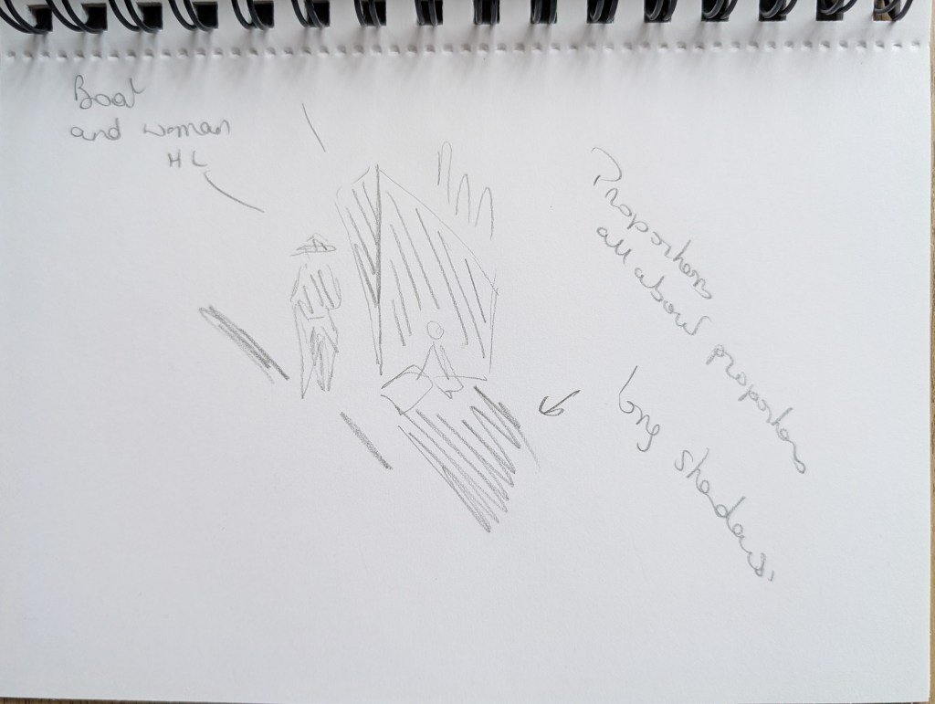
There is a contrast in scales between the elephant and the building on one hand and the people on the other hand, who are much smaller. This is also true of the lady in front of the ship. This contributes to add drama.
I remember reading in the book 101 Sketching Tips (Bower, S. (2020). The urban sketching handbook : 101 sketching tips. Beverly: Quarry Books.) that symmetry is a great way to emphasise “strong classical architecture” and it works particularly well in the first image and the next.
Symmetry also brings harmony with the same windows on the left and right of the building in the middle image.
There is a sense of depth in all the illustrations with a background, middle ground and foreground.
The first arch of the bridge frames the people rowing through and the building at the back. It is emphasised by the fact that the building is highlighted. We can feel the flow of the river. The foliage and the bit of ground help to anchor the scene.
Small details add life to the scenes. In the kitchen, there is a Christmas tree on top of the fridge and utensils showing the preparation of what could be a cake.
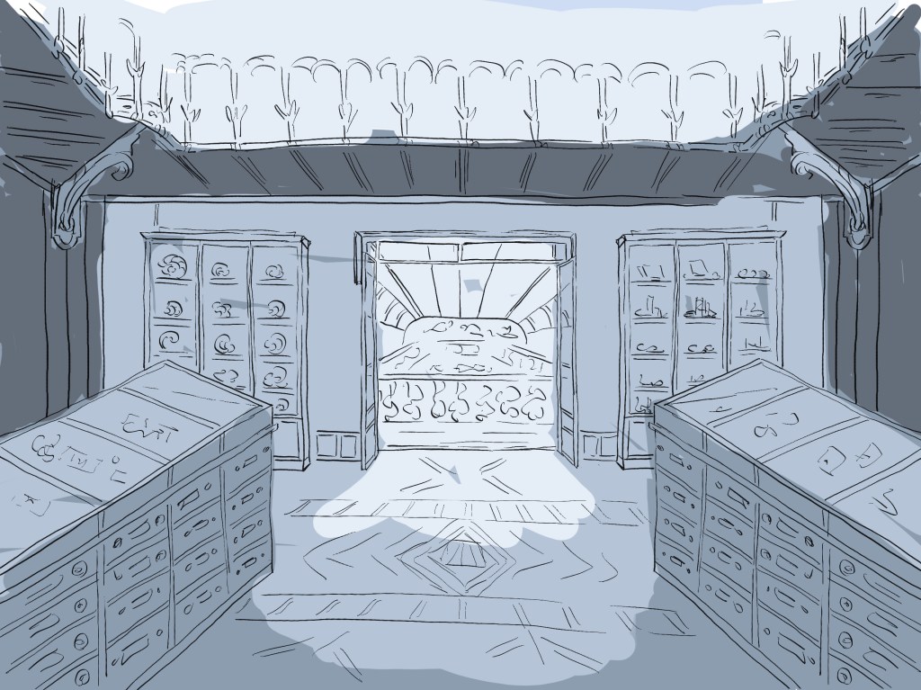
Hergé – Tintin – www.tintin.com/en/albums/the-calculus-affair
I thought it would be interesting to look at backgrounds in a graphic novel. Tintin’s illustrations are both simple and detailed and are a good reference to analyse.
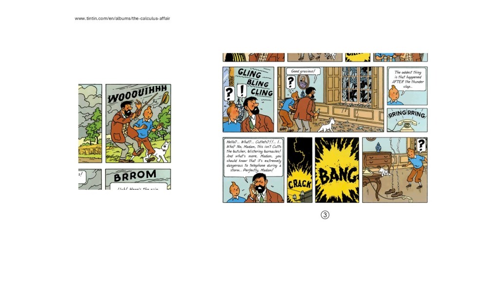
Hergé usually adds perspective to the scenes. The walls are at an angle to give a sense of movement. There are not many details because the drawings are very small but they are carefully chosen. The ornament on the chest of drawers helps to make the place feel like a home but also gives an identity to the room and is repeated in different scenes.
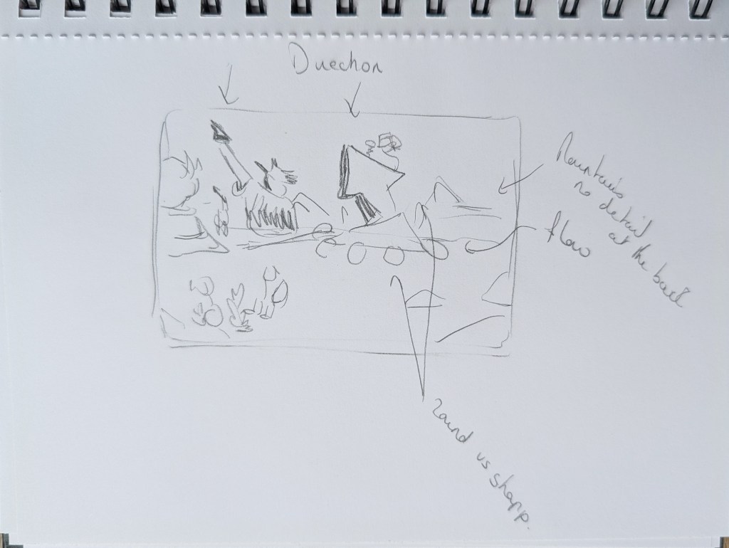
Nathan Hackett – www.nathanhackett.co.uk
Nathan Hackett creates scenes that are full of life where a lot is happening and I wanted to see how the background helped to achieve this outcome.
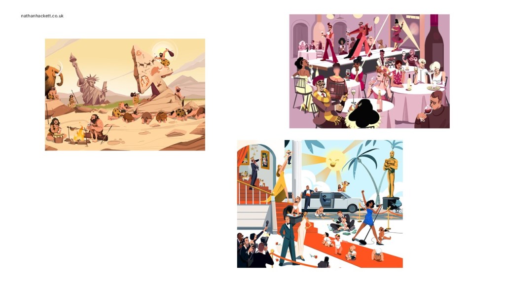
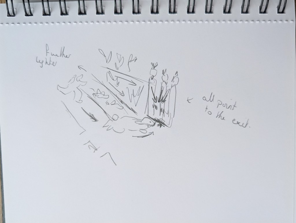
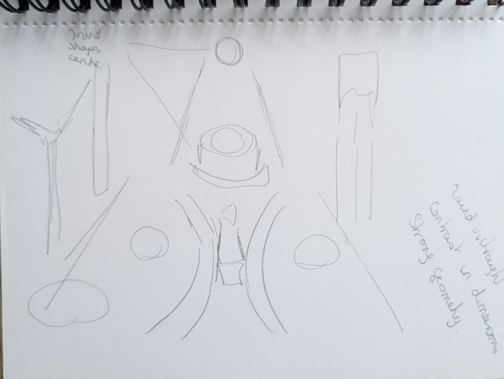
In the prehistoric scene, both the arrows and the Statue of Liberty point to the same direction. There is a contrast between round and angular shapes.
Beatrix Potter – The Tale of Peter Rabbit (Potter, B. (2019). The tale of Peter rabbit. London: Frederick Warne.)
One thing I like about Beatrix Potter’s illustrations is the fact that we can nearly smell the nature surrounding the main characters and I wanted to understand how she achieved this.
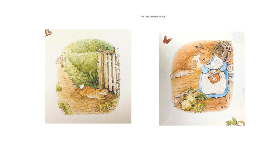
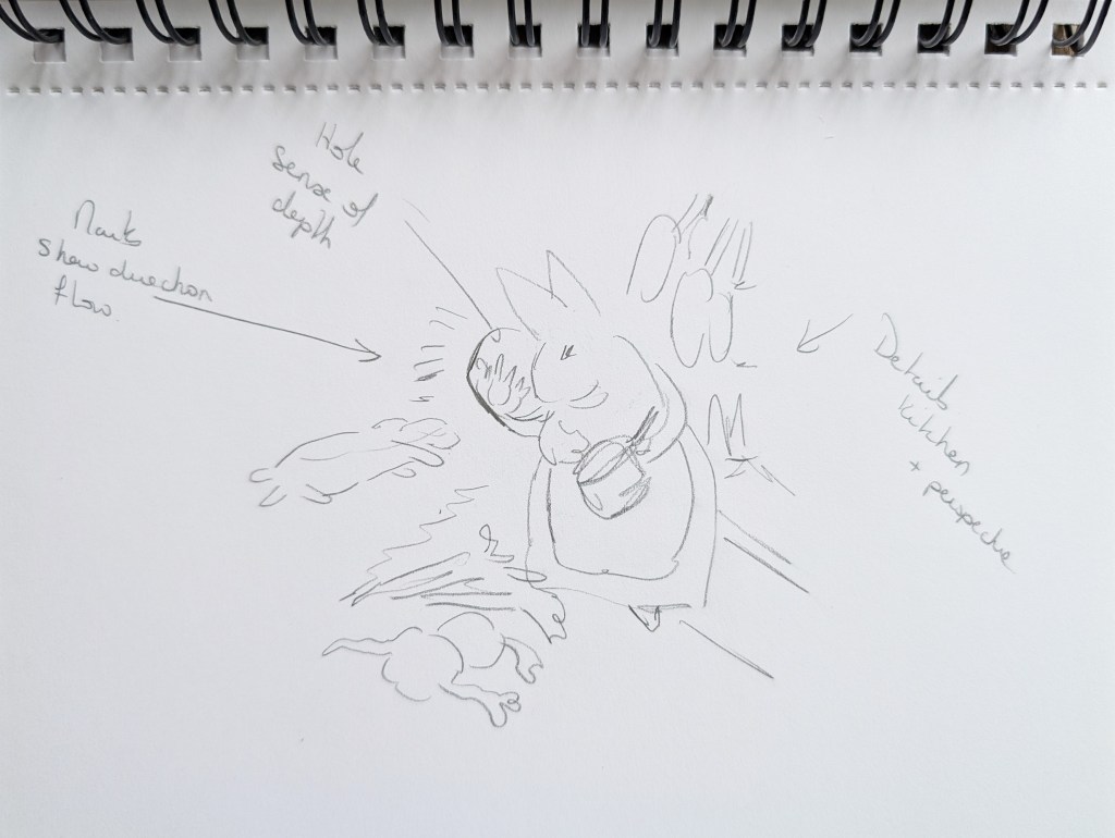
When the rabbit escapes the farmer, everything points to the rabbit’s escape route: the perspective, the road, the birds looking down at the space below the gate. In the second illustration, the hole at the back with the rabbits looking in adds a sense of depth.
Each illustration contains exactly the right amount of details necessary to depict the scene. The hanging saucepans, part of a sink and the vegetables on the floor indicates a simple and quiet domestic life.
Adam Dant – www.theguardian.com/politics/2015/sep/17/adam-dant-the-government-stable-storeroom-that-contains-an-election, www.escapeintolife.com/artist-watch/adam-dant/
I had the opportunity to study Adam Dant’s illustrations in the previous unit and wanted to look at the composition of some of his drawings to understand how he can combine such complexity and level of details with harmony and balance.
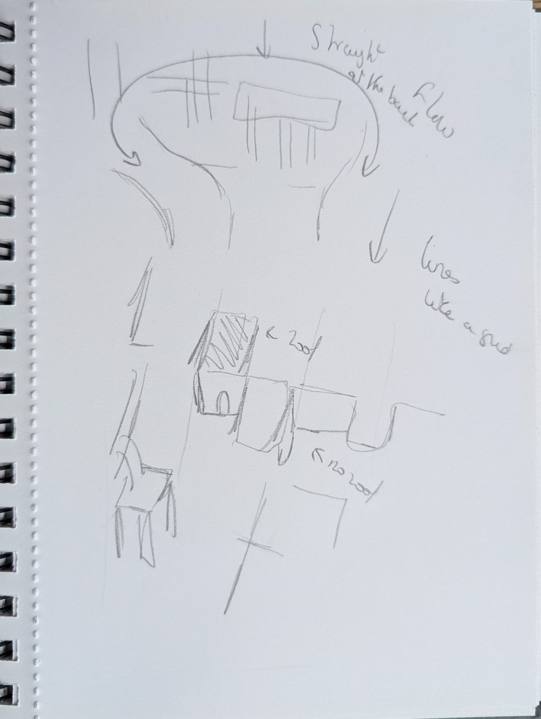

It was very interesting to analyse the big shapes and perspectives in my sketchbook to get a better understanding of the structure of the drawing. Perspective is used in a very clever way to add a sense of depth as are the many levels with stairs going up and down.
My Illustrations
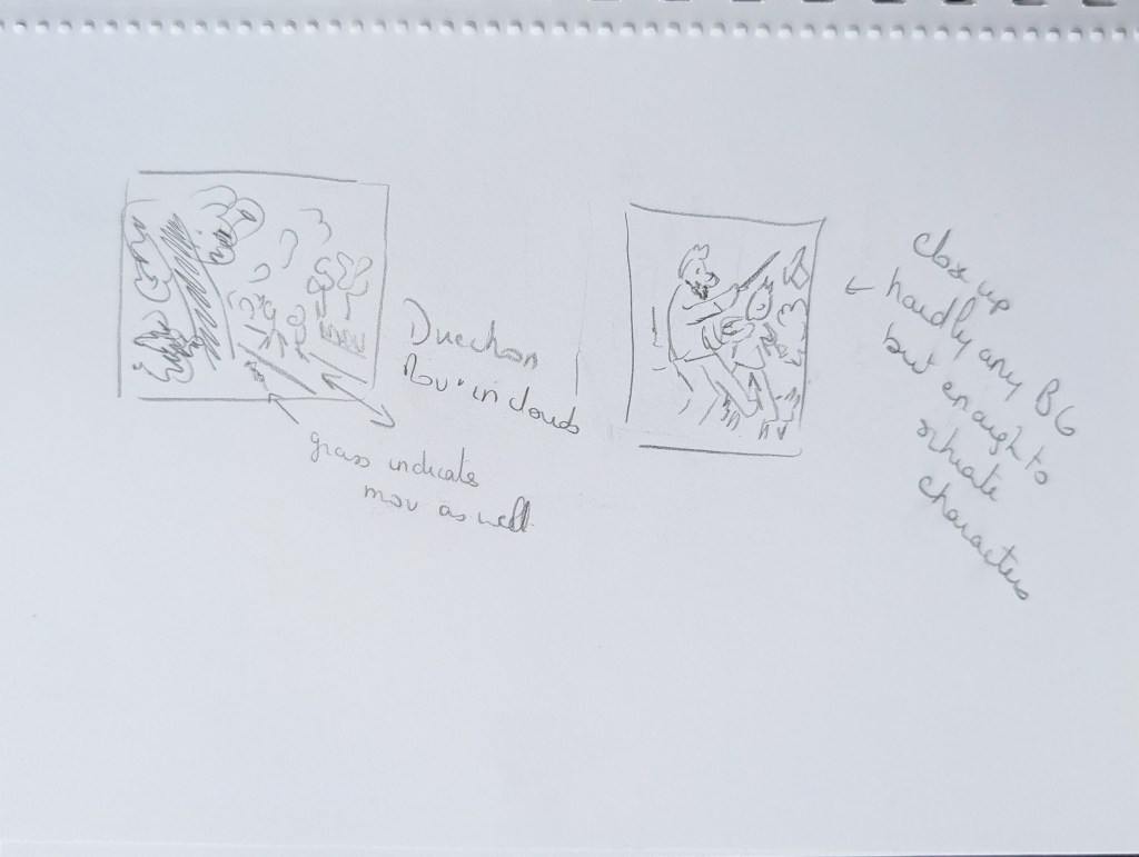
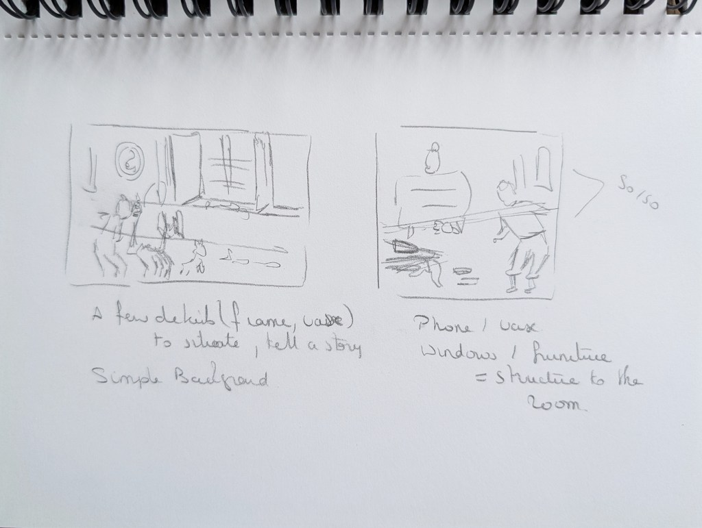
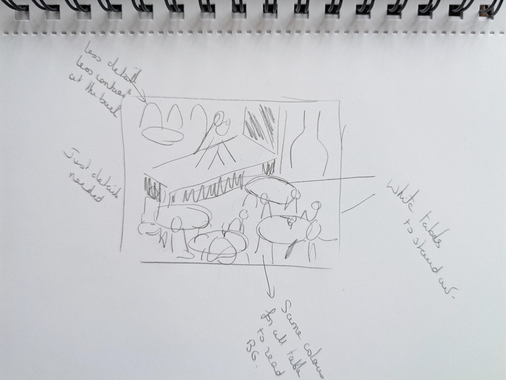
With the knowledge I had acquired, I revisited some of my illustrations to understand what I could have done differently and what worked and did not work and why.
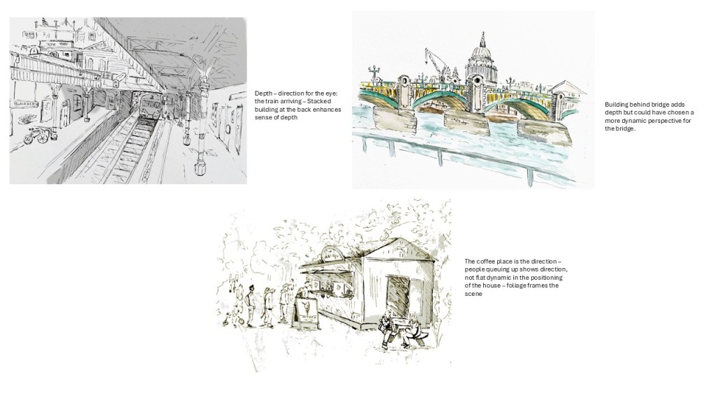
I can see better what worked in the three sketches above and how I have created depth without always being aware of the techniques employed.
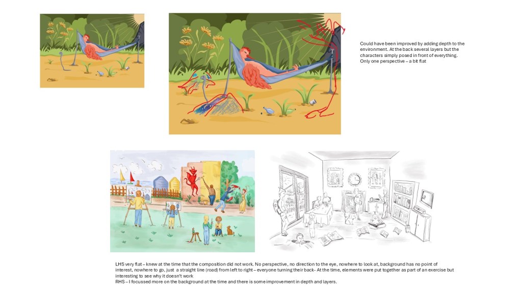
The illustrations below do not work so well.
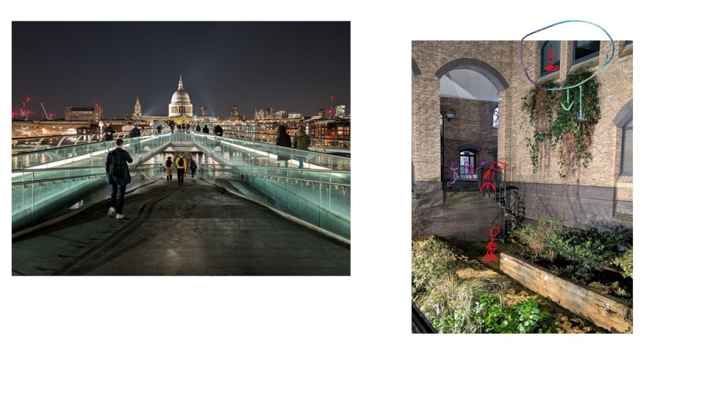
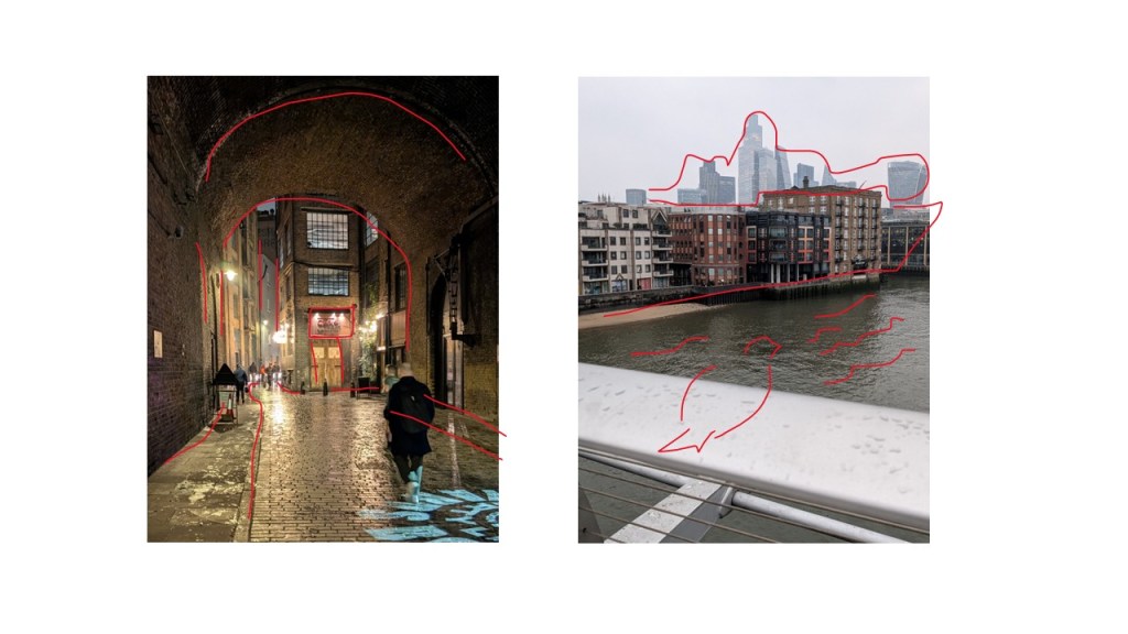
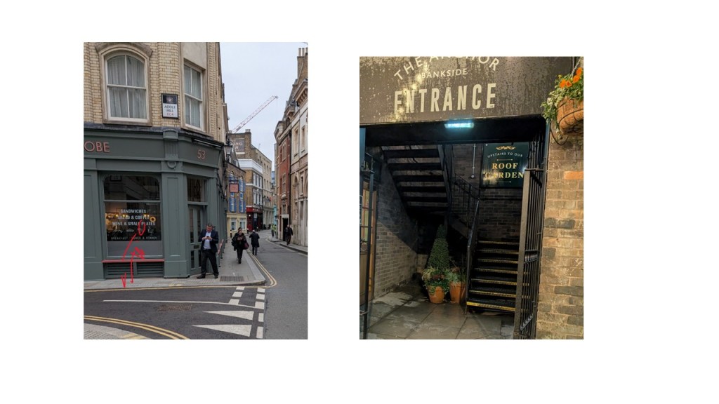
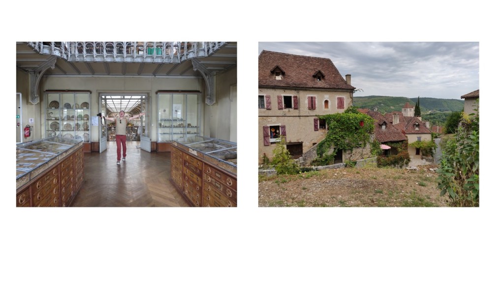
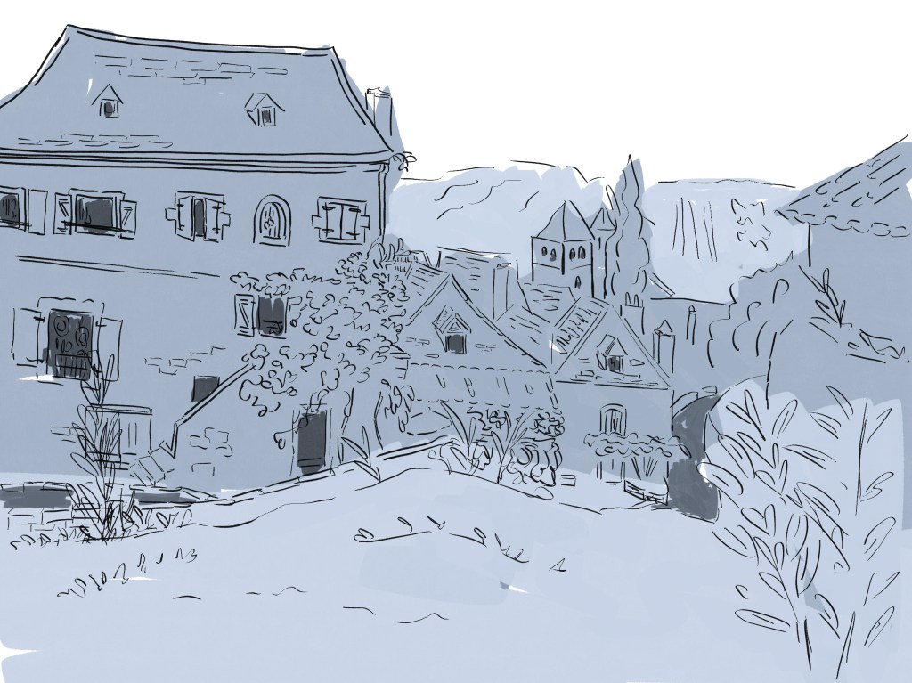
I then took some photos to see how I could apply the theory I had learned to create better compositions for backgrounds. I analysed the perspective and the main shapes.


Design backgrounds
I chose some of the photos I liked as a basis to create some backgrounds. I worked in Procreate. I wanted to create backgrounds in black and white and concentrate mainly on the composition.
Below is the WIP of the first background in Procreate:
I then created more backgrounds in Procreate following the same process.

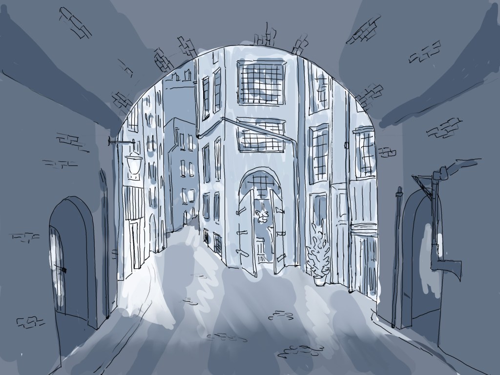
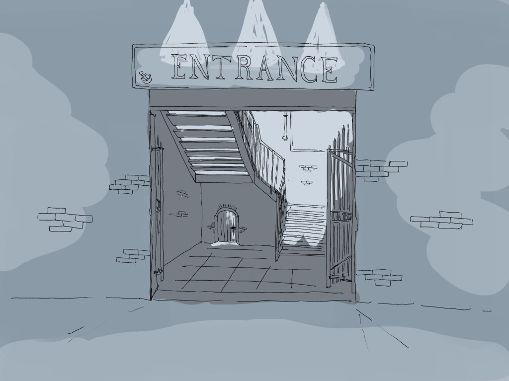
I have focussed on the following techniques to create depth and interest: have a direction for the eye to follow, use symmetry to emphasise the beauty of a building or a structure (#1 and #4), frame the scene for a potential character (use of the arch in #2 for instance), draw a scene with different levels (#1), have less details in the background.
I have added some shading to define the different parts of the illustration. I now realise that in the last one, the foreground should have been darker. It would have helped to create thumbnails with tonal values and I should do this next time.
All the illustrations have been drawn at eye level and it would have been interesting to choose a different angle. In retrospect, I would have like to draw part of a room to see which details could create the right mood. I still struggle to create scenes from imagination. It might be a good idea to use a photo as a starting point and change some elements.
One of the challenges was to remember not to get lost in too many details.
I feel that even if I still need some practice, I have started implementing what I have learned while researching the subject. As a result, not only have I created backgrounds with more depth but I have also started to understand how I did it.
It would have been interesting to create more simple backgrounds as well, as sometimes a scene needs to be minimalist while conveying the right mood.
I plan to carry on implementing the techniques I have learned to keep improving my illustrations.
