The place
After reading the brief, I chose the theme “A Place”. I immediately thought of Eltham Palace in South East London as the place to explore (https://www.english-heritage.org.uk/visit/places/eltham-palace-and-gardens/?gad_source=1&gclid=CjwKCAjwhvi0BhA4EiwAX25uj1LtjhkYnbfrsZQQvNkOdMDbGDWsOQG–pyoCcVZKPHRfPuCrcT7kxoCc3kQAvD_BwE&gclsrc=aw.ds). I do not live very far from there and discovered it last summer. It is run by the English Heritage.
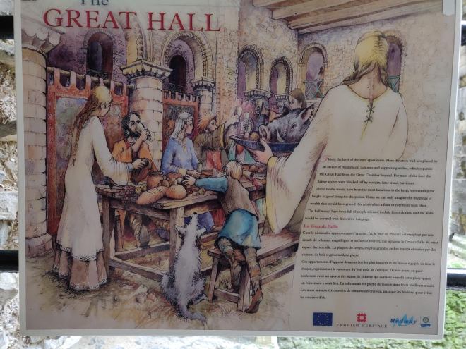
I find Eltham Palace interesting in many ways. There is a rich architecture and history. According to the guidebook published by the English Heritage, “by the early 14th century, Eltham had become one of the largest […] royal residences in the country”. During the XVIth century however, Henry VIII started to focus more on other places and Eltham Palace started to be neglected over time. When Virginia and Stephen Courtauld acquired the place in the 1930s, one hall remained of the former royal residence, and it was used as a barn. They built an art deco house next to the Hall and redesigned all the gardens around the remaining ruins. The result is an exciting place where the visitor can be transported in time. The Courtaulds left after world war II and, following a transition period during which the place was used by the army, it was entrusted to the English Heritage and opened to visitors. The place is surrounded by nature. It is lively without being overcrowded. It is both varied and contained.
I went to Eltham Palace for a second and third visit and took pictures every time. I knew early on that I would like to create some drawings/illustrations but I did not really know what would be the format or the style. I had enjoyed drawing some illustrations on the iPad for the exercise “Composing pictures” (https://catherinerouxillustrationdegree.uk/illustration-year-2/visual-exploration/visual-exploration-coursework/part-2-visual-approaches/exercise-7-composing-pictures/) and thought I might use the iPad again to create some digital illustrations. I had many ideas at that stage including creating different scenes and characters and developing a story or designing some kind of tapestry or some posters.
Research on the concept of the place
I then did some research about artists who based their artwork on a place. Following my tutor’s feedback, I was aware that I did not always reflect on how my research could inform my work. Therefore, when I looked at the work of these artists, I asked myself what element in their work could be a source of inspiration for my practice.
In an interview (https://www.youtube.com/watch?v=uQ8l3f5B22g ), George Shaw talks about his emotional journey when he paints the place where he grew up and how he started seeing it differently over the years. It helped to understand my choice of Eltham Palace. It is a place that tells many stories and the first time I visited, I immediately liked how it transports the visitor in a different place and time.
Stanley Spencer’s paintings (https://artuk.org/discover/curations/stanley-spencer-his-cookham-landscapes) focus on the area where he lived most of his life. When we look at his artwork, we can see how familiar he is with the place. It was a reminder to spend some time in Eltham Palace to really feel and understand the place.
I was particularly inspired by David Hockney’s work. I already knew I liked his work and had been to see one of his exhibitions in London. I found out when I did more research that he created a 90m frieze composed of paintings he created in Normandy (https://www.visitbradford.com/whats-on/david-hockney-a-year-in-normandie-p1792141). He was partly inspired by the Bayeux Tapestry and also worked on an iPad. As I was already thinking of a tapestry, looking at his artwork made me want to explore that option further. He focussed on seasons. I thought I could focus on time. I had already enjoyed reflecting on the idea of time in the exercise “Slow” (https://catherinerouxillustrationdegree.uk/illustration-year-2/visual-exploration/visual-exploration-coursework/part-3-making/exercise-2-slow/).
Martin Parr tends to zoom in and out in his photos (https://www.martinparr.com/) and I somehow wanted to do this when creating the various scenes.
Visit of Eltham Palace
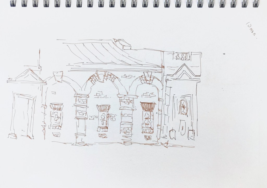
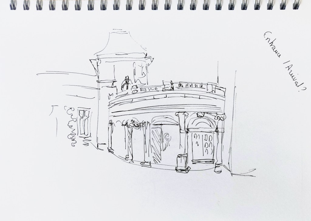
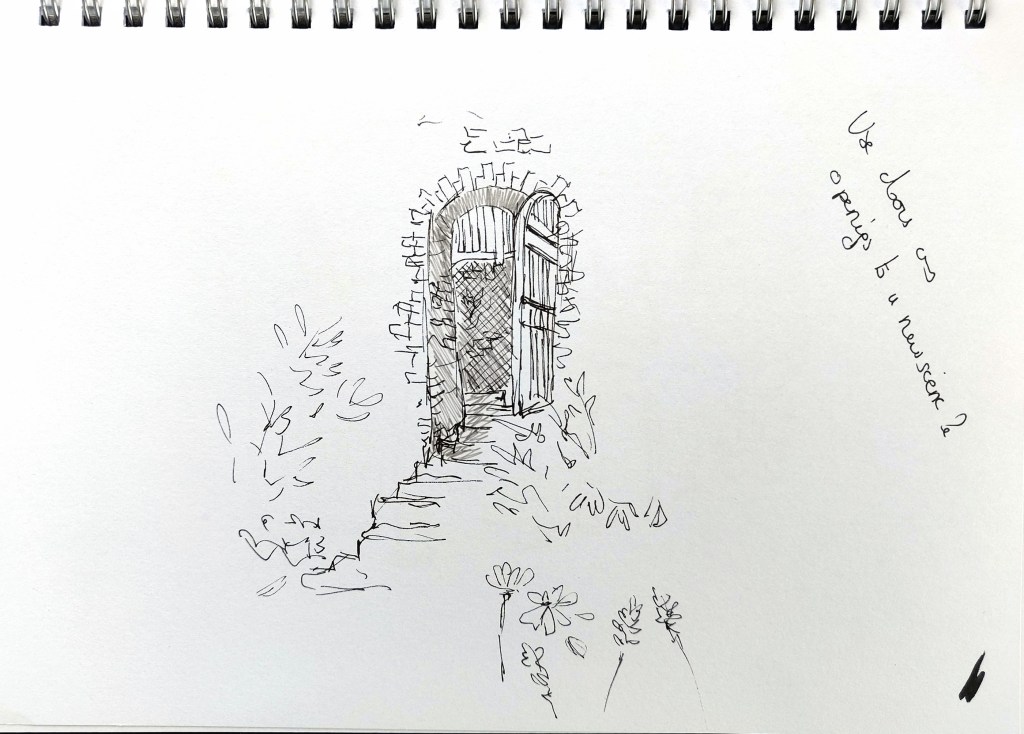
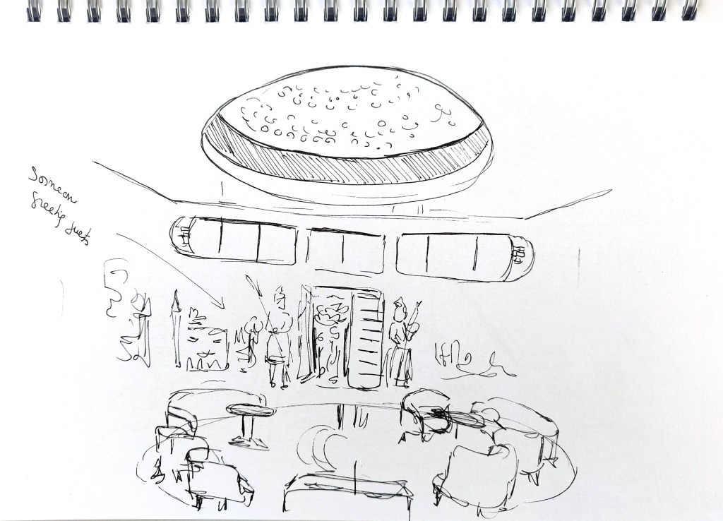
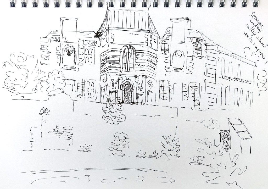
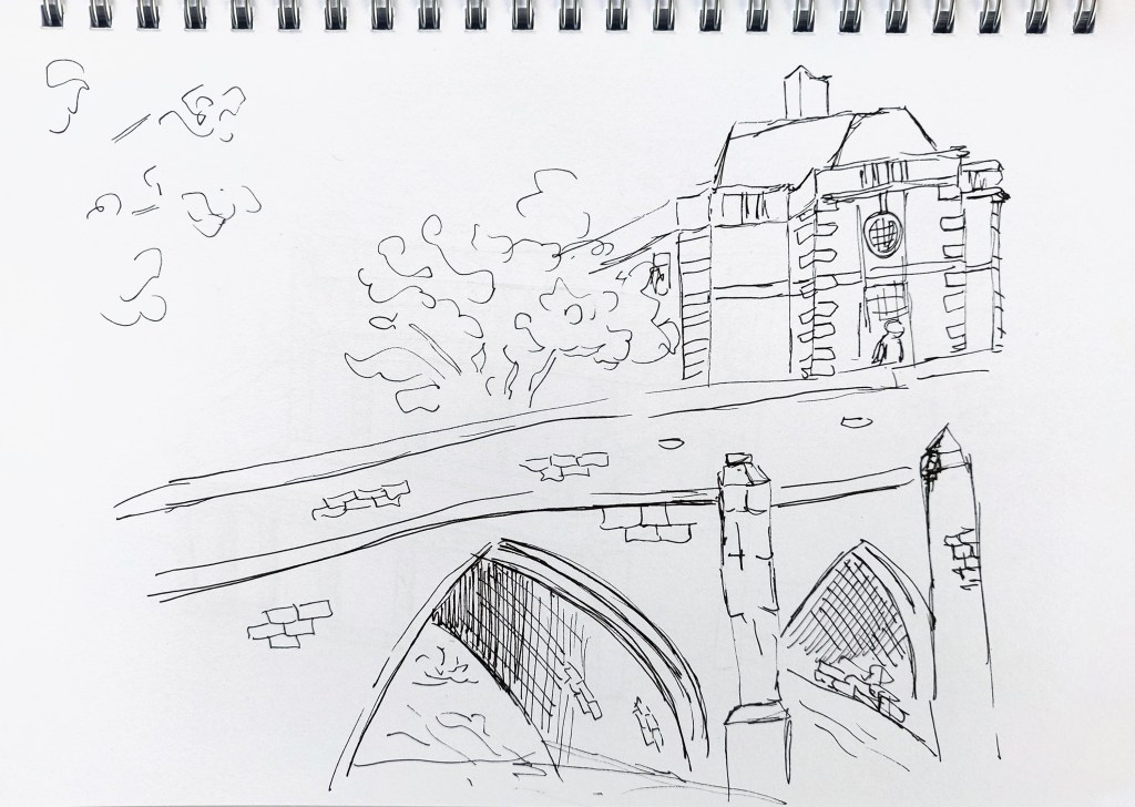
Between visits I explored ideas in my sketchbook in order to understand better what I was looking for. I had to rely on my memory and the guidebook for the basement as it had been flooded since my first visit and was not opened to visitors. I did not sketch so much on location, partly because of the weather and partly because it was quite busy. However, I spent a lot of time just wandering around the place to get to know it better.
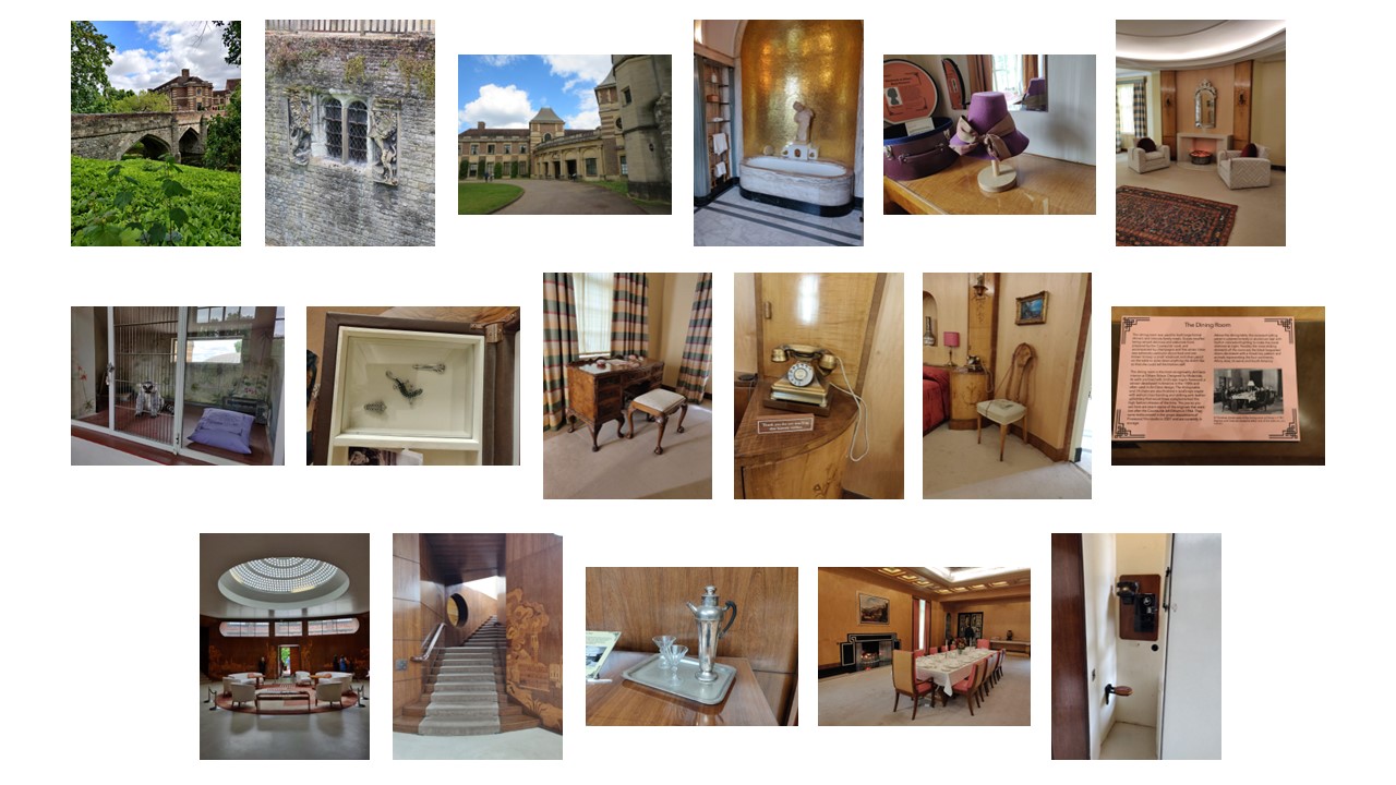
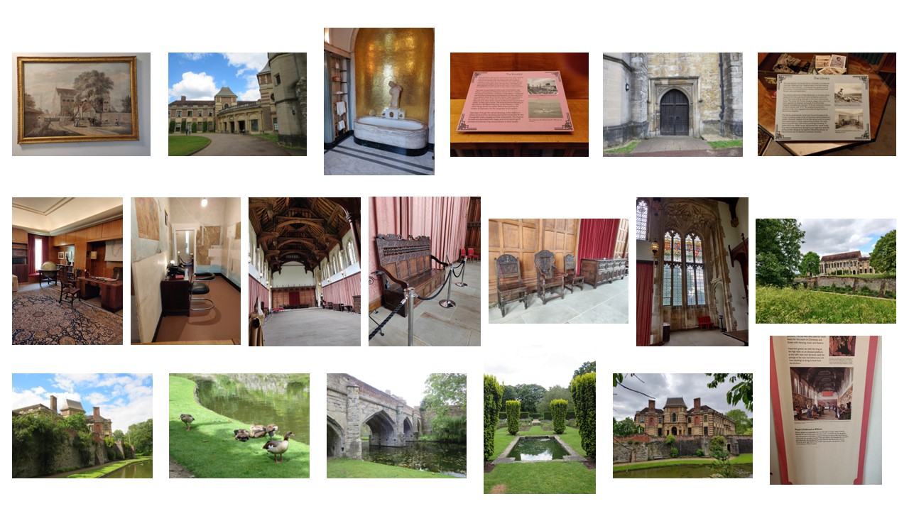
This is a sample of the photos I took:
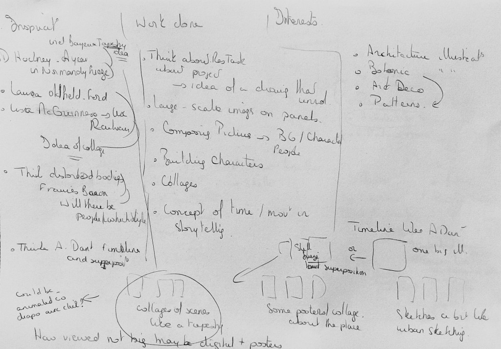
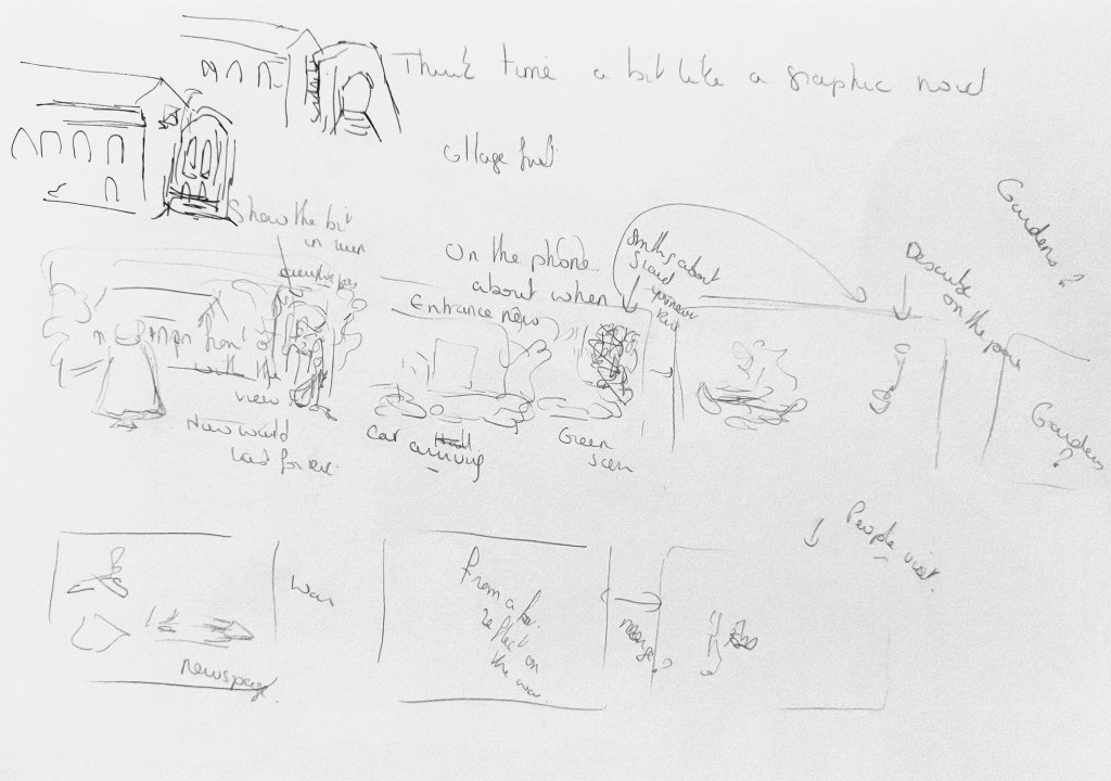
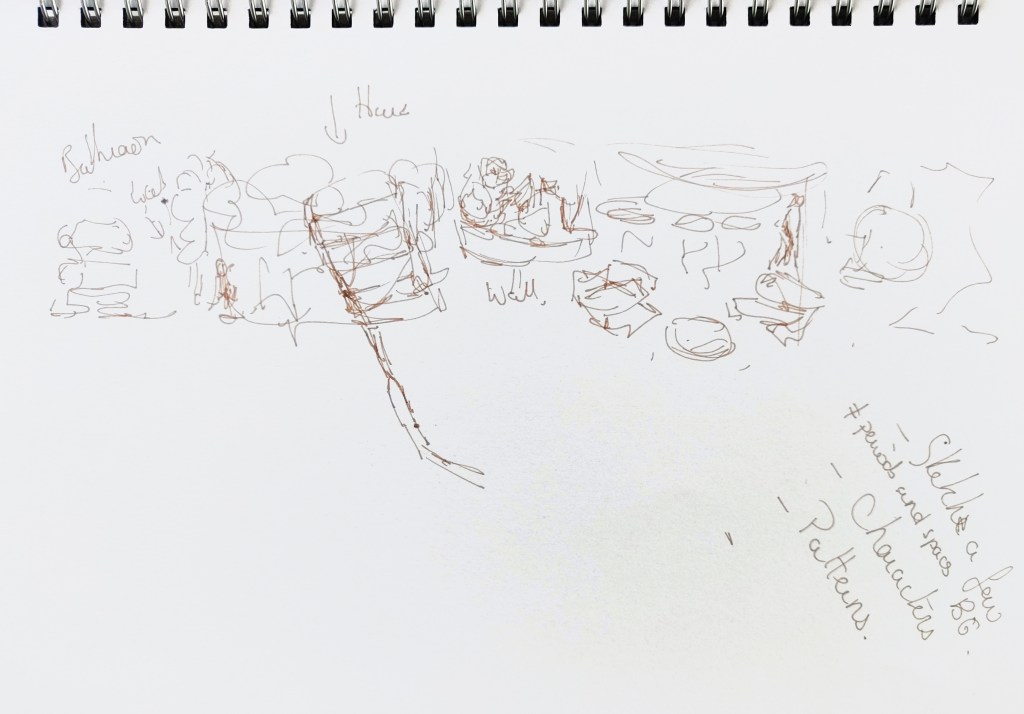
This is the ideas I explored in my sketchbook:

I looked at the work I had done in this unit and what I particularly enjoyed, the artists I had just researched and what I had discovered when I visited Eltham Palace.
Statement
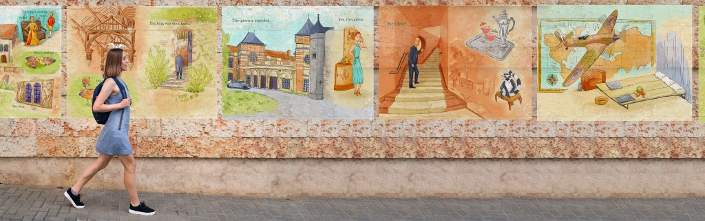
A work composed of 6 panels that would illustrate the history of Eltham Palace.
The audience would be visitors or potential visitors of the place. It means that it would be for both adults and children.
The drawings could be used in different ways. They could adorn a wall in a coffee place or be part of a brochure to attract visitors.
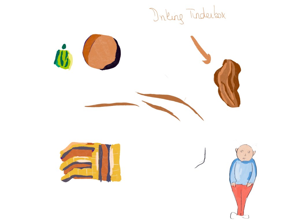
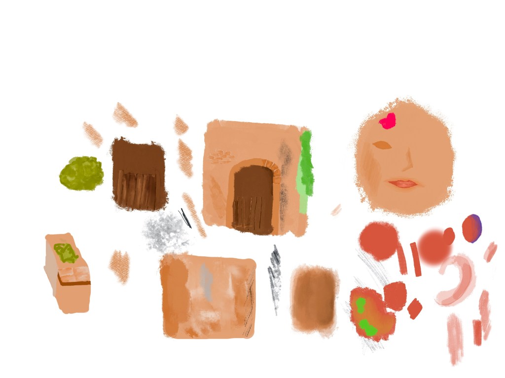
Sketching
At that stage, I decided to create sketches without thinking too much of what I would like to illustrate. I remembered researching the artist Pam Smy and how she created the illustrations for “Searching for the Green Man: a Sketchbook Quest” and I have often followed her example afterwards. She explained how she started sketching and ideas came from there.
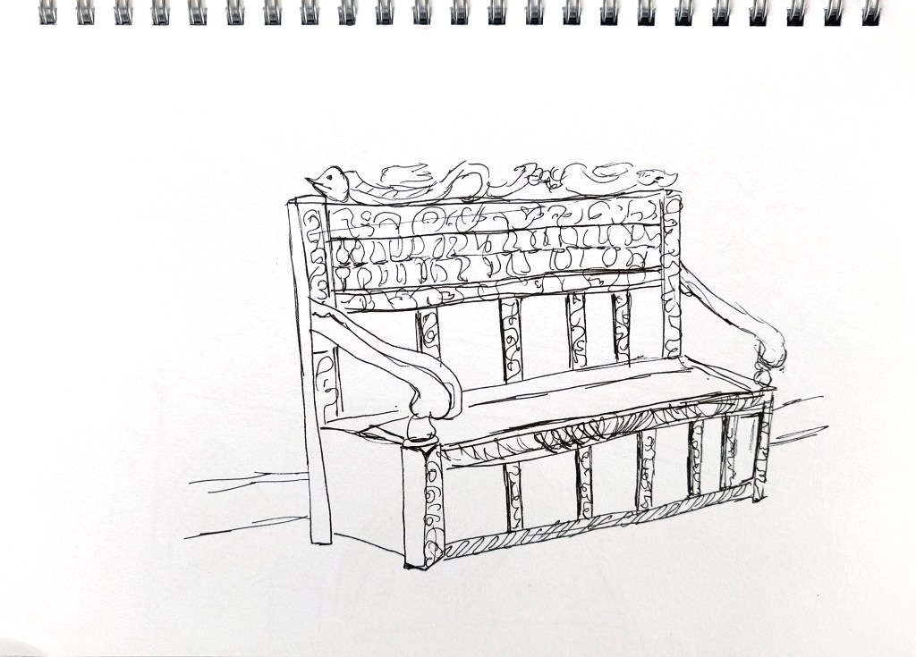
Although I did not exactly use the technique I learned with the exercise about continous line drawing, I made a conscious effort to keep my drawings loose and fluid and not to spend too much time on one sketch.
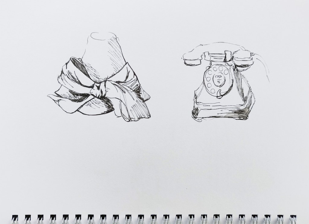
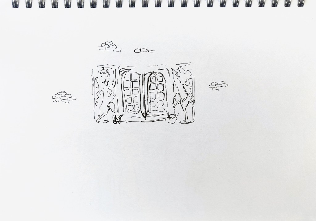
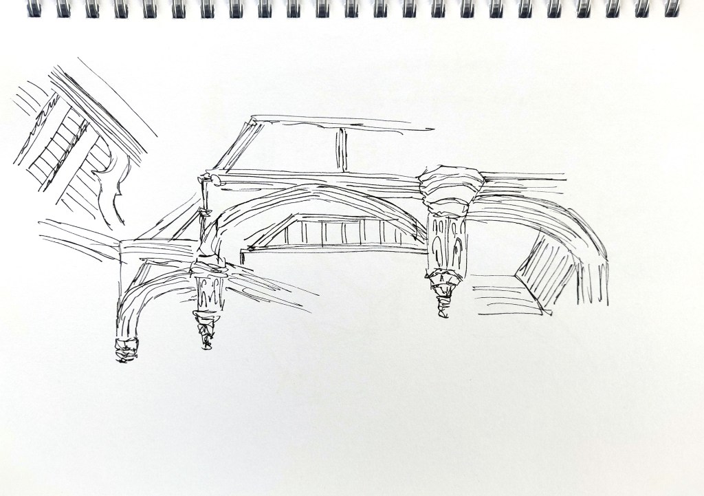
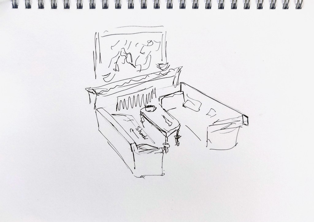
I used mainly the pictures I had taken for inspiration. However, I also looked at one of my books “Art Deco – The Golden Age of Graphic Art & Illustration” and created some quick sketches based on some of the artwork to understand better how illustrations were stylised during that period (Robinson, M. and Ormiston, R. (2013). Art deco : the golden age of graphic art & illustration. London: Flame Tree.). I occasionally used the guidebook although the images are mainly very small.
This is the sketches I created.


Primary and Secondary Research on Style
I then revisited the work of illustrators I like such as Hennie Haworth (https://www.henniehaworth.co.uk/) and Alex Green (https://www.alexgreen-illustration.co.uk/). I looked online at urban sketching and street art. I also checked illustrations used by the English Heritage to promote their sites.
I experimented with the iPad as well.


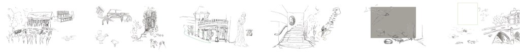
I created a montage with my sketches to get a better idea of the scenes I had in mind and the story I wanted to tell. I modified it a few times during the process but this helped me a lot to visualise what I was trying to achieve.
I then created the scenes on the iPad. This is the work in progress for the first scenes:
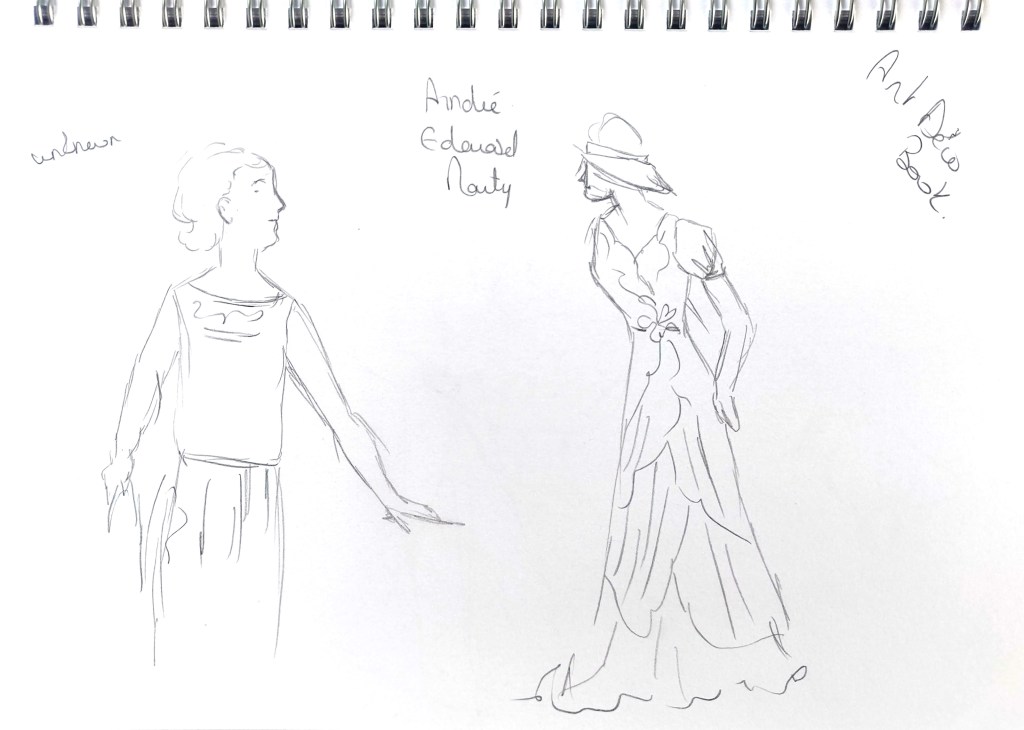
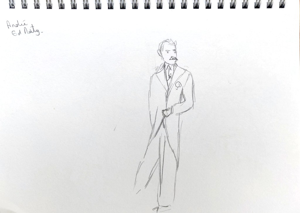
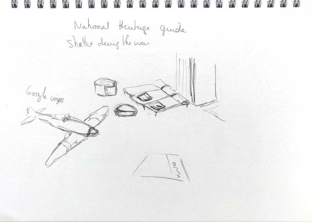
Here are the images I created on the iPad. For some drawings (fashion for different periods for instance), I looked at Google images and took inspiration from various images.


I then finalised my work in Photoshop and Illustrator. Here are the 6 panels:

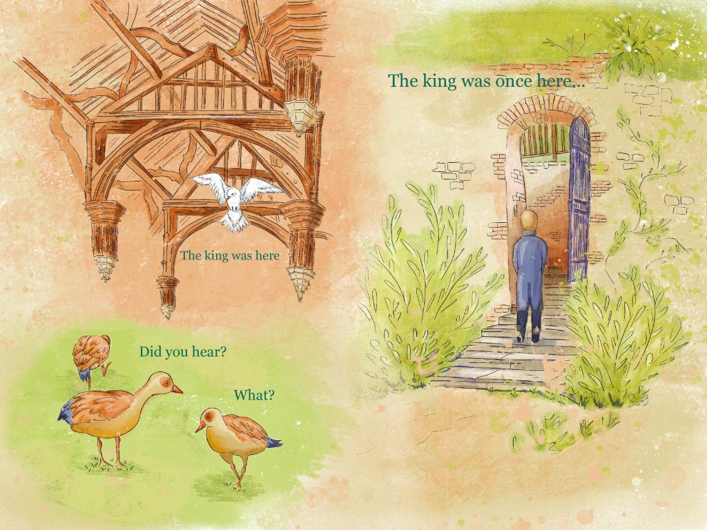
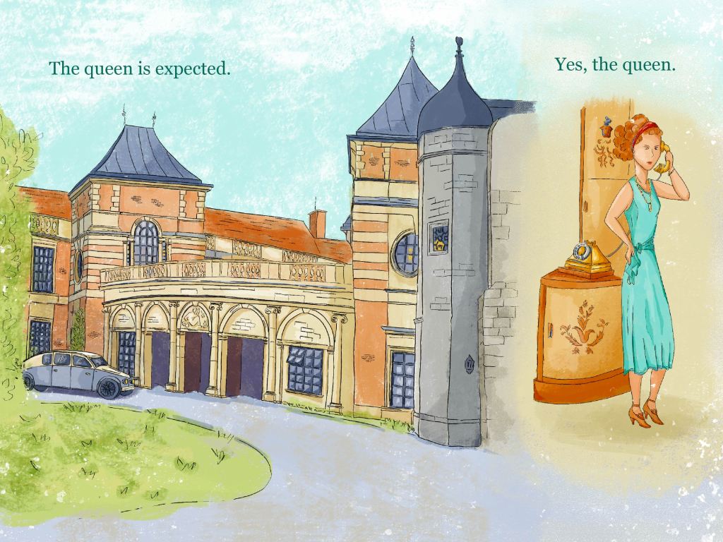
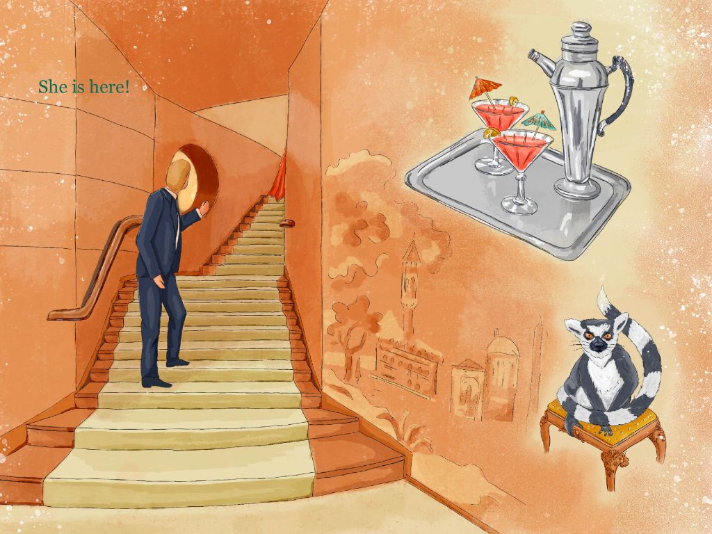

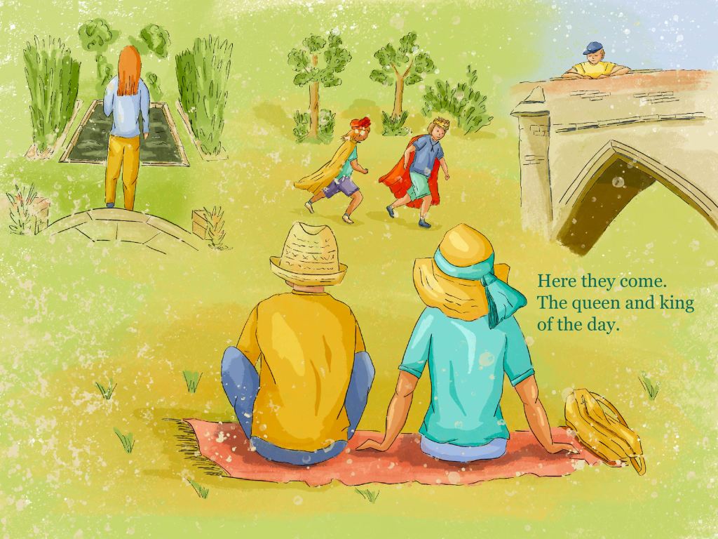
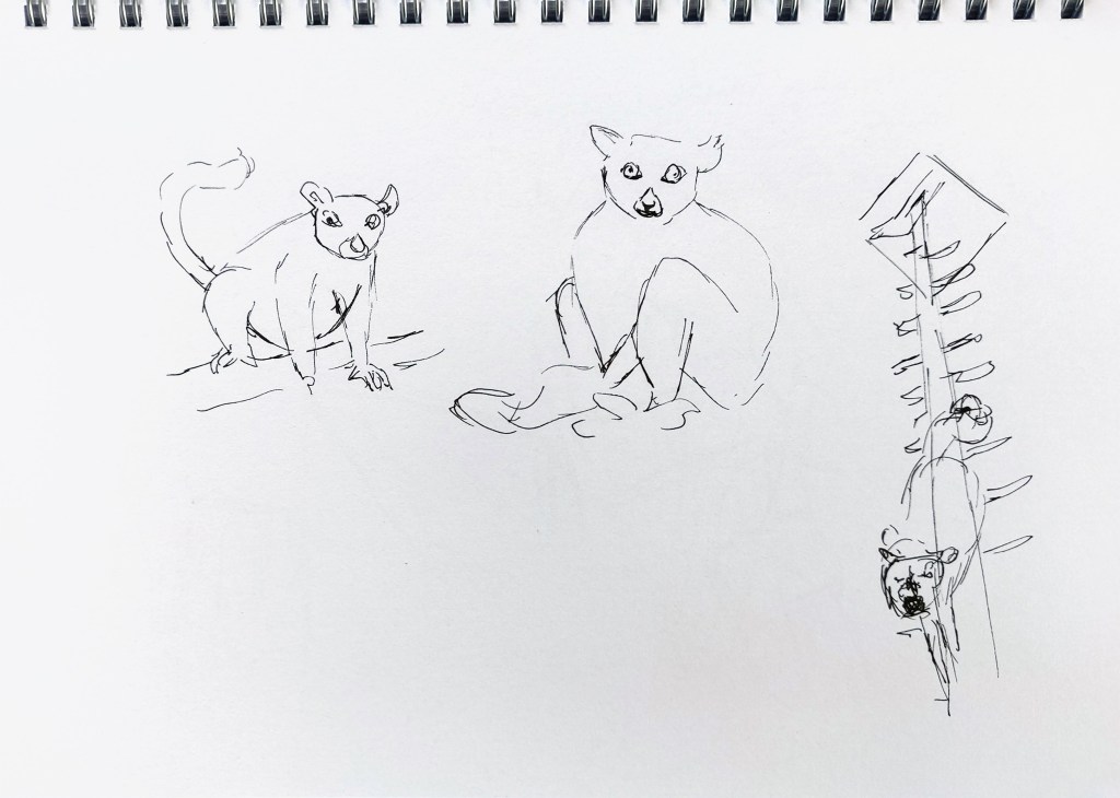
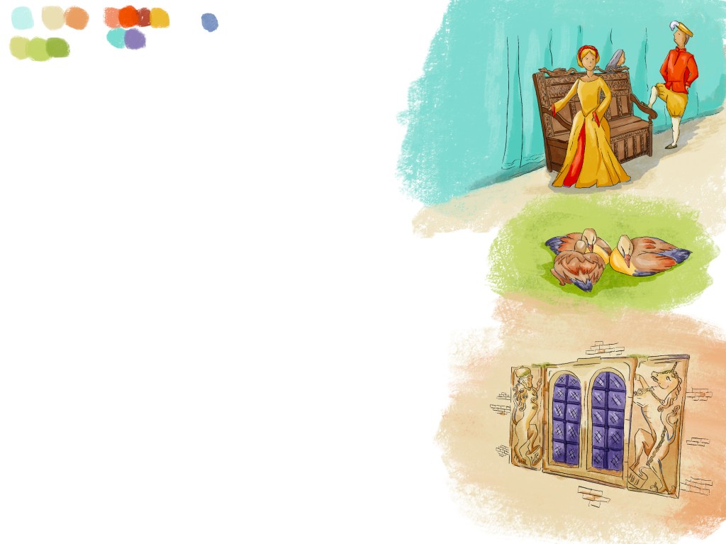
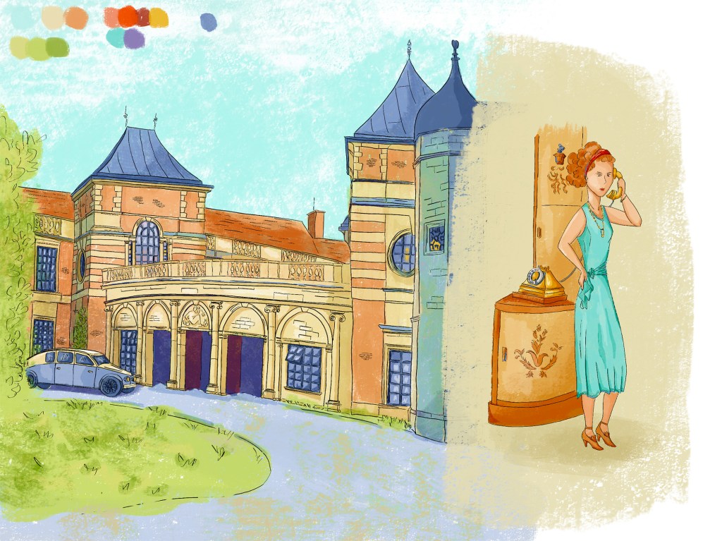
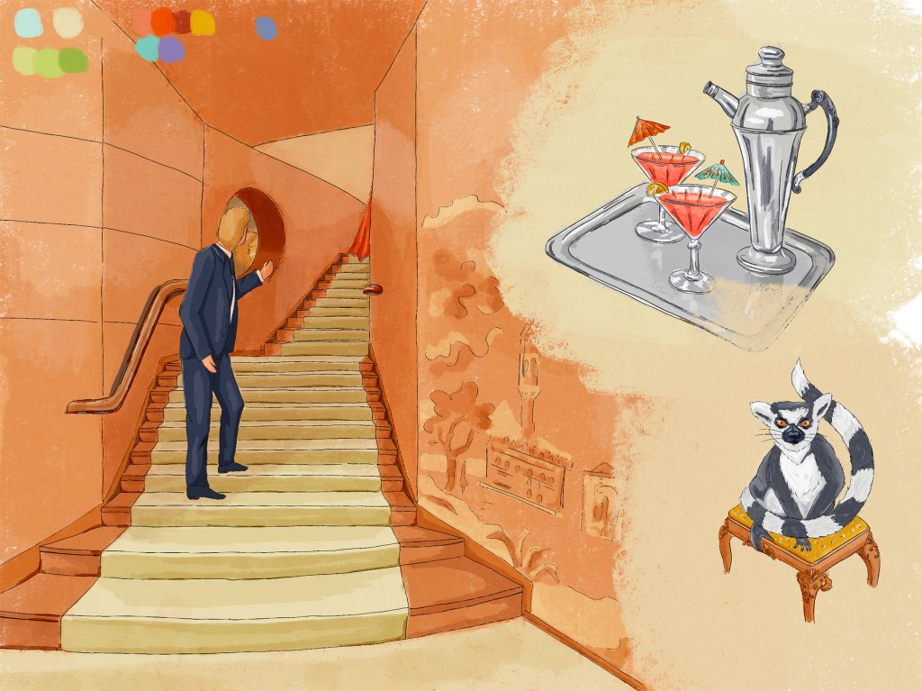
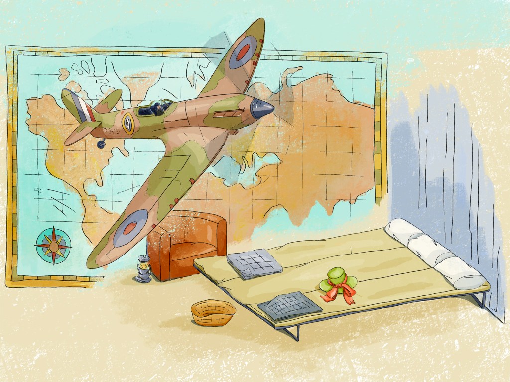
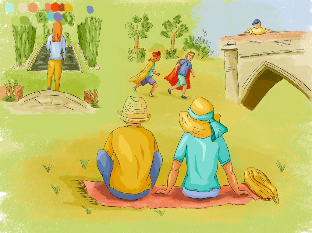
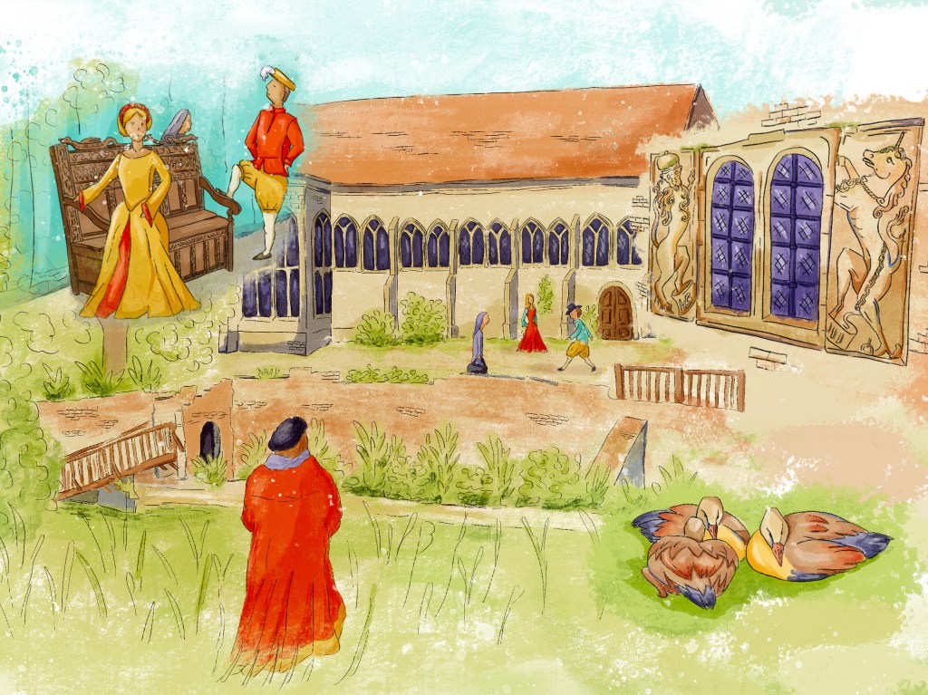
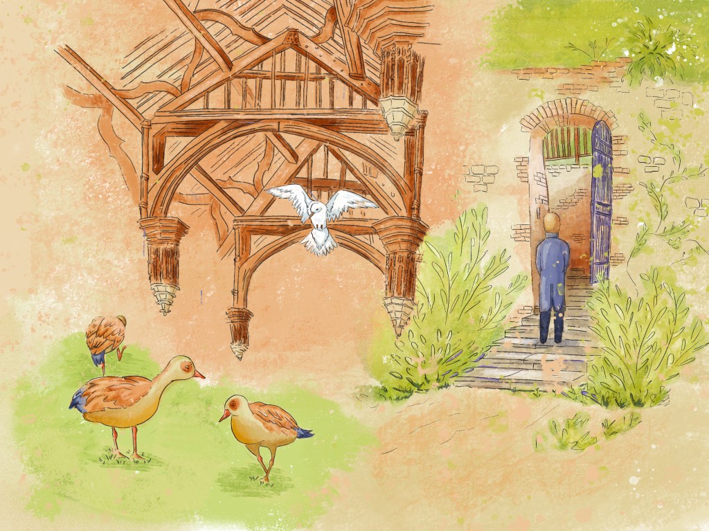
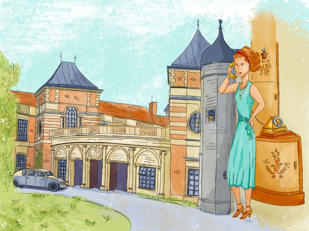
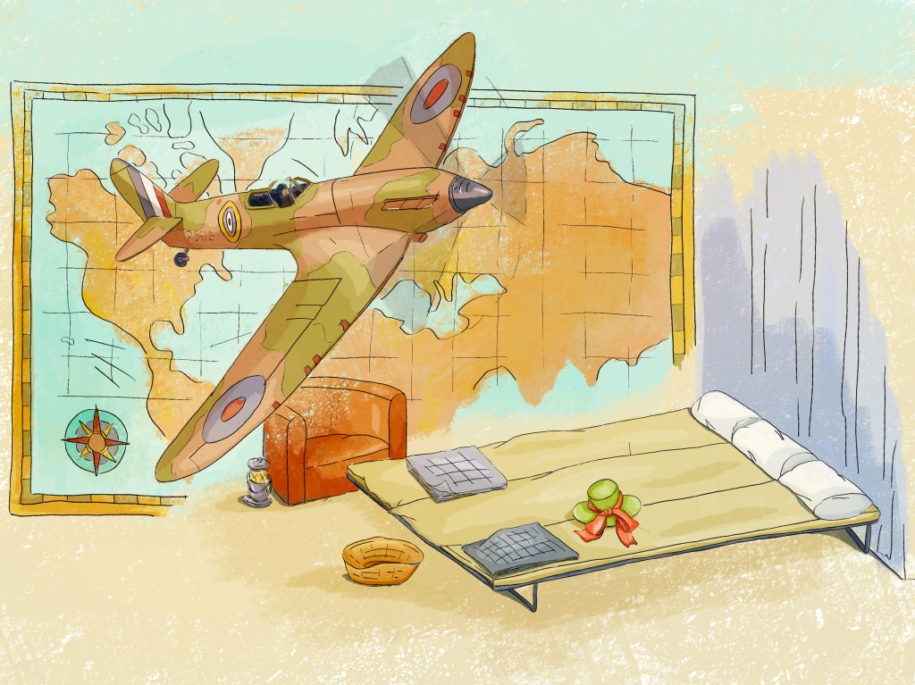
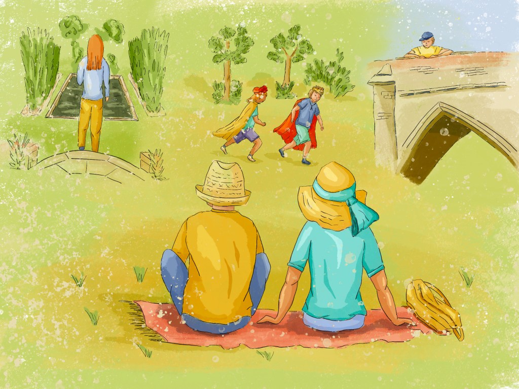
The first panel illustrates the medieval Hall. The second panel is the transition. The third and the fourth panels illustrate the Courtauld’s period. The fifth panel is about the war and I kept it simple as it represents a time when, in a way, everything stops. The beds could be seen in the basement before the flooding. This is where the family would take refuge during a raid. I thought of the map as this is world war II and also because there is a map room in Eltham Palace. The last panel is about Eltham Palace today. I added some details that could be understood by visitors as they discover the place further. In the fourth panel, there is a lemur on a stool to show that the Courtauld’s pet (a lemur) had a big place in their life. In the third panel, the car in front of the house is similar to a car owned by Stephen Courtauld (as shown in the guide).
This is a mock up I created with an image of a wall from Freepik by ArthurHidden.
I sometimes struggled to create a collage that worked. It can be tricky to superimpose images and find the right composition. I like the composition in the fifth panel with the plane flying as if it is in the room.
I tested the images in black and white and added some contrast but I could still go further. I am still working on improving contrast in my images.
I have enjoyed spending more time on a project. It has not always been a linear process as I alternated between visits to the place, other research and sketching until I knew exactly what I wanted to do.
I like adding stories to the main story: the way the ducks interact with each other or the hat on the bed to evoke the luxury upstairs for instance.
After reading the feedback on Part III, I have looked at the work of artists differently and it has helped me. The frieze created by David Hockney has enabled me to visualise more clearly how I could explore the idea of a tapestry.
I have also tried to experiment more with colours before committing to a palette as suggested by my tutor. I still need to make some progress in that area. Although I am quite happy with the colour palette I have used, I know I could be more adventurous with shadows in different colours and the use of accent colours. I have started adding shadows in a cooler tone for instance in some places and this gives some interesting results.
I looked at the work I had created so far and reflected on how I could make use of what I had learned. I have explored further the idea of time as well as the contrast between small and big. Some scenes depict grand buildings while others are drawings of objects or small animals. The idea was not only to bring a dynamic to the scenes but also to show how time affects everything and everyone.
In Part Five, I would like to explore further how I can bring together what I have learned in this unit.
Revision
At the end of the unit, I decided to revisit this exercise to see if I could improve the composition of some of the panels.
When I analysed all the images, I felt that the collages of the different scenes did not work so well for the first three panels. I started to understand better why some worked better than others. In the 5th image for instance, there is an interaction between the plane, the map in the background and the room.
This is the revisited version of the panels. Only the first three have been edited.

In the first image, I tried to redistribute the different elements in a more balanced way, although it was difficult to do this at this later stage.
In the second image, although this was not my intention, it originally looked as if the panel had been divided in four parts and the edges of the different scenes had been blurred to be brought together in the same picture. I changed the proportions of the different scenes as well as the transitions between them. The duck that is moving away from the other two now looks as if he is entering the other scene with the roof. One of the pillars of the roof is positioned on top of the left bush from the other scene.
Again, in the third image, I tried to improve the interaction between the two illustrations. The lady is now turned towards the house and the car that is arriving. It is as if she is commenting on what is happening in front of her. Also, she is partly in the room with the phone and partly on the road.
I found it beneficial to revisit this exercise after some time. It has given me the opportunity to analyse the compositions with a fresh eye and understand better how I could improve the outcome.
