I read the brief a few times and tried to identify and group key elements:
- “Produce a body of work that explores a starting point of your own through different stages of development, materials and processes”
- “Think about the skills, strategies and methods explored in this course both to generate idea and for the process”/”Opportunity to demonstrate your interests and skills”
- “Consider mixing materials, techniques, … to do something that you have never done before”/”Move out of your comfort zone to explore new ideas”/”Push further experimentation and research undertaken so far”/”focus on raising the level of risk-taking to embrace ideas of experimentation and risk-taking”
- “Your body of work will need to be a minimum of three finished pieces”
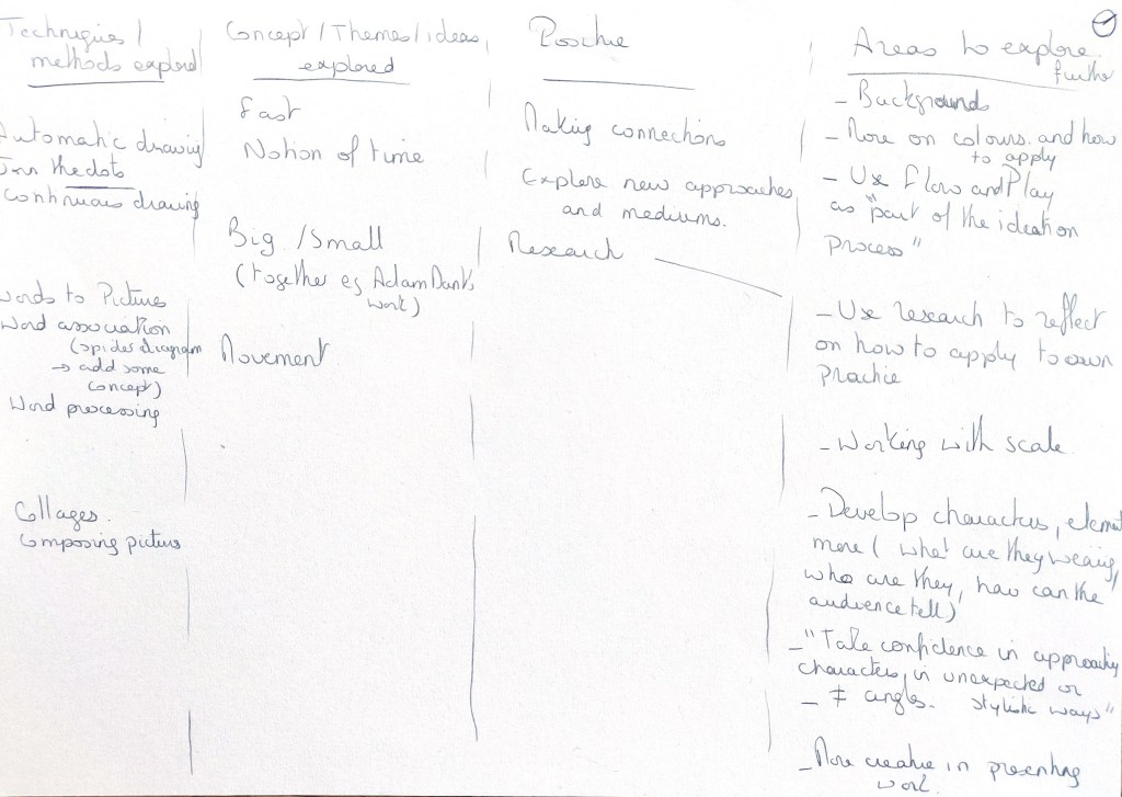
I created 4 columns in my sketchbook to have an overview of the techniques and methods I experimented with in this course, the themes I explored, positive aspects and areas I would like to explore further. I read my tutor’s feedback again to understand better my progress and how I could improve my practice. I asked myself what aspects of the course I enjoyed the most.
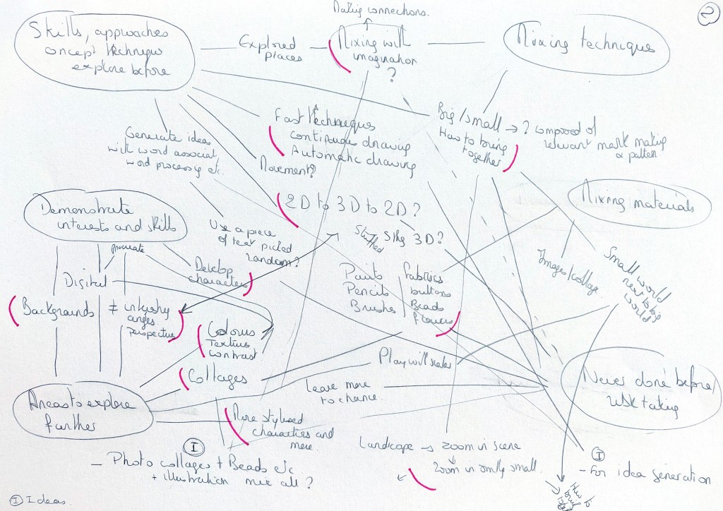
I tried to make connections in my sketchbook between all the points I had identified. For instance, I identified how I would like to explore collages further and wondered if I could combine this exploration with new techniques. I am always looking for a more dynamic way of drawing and thought there might be possibilities to experiment further with some approaches I had tried in this course.
I also took some notes about some initial research that could help me to define better what I would like to achieve.
I researched artists who use collages, mark making or patterns. I was also interested in the use of different materials such as fabric. I looked at how to create better backgrounds and compositions. At that stage, the idea was more to do some broad research rather than to explore anything in depth. It included looking at the work of Clare Curtis and Camilla Perkins for mark making, Karla Schuster for collages, Adam Dant for the level of details in his illustrations. I also used Google images and searched for fabric collages, embroidery illustrations and more.
I created a Pinterest board and added images as I went along.
I went back to my sketchbook for more brainstorming. I identified some keywords that would help to define my interests: Backgrounds/Stylised Characters/Alternative Materials/Mark-making, patterns and textures.
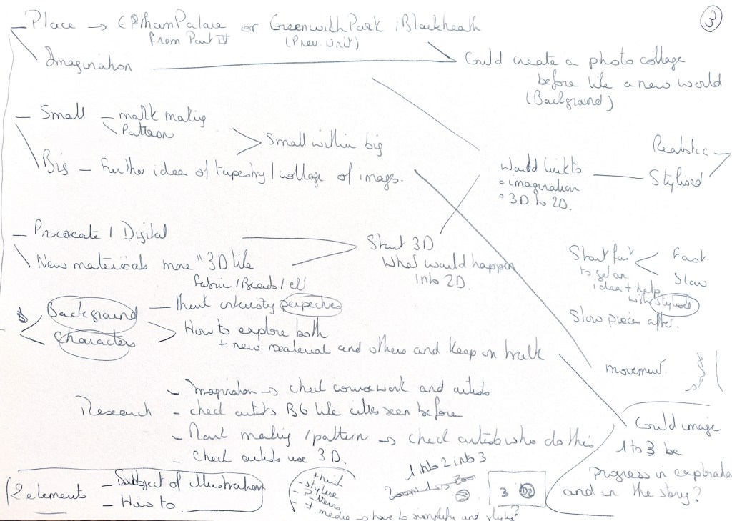
I considered ideas such as taking the page of a book at random and illustrating what was on that page, creating three images that would go from small to big (the first one would zoom on a very small area and the last one would be an entire landscape for instance), or a very large image that would contain small illustrations. I read again the part of the coursework about imagination as I wondered if I should combine the themes of place and imagination.
The main idea that emerged was to experiment with new techniques and materials to render an illustration, including mark making, collages and maybe unusual materials I had never used. I thought that such an exploration could be a way to discover new combinations of approaches and maybe different dynamics in the way I draw and colour illustrations.
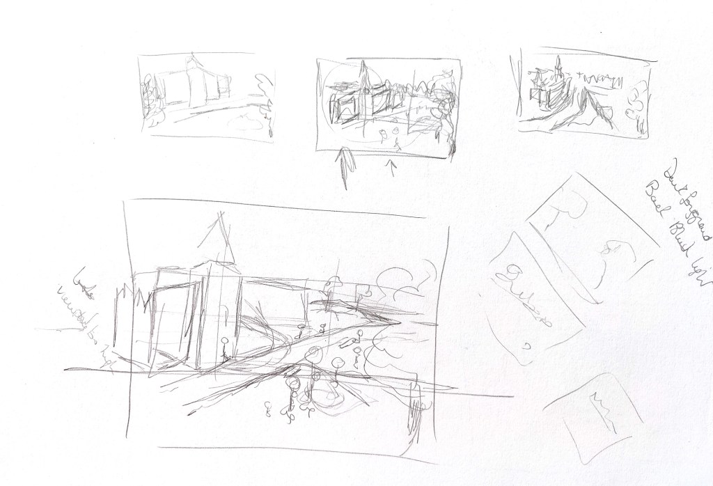
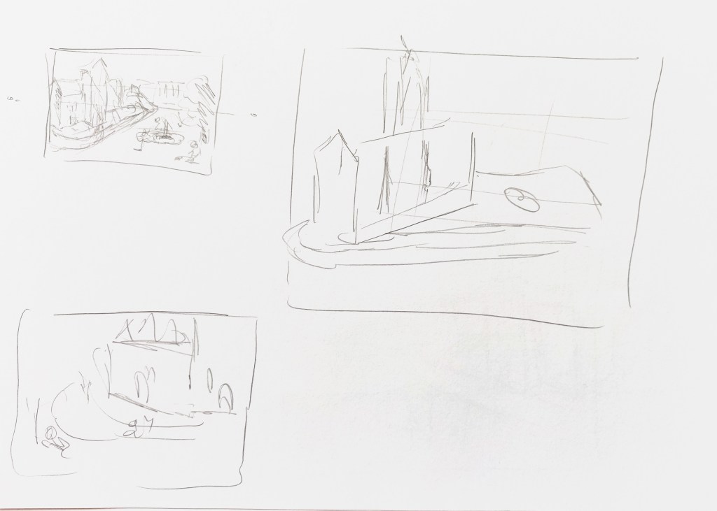
This is the exploration I did in my sketchbook.
After this exploration, I decided on the following:
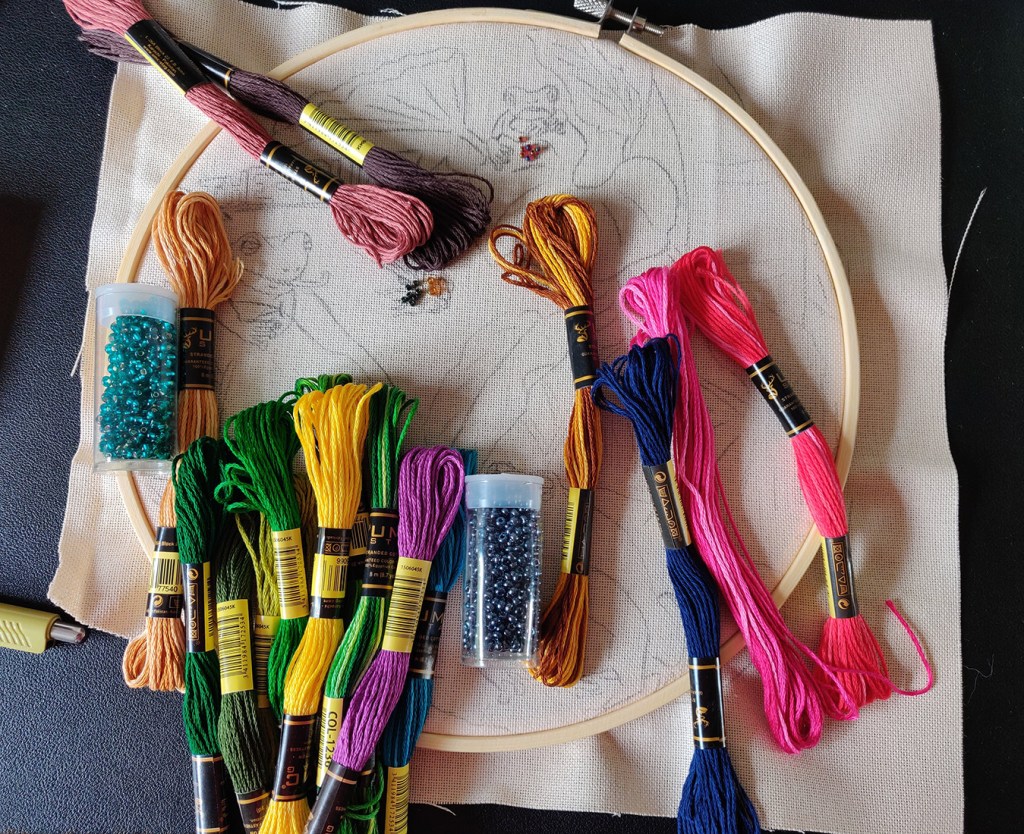
Image 1: I will use some materials I already have such as buttons and beads and get some embroidery thread to explore the idea of “sewing” an illustration. This exploration would give me the opportunity to observe the texture created by the materials used.
Image 2: I will create a digital collage with photos I have taken over the years. I have an interest in collages and have been wondering how I could use them to add texture, contrast and points of interest to my illustration.
Image 3: I will explore how mark making can bring some texture to an illustration, maybe using smaller illustrations within an illustration to create the different textures.
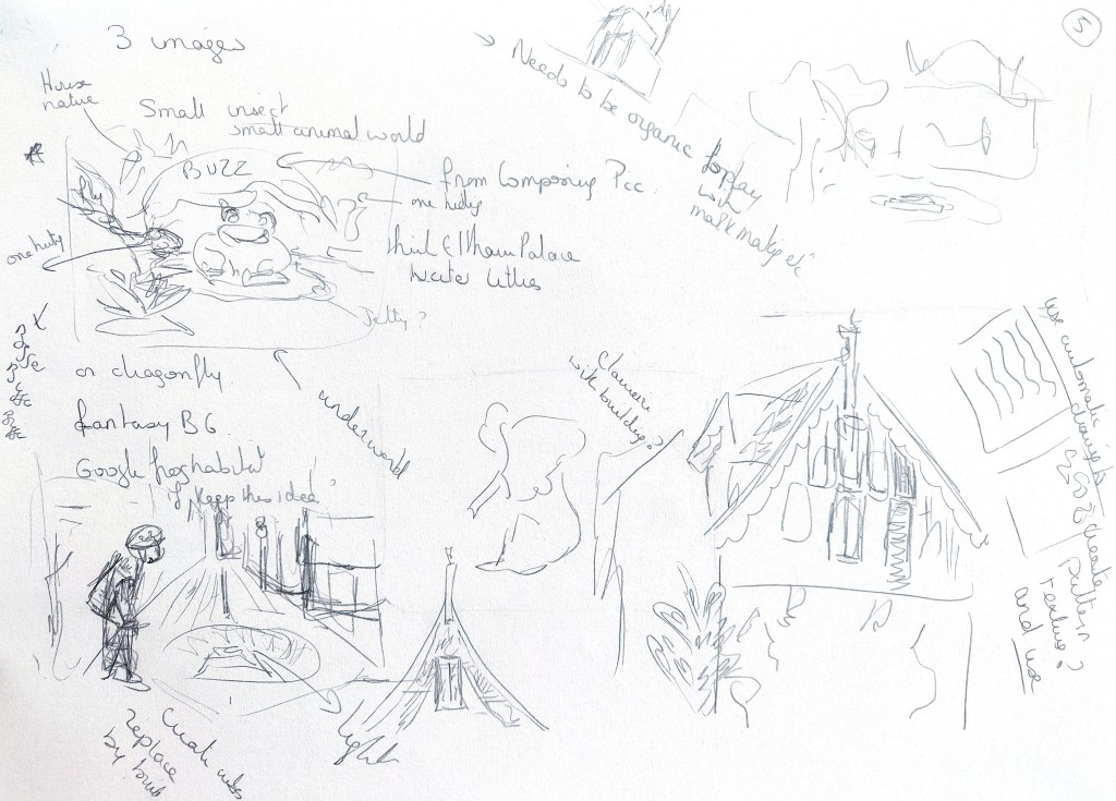
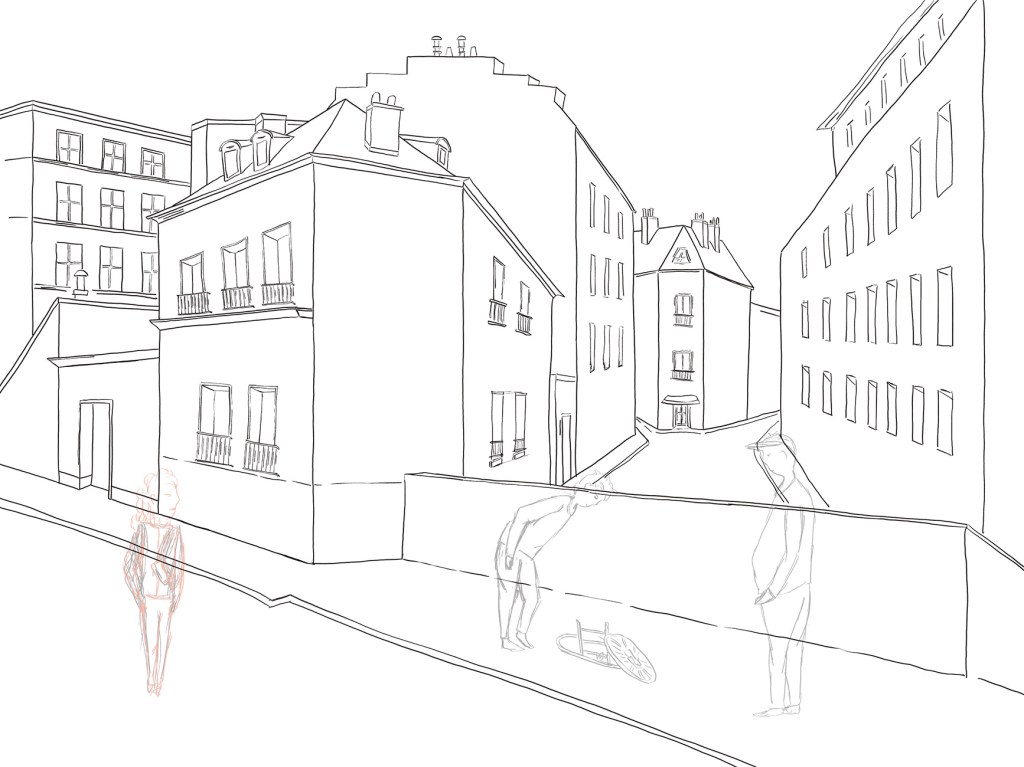
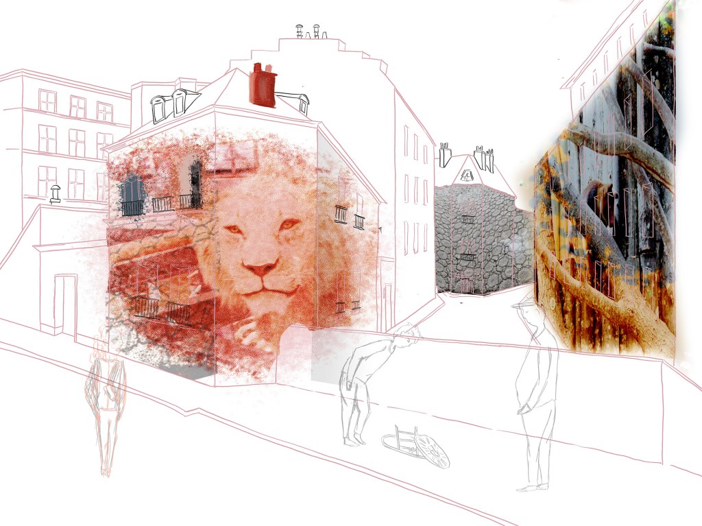
The first image would zoom on a small area. This immediately made me think of zooming at the level of an insect or a small animal. The second would be a bigger area, maybe like the street above. The third was meant to be maybe a city or part of a city. The original idea was that the bigger area would contain the smaller one.
Image 1
I carried out some research about embroidery and the use of beads to create illustrations.
I looked again at the work of Hinke Schreuders (vsemart.com/embroidery-paper-hinke-schreuders/). She gives a second life to photos by adding some embroidery and her work is very delicate. She uses different techniques depending on the photo and each image is different. I considered taking inspiration from her work and using paper instead of fabric as a base. I wondered if I should embroider one of my illustrations.
I also looked at the work of artists such as Jane Newland. She focusses a lot on textures and mark making in her illustrations and the outcome has some similarities with the various textures that could be created with embroidery. The repetition of patterns brings harmony and clarity to her work (www.janenewland.com).
I also enjoyed looking at the work of Monica Rohan and her vibrant patterns (patternpeople.com/arts-culture-monica-rohan/). I considered using small bits of fabric to sew a colourful collage taking inspiration from her work but I would have needed a lot of different fabrics and that was not very practical.
In the end, I decided to create a simple composition and transfer it on fabric as I had never worked like this before and felt like trying.
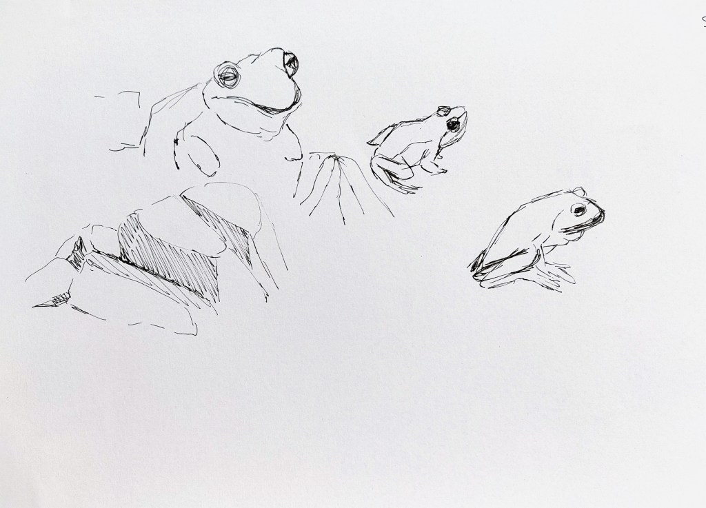
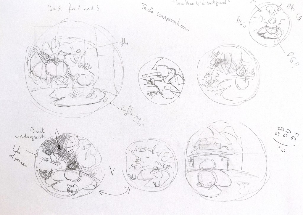
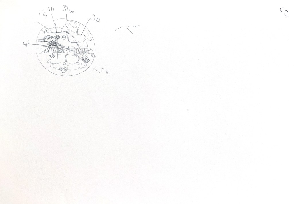
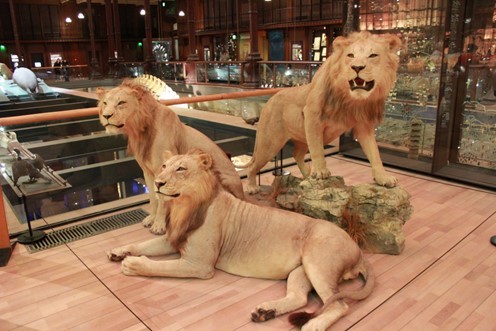
I explored possible compositions. I liked the idea of creating a smaller world unseen by humans. I looked at some images I took while visiting an aquarium in Paris, a board on Pinterest created by the artist Austin Batchelor about amphibian references (https://uk.pinterest.com/austnbatch/amphibian-reference/) and some images on unsplash.com ( David Clode, Bryan Hanson and Zdeněk Macháček on unsplash.com).
For this illustration and the next two, I watched several times a video about the creation of backgrounds by BaM animation on YouTube (www.youtube.com/watch?v=tVynETvms-o&t=489s). I researched backgrounds many times before and looked at the work of artists to understand how they created the background of their illustrations but this video helped me to understand better how to make sure that I have a foreground, a middle ground and a background to add some interest to a scene.
I remembered using various elements that do not seem to belong to each other in the exercise “Composing Pictures”. That gave me the idea of using one of the elements I had created: a sign from a funfair that reads “The Buzz”. Initially the idea of the sign was to show that the frogs are having a bit of a party away from the human world, and I realised that it could be read differently once I had drawn the fly who narrowly escapes the hunting frog.

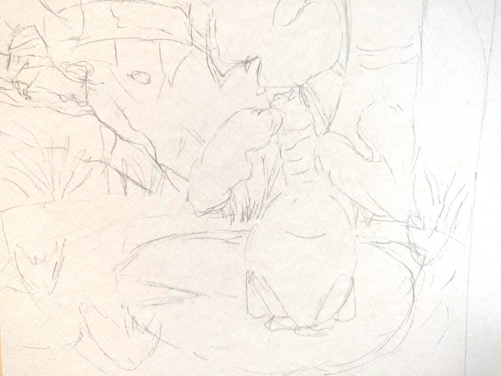
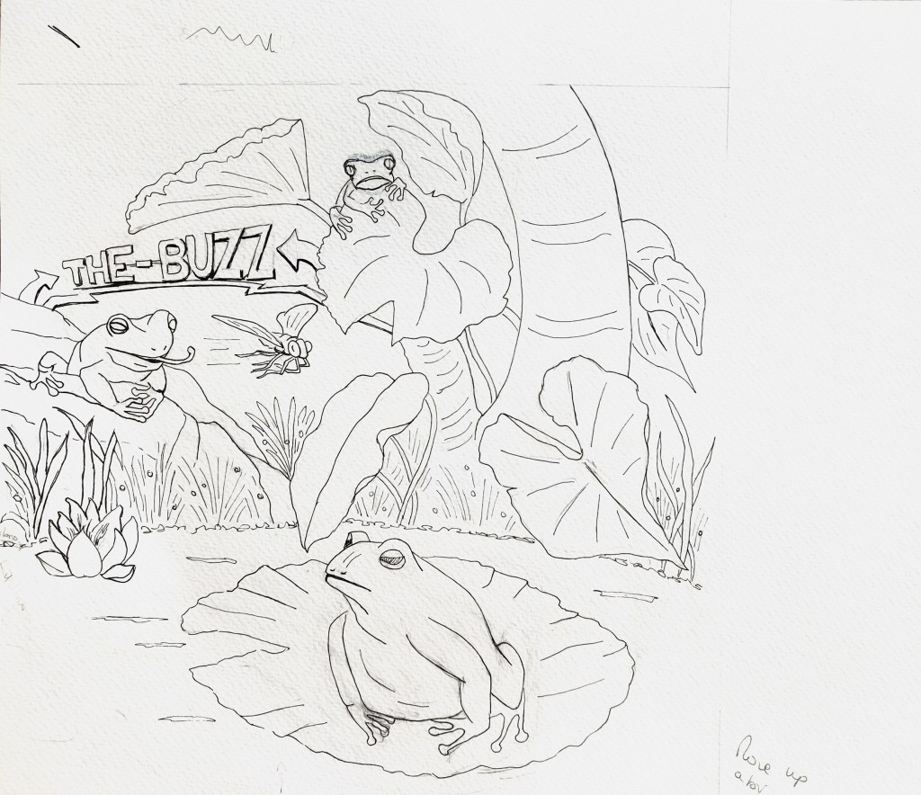
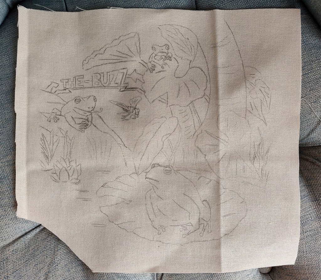
I then looked at some basic techniques for embroidery to have a starting point. I followed a YouTube video and recreated the stitches (www.youtube.com/watch?v=tVynETvms-o&t=489s). I then transferred the sketch on a piece of fabric with the help of a lightbox.
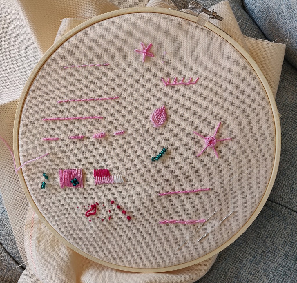
As I progressed with the creation of the piece, I realised that certain things I had in mind did not work or were not practical. I did not find any fabric I could use that was of any interest in terms of texture or colours and sewing with beads did not look as I thought it would. I did and undid some of the work at first. I found that I really enjoyed embroidery and that even without previous knowledge, I could try different techniques and tweak some I found on the internet (www.youtube.com/watch?v=d-YxKIqMwK0, www.youtube.com/watch?v=HoRBnmM0690&t=1702s, www.youtube.com/watch?v=ErjoozN6NA8, www.youtube.com/watch?v=PgPOSw6Oq44, www.youtube.com/watch?v=kDpyfAKLKcE&t=206s)
In the end, I decided to embroider the piece and add elements once this part was completed. I chose the direction and type of stitches depending on the effect and texture I wanted to create. I found that there were similarities with painting with a brush.
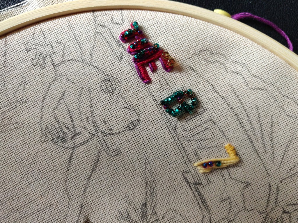
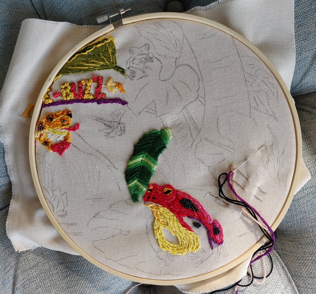
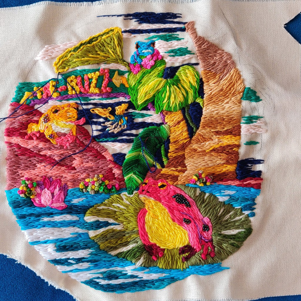
Once the embroidery part was done, I added some beads. I am not sure that they were needed. I thought that they would add some depth but I think I preferred the way the piece looked before. There is something organic about thread made out of cotton that clashes with beads made out of plastic. I also experimented with leaves made out of jewellery wire. Although it did not really work, I could see some potential but I would have needed to experiment further and I had not realised that embroidery was a slow process. As a result, I was running out of time.
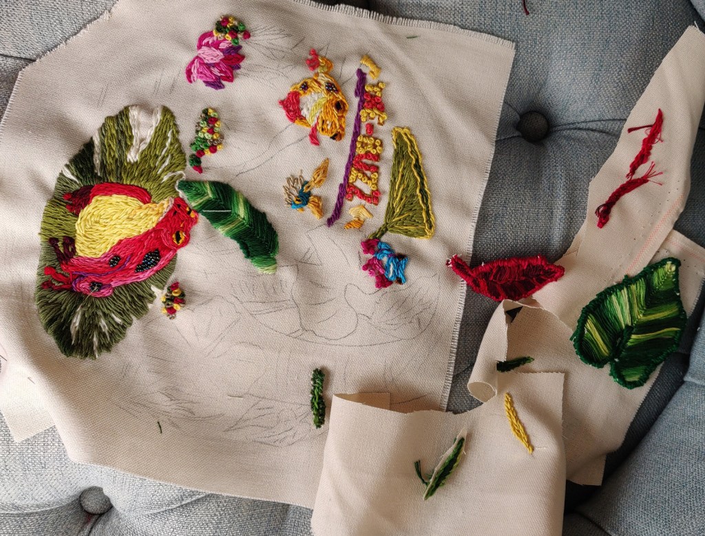
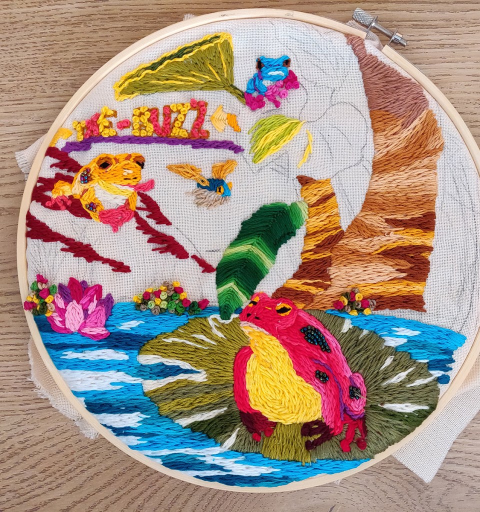
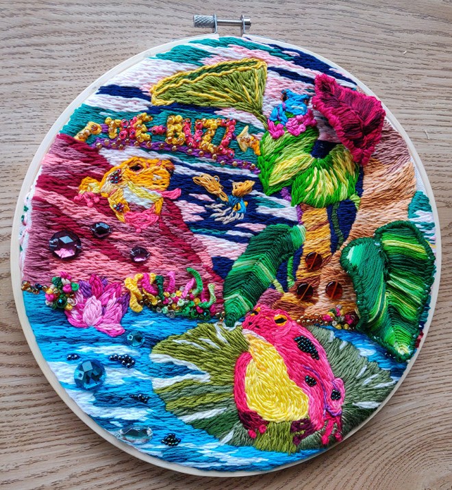
This is the final piece with different lightings.

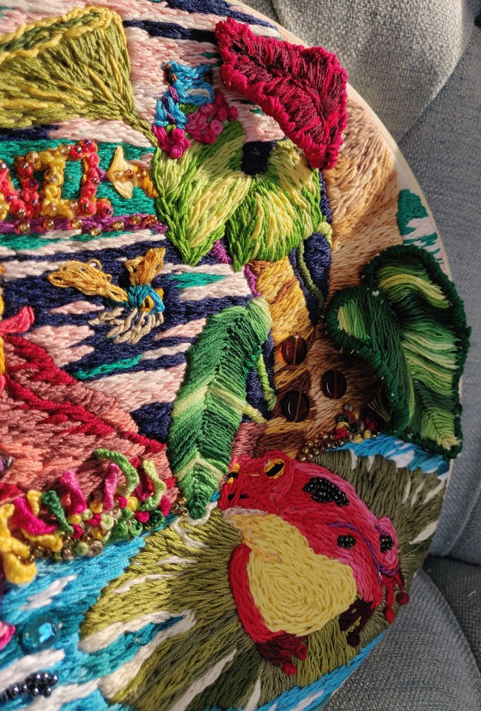
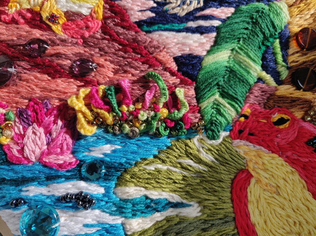
Below are some details of 3D elements and embroidered beads.
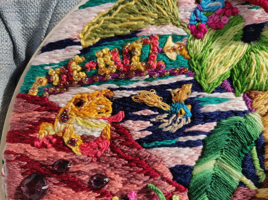
I would not have thought of embroidery to create an illustration and had not realised how texture could be created with various stitches as well as the direction and length of stitches. I enjoyed the process a lot and tried many different ways to create depth and shapes.
With more experience, I would plan better the colour palette. However, it was interesting to have to make do with the thread I had left at times. For instance, I had decided to use a dark blue for the background but ran out of thread in that colour and experimented with some light pink. This is probably something that I would not have done if I had coloured an illustration digitally. It demonstrates how using different media can be a way to discover new possibilities.
The outcome lacks focal point as all the colours are very strong and there is not enough contrast. As a result, the eye does not rest on anything. I discovered later an article about some embroidered illustrations created by artist Sarah K. Benning for the Washington Post, where she mentions that “anyone who has tried embroidery knows what an incredibly slow medium it is” (craftindustryalliance.org/how-i-got-that-gig-creating-embroidered-illustrations-for-the-washington-post/). In this article, she explains how she ran out of time and as a result only filled the sections that would be lit by a direct light source. As a result, she did not only save time in order to meet her deadline but she created some strong contrast that enhanced the final outcome. I can see a lot of potential in covering only one part of the illustration with stitches or use brighter colours sparingly.
The texture of the thread is very strong and I should have taken this into consideration with my initial drawing as some details are lost.
I would definitely like to create some illustrations with embroidery again, maybe adding pieces of fabric. I feel that I have learned a lot and want to experiment further with this material in the future.
Image 2
Initial idea: create a digital collage with photos I have taken over the years.
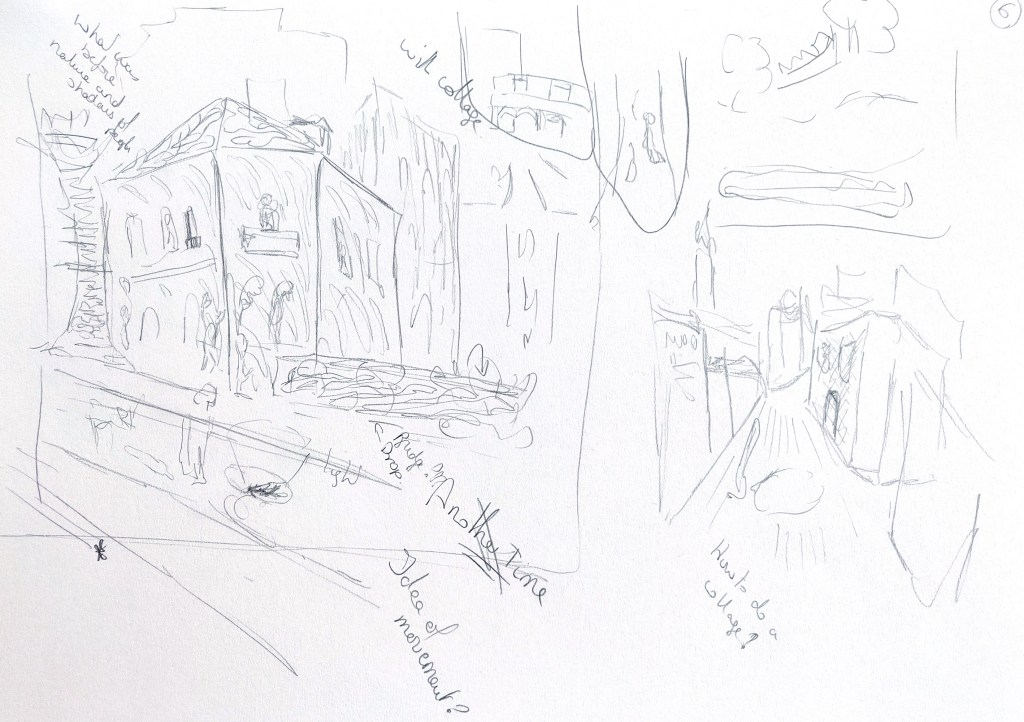
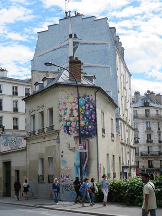
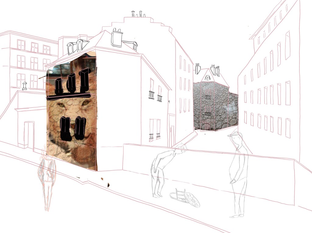
I took inspiration from a picture of Paris I took a while ago. I thought there was depth in that picture and this would give me the opportunity to create an interesting composition. I added some characters who are looking at a hole in the ground to add a sense of mystery. I was inspired by the first image and thought that the scene with the frogs could be happening in a different world below the city.
I looked at the work of many artists who work with collages but struggled to visualise what I had in mind. Would the pieces I would use for the collage be about texture or contents, would it be a mix between drawing and photos, would I use parts of images only for their colour?
I like the work of Andy Burgess (www.andyburgessart.com/collage#/tucson/) and how he uses geometric shapes to create his collages. The signs give a feel for the place. I wondered if the way he recreates the buildings with various patterns could be a source of inspiration. I could maybe look at patterns in the pictures I would use.
Karen Stamper’s collages have something very organic, with juxtaposition of textures and signs. When we look at her collages, we feel the dynamic and complexity of the places she illustrates (https://karenstampercollage.com/gallery/antiquites/). I thought I would like to add some elements at the end, a bit like pieces of old wallpaper left on a wall.
Johanna Goodman’s collages are very interesting (www.johannagoodman.com). She uses tiny pieces of paper to create her images. This is a different approach that I could potentially use in some places.
I chose to try to work digitally because I wanted to see if this was a process that could be incorporated in my work in general.
The more I looked at different styles and techniques, the more I hesitated and struggled to visualise what I was trying to achieve. In the end, I decided to experiment and see what happened. I created a scene in Procreate and coloured it to identify the lighter and darker areas. I thought that I would need clean lines to work with. That is why I drew straight lines.

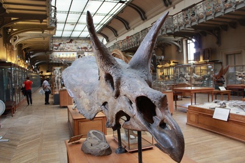
I selected some of my photos for their texture or colours or because they contained some elements I was interested in. Some come from the Natural History Museum in Paris, the others are mainly from Paris but a few are from different cities. Below are some of the images I collected.


I tried adding images in various ways to see what happened. Below are some initial tests.
I then decided to explore with the final piece and see what happened. Here is my work in progress (in Photoshop).
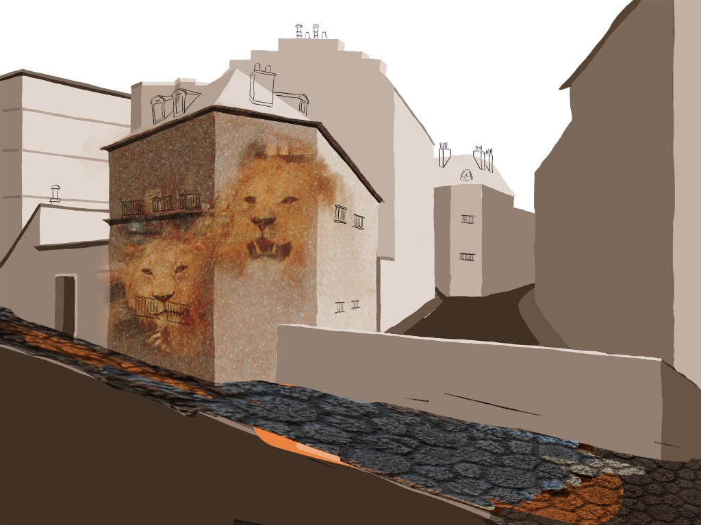
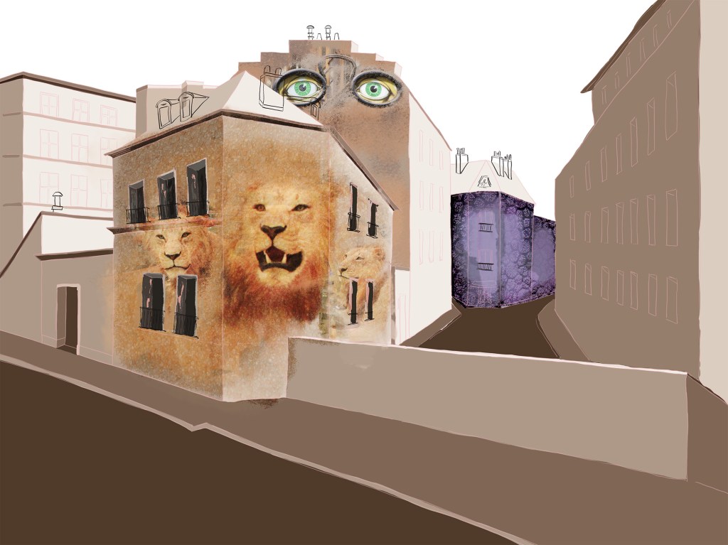
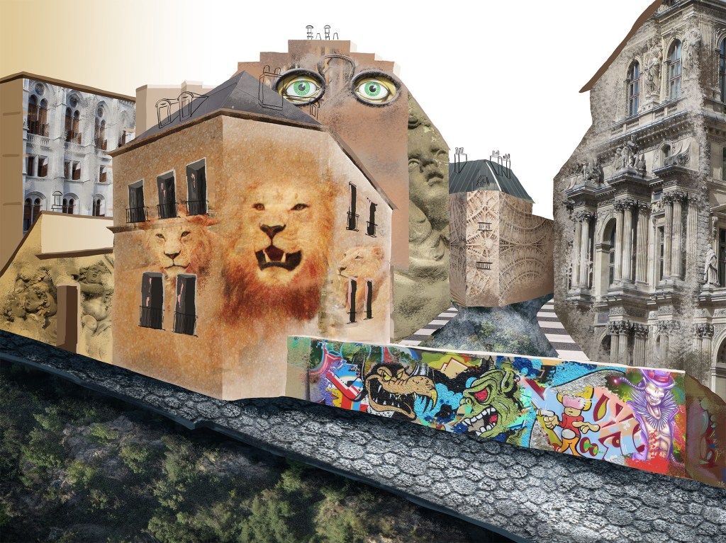

I drew the two characters as I liked the mix of photos and drawings. As I experimented more and more, the way I used images evolved. At first, I had some vague idea of life coming out of the buildings (with the lions). Then the statues I used (front left wall) were a way to create some texture and life at the same time, as if the wall was engraved with the angels. I then added the facade of a different building (building on the left at the back) and really liked that effect, so I tried it again on the right. I used the picture of a pedestrian crossing twice to define pavements. Inspired by Karen Stamper’s collages, I enjoyed adding some signs and street art in different places at the end. This is the final image.
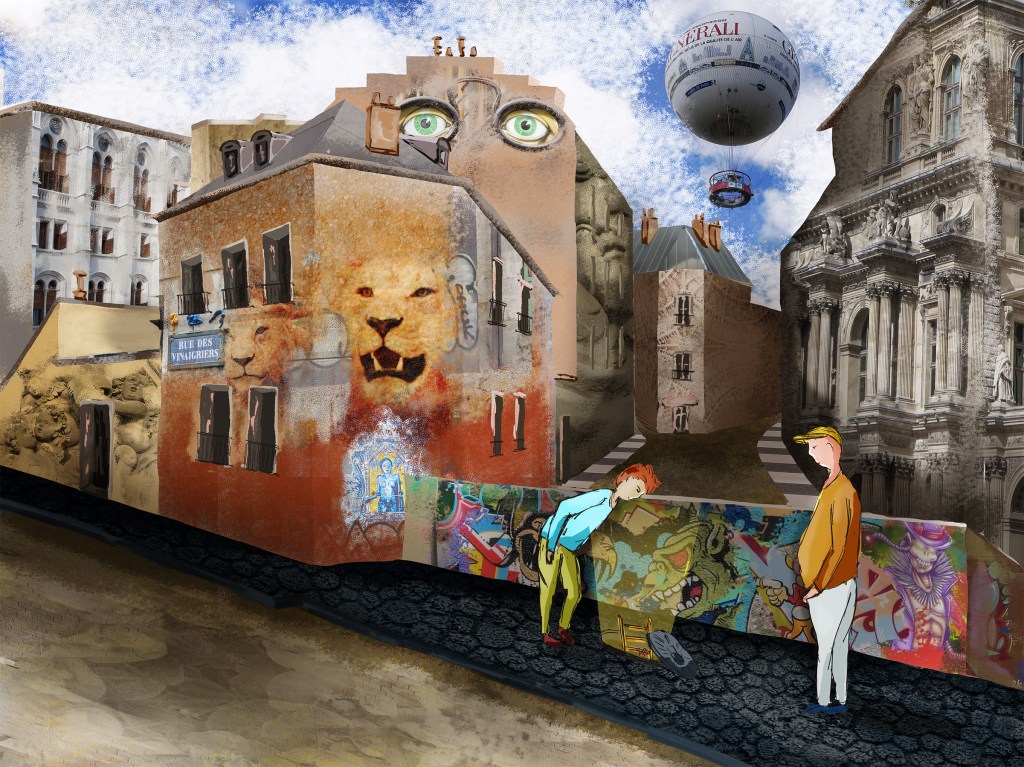
The final illustration lacks harmony and contrast. As I was creating it, I felt at times that I did not really know how to proceed. However, in the end, I realised that there were some elements I liked. I like the painted windows in the front building because of the different texture, the pieces of street art, the facade of a different building on the left. I also like the eyes in a pair of glasses.
Although the final outcome does not work so well, I feel that I understand better how I could use collage in an illustration. Too much is happening in this picture but adding parts of a photo in a painted illustration could be interesting. An option could have been to paint that scene for instance and only add small elements to add texture to the whole image.
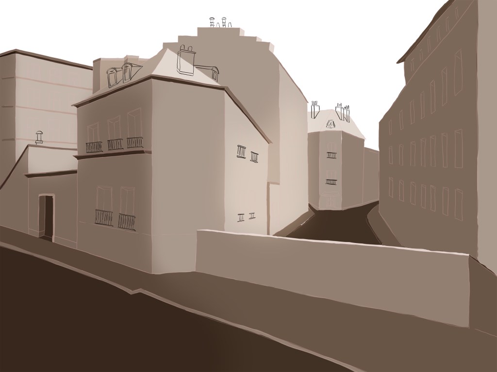
Image 3
Initial idea: Explore how mark making can bring some texture to an illustration, maybe using smaller illustration within an illustration to create the different textures.
As mentioned in previous exercises, I found the work of Adam Dant very inspiring and really like how so much is happening in one illustration. One element that makes some of his illustrations so striking is how the background is the main character of the story. In the illustration called The Budge Row Bibliotheque (https://www.architectural-review.com/today/adam-dant-the-budge-row-bibliotheque), the building and the square with all the perspectives and different levels are beautiful to look at and in a sense would be enough on their own. This sets the stage for the smaller characters.
He draws people in dynamic poses, there is a lot of running and falling and that adds to the sense that a lot is happening. This is something that sometimes lack in my illustration as my characters can be too static. His work reminds me in some way of William Hogarth’s illustrations (Beer Street and Gin Lane).
I looked again at the work of Camilla Curtis, especially her landscapes. I tried to understand how the subject I would choose would influence the style I can experiment with. There is a fluidity in some of her scenes that means that details do not have to be accurate and it is more about a feeling. That gives her freedom to experiment with mark making and texture (https://www.camillaperkins.com/f0onbgs35czk5rqz7dcg1wye37wsn5). In a sense, this is also true of some of Camilla Perkin’s illustrations (https://www.camillaperkins.com/illustration).
With all this in mind, I still felt that I could not visualise anymore what I wanted to achieve initially.
I decided to redefine what I would like to do. If I wanted to take an experimental approach when it came to the outcome, I had to define the process better.
I therefore asked myself again what i would like to do and decided on the process:
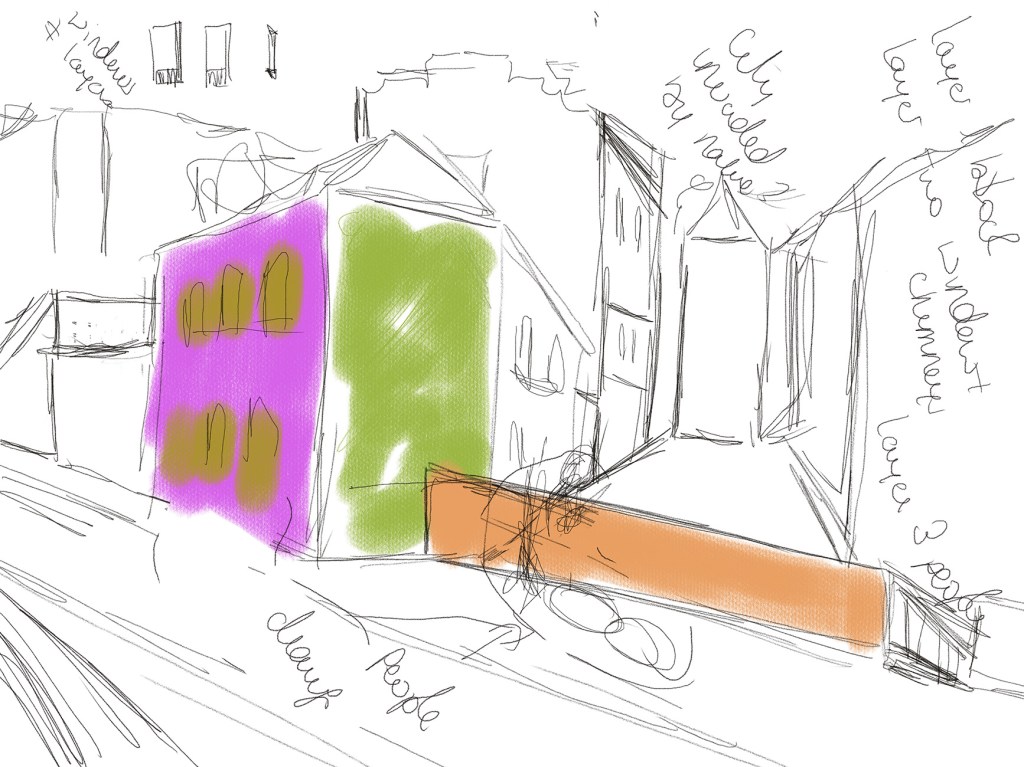
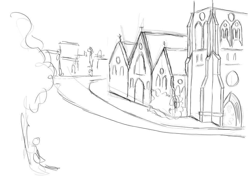
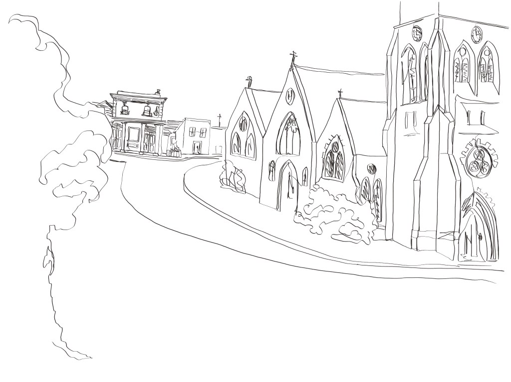
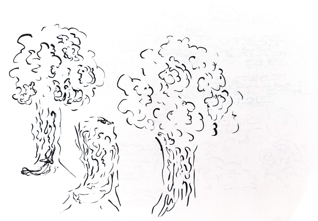
The background: I will create a background that would be a base for a lively illustration. It will be created in Procreate so that I can use the sketch later for the final illustration. I will draw first the main lines of the background to have the perspective and proportions right and then try to draw the whole with continuous lines.
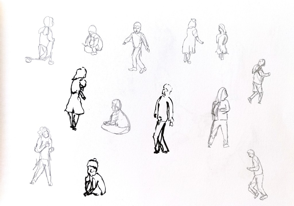
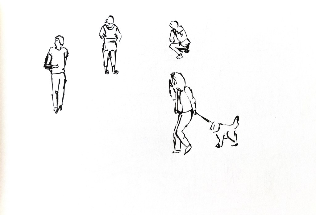
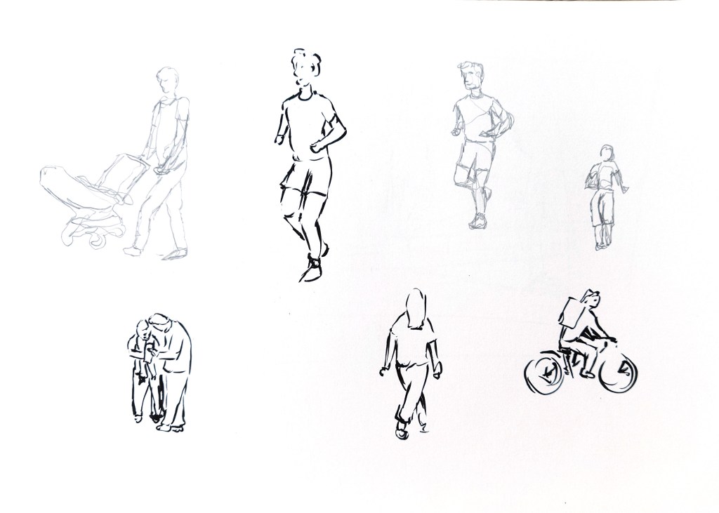
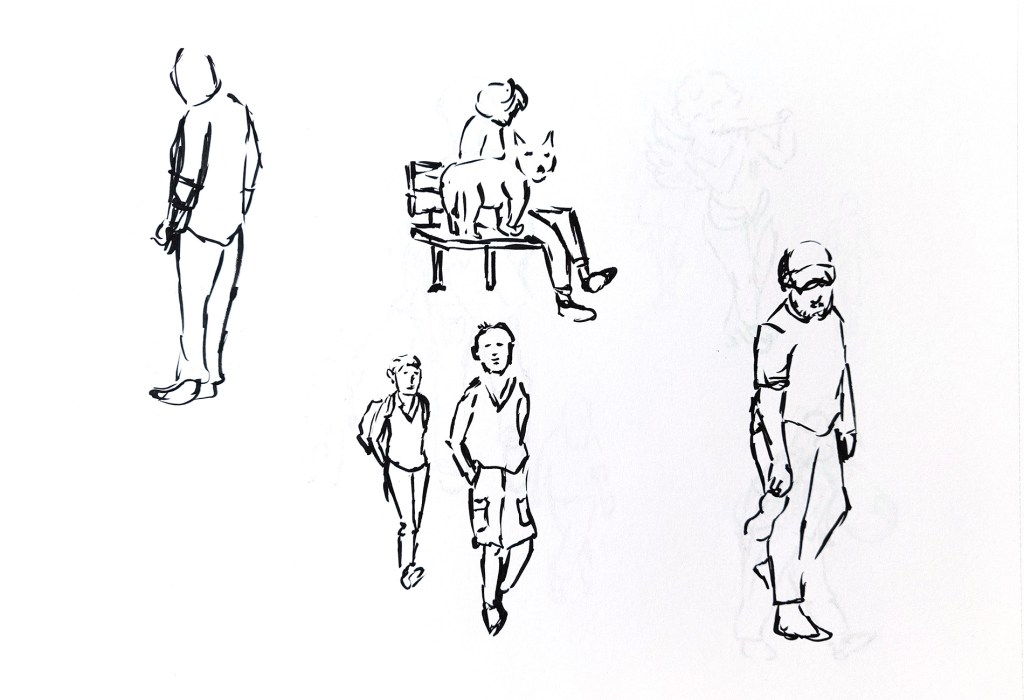
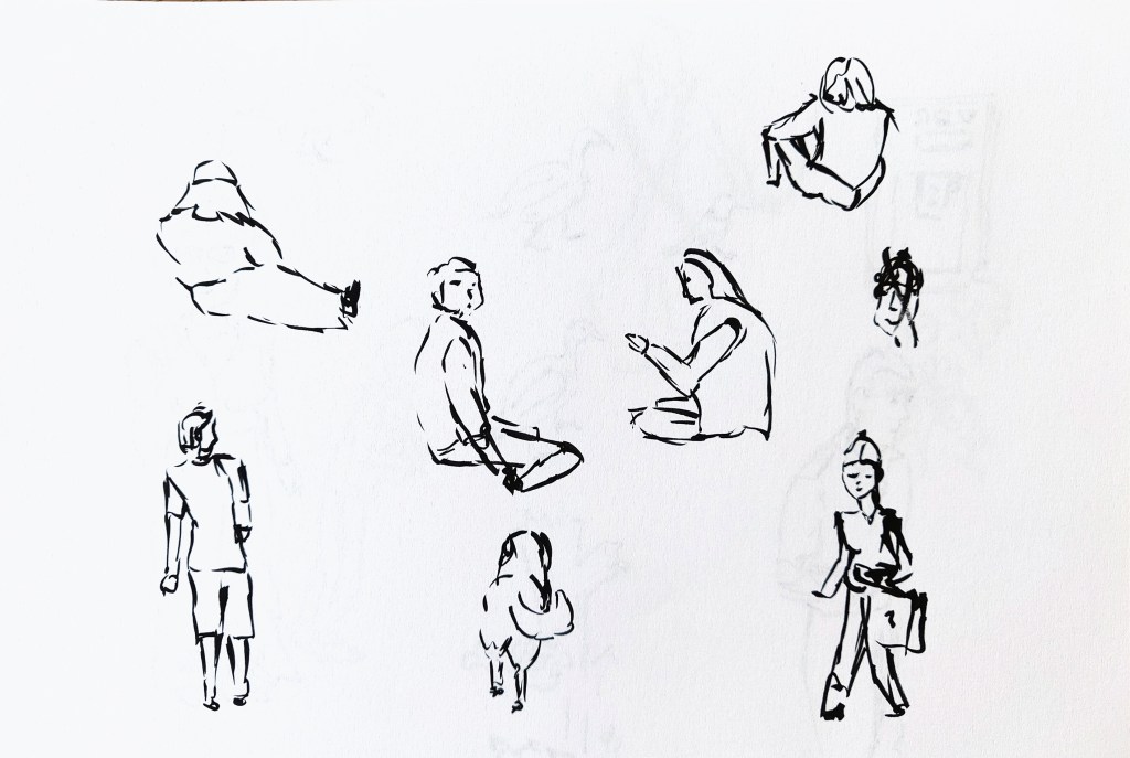
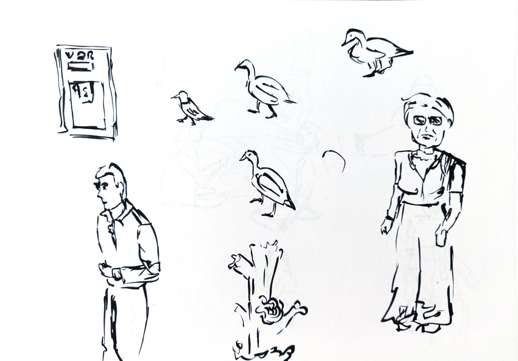
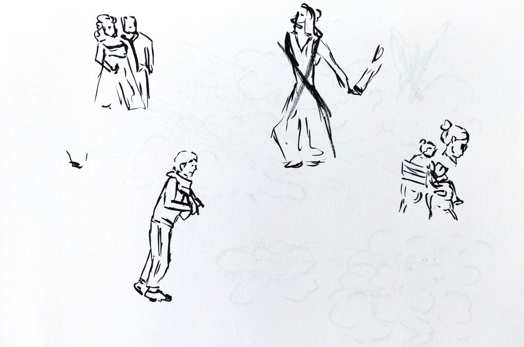
The people and other elements: I will create a lot of fast sketches of people in the street as well as some animals. I will draw some of the sketches with the continuous line technique. For others, I will use a brush pen and limit the number of lines I use. I will look at making connections between these sketches later.
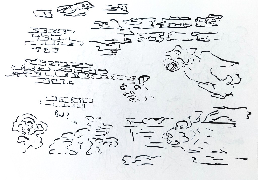
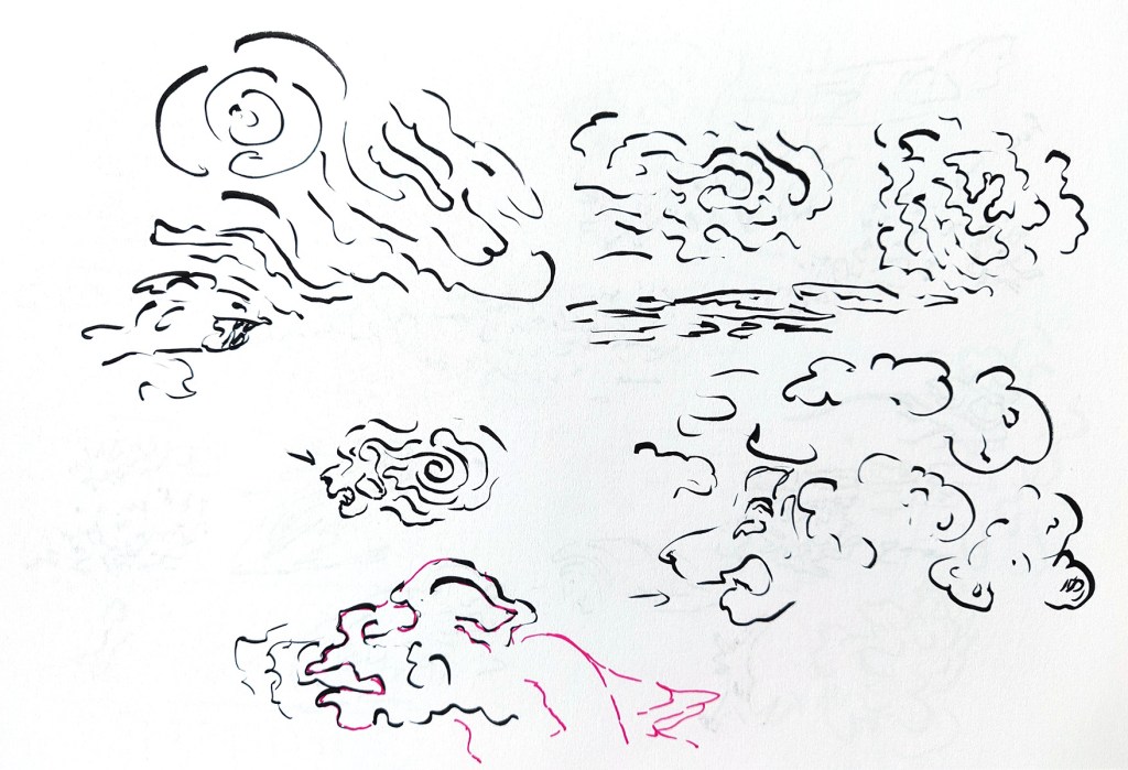
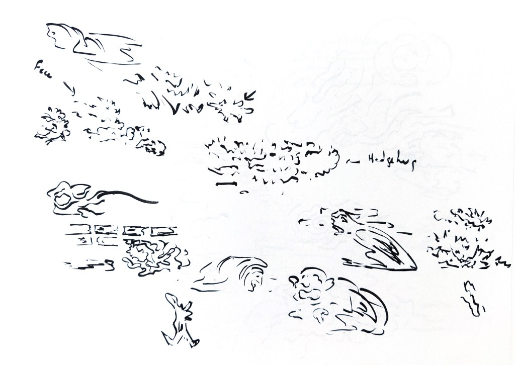
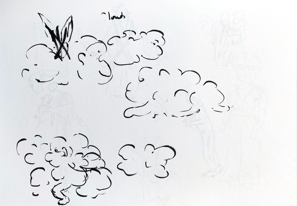
Mark making and textures: I will take inspiration from the technique of automatic drawing to create textures and maybe find some elements in my lines as a start for small illustrations.
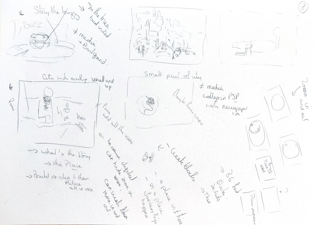
Putting it together: I will then put everything together digitally and make connections to create a final piece.
I hoped that using these techniques together would be a way to new ideas, interesting connections and happy accidents. I also hoped that I could create a more dynamic piece with some interesting textures.
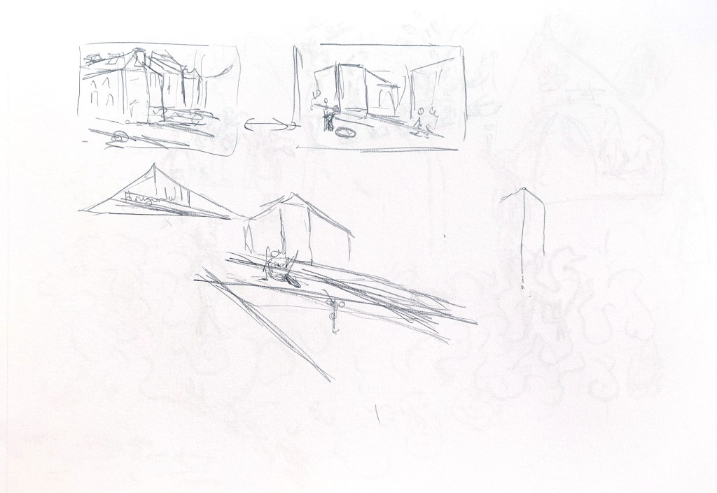
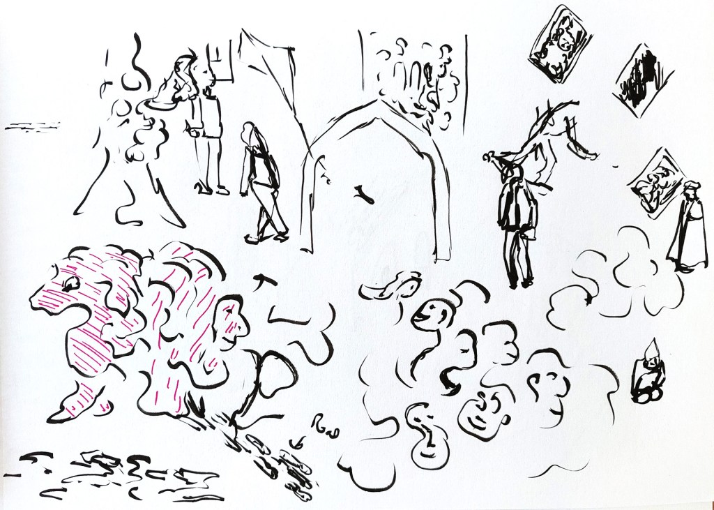
I first did some tests in my sketchbook for the various steps to see if this idea had some potential.

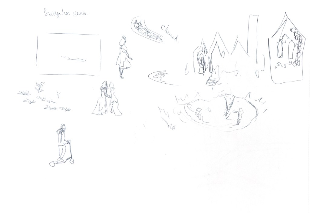
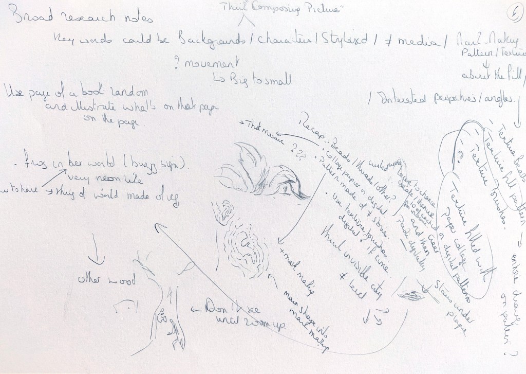
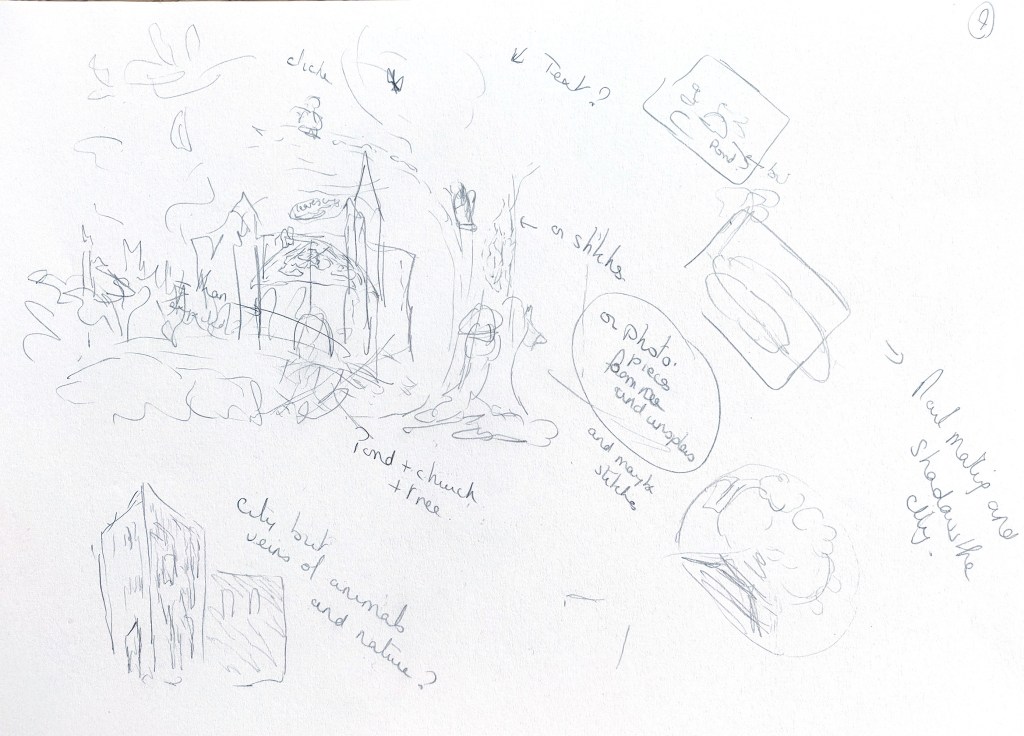
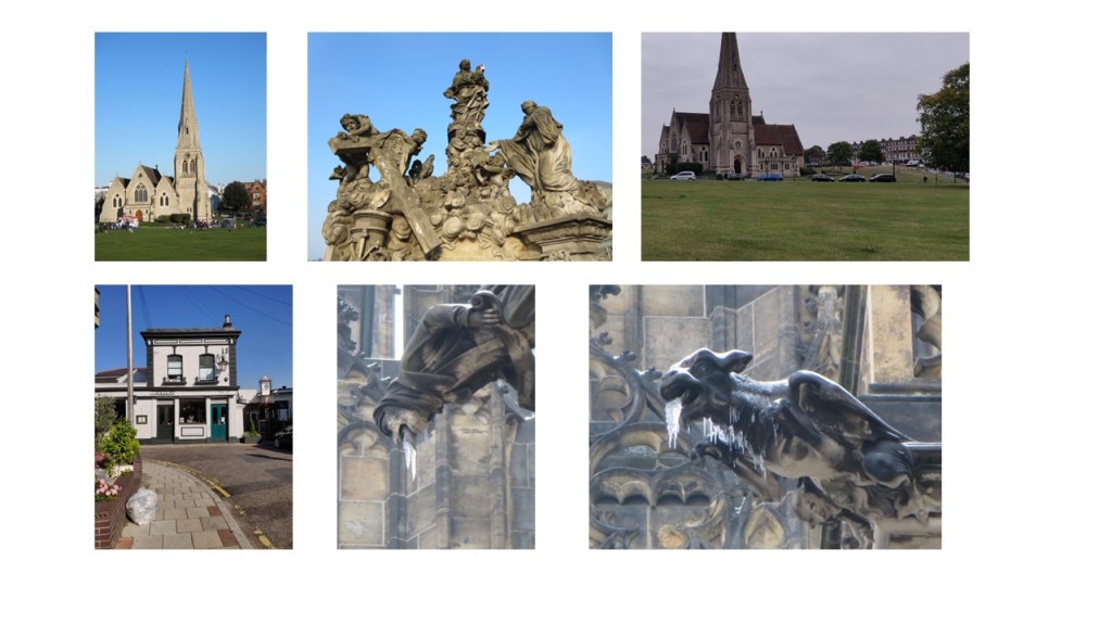
The idea I had at the beginning of the project of an illustration about a larger part of the city was too complex. I therefore changed direction and simplified my ideas. I took inspiration from the park and the church near my home. Below are some of the images I use. However, I have not included images that might contain people.
After working out the composition in procreate, I created the outlines to have the right proportions before experimenting with continuous drawing. I wanted to see if using drawing with a continuous line would bring more fluidity and even texture to the whole. I had seen an interesting YouTube video by an artist who uses this technique for urban sketching and wanted to try (www.youtube.com/watch?v=3je9c0w8QWI).

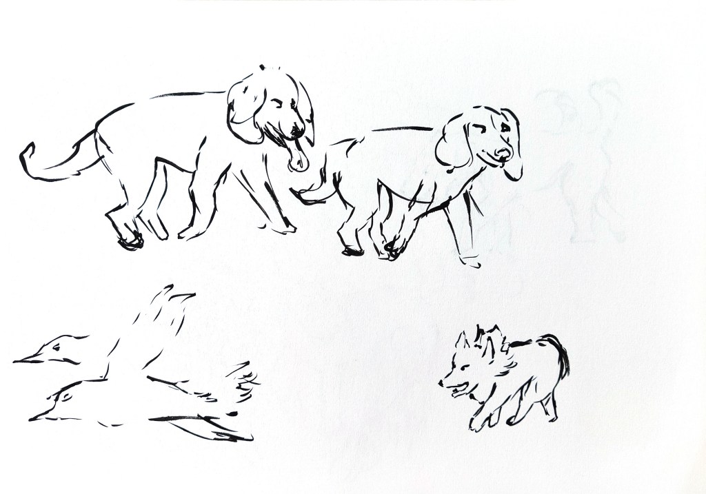
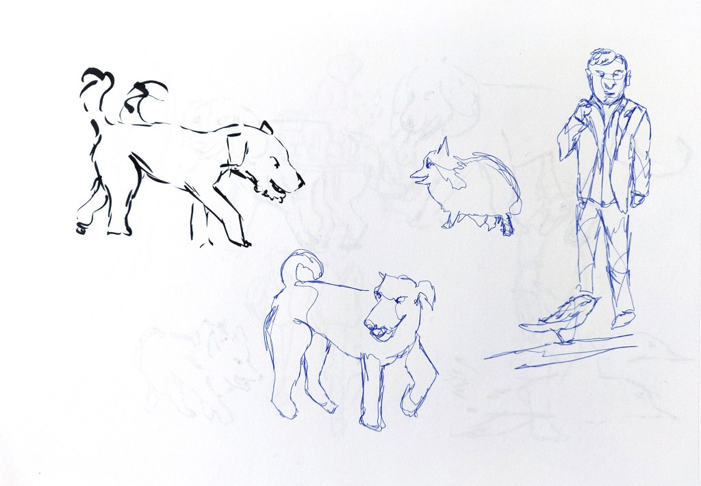
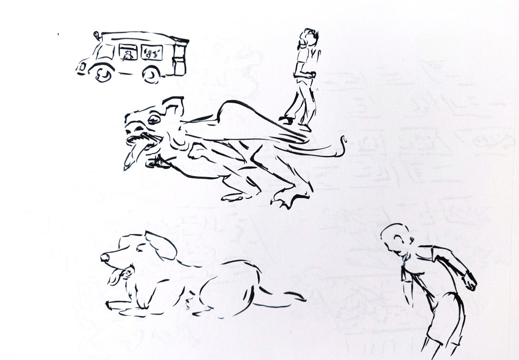
I then drew a lot of people and a few animals with continuous drawing or with the brush pen.
I alternated with some automatic drawing experiments for the textures. I looked at some images of statues and gargoyles used in churches for some very loose inspiration. When I noticed some interesting shapes, I explored a bit further to see if some characters or other elements would appear.


I then put all the elements I had in an Illustrator file and created a montage to see what I could use and how:

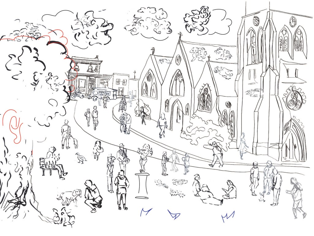
Once I was happy with the result, I transferred everything in Procreate and drew my final illustration. I did not use the continuous line drawing of the background. I found out that I preferred drawing fast once I had the main perspectives and proportions.
I then played with colours before colouring the entire piece. I considered leaving it in black and white or adding only some touches of colours. I looked at the work of Quentin Blake as I like the way he applies colours loosely. I tried to do something similar. I left some parts in white. I also tried to keep some bright red and yellow for the characters as they are smaller, so that they could stand out.

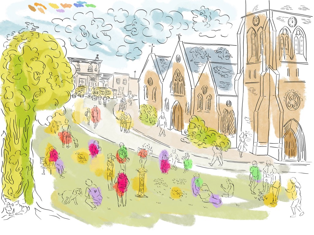
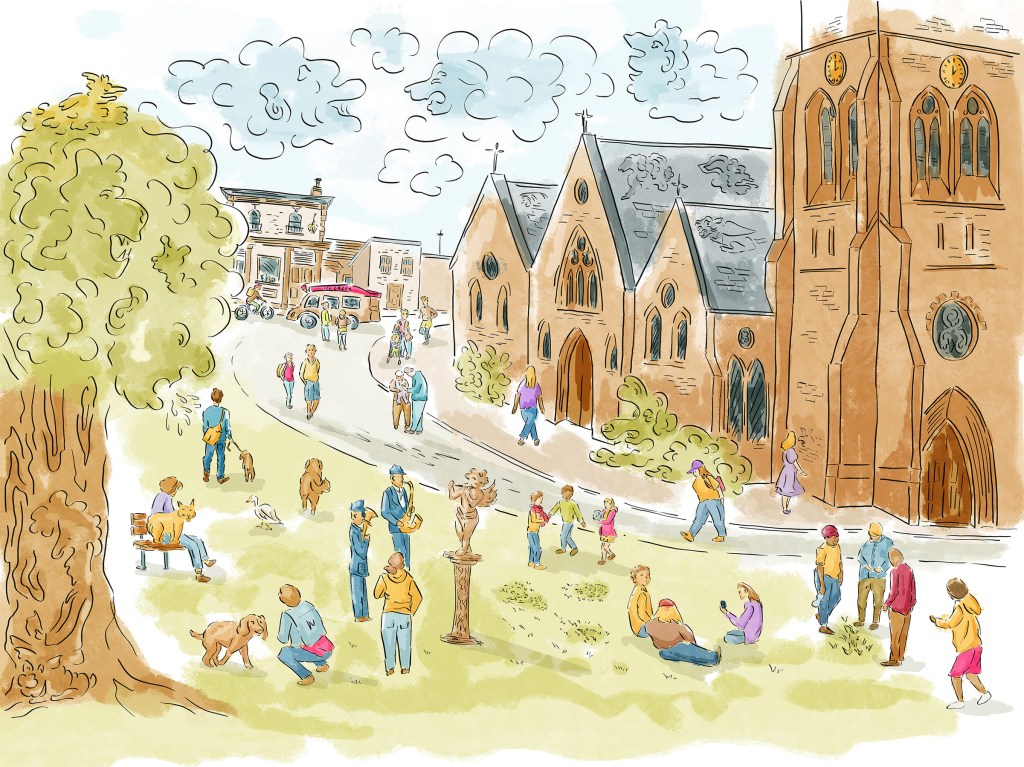
I then put the image in Photoshop and added a bit more contrast.
I usually struggle to create animated scenes as I am too concerned from the start about what I will include and how. By creating sketches at random, I had a lot of material I could use to create a very busy scene. In fact, I did not use all the sketches, only my favourite ones. I can see how I could use this technique again.
I really enjoyed finding characters in the texture I created. Among others, there is a face in the tree that looks like it is coughing on the people below. The bush in front of the church is a giant dog and there is a man reading a book in the tree trunk. The texture in the grass hides more characters. I tried to make some connections. Three people looked like they were looking down at something. I grouped them and they are now looking down at the same place. If we zoom on that part of the ground, there is a little fantasy character in the grass. The girl who is looking at the wall of the church is looking at a face. The idea is that we walk around but a lot is happening that we are not aware of and a lot happened in the same place before us. There is also the idea that all these people are being watched.
I wanted to add more historic figures and looked at the history of the place but I did not find much.
I found out that my favourite method was to sketch loosely with the brush pen. This is because It is not really possible to slow down with the brush pen and I have to draw very fast to avoid having too much ink in one area. This tends to give some interesting and unexpected outcomes.
I did not add as much texture and mark making as I wanted initially. I worried at some point that there were already too many details but I could have added some more.
I wondered if it would have worked better if I had created a monochrome illustration with small areas of colour. This could have made the piece more interesting and would have potentially give me the opportunity to add more texture with mark making.
I would have liked a background with more depth and unexpected perspectives a bit like some scenes created by Adam Dant.
I would definitely use these techniques together again as it helped to be more creative and create a more dynamic illustration.
Conclusion
Once I had completed everything, I looked at the brief and what I had decided at the beginning of this project to make a comparison with what I actually achieved.
I am aware that I lost track of what I was trying to achieve at some point and I think that it is because my vision was not strong enough at the beginning. As a result, the three images lack cohesion. I probably was too worried about the outcome and about taking the wrong decision. As a result, I ended up losing a sense of direction.
What I have discovered however is that every experiment has been very beneficial and there are many elements and techniques I intend to use in the future. Even if in the end, the pieces were not so connected as I changed direction, I can make connections between what I have learned. Studying the texture created with embroidery can be beneficial when I work digitally. I could use some of the collage techniques as part of a painted illustration.
In every image, I focussed on creating more depth in my compositions and I feel that I understand better how to do this.
It can be challenging to let go and experiment freely but this project has shown me that it is worth it. I wonder if at time, I did not go too much out of my comfort zone, but I have discovered a lot in the process. I found it easier to keep track of what I had in mind in part 4, but I think that it is because I had a clear subject in mind.
How did my creative approaches to image-making, design or photography
develop over the course?
I have learned many techniques in this course that will lead to more experimentation and ideas in the future.
How did my use of observational drawing as a form of visual research and
idea development change?
I feel more free to experiment with drawing to develop new ideas. I have more confidence in what I can achieve.
Which creative strategies like chance, process or collage worked for me
and produced the most successful outcomes?
Concentrating on the process and not so much on the outcome has been very beneficial as it has enabled me to be more creative and to draw in a more dynamic way.
Collage is not my strongest point but I am interested in the process and would like to experiment further.
There are so many methods and approaches that I enjoyed and found useful. It includes continuous line drawing, designing characters, objects and backgrounds and making connections in order to create composite pictures or creating 3D characters and turning them into 2D illustrations.
What do I feel and think about the processes of experimentation I have
undertaken with a range of materials and processes?
I am glad that I tried different materials and processes. I discovered many techniques I enjoy. I also think that I will make more connections between these techniques in the future.
How has looking at other practitioners’ artwork expanded my understanding of creativity?
Looking at the work of other illustrators has been essential to find inspiration and consider new techniques. It has enabled me to see more possibilities and potential in the creative process.
What does visual dynamics mean to me?
It is about the connection and interaction of the different elements in a piece: the composition, the colours, the shapes. The objective is to create a dynamic that captures the interest of the viewer and tells a story.
Revision
After reading my tutor’s feedback, I considered designing two more pieces to complement one of the pieces I had created for this assignment. As mentioned before, as I progressed through the assignment, I ended up creating three pieces that were not connected in the way I had envisioned at the beginning.
Once I had completed this unit, I thought that it could be interesting to revisit the embroidered piece and explore other fabrics and/or techniques.
One day, as I was considering various options, I had the idea of creating a piece with warm materials and colours and another piece that would be the opposite. The one I had already created was vibrant and full of colours and it could be an interesting set.
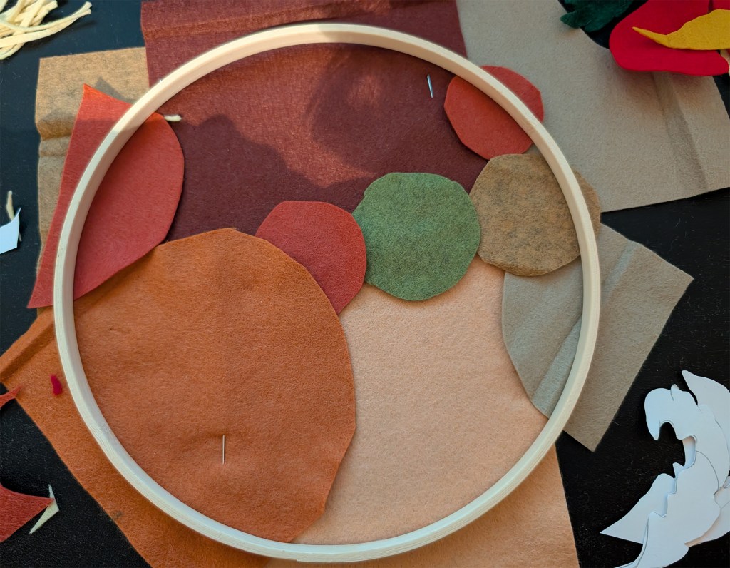
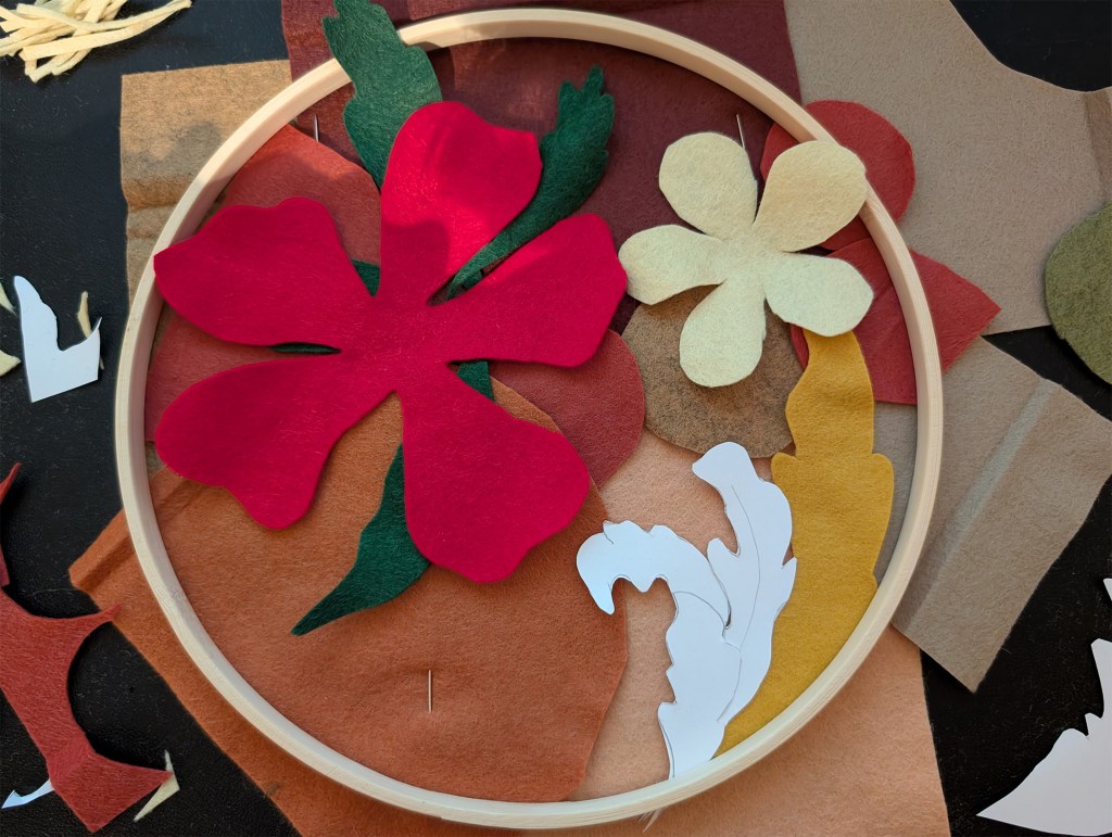
When I looked for warm fabrics, felt made out of wool seemed like the perfect material to start with. Everything from its thickness to its texture has a warm feel. I selected warm colours with browns, yellows, oranges and reds.
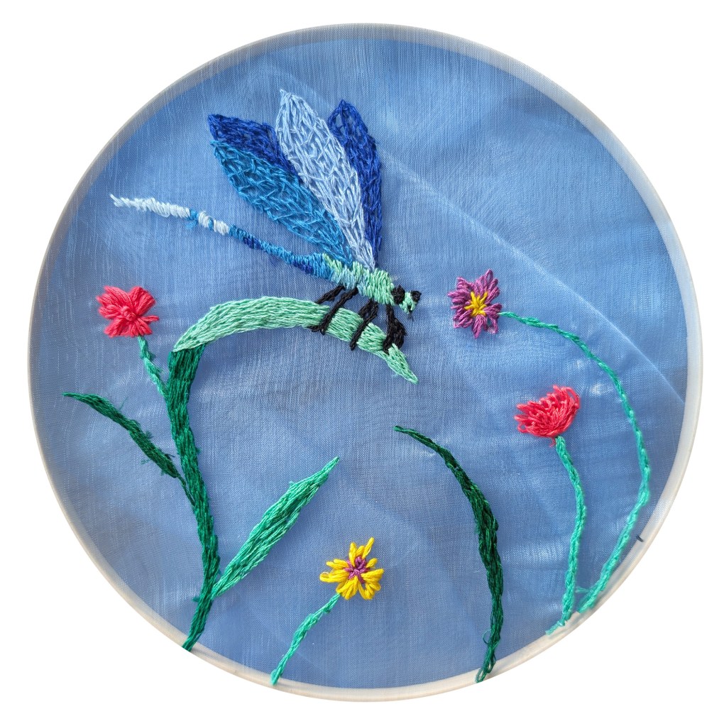
For the cool piece, I thought of fabrics like satin or other silky fabrics that would reflect light. After some research, I bought a piece of very light blue organza. I liked the idea of playing with a semi-transparent material as a background. I thought that I could also incorporate other “cold” materials such as wire.
I then used my sketchbook to decide on the compositions.
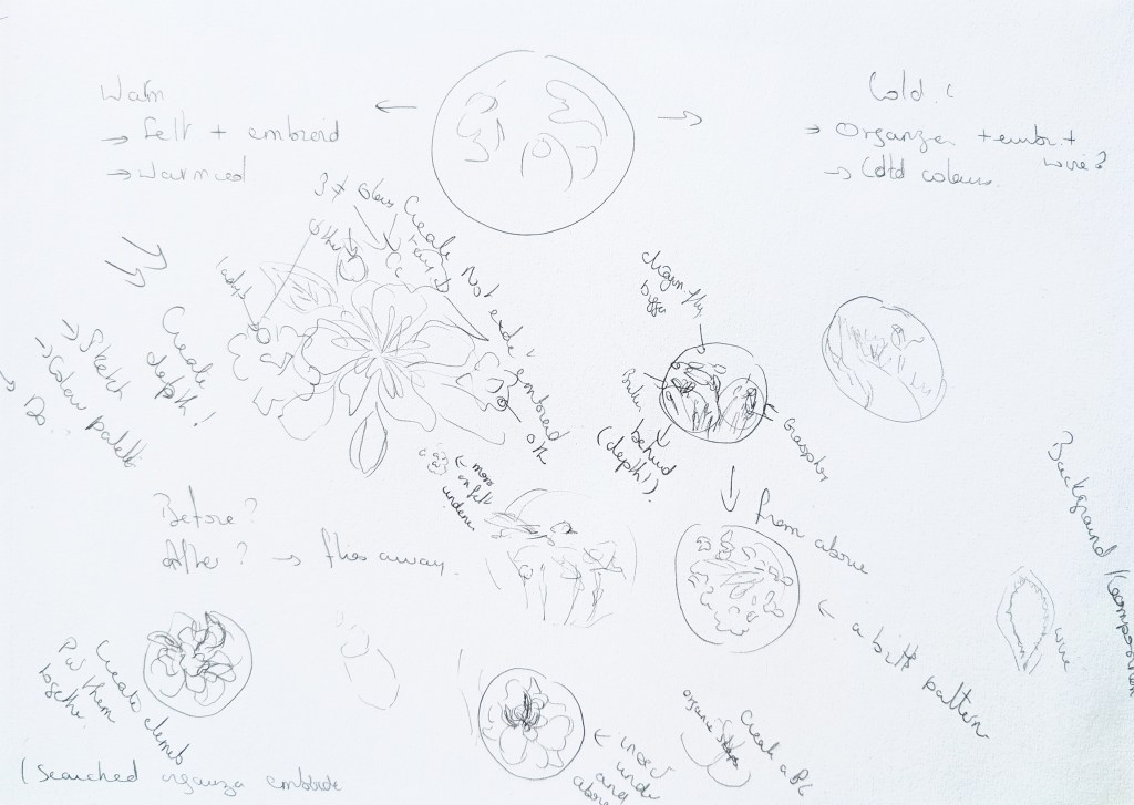

Time was an issue, and I had to make sure that I could complete the two pieces in a reasonable amount of time. I had also learned that many details can be lost when working with collages, sewing and embroidery. I therefore created simple compositions and decided to carry on with the theme of nature. I looked at pictures of flowers I had taken and checked dragonflies on Google Images to understand the insect’s anatomy.
Warm Piece (felt)
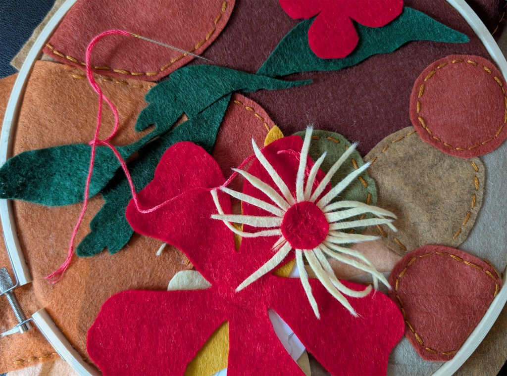
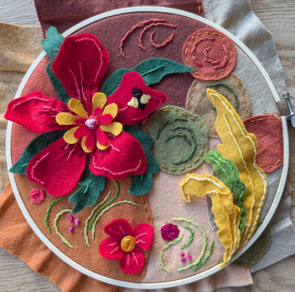
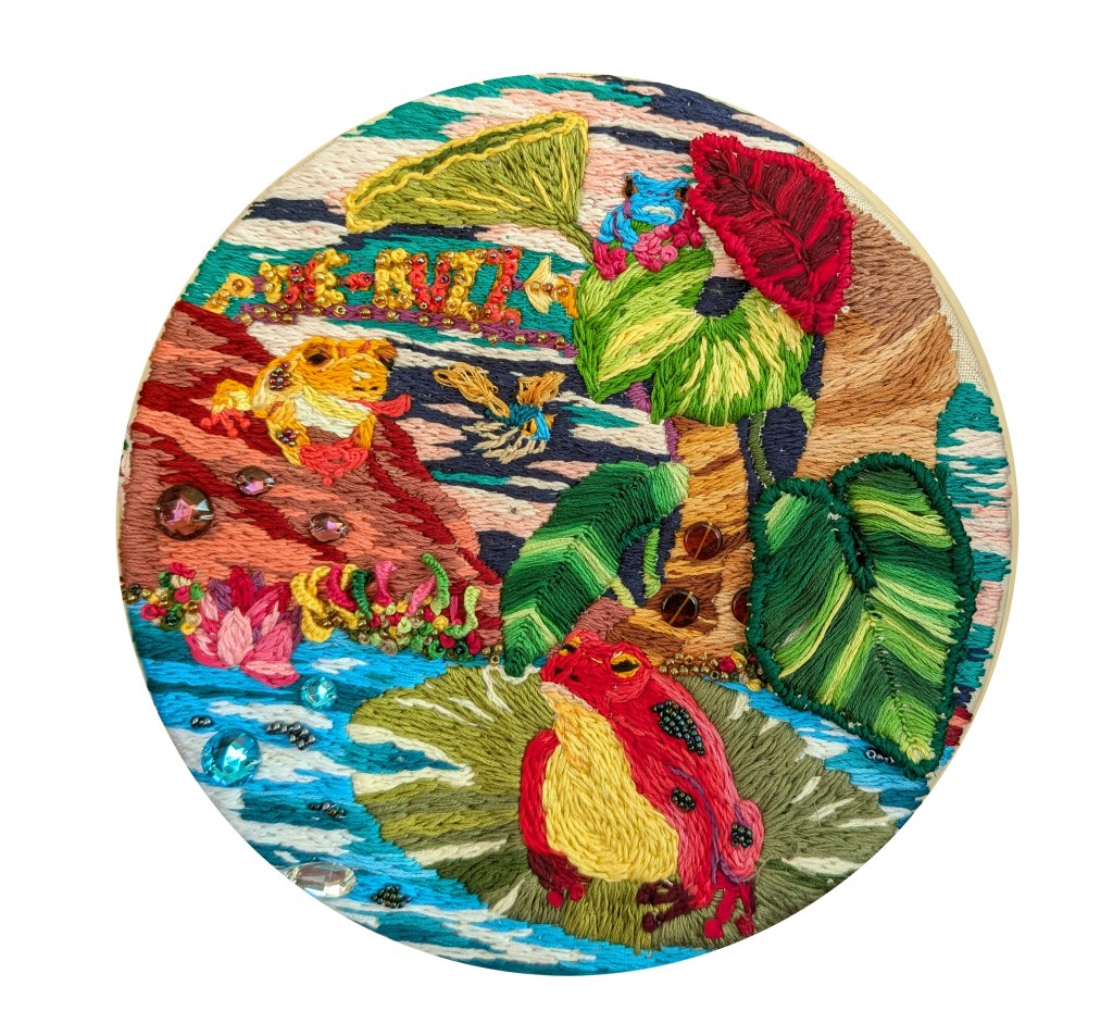
I wanted to take advantage of the thick material to create some depth. To achieve this, I played with layers and added texture with the embroidery. When I did some research about felt artwork and craft, I realised that this material was very versatile and could take many shapes. I decided to play with various shapes and use embroidery to create the design. I had never worked with felt and often had to improvise and adapt. Some ideas did not work. For instance, I wanted to create filaments with felt but they kept breaking. I wanted to embroider some insect(s) but it did not really work as I lacked expertise to embroider something so delicate on this fabric. I had to create a patchwork for the background as I did not have a piece that was large enough, but I thought that this could create an interesting effect. This is my work in progress.

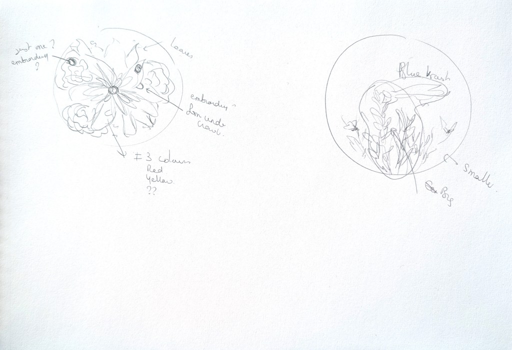
Cold Piece
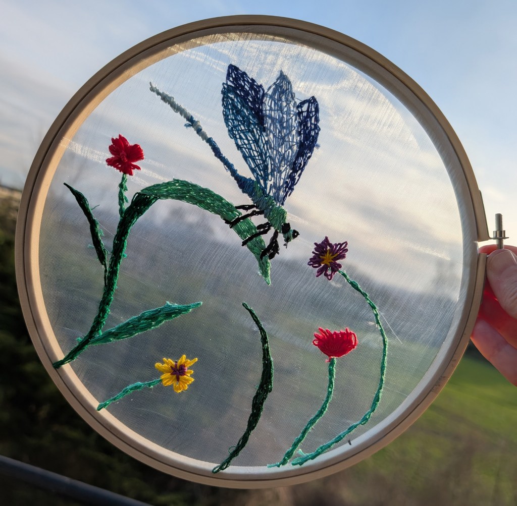
I looked at examples of work on organza in Google and Pinterest and saw a lot of lace-like embroidery that made the most of the semi-transparent background. I wanted a simple design that would be light and convey the feeling of elements suspended in the air. I chose a dragonfly because they are very delicate creatures but also cold in their texture and appearance. I used a lot of blues and cold greens with only touches of yellow and red to add contrast.
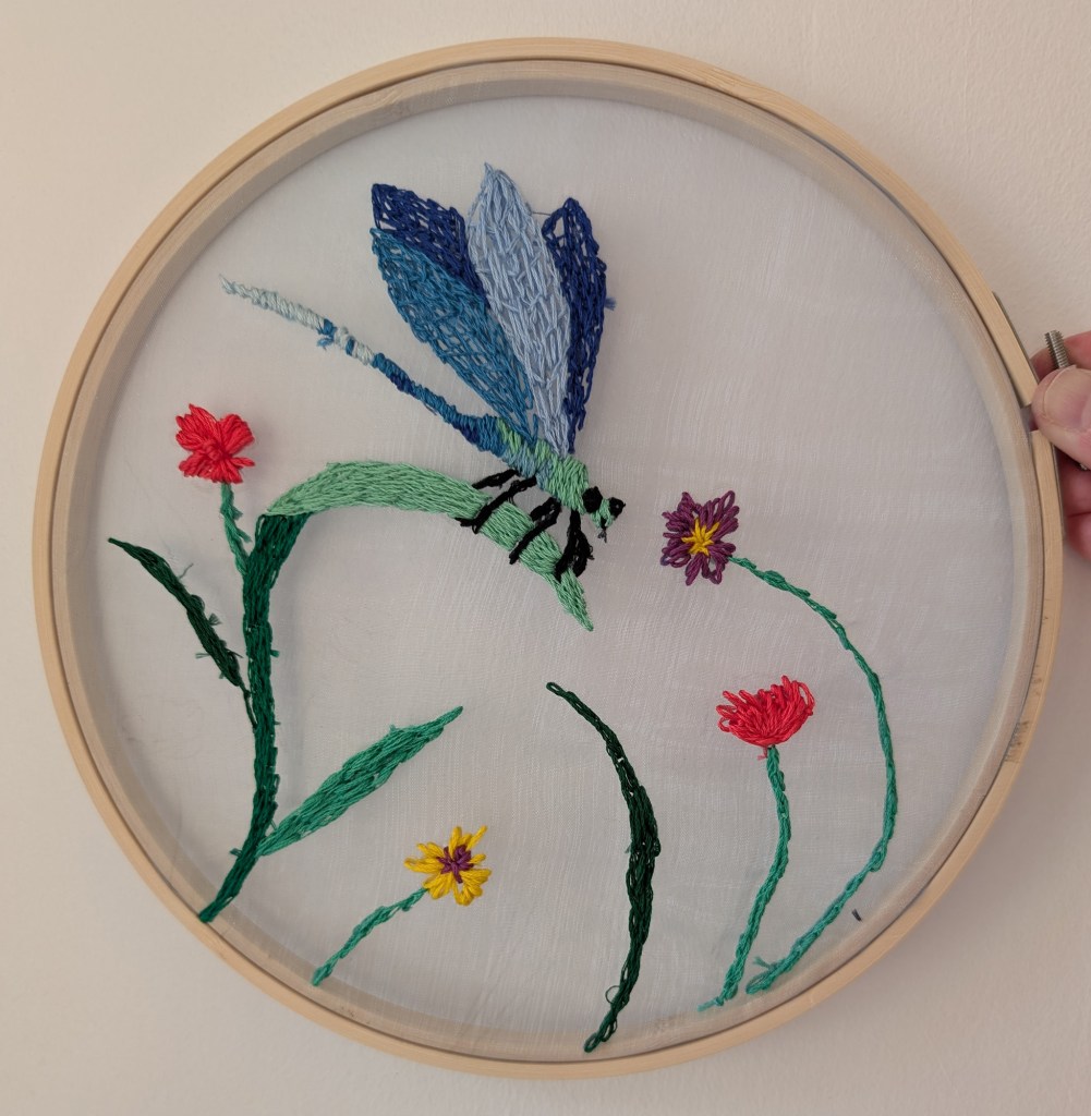
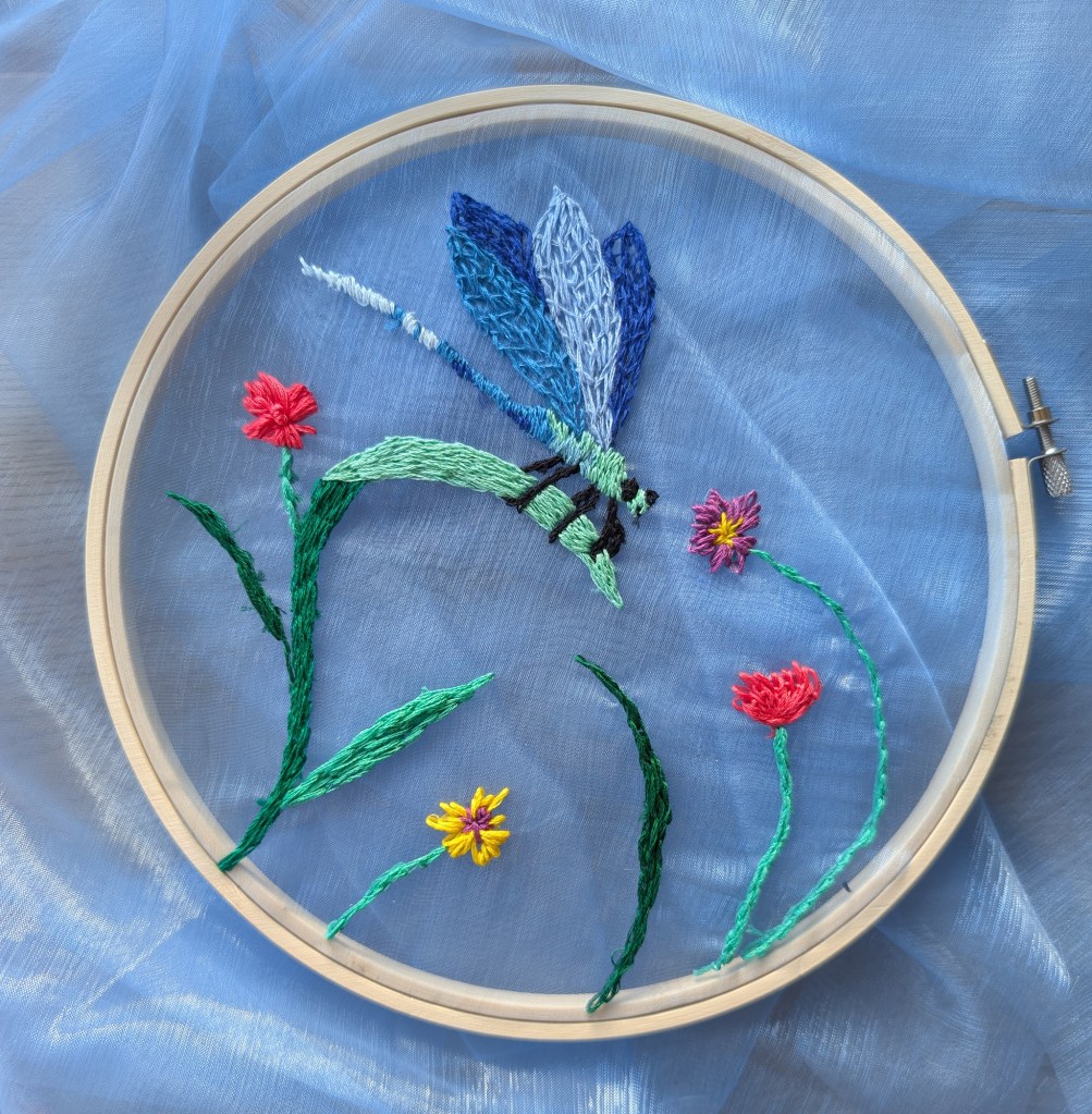
Below are the three pieces next to each other:
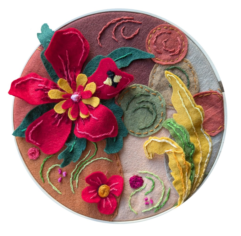
I liked the idea of exploring warm materials associated with warm colours and the opposite and I think that we can see the contrast between the two new pieces.
I liked both combinations of colours, in particular the light touches of red and yellow in the piece with the dragonfly.
I find that the piece with organza is not as subtle as I would have liked. I tried to create wings with wire so that they would be three-dimensional but I did not manage to create a design that worked, maybe because the wire was not thick enough. I then tried to weave the thread as an alternative so as not to cover the entire area but the outcome is not very subtle. Embroidering very small areas such as the tail was challenging, and I would need more experience to create something more delicate.
My tutor asked in the feedback how my pieces for this assignment were unconventional and experimental. In a sense, they were experimental because I used techniques and/or materials I had never used before. It meant that I really did not know what to expect regarding the outcome. However, the outcome looks at times less experimental than I envisioned because certain techniques did not work and I did not include them in the final piece.
I did not have much time for execution and research for the new pieces, but I am glad that I revisited this exercise as it gave me the opportunity to learn more about working with different materials. I really enjoyed working with fabric and the research I carried out has given me many ideas for the future. The work of Nahar Shamsun was particularly inspiring and shows the variety of textures that can be created with some imagination and exploration (https://creativeartworksblog.wordpress.com/2024/06/27/nahar-shamsun-embroidery/).
