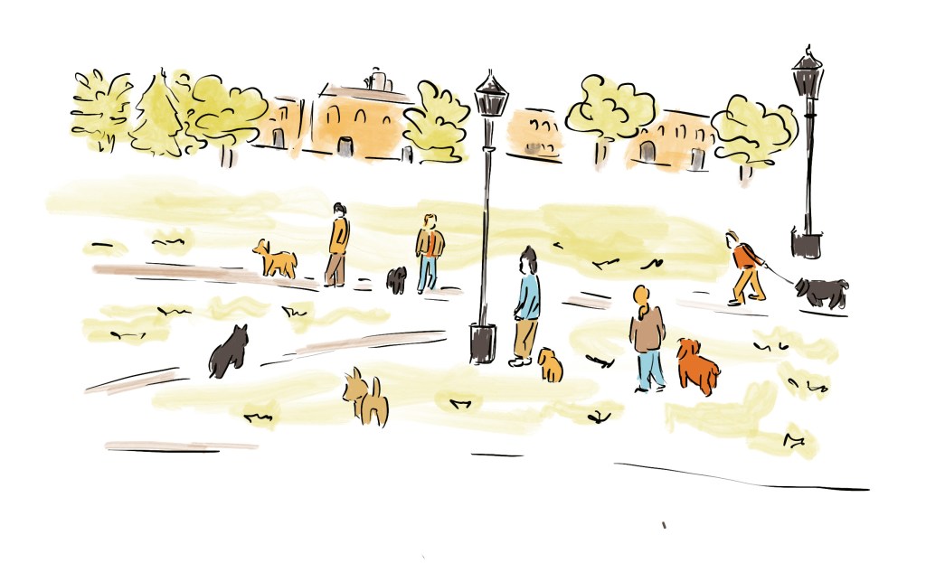
I first checked my sketchbooks and previous work for inspiration. I particularly liked the idea of exploring further some sketches created on location in part II of this unit. I considered creating a journal about my regular walks but this could have been too similar to some exercises I had already done and wanted to create something new.
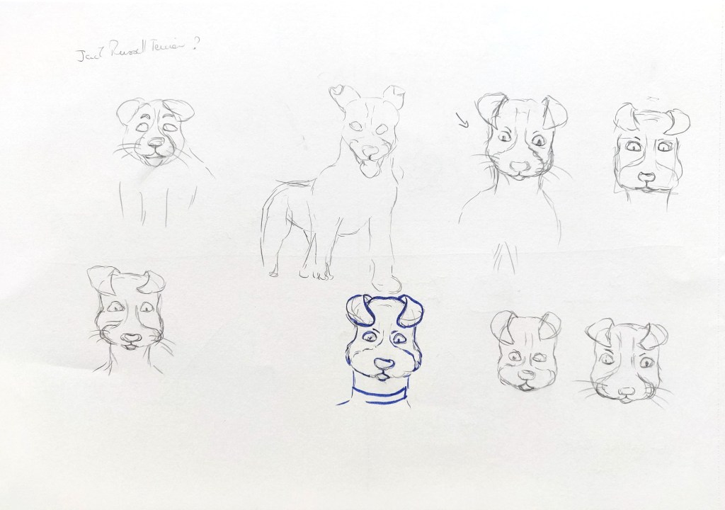
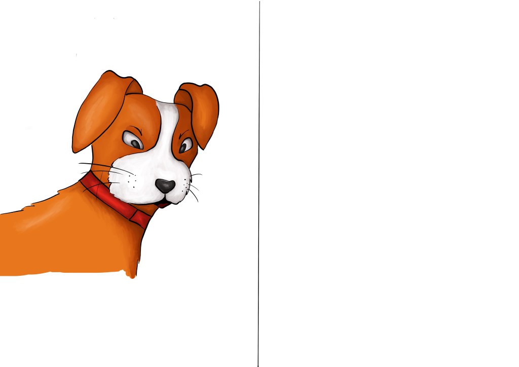
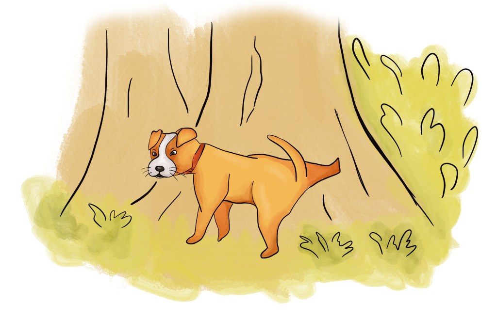
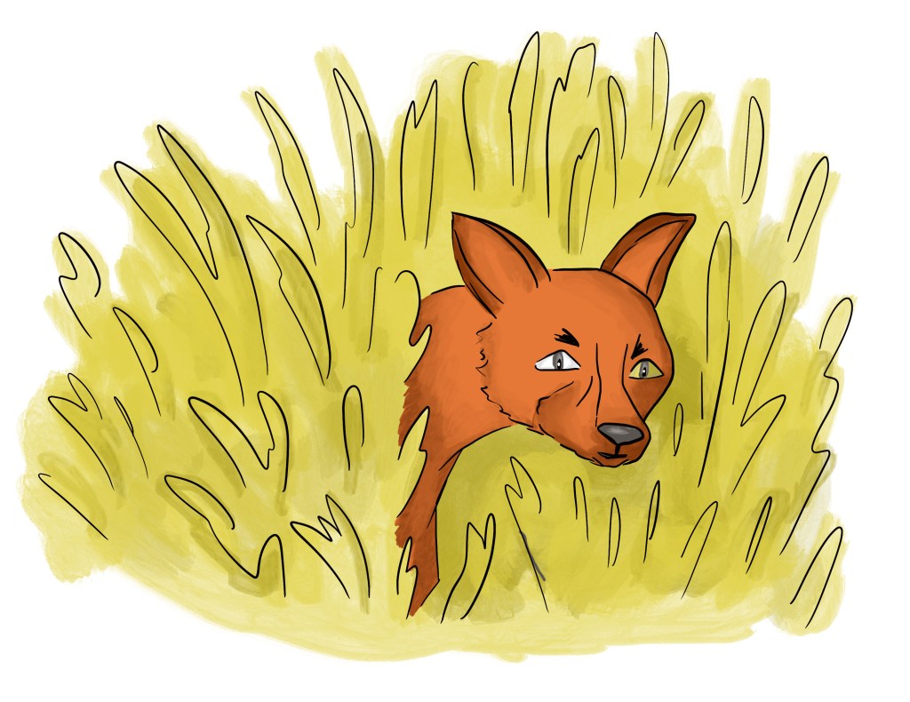
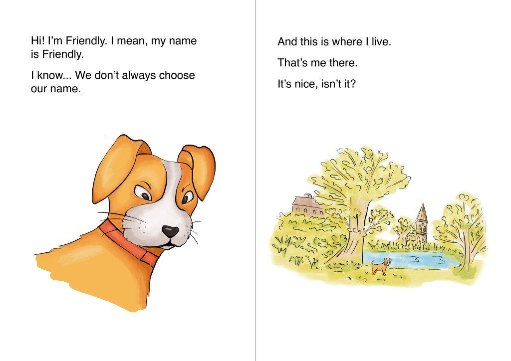
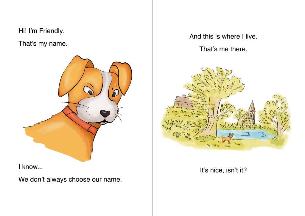
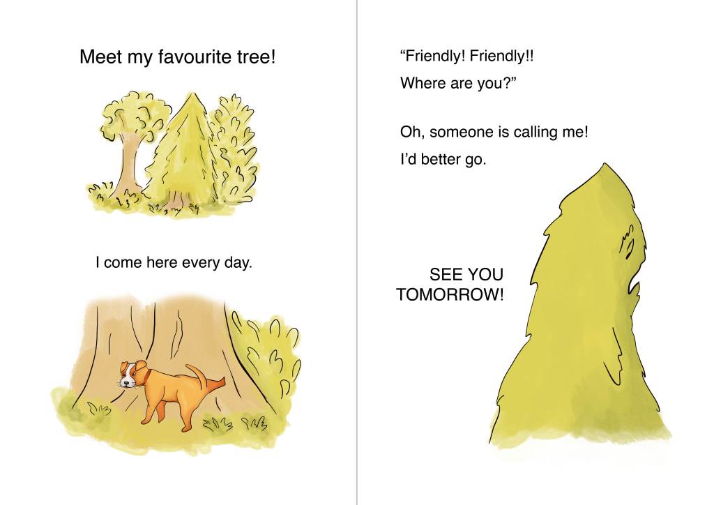
My next idea was somehow to introduce a fictional character and see the area through their eyes. I explored various options in my sketchbook, including a fantasy character based on sketches I had done in the past. In the end, I thought about exploring the area through the eyes of a dog who would be on his usual walk.
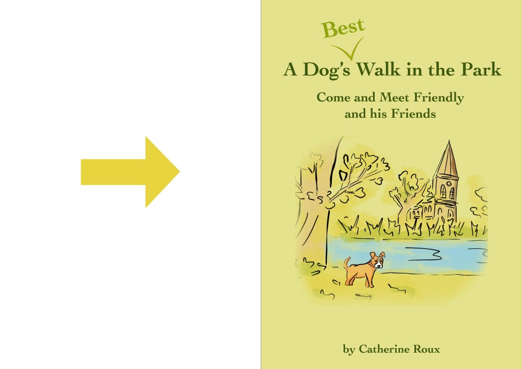
The audience would be young children. As it would be a short story, I opted for a small pocket book and decided on an A6 format.
Following my tutor’s feedback for part III, I wanted to explore line weights further and considered drawing with a brush pen. At that stage I was thinking of fluid lines, a bit like calligraphy. I did some research to see how similar styles had been used in illustrations for children and found two examples where playing with line weights work really well. One is the animation film “The Boy, the Mole, the Fox and the Horse”, which is an adaptation of a book by Charlie Mackesy (www.bbc.co.uk/iplayer/episode/m001gn7t/the-boy-the-mole-the-fox-and-the-horse). I also really like the illustrations created by Mariajo (www.theaoi.com/wia/mariajo-ilustrajo-flooded/).
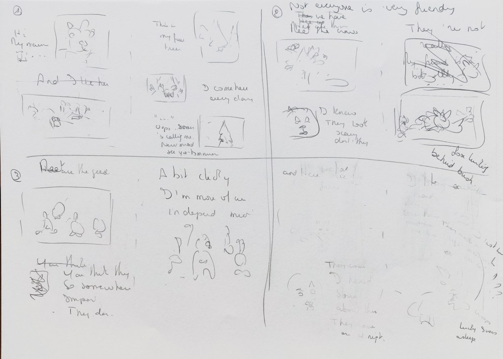
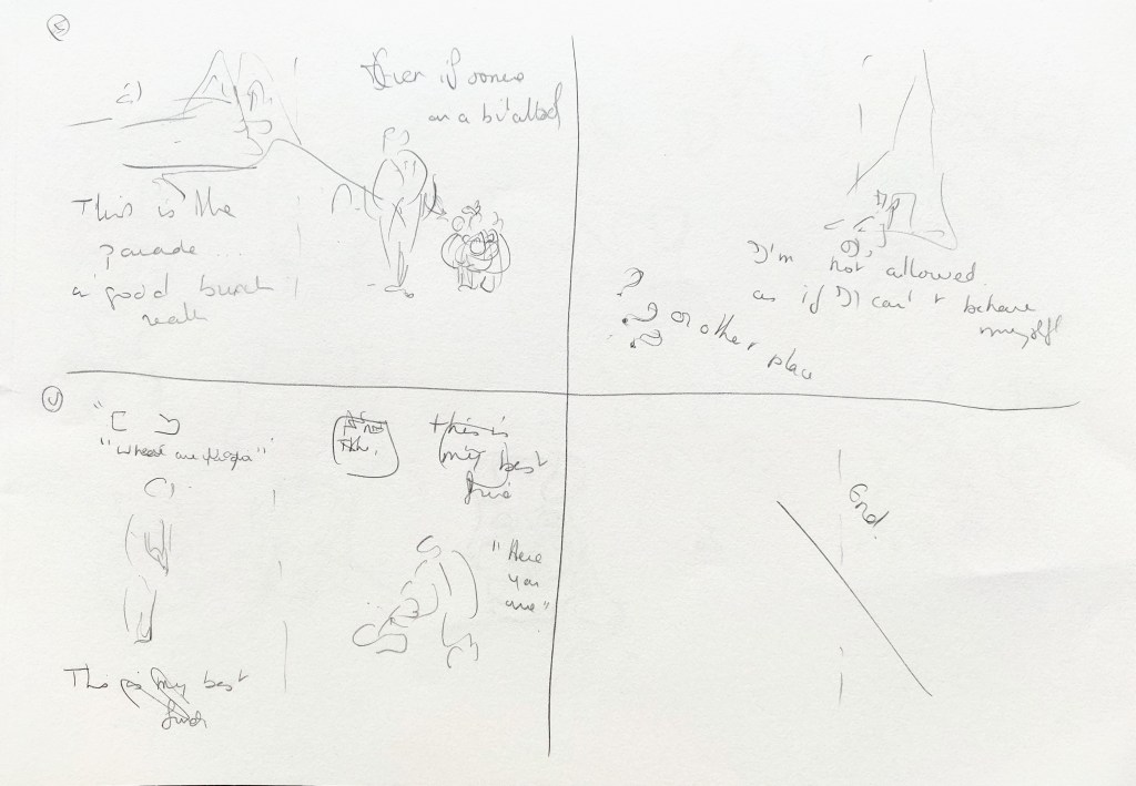
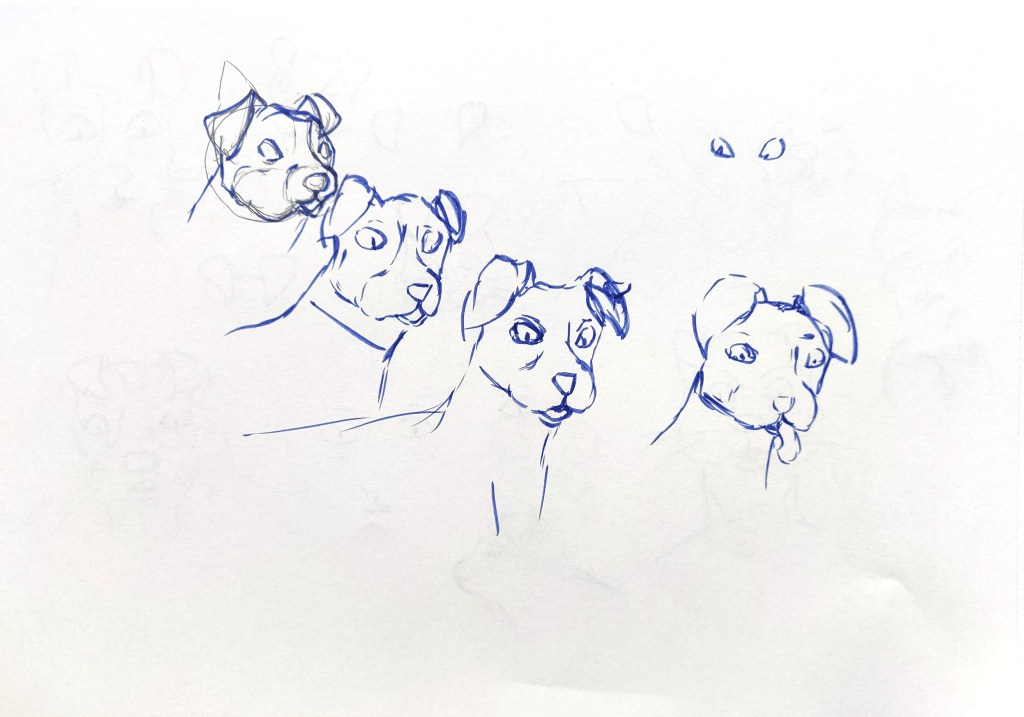
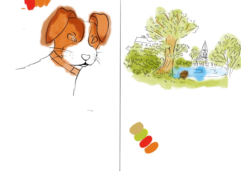
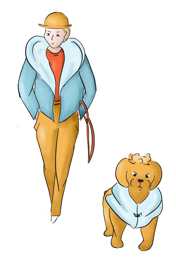
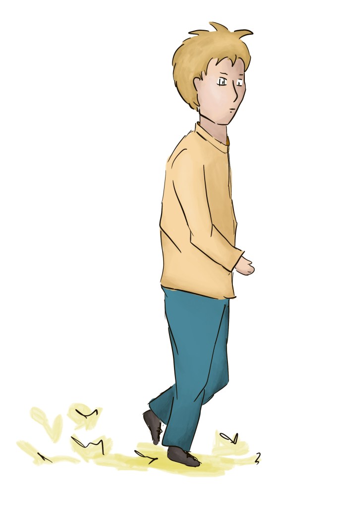
Here are the ideas that I developed in my sketchbooks. While creating the thumbnails, I also played with placeholders in an InDesign document to start having an idea of how the images and the text would fit. I looked at many pictures of dogs in Google images and tried to create a character that would be funny and friendly.


I was not sure that the brush pen would work and decided to use the iPad instead as I would be able to control the line weights better.
This is some of the work in progress:


I struggled to find a style to colour the illustrations that would be consistent throughout. I thought of a watercolour style but wanted more definition for the main characters. The video below shows in part the different methods I tried.
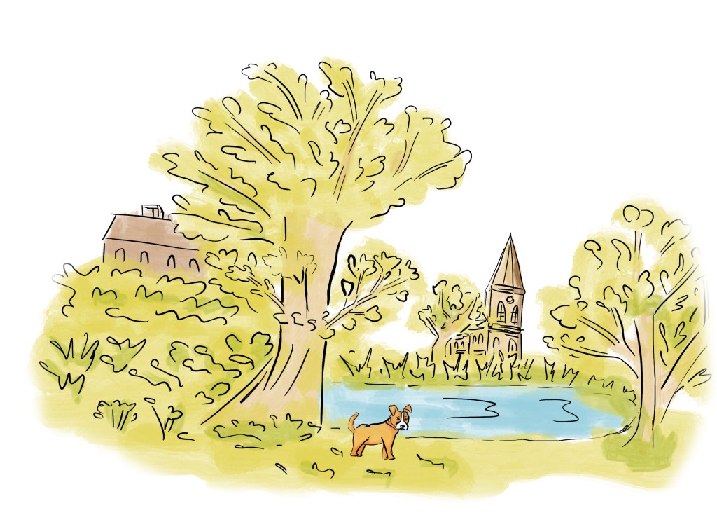
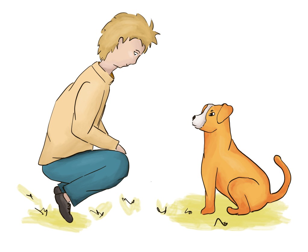
Here are the final images I created:
Regarding the choice of typeface, I looked at a sample book I created for a previous exercise with examples of typefaces and did some research on the internet to see what typeface would be better for a younger audience: https://www.fonts.com/content/learning/fyti/situational-typography/typography-for-children and https://www.indiekidsbooks.com/p/what-fonts-for-childrens-books.
In the end, I chose Helvetica for the main text. It is a sans serif typeface that is easy to read and is a bit rounded. As suggested in the articles mentioned above, I opted for a typeface that would standout more for the heading and subheading (Cochin).
The title is very simple and describe the contents of the book well. I looked at children’s book covers and noticed how they play a lot with the typography and added the word “best” to show the enthusiasm of the dog about his experience. I used the same method on the last page to evoke the title. The subheading is more interactive and appeal to the young reader to take action and join in.
This is the final outcome:
What I liked about this exercise
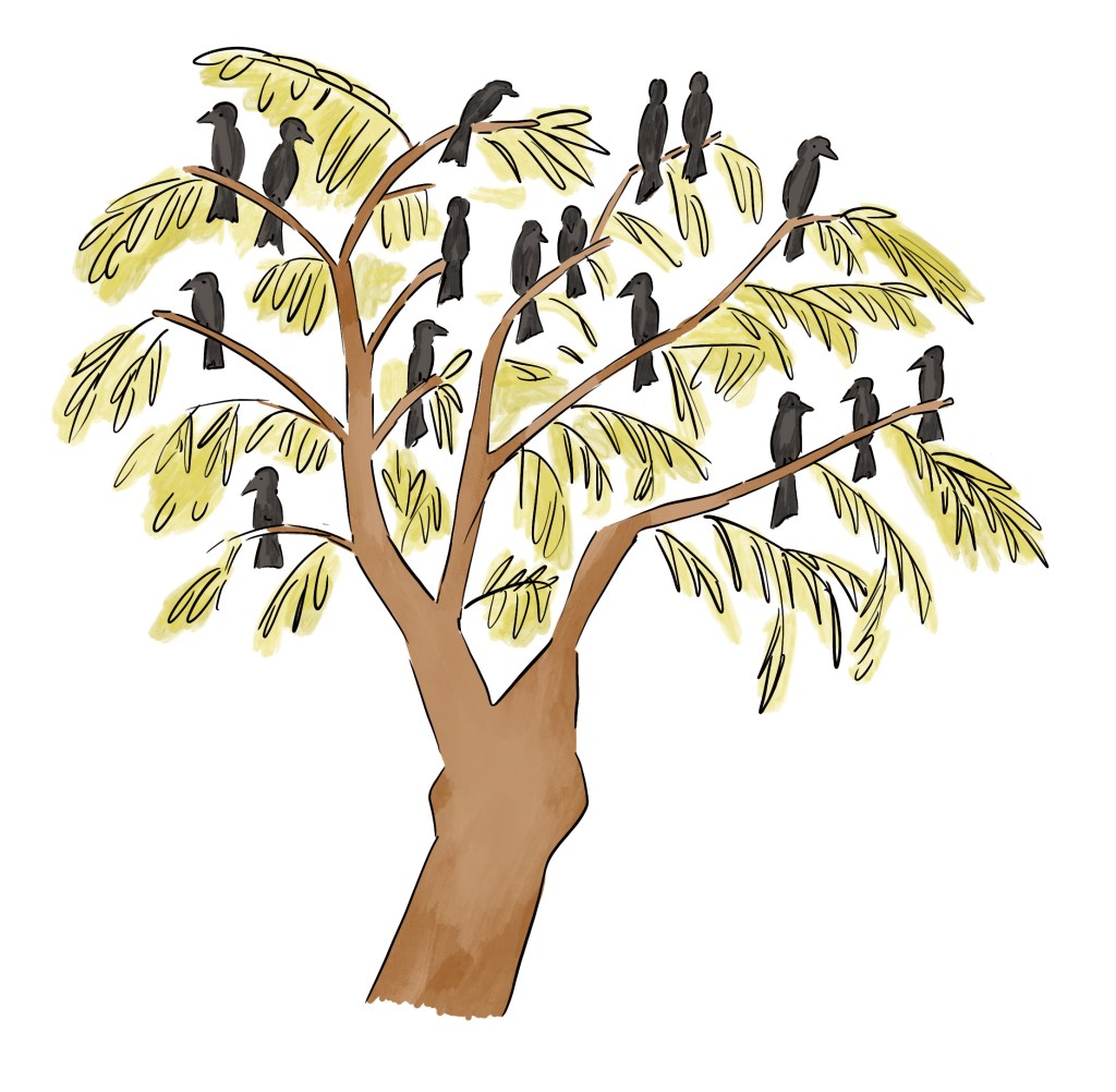
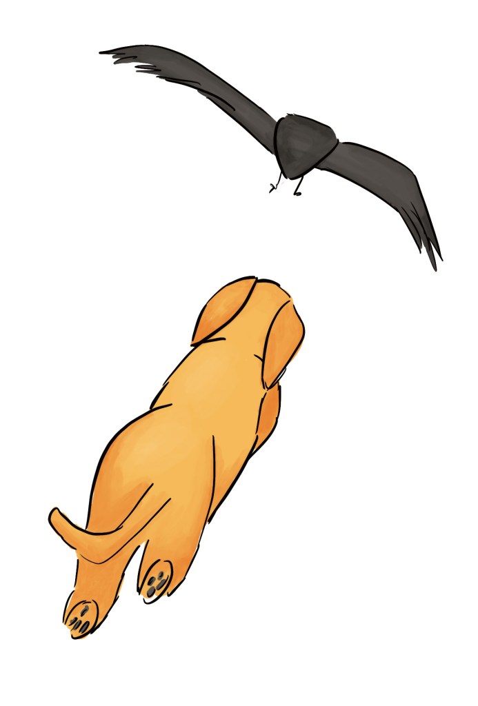
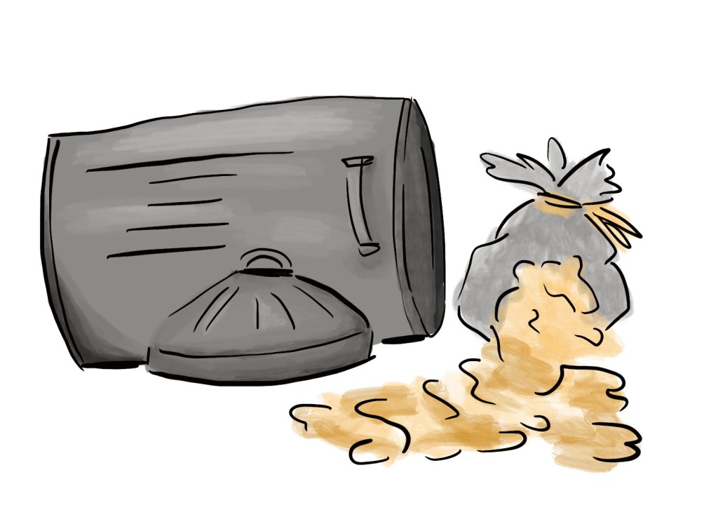
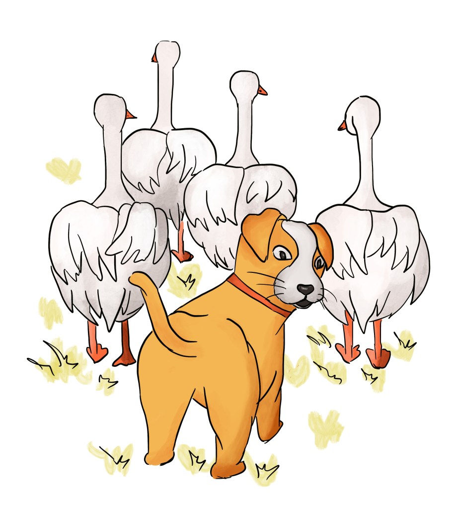
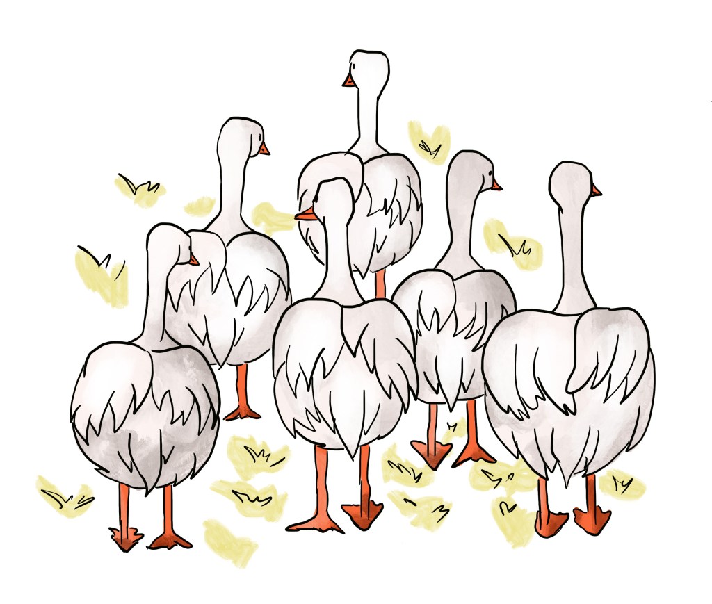
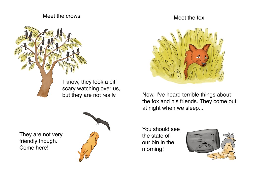
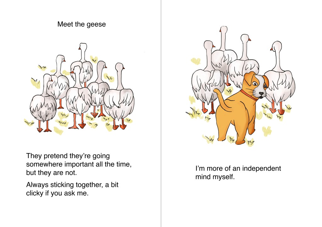
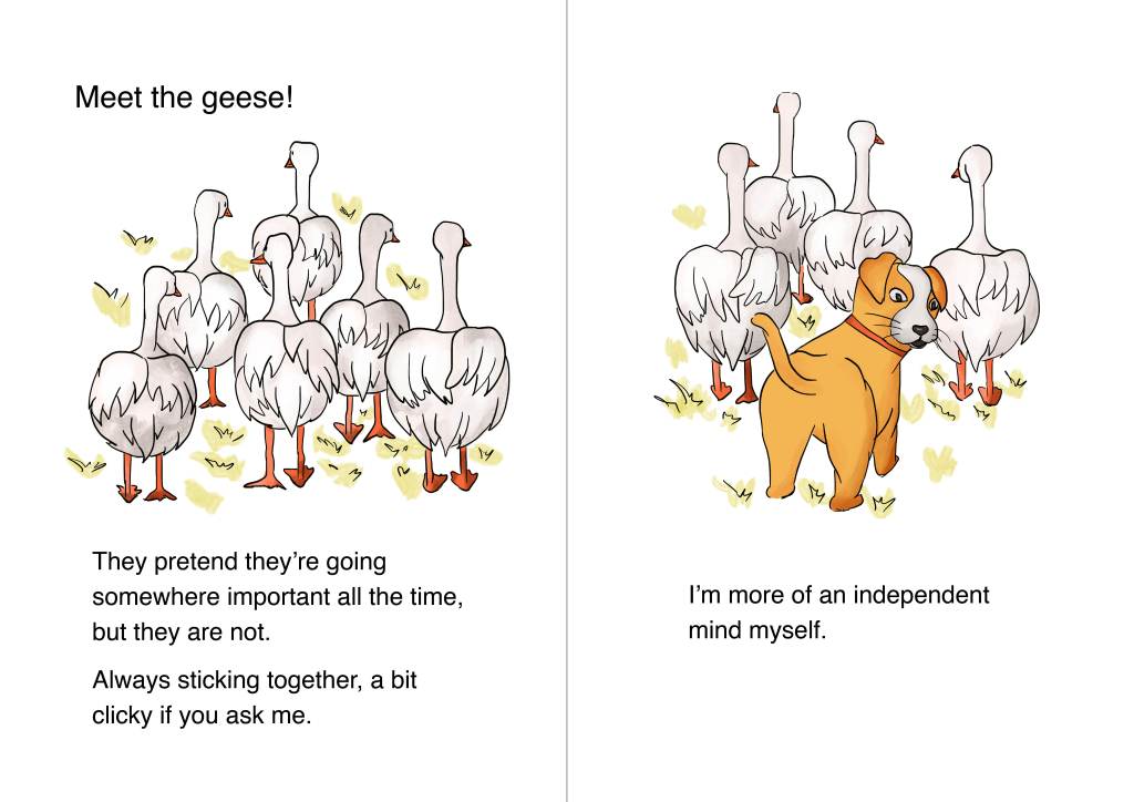
I am happy with the flow of the story. I have used scenes I regularly encounter on my walks and make them part of the story (e.g. the geese always in groups, the crows on trees,…).
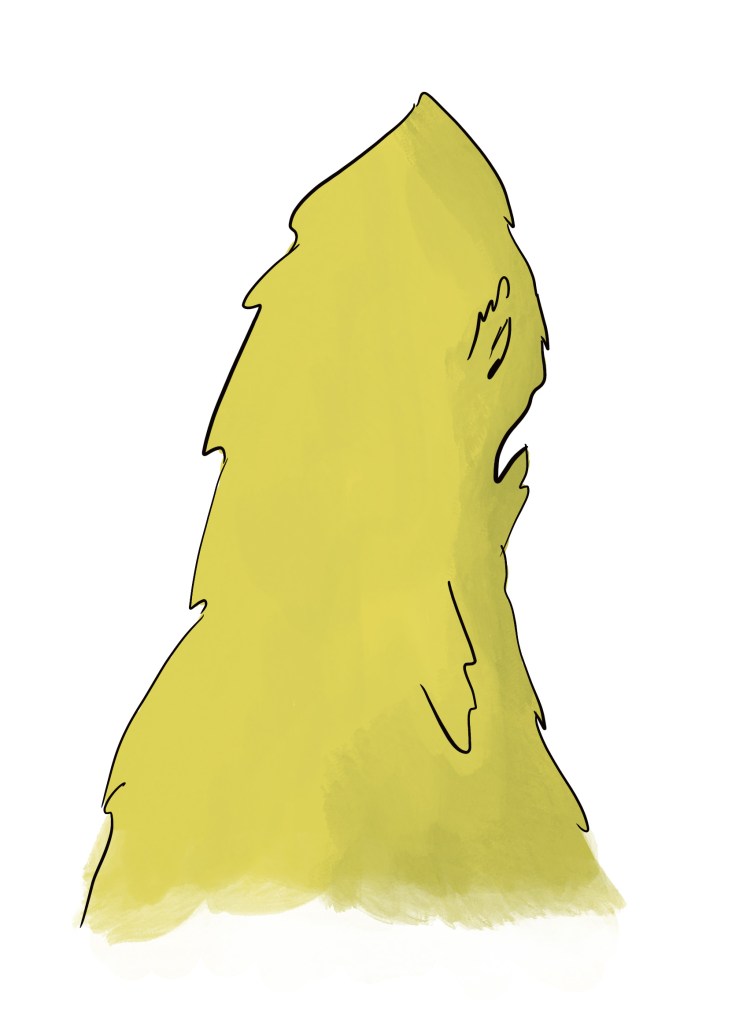
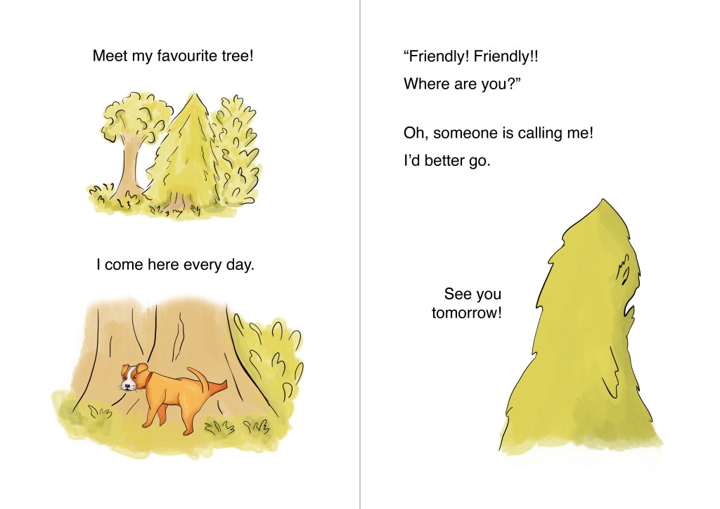
I took inspiration from my sketchbooks at different stages and enjoyed finding ideas in my previous work. For instance, the tree that is very dismayed by the dog’s visit is inspired by a previous exercise on pareidolia.
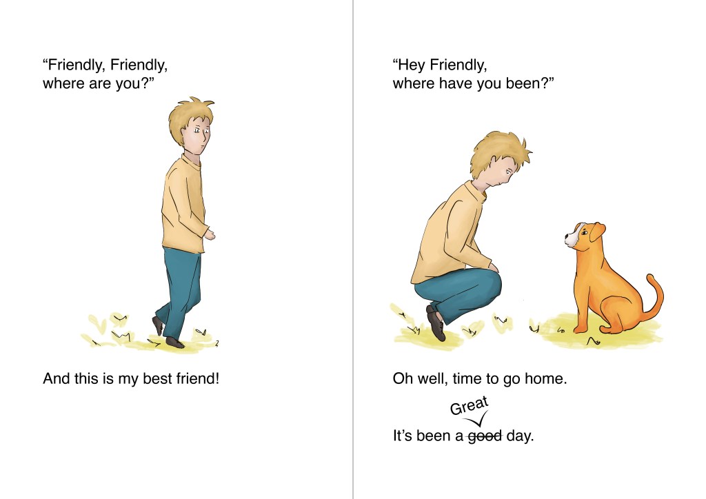
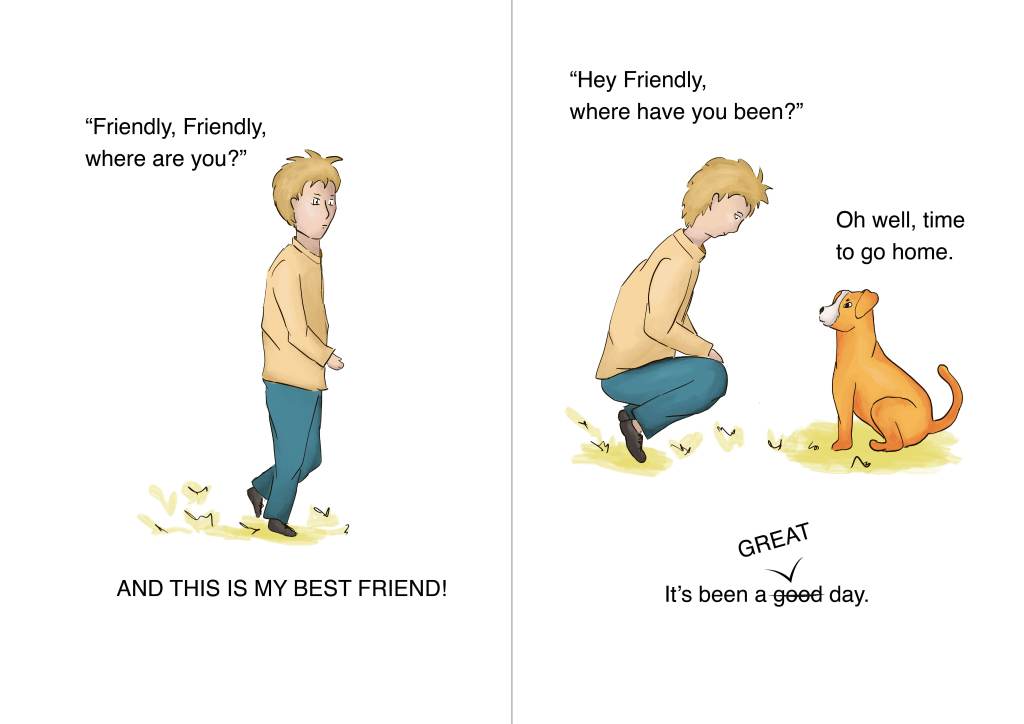
I showed my story to a friend and made some small changes. On the last page, the story ended a bit abruptly at first. That’s why I added “time to go home”.
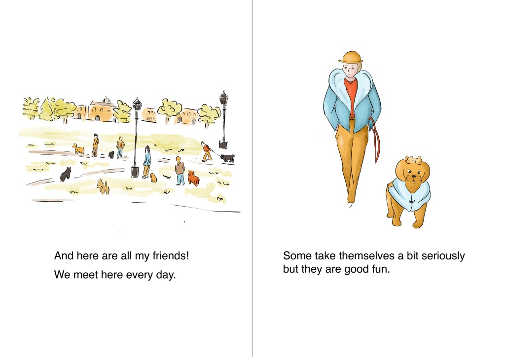
I think that the story could work for a younger audience. There is not much text and I tried to keep paragraphs very small, letting images speak for themselves. I also like having a lot of white space on the page so that the small images stand out.
Challenges
Although I like the style of the book, it is not completely what I had in mind at first. In a sense, I let the story dictate the style. I was thinking of something a bit eery with fluid lines and light colouring, but it is a funny story that works better with bright colours.
I still need to improve certain aspects in my illustrations:
The lines: Although I tried to vary the line weights and have thicker lines when there would be a shadow for instance, I still need to improve on that. When I concentrate on the accuracy of the lines, I tend to forget other considerations.
Contrast: I still struggle with contrast at times and need to focus on that aspect.
Colouring: I still need to improve my skills in that respect. There are so many ways to add colours and contrast to an illustration that I sometimes get lost in all the different techniques and feel that I often end up with a mix of different styles I am not entirely happy with.
I have enjoyed this exercise and this has given me the opportunity to combine the skills I have acquired and the work I had created so far.
Edits
After reading my tutor’s feedback, I wondered how I could have formatted the text better so that it would interact more with the images.
I checked some children’s books to see how some of the text can be highlighted. I particularly looked at The Tale of Benjamin Bunny (Potter, B. (2002). The tale of Benjamin Bunny. London: Frederik Warne) and Eeyore Loses a Tail (Milne, A.A. (2021). Eeyore Loses a Tail. London: Dean). I noticed how italics for instance are often used to put the emphasis on a word or part of a sentence.
I created a new version. I experimented with upper case to indicate that the narrator is shouting. I also moved the text around and changed the size at times so that the text would interact more with images. I think the outcome is more dynamic, especially the last page where the dog seems to answer to his owner in his head. It highlights the connection between the two characters.


Although I tried to plan the composition at an earlier stage in the process, I can see how I could have done things differently to add more cohesion between the different scenes. I could have had some elements repeating across the scenes for instance such as small birds flying from one scene to another as it is done in one of the editions of The Tale of Peter Rabbit (Potter, B (2007). The Tale of Peter Rabbit. London: Frederick Warne).
