The brief:
– Create a series of illustrations that explores your relationship to digital technologies;
– Use a grid format of pixels and use only one colour per pixel.
Research on pixelated images
I was not familiar with that type of illustration, so I did some research on the subject and found a very informative article with good examples of pixel art: https://www.creativebloq.com/features/how-to-break-into-pixel-art.
In this article, pixel artists explain what attracts them to this type of illustration and how nostalgia plays a part in it. They talk about the constraints of pixel art, mainly regarding the resolution and the level of details that can be included and how these challenges can result in more creativity in order to find a way around these limitations.
I also searched for pixel art in Google images for some more inspiration.
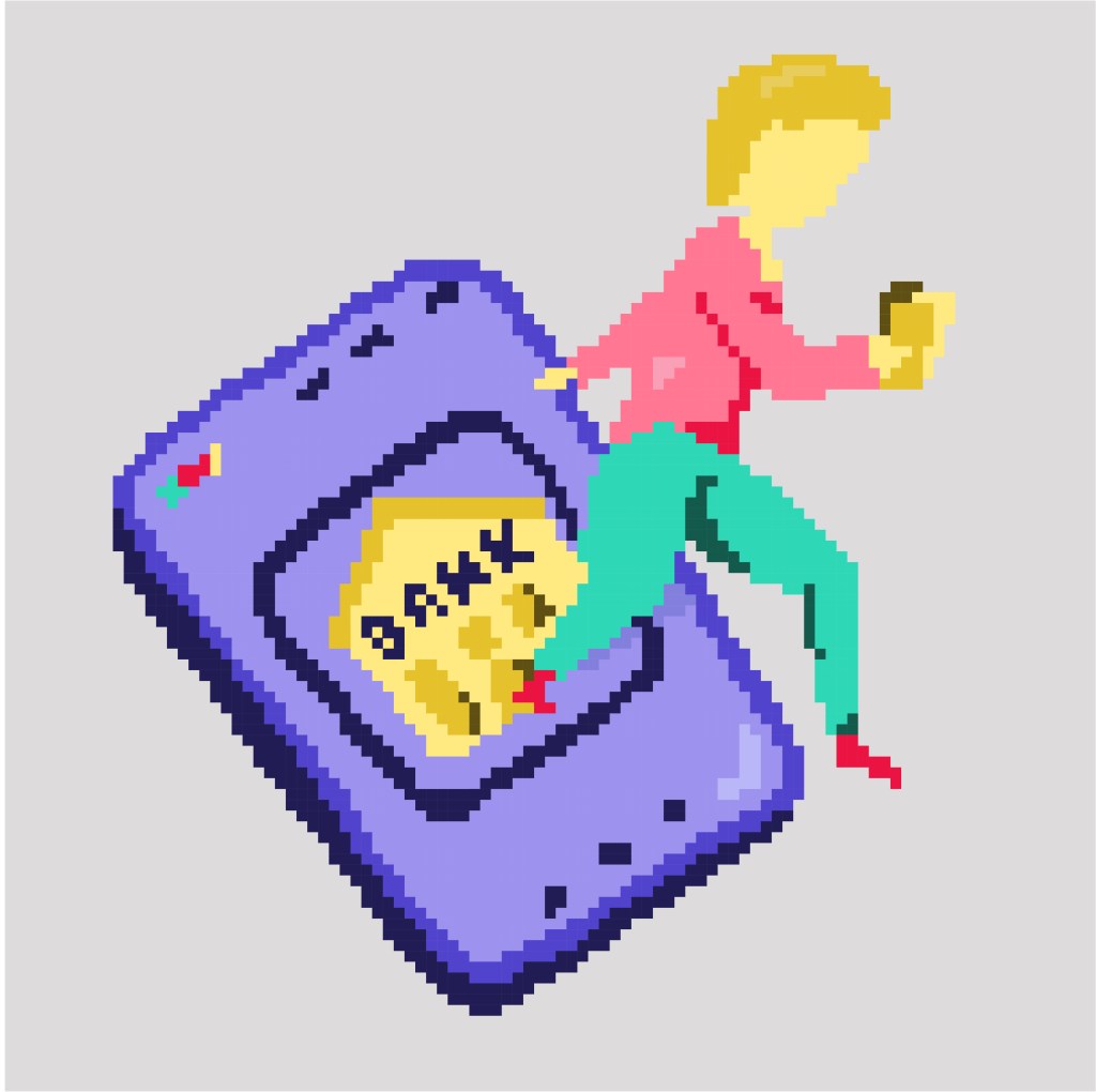
I then used my sketchbook to develop some ideas. I thought about my relationship to digital technologies and how it is now everywhere. As I reflected on how so much of what we do (shopping, banking,…) has changed because of technology, I decided to develop the idea of how the digital world and the real world merge.
I planned to create the images as vector images so the ratio was more important than the size, although I wanted to be able to size them down to use them as a set. I opted for squares as I thought that they potentially could be turned into icons.

Once I was happy with the sketches, I placed them in Illustrator and created a grid. I developed the three sketches that were my favourite.
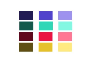
To choose a colour palette, I looked at vintage games in Google Images and found that the colours tend to be quite bright and saturated. I wanted to keep the colour palette to a minimum to make the shapes more distinct.
Below are the three illustrations I created; they respectively illustrate online shopping, online banking and a mobile phone that replaced a traditional phone. I tried to have a few highlights and shadows while keeping a certain simplicity so that the images could be readable. In the second one, the lady has banknotes in her hand to indicate that we now get money online but it was difficult to make that clear. I drew a phone that would be the kind of phone that was around when the first games were created to highlight the vintage aspect of the illustrations.


I turned the three illustrations into icons.
There is a difference between pixel art and an illustration that would have been pixelated in Photoshop with a filter; it potentially makes the illustrations more interesting because it is intentional and less “perfect”.
What went well
When I started colouring the squares, I did not know if that was going to work but I was surprised to see how the shapes appeared slowly.
I can see what Jubilee, a pixel artist meant when she said that “the creation process was very soothing” (https://www.creativebloq.com/features/how-to-break-into-pixel-art). Once I had set up everything, I enjoyed adding colour to the different squares.
What I could do differently
Now that I have experimented with that type of illustration, I would change a few things. I created the sketches by hand and did not want them to be too perfect to keep some dynamic. However, because the colouring cannot be perfect since a colour has to be selected for each square, it might have been better if the lines of the sketches had been more straight and maybe drawn in Illustrator (especially with geometric shapes like the phones or tablet).
It might have worked better with smaller pixels, although if the pixels are too small, the pixelated effect might be lost.
I have enjoyed this exercise and can see how this style could be very interesting in certain contexts (to give a vintage look to an illustration for instance).
