Brief:
- Create a poster advertising a circus
- The poster should contain the following information: What event is taking place, when and where.
- Use only paper.
Audience:
I went to Zippos Circus in Blackheath last summer and the public tended to be mainly families with younger children. The poster should be playful with bold colours to attract attention.
Size
I checked the size of the largest sheet of paper I already had and decided to create a poster in that size (c. A3). In the end, though, I used some coloured paper I bought and had to adapt the size to the shapes I had already created.
Research regarding circuses
I had not taken many pictures when I went to the circus last year but I had a look at them again and went on Zippos Circus’s website to look at the colours, costumes,… (https://zippos.co.uk/).
I did some research online about other circuses (e.g. http://www.cirquedhiver.com/en/visit-the-cirque-dhiver-bouglione/). I also googled “circus posters”.
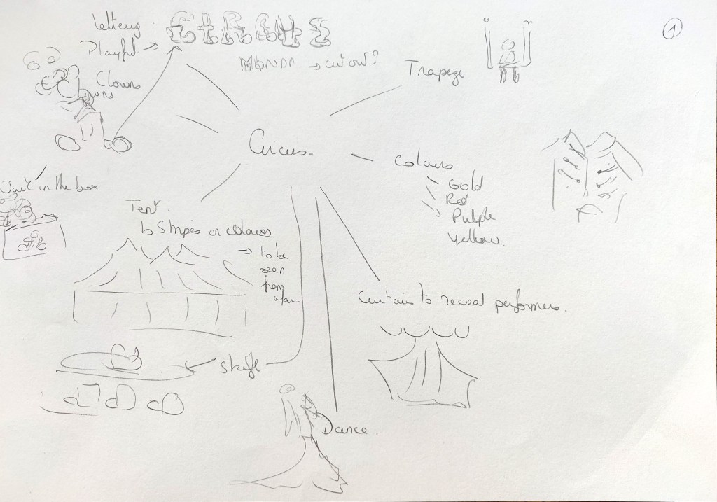
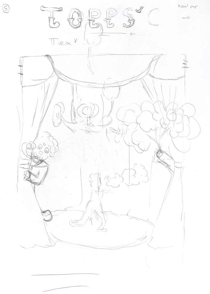
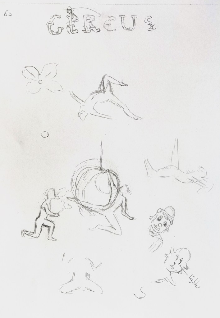
I then explored some ideas in my sketchbook.
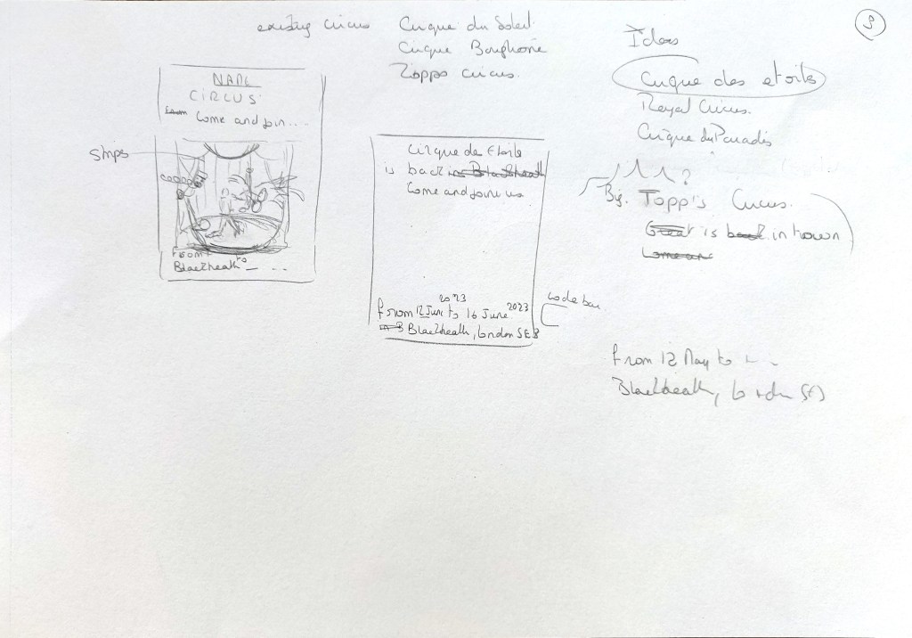
For the name of the Circus, I talked to my partner and we came up with that name. It’s a reference to the top tent with an added “p” to make it sound like a family name.
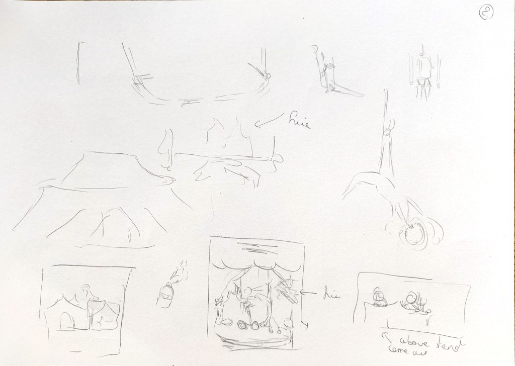
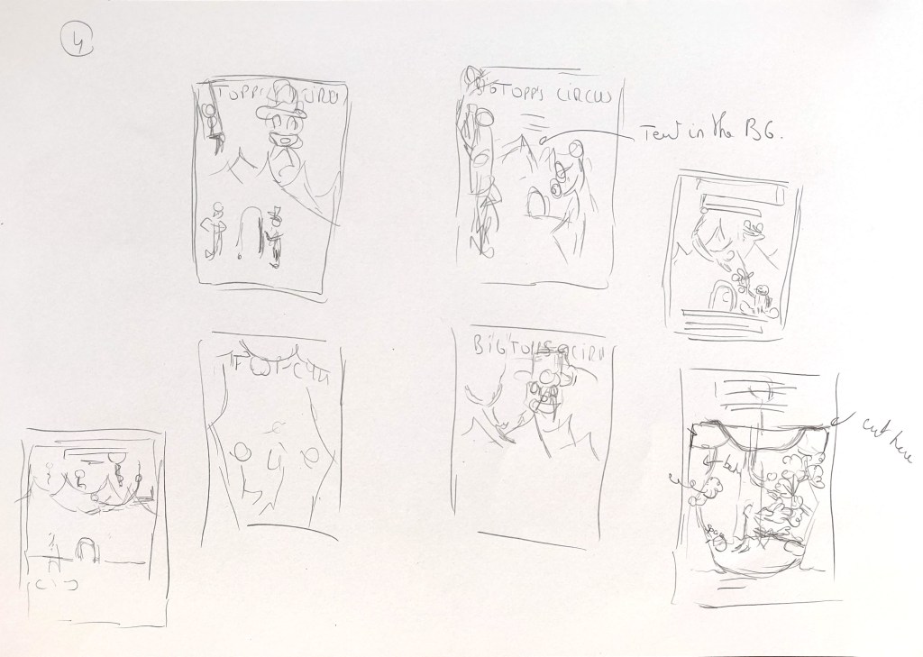
I decided to create a poster for a traditional small circus that would have some clowns, a gymnast and a fire breather. Many circuses do not have animals anymore because of animal welfare and I therefore decided not to include any. I sketched some of the elements in more details and use these sketches to create the shapes in Illustrator. I opted for Illustrator because I had no experience in that type of craft and I needed to see how the shapes would interact with each other before cutting anything.
This is the rough design I created in Illustrator.
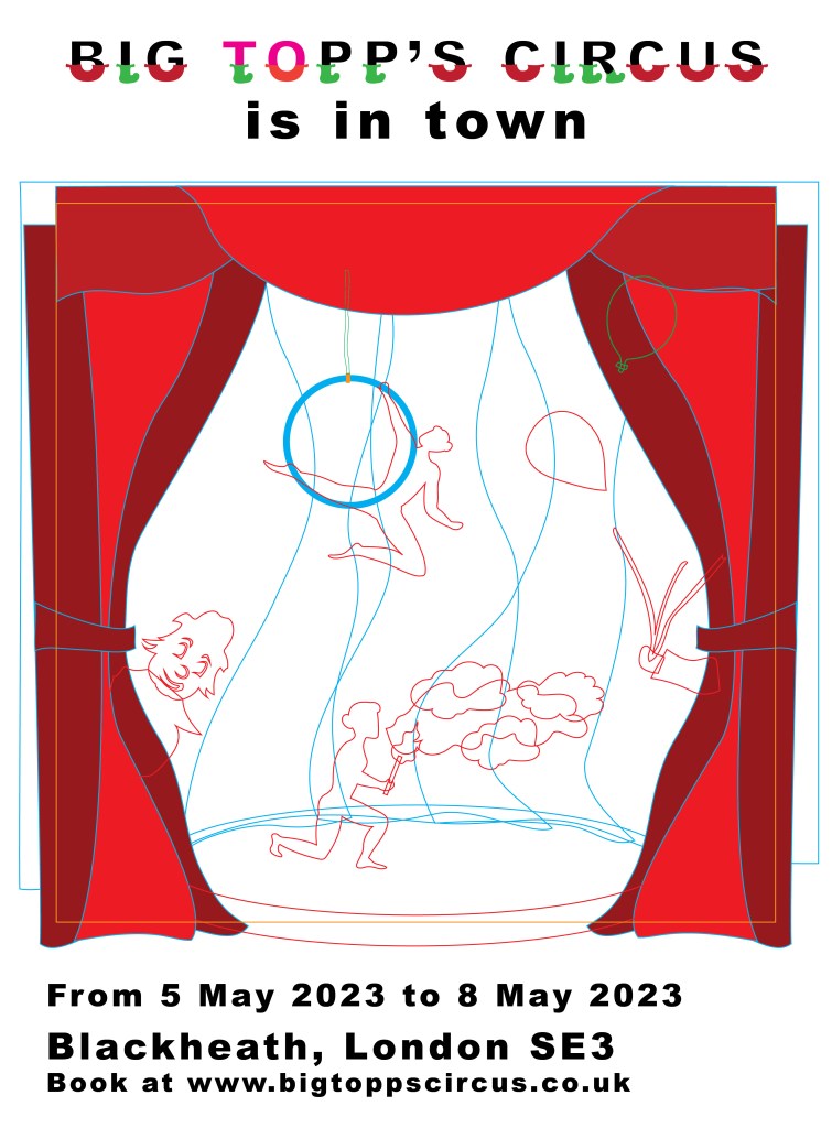
Once I had all the shapes, I separated them in Illustrator and printed them on the different sheets of coloured paper I had.
I then put everything together.
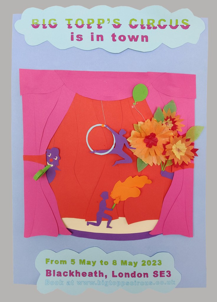

I like the photo taken near the window with the reflection of the sun (image on the right) as it emphasises the shadows and the 3D effect of the paper layers.
What went well
I enjoyed creating some mobile parts in the poster. The gymnast who is suspended by a thread can move from left to right.
I used some crepe paper for the flowers and the difference in texture brings an interesting element to the whole.
I enjoyed playing with layers and have the clowns behind the curtains with the flowers coming on top.
Challenges
I found the typography challenging. I first tried to cut out the text but, partly because I did not have the right tool, partly because I do no have much practice in this area, it didn’t work as the shapes were so small, so in the end, I printed the entire text. I was a bit disappointed as the idea was to have two shapes per letter for the first line (the name of the circus), so that the main title would stand out.
The whole poster looks quite rough, again due to the fact that I was experimenting with that type of collage.
At first, I thought of created a poster that would be like a pop up book partly open. I now think that this might have worked better and be more interesting.
What I learned from this exercise
I like the potential of paper craft but realised that it would require much more practice to obtain a better result.
I did not feel that I could be less creative with this technique but that I had to use my creativity in a different way. There is a lot of potential to play with depth and to create mobile shapes that brings some life to the whole project. When I did some research on the subject, I noticed that artists using this medium are often call paper engineers and there are a lot of elements to take into consideration when working with paper to make sure that the shapes fit and move as planned.
