Before exploring ideas, I reflected on the objects I would choose to decorate. I opted for a set including a plate, a cup and a saucer as I thought it would be interesting to adapt a series of illustrations to these three items. The plate and the cup have a different shape and the decoration on the saucer would be different from the plate.
I looked at standard dimensions online and selected the following sizes: Plate (22cm diameter), cup (8.4 by 6.4cm) and saucer (13.7cm diameter).
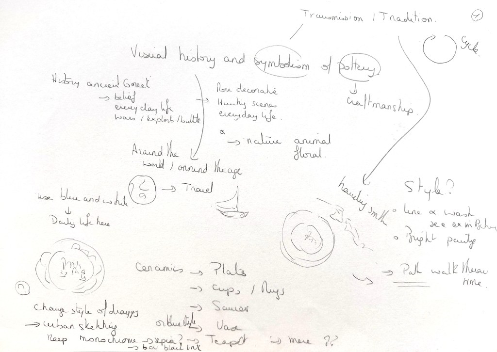
I then explored ideas that would work on ceramics and would be inspired from the history and symbolism of pottery.
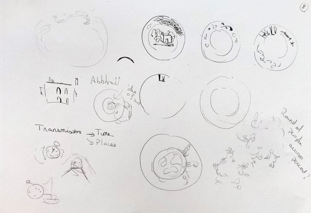

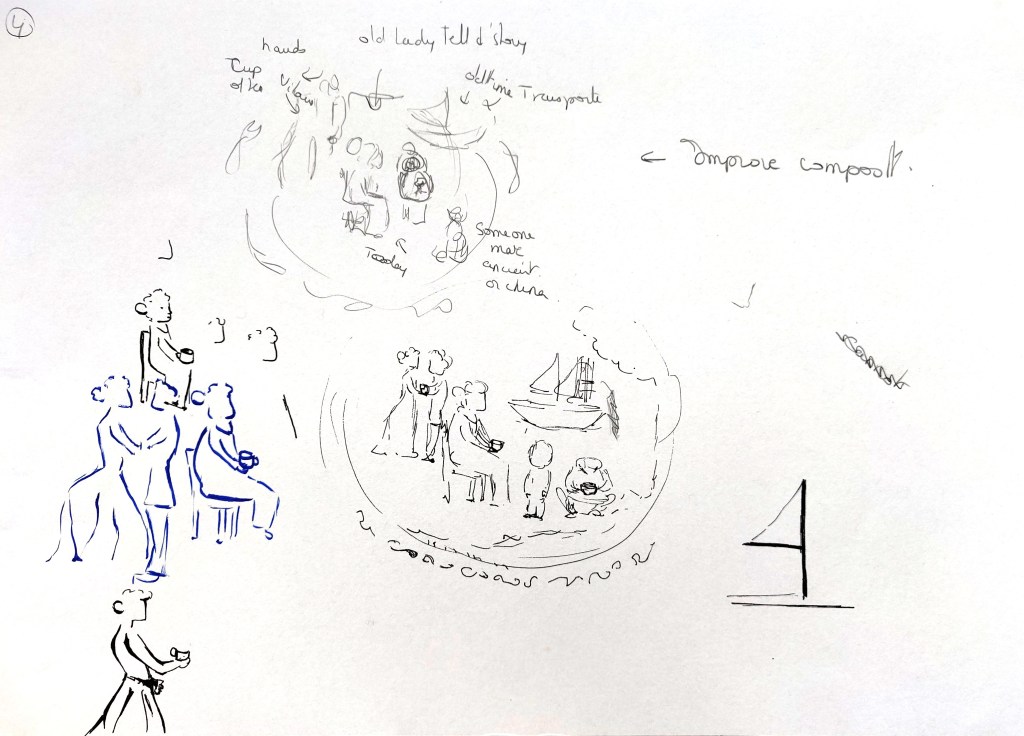

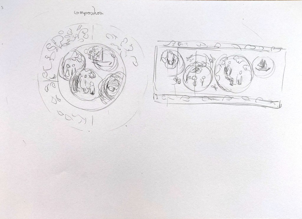
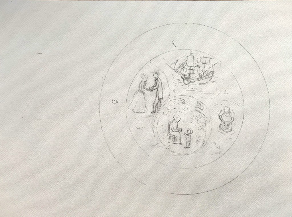
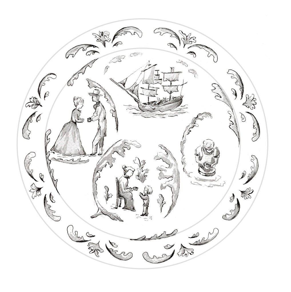
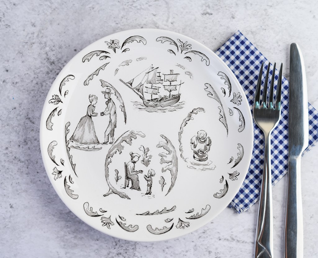
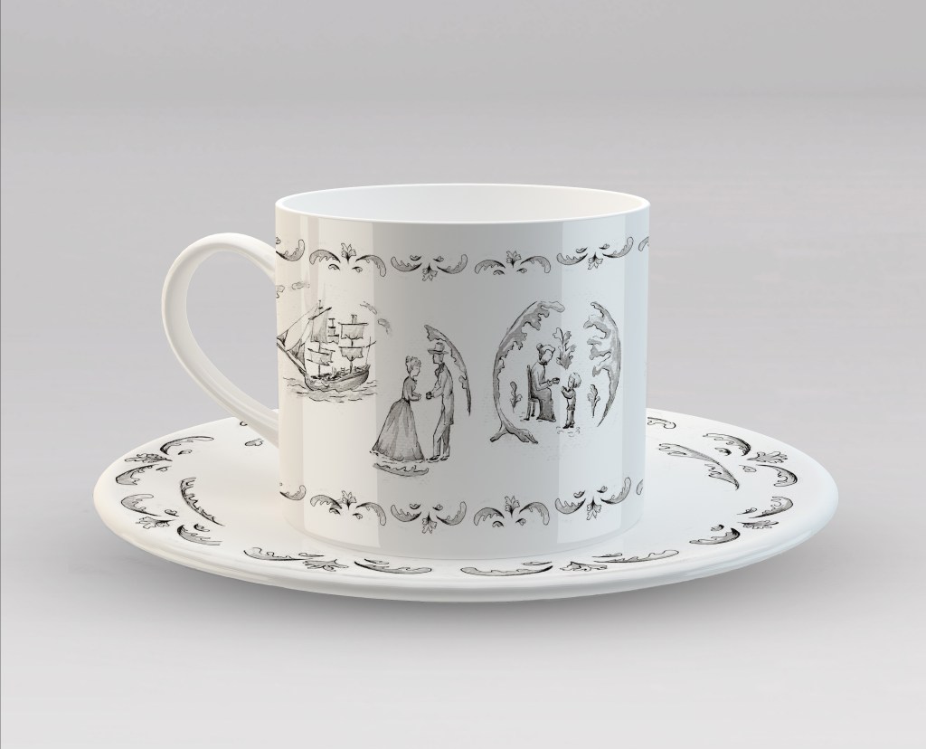
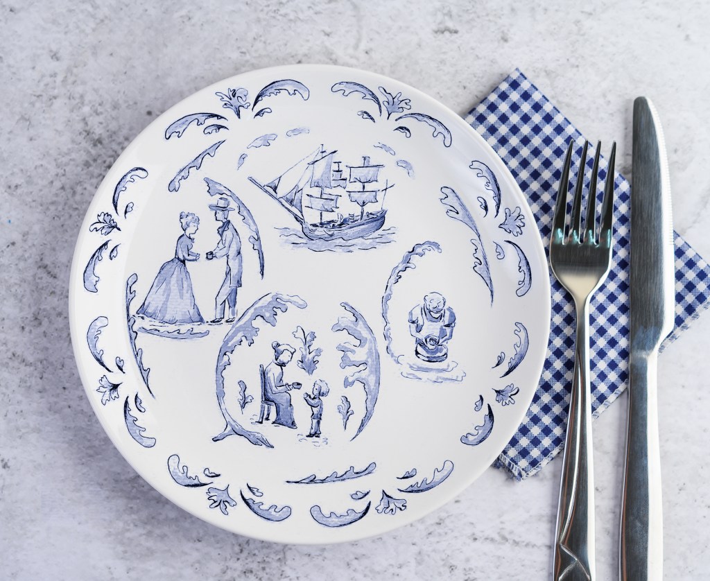
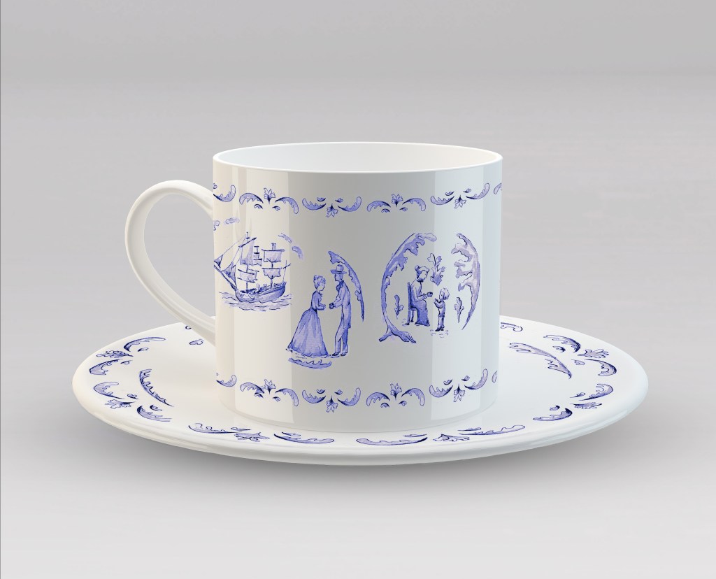
I thought about the value of these objects and how they could be transmitted across generations and developed a series of sketches that illustrate the travel of one of these items both across time and place. The grandmother is handing a cup to a child while telling a story, possibly the story of that cup, a man in the background is giving a cup to a woman in the past, a ship is sailing maybe carrying goods including the cup and a potter is creating the cup. I used floral elements to create circles and used the concept of circles throughout the design to illustrate the life cycle.
I experimented with different types of lines/pens to work out the style I was going to use. I wanted something modern, possibly a bit like urban sketching.
Once I had created a sketch I was happy with, I used pens of different thicknesses to draw the lines and a light watercolour wash. I decided to use only one colour and opted for black as I liked the idea of a monochrome style. My sketch is the same size as an actual plate so that I could see how the patterns and illustrations would fit. Once I was happy with the outcome, I took a picture and cleaned the illustration in Photoshop.
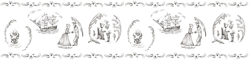
I then experimented with alternative colours. I also moved the illustrations around on a rectangle that would be the same size as the cup to see how they would work on the actual object.
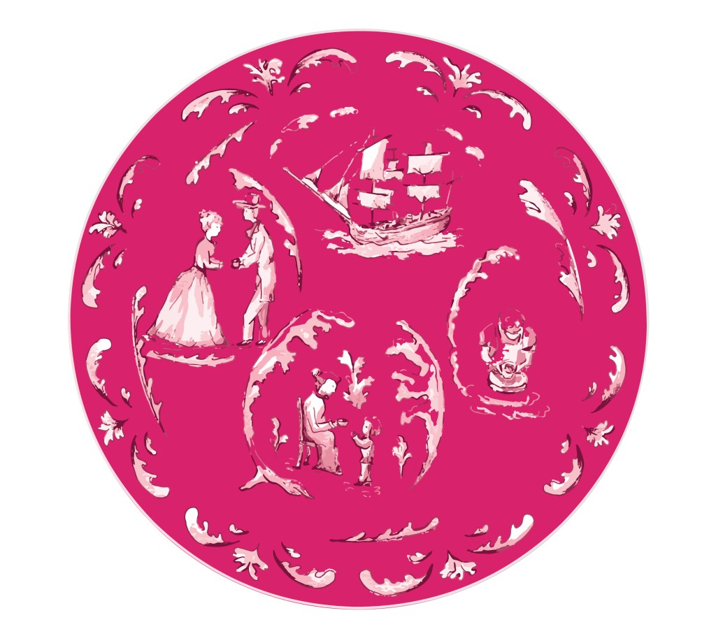
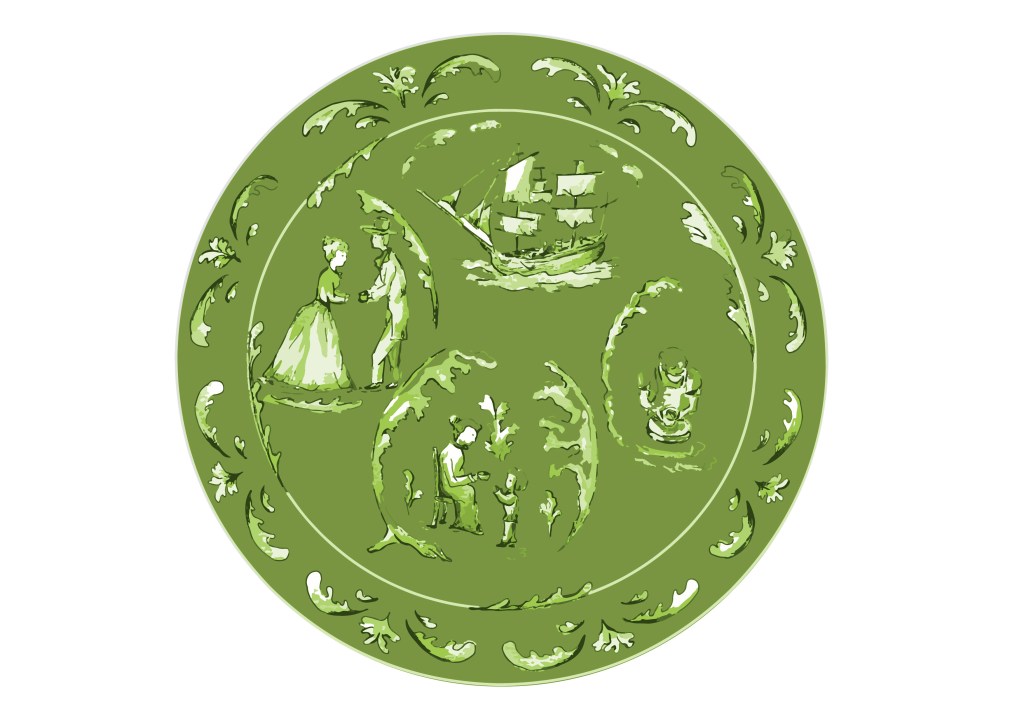
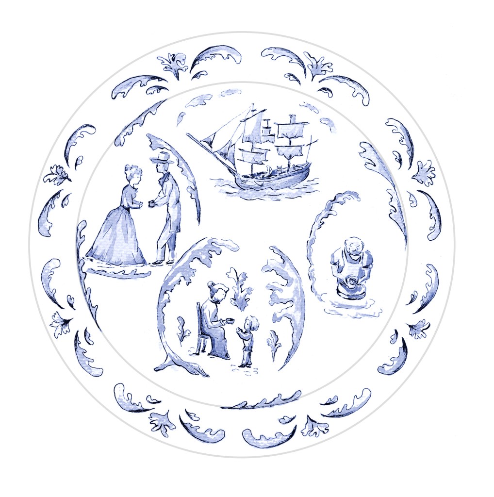
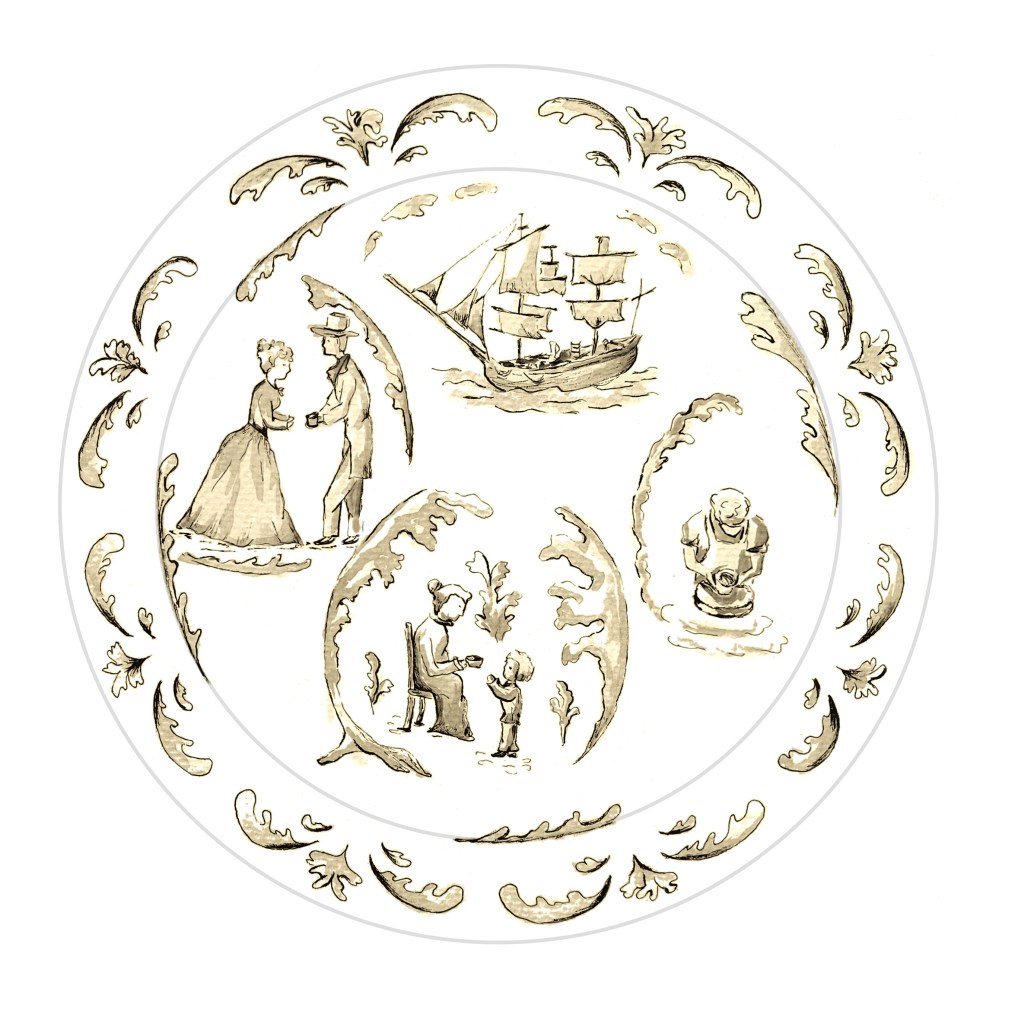
I like both the blue and sepia colours. A strong colour in a background like the pink and green examples could have been interesting with a different kind of illustration.
I created mockups with both the original colours and the blue version. For the saucer, I only used the pattern on the outside as the middle is covered by the cup.
What went well
I like the idea of the cup travelling and the story around an object. At the same time, the scenes depicted in these illustrations are the type of scene that could have been found traditionally on ceramics.
I am glad I kept the watercolour quite light and delicate. I think it works well with the black lines.
Challenges I have encountered
In retrospect, the cup is not obvious enough in the illustrations. It might have been better to choose a bigger object or one with a shape more easily recognisable.
Although I like the style of the illustration, there is something a bit old fashioned about it and maybe not as “urban” as I wanted initially. It might have worked better if the lines were flowing more and the whole had been more stylised with colours sometimes flowing outside the shapes.
With the floral patterns around the plate, I struggled to keep them exactly the same while keeping a style that seemed to flow naturally.
I enjoyed creating illustrations meant for a particular surface and to work out how the illustrations would interact with the various shapes. In the case of the cup for instance, I had to experiment to see how I would repeat the story. It is repeated twice so that when the cup turns, it slowly reveals the story. I like patterns and pottery offers a good opportunity to use them.
Sources:
Plate mock-up: Image by jcomp on Freepik (https://www.freepik.com/)
Cup and saucer mock-up: didikyul597200 / https://www.vecteezy.com/members/didikyul597200
