I read the plot of “The Metamorphosis” in Wikipedia (https://en.wikipedia.org/wiki/The_Metamorphosis) as I studied this novel a long time ago and could not remember it very well.
I then did some research (on Google images) for book covers. I also looked for other representations of the novel such as plays and films:
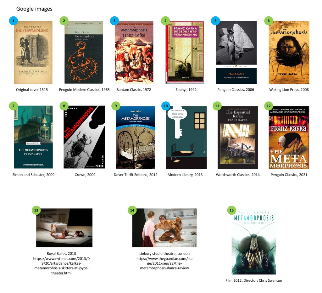
I also found an article online where the author collected as many book covers of the metamorphosis as she could find and it was very useful to be able to compare covers side by side (www.bookriot.com/metamorphosis-metamorphosis-cover-design-exploration/).
Here is what I have noticed about the designs:
A lot of the book covers use illustrations rather than photos. This might be to illustrate the fact that this a classic novel (first published in 1915). Also this is a story that is surreal and where a lot is left to imagination and an illustration leaves plenty of freedom of representation.
Regarding the themes explored, apart from a few exceptions, the covers can be divided into a few categories:
Some illustrates the spare room (see #10 above) as a way to evoke the limited life of the main character, Gregor Samsa. Sometimes the family and the close group of people who appear in the novel are the centre of the illustration (see #3 above). Again this highlights the limited circle of Gregor’s life.
However, most book covers focus on the beetle. The metamorphosis is at times evoked with an illustration that mixes the human and the beetle (#6 and #8).
The beetle is often represented as a shadow (#7), an outline (#2 and #9) or only in parts (#4). This reinforces the idea that Gregor has transformed into a creature that is so repulsive that it is quite impossible to look at.
In the article I read online (www.bookriot.com/metamorphosis-metamorphosis-cover-design-exploration/), it was mentioned that, when the book was first published, Kafka did not want a beetle on the book cover. This is an interesting fact and we can wonder about the reasons behind this decision. Maybe, before the book was a classic, he did not want to give the plot away on the book cover or he wanted to convey that what is really important is what happens in Gregor’s mind. It could also be that he wanted to leave the transformation to the imagination of the reader.
One thing is common to most covers and this is the mood. The colours are dark, often black. There is a limited numbers of elements and details in the illustrations highlighting the limited life of Gregor.
When I looked at other representations such as films or theatres for instance, I noticed the same thing, the focus on the beetle and the dark feeling.
My favourite is probably the illustration of the Wordsworth Classics edition (2014) (#11) as the creature coming out of the sofa illustrates well the impact it would have on others. The room is deprived of any personal object and is old-fashioned and tired, reinforcing the distress of Gregor. I also like the original as we can see the horror and despair in the body language of the character.
It is interesting to see how a book cover can highlight certain aspects of the story and this can evolve with times. A classic might be illustrated differently after several years when the story is common knowledge for instance.
