When I looked at examples of book and magazine covers that use illustrations, I noticed how the text and the images can interact in different ways.
Often, the illustrator creates some space for the text by having an area free of too many details as can be seen in the examples below.
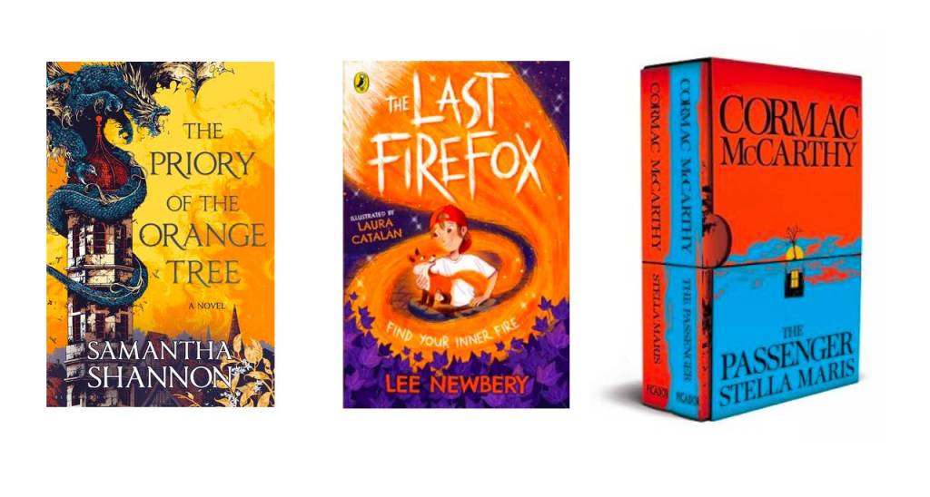
When it comes to the titles of the books, these three examples work well as there is plenty of contrast between the text and the background. However, on the cover on the left, the name of the author hides the lower part of the illustration that might have been interesting and give some context to the location of the tower. Also because the illustration is quite busy, the name does not stand out so well.
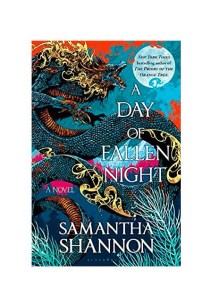
The same happens in the cover below but this time with the title of the book. The background is very busy and, as a result, the title is not so easy to read.
Other times, the interaction between the illustrations and the text can be playful and this is something that often happen with children’s books, but not exclusively.
In the first example below, the cat is sitting on the title, the “o” is a globe and there are many other elements interacting with the heading. On the second cover, the heading is intertwined with the branches. Finally, on the last one, the heading is the dress. I find that kind of illustration quite effective. The limited numbers of shapes and colours makes the whole quite crisp and offers a lot of contrast. It is a shame that the text at the bottom is on top of the foot.
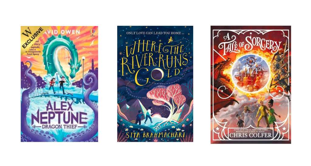
The typeface can be drawn so as to enhance the message conveyed in the illustration. In the first example below, parts of the letters are arrows. In the second example, the title evokes the flow of a river and in the last one, the typography hints at ancient calligraphy associated with sorcery.
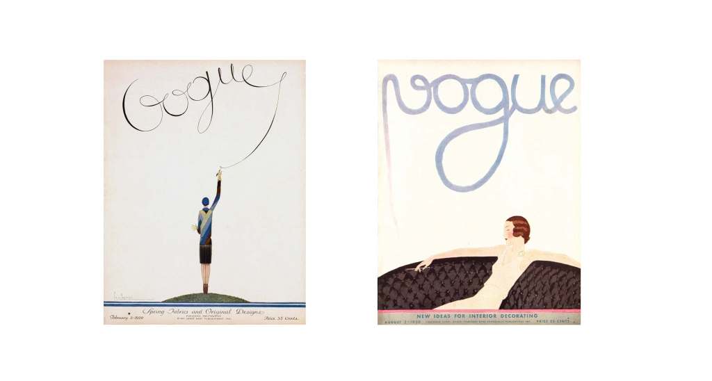
The text can be part of the illustration as demonstrated in the examples below. On the first magazine cover, the woman is writing the name of the magazine and in the second example, the smoke takes the shape of “Vogue”. These classic covers illustrated by Georges Lepape and André E. Marty work particularly well as there is a simplicity and a large background that conveys an eery feeling and offers a lot of contrast.
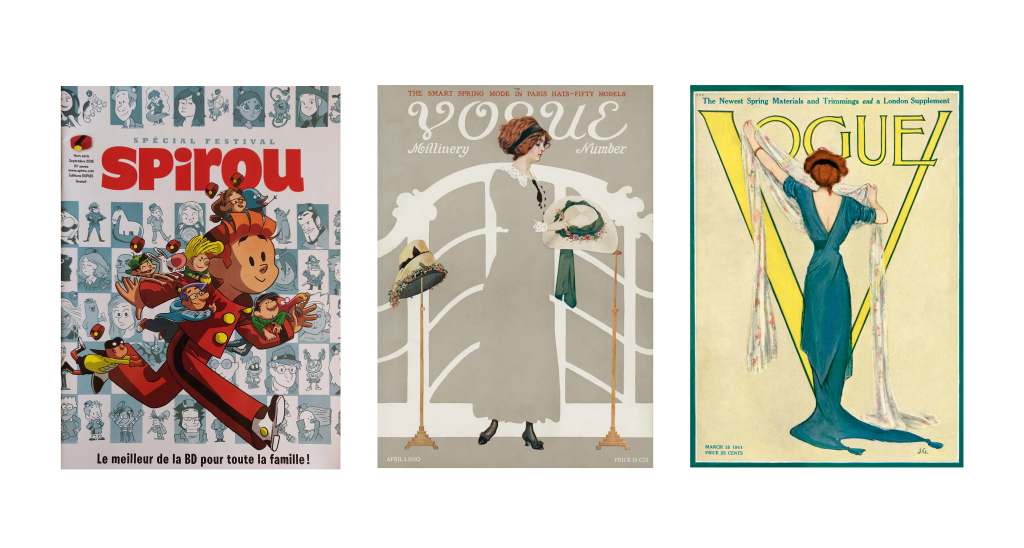
Another technique often used consists in having part of the illustration above the title. This gives a dynamic feeling. It is important that the text is still recognisable. In the second example below, it works because the reader would know that this is Vogue and does not need to see the whole name.
In general, the choice of typography is important as it should reflect the mood of the illustration. It could be modern, traditional, playful and much more.
As we have seen in the examples above, contrast is an important factor to make sure that the interaction between the text and the image works well. They should complement each other.
Sources:
The book covers can be found on the Waterstones website: https://www.waterstones.com/
The covers of Vogue magazine come from the Vogue website: www.vogue.com/slideshow/vogue-covers-photos?mbid=social_onsite_pinterest&epik=dj0yJnU9eTNJR2l1TDBXWlYzWUthNERUMFVCYlMxdWJxZElkdzImcD0wJm49X2JOemZYMGduNXNDQWFGMTBaeVNidyZ0PUFBQUFBR0x2ejBv
The cover of Spirou is a photo I took of a magazine I have at home.
