I went to the Comics Art Museum when I was in Brussels. I revisited the pictures I had taken when I was there and borrowed a few graphic novels from a friend. Looking at the pictures I had taken was interesting as it reveals a lot about the illustrations and styles I am attracted to. Here are some reflections about some of the comics and graphic novels I found interesting.
Tintin (Hergé 1907-1983)
I read Tintin when I was young and always enjoyed it.
Tintin books would appeal to older children as there is a lot of text and stories carry on over several pages.
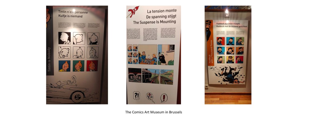
The characters are easily recognisable and all have distinctive features including Tintin and his hair always standing up and Captain Haddock and his beard. I read that the colours used were very specific (Tintin’s jumpers was always the same blue for example) (https://tintinomania.com/tintin-methode-travail-herge-studios). Some notes in the museum explained how Tintin is no one so that everyone can identify with him. He is drawn with a few lines and shows little emotion so that the readers can project their own feelings.
The structure is also quite interesting as each page always ends on a cliffhanger so that the reader is compelled to keep reading (https://tintinomania.com/tintin-methode-travail-herge-studios).
There is quite a lot of text on top of most images and some codes are followed so that the reader understands easily what is going on. The size is bigger if the character shouts, yellow can indicate that the noise comes from the radio or other indirect sources,…
The lines and the way colours are applied contribute to crisp illustrations. As a result, even when a lot is going on, we can identify the different characters, the background and what is taking place. The lines are very neat and quite minimal. Only solid colours are used except on the cheeks to express emotions (https://tintinomania.com/tintin-methode-travail-herge-studios). There are no shadows, probably to simplify images that are meant to be small.
Nothing is left to chance. Again, on a website where they show in detail how Hergé used to work (https://tintinomania.com/tintin-methode-travail-herge-studios), they explain how the backgrounds were drawn by collaborators who would do some research on the subject beforehand to make sure that all details were accurate.
All these elements put together results in fresh and dynamic illustrations, that reflect the adventures of the characters.

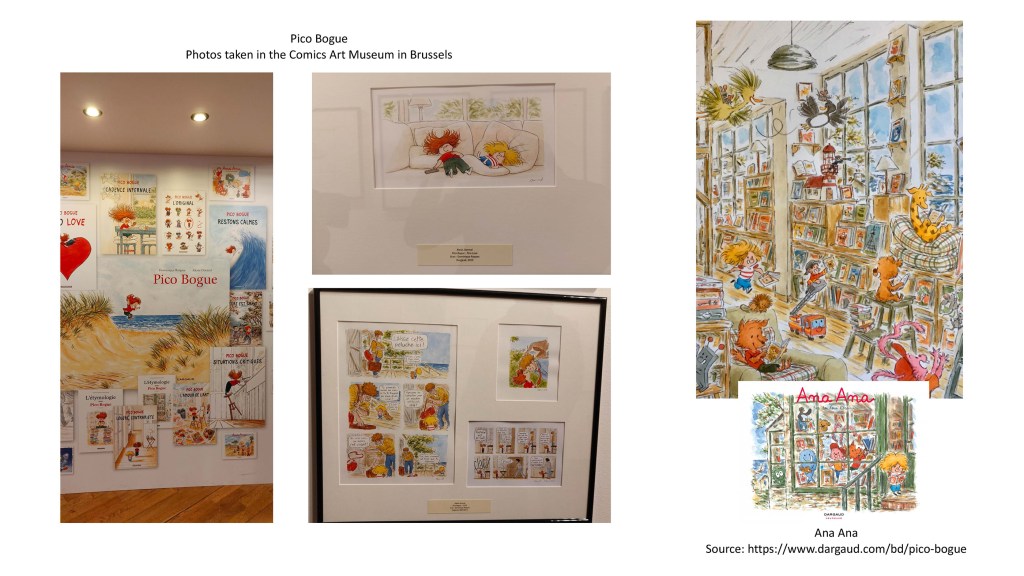
Pico Bogue and Ana Ana (Illustrator: Alexis Dormal)
Alexis Dormal works with his mother, Dominique Roques who writes the stories (in French).
I first saw the illustrations created by Alexis Dormal in the Comics Art Museum.
Alexis Dormal and Dominique Roques first created Pico Bogue, aimed at an older audience that he describes as grown-ups, teenagers, and grown-up children (https://www.actuabd.com/Alexis-Dormal-Pico-Bogue-Quelles-que-soient-les-circonstances-il-serait-dommage). They then created another series Ana Ana for younger children. Ana Ana is Pico Bogue’s sister.
The style of illustration and the colour palette are similar in both series but the themes and stories differ.
I looked at extracts on the publisher’s website (https://www.dargaud.com/bd/pico-bogue/pico-bogue/pico-bogue-tome-13-sur-le-chemin-bda5388450) and the layouts for the images and text is quite different. In the Pico Bogue series there are up to 10 thumbnails on a page whereas there are only a few images per page (sometimes only one) in Ana Ana books. This reflects the age of the audience.
I really like the illustrations in both series. The characters are unique thanks to Alexis Dormal’s style of drawing. His illustrations can contain many details like the illustration in the library (see below) or describe a scene in a few lines (when the two main characters lay on a couch). In all cases, the images are full of life. The colours are bright and warm, the lines are dynamic with characters in movement. His style works very well with the stories that are funny and heartwarming.
Captain Britain
Although I am not particularly familiar with Marvel graphic novels, I thought it would be interesting to look at a completely different type of illustration to compare different styles.
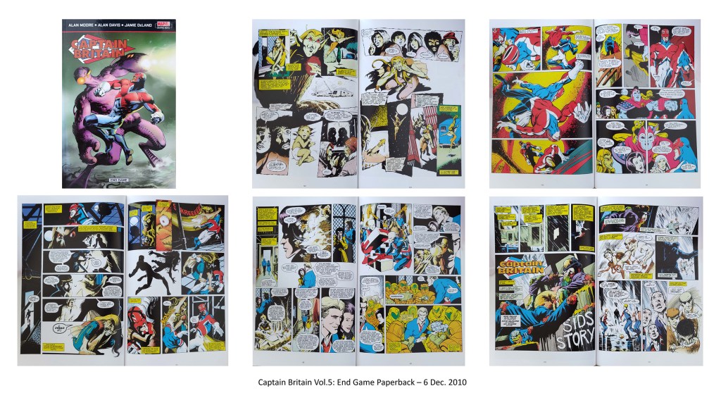
I looked at the volume 5 (“End Game”) published in 2010 (Illustrator: Alan Davis).
The audience for graphic novels about superheroes is older (teenagers and adults) and this is quite obvious in many ways. The colours are darker, some pages can contain a lot of black or very dark colours to illustrate the seriousness of the situation.
The characters are more adult-like and can be quite scary at times.
The images and the text are more complex, with a lot of happening in terms of action and number of characters.
These novels are interesting to look at to study how action is illustrated: extreme positions of bodies, intense facial expressions, lines to express action and bubbles to illustrate noises. The size of the thumbnails varies and they are irregular to again emphasise the action.
It is also interesting to note that the backgrounds are often omitted in this novel as if the characters and the action are really what matters.
Doctor Who
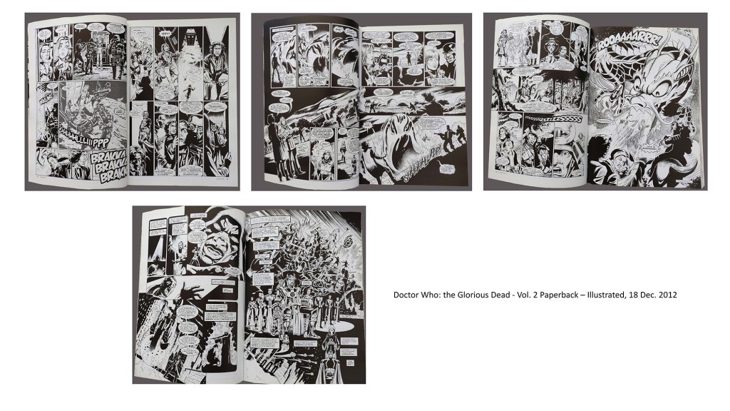
I looked at a version in black and white that I borrowed (Doctor Who: The Glorious Dead – Vol. 2 published in 2012).
This book is very interesting. There are no shades of grey and all the action and contrast have to be expressed in two colours and this is very cleverly done. At times the shadows define the shapes, creating a very dramatic effect.
Again, the audience would be older and this graphic novel is all about the action.
It is very interesting to look at such different styles and to see how they adapt to the audience with the colours, the complexity of the images and text, and the way characters are drawn.
