Brief
- Produce a series of black and white illustrations in response to a popular fairy tale or folk tale.
- The illustrations will sit alongside the text to enhance the reading experience. They will need to bring the characters, locations and plot of the story to life
- Make the most of the dramatic qualities of black and white
Story
I researched popular fairy tales such as Hans Christian Andersen and Brothers Grimm’s fairy tales, the Arabian Nights and Aesop’s fables. In the end I liked the idea of a short story with a moral and chose one of Aesop’s fables: “The Fox & the Stork”. I found one version of the fable on the following website: https://read.gov/aesop/016.html.
There seems to be slightly different versions of the same tales online. Although these stories were accredited to Aesop, a slave who lived in Greece around 500 or 600 BC, their origin is not entirely clear and they might have been orally transmitted over generations (https://en.wikipedia.org/wiki/Aesop%27s_Fables).
The plot
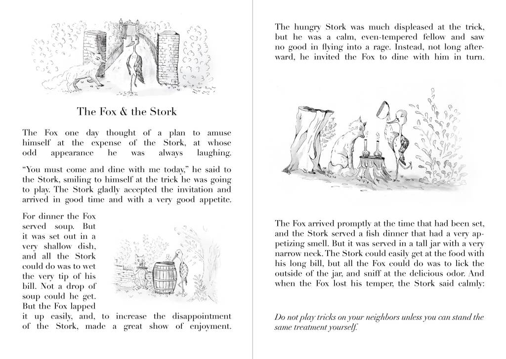
- Introduction of the characters: The stork and the Fox. The fox, amused by the stork’s appearance wants to play a trick on him and invites him for dinner.
- The fox serves soup in a shallow dish, so the stork cannot eat. The fox makes sure he shows how much he enjoys his meal.
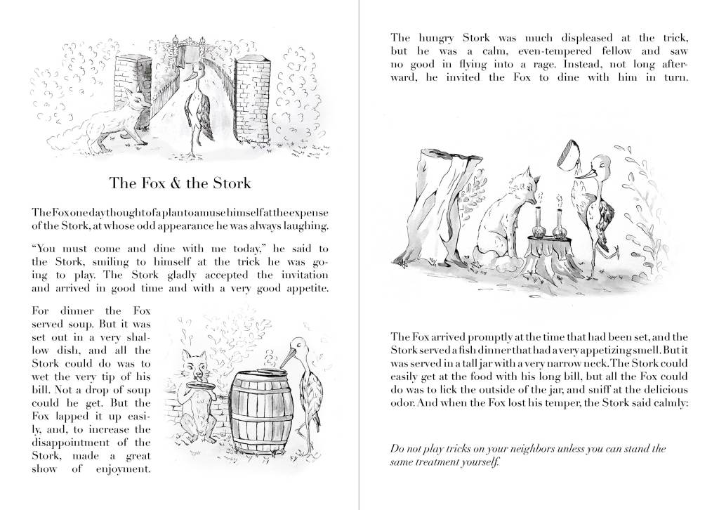
- The stork invites the fox to take his revenge. He serves a delicious dish in a long jar so that, this time, the fox cannot eat.
- As the fox loses his temper, the stork says to the fox: “Do not play tricks on your neighbours unless you can stand the same treatment yourself.”
I looked on Google images to see how others had illustrated this fable. There are many illustrations of the stork and the fox trying to eat. The animals are represented with more or less realism, they sometimes wear clothes and are sitting at a table in a house, other times they are eating on the floor,…
Elements to take into consideration to position and size the illustrations
- The illustrations should complement the story. Ideally they would make the reader want to know more and read the text.
- A few options are possible regarding the position of the illustrations: As a header above the title, as vignettes with the text around or as images that take a whole page.
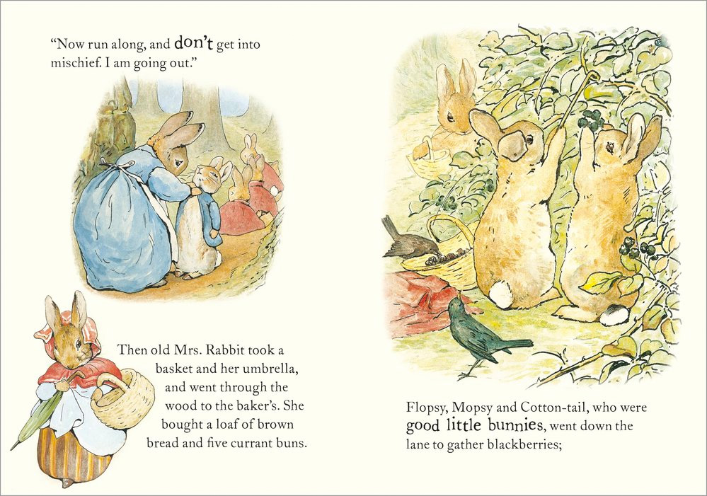
After taking all these aspects in consideration, I decided to create a two-page spread that would be aimed at children. It would be something similar to the example below (https://eu-shop.scholastic.co.uk/products/The-Tale-of-Peter-Rabbit-Beatrix-Potter-9780723281429):
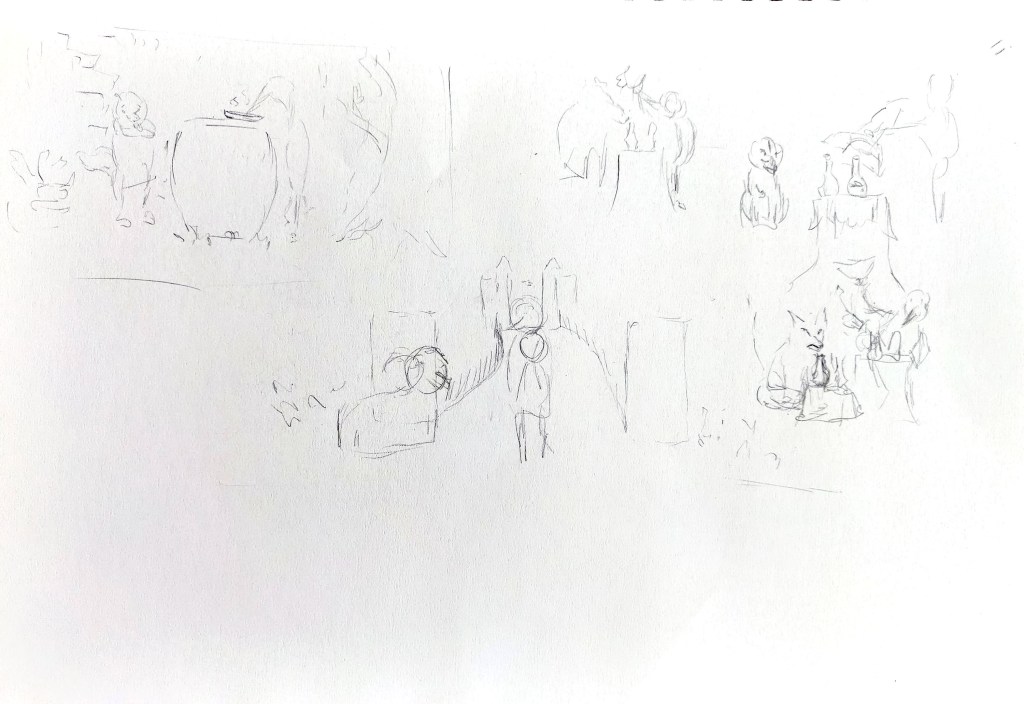
The spread could be part of a booklet containing several fables. I opted for an A5 format and created some mock ups in InDesign to see how the illustrations could be arranged around the text. I adjusted this mock up a few times and created new versions as I developed my illustrations:

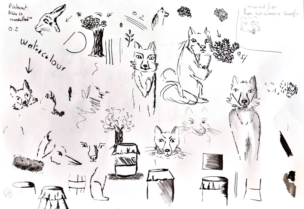
I also created a board on Pinterest with examples of black and white illustrations:
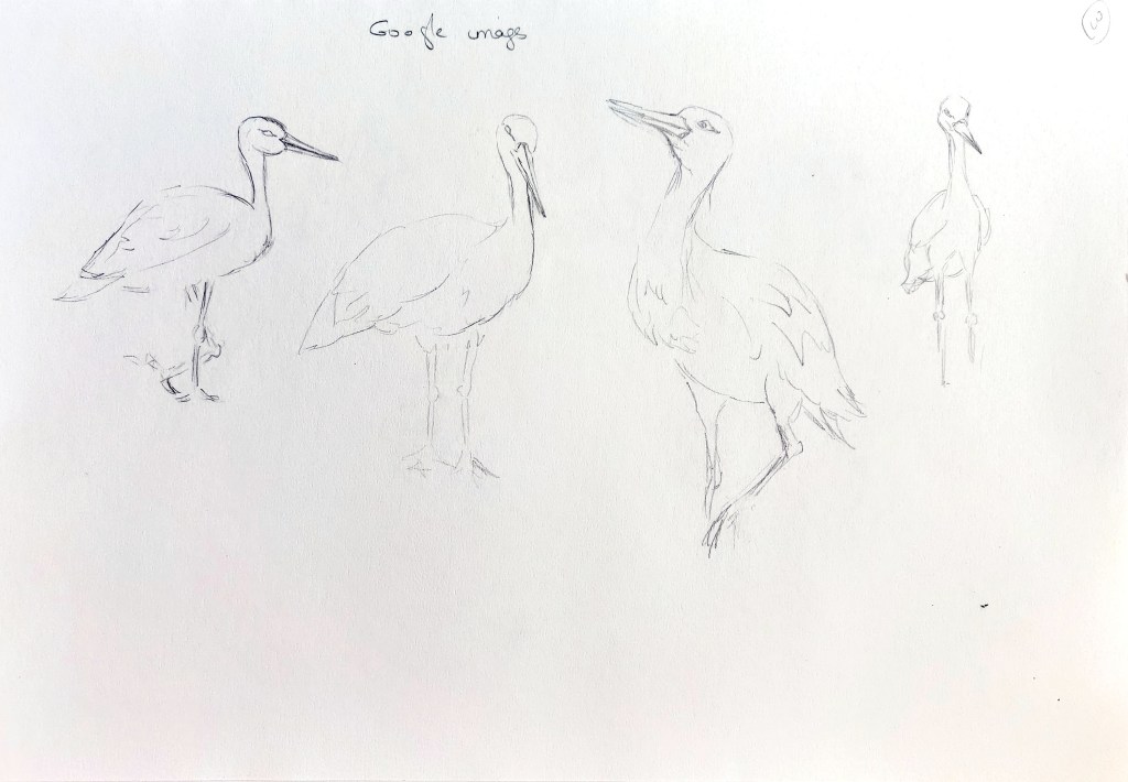
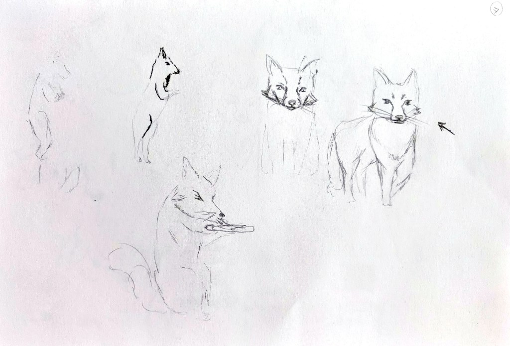
I then explored ideas in my sketchbook and created thumbnails. I drew storks and foxes taking my inspiration from Google images to become more familiar with both animals and then experimented to give a personality to my characters through sketches. I also tested different styles and lines to create the illustrations in black and white.


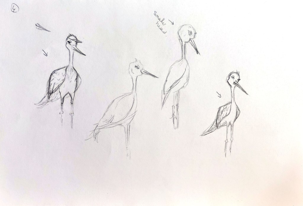

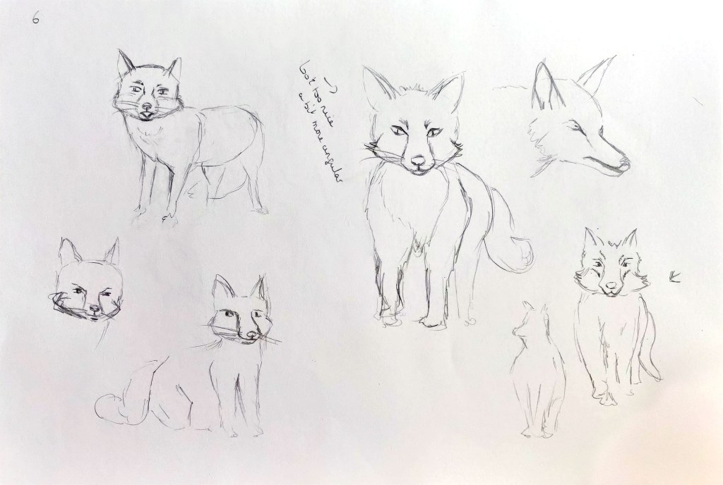

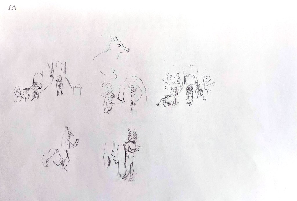
Initially, I thought of having four illustrations but this seemed too much for that amount of text and visually, I preferred an odd number.
The first illustration introduces the character and the location and is above the heading. The second is a vignette as the story progresses and represents the fox serving soup to the stork. Initially I meant to create one where the stork would reveal his dish to an impatient and hungry fox and another image where the stork enjoys his meal. I combined both images with the stork revealing the dish while the fox smells it and shows his disappointment. I thought that the stork enjoying his food could be left to the reader’s imagination. At the same time, it was a way not to tell the entire story, which means that the reader would have to read it.
Below are the three illustrations. I first drew them with pencils, then added black lines and a watercolour wash.
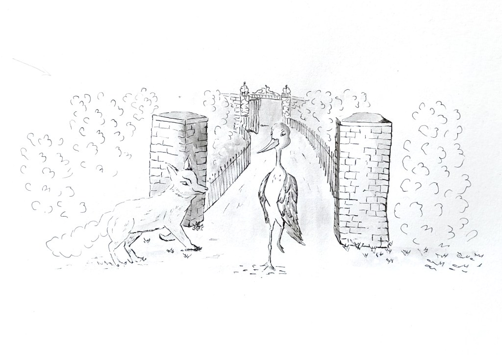

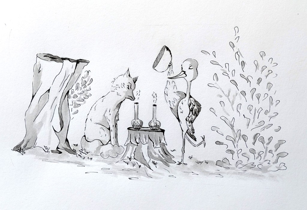
I then improved the illustrations a bit in Photoshop and inserted them next to the text in InDesign. I created two slightly different versions with different levels of cropping. “I took into account the story to make sure that each illustration was relevant to the text near the image. In fact, in the original version I found online, the two paragraphs on the second page were only one paragraph. I split the text and inserted the illustration in the middle as I thought it worked better that way.
I think I slightly prefer the second one where I cropped some of the images a bit more:
What went well
I enjoyed working in black and white and showing textures with different patterns (wall, leaves, … ). I wanted to create images that would be quite traditional and would reflect the fact that this is a story that has been told through generations and I think the line and wash technique works well in that case.
I wondered at first how to represent the animals. Should they walk like humans and be clothed? I somehow wanted to convey the idea that there is a whole world that humans do not see where the animals interact with each other, but keep them as animals at the same time. This is why I used a wine barrel and the trunk of a tree as tables as they could be items found in some parts of the countryside. As to the animals’ postures, I extended their natural postures to go towards human postures at times without making them entirely human. For example, in the second illustration, the fox is sitting and holding a bowl of soup.
I tried to give a bit of a background to the three images. For the first one, I took my inspiration from a gate on the side of Greenwich Park so that the stork can make a grand entrance. The fox on the other hand is coming from the side as if he was waiting for the stork to play a trick on him. I kept the other backgrounds more simple as the focus was meant to be on the tables.
I like having small illustrations that highlight different parts of the story rather than an illustration that would take the whole page. There is something delicate about small vignette illustrations.
Challenges I encountered
The idea was to have thicker lines to suggest shaded areas or to add contrast but I am still too hesitant with line weights. As a result, the texture of the feathers is not really what I was after and the fox’s tail lacks contrast. The same happened with the watercolour. I added a bit more shadow in Photoshop to partly rectify this. As a result, I am not sure that I fully took advantage of the black and white to create a dramatic effect.
What I learned from this exercise
I really enjoyed creating illustrations that complement a story. The research I did before this exercise about the relationship between the text and the images helped me to take certain elements into consideration such as the parts of the story I wanted to illustrate and the position of the illustrations in relation to the text.
