For this exercise, I selected a building at the top of Greenwich Park, the Ranger’s House (https://www.english-heritage.org.uk/visit/places/rangers-house-the-wernher-collection/).
As well as drawing some sketches on location, I also took pictures of the place. Here are a few of them.
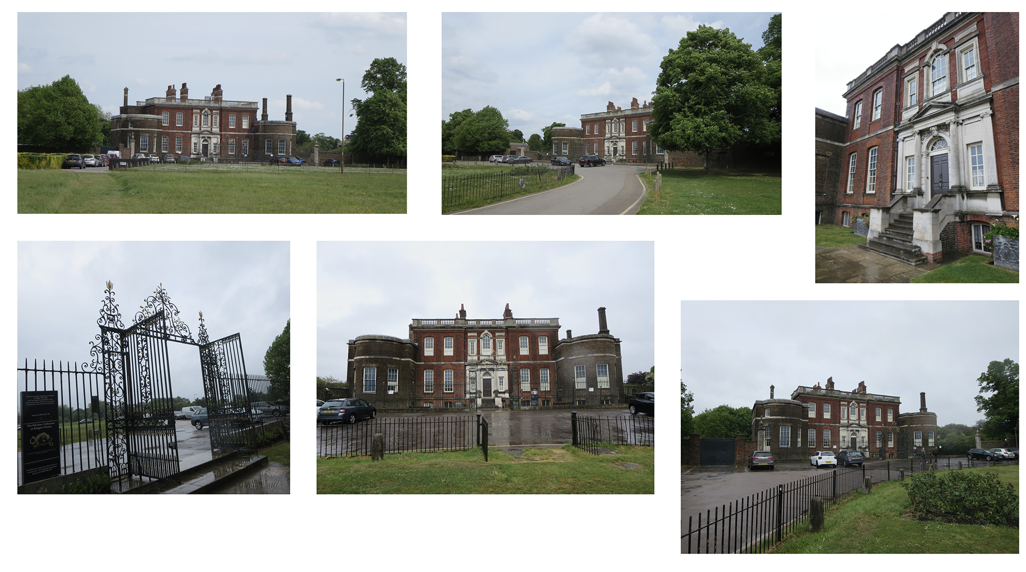
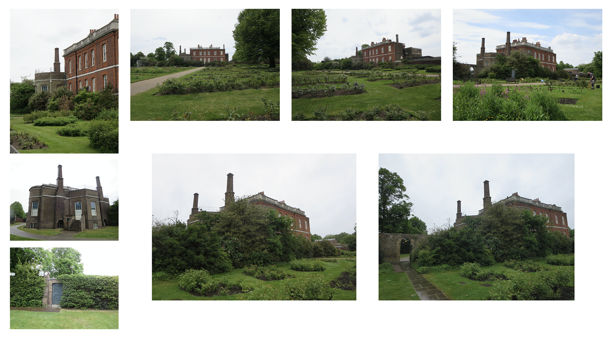
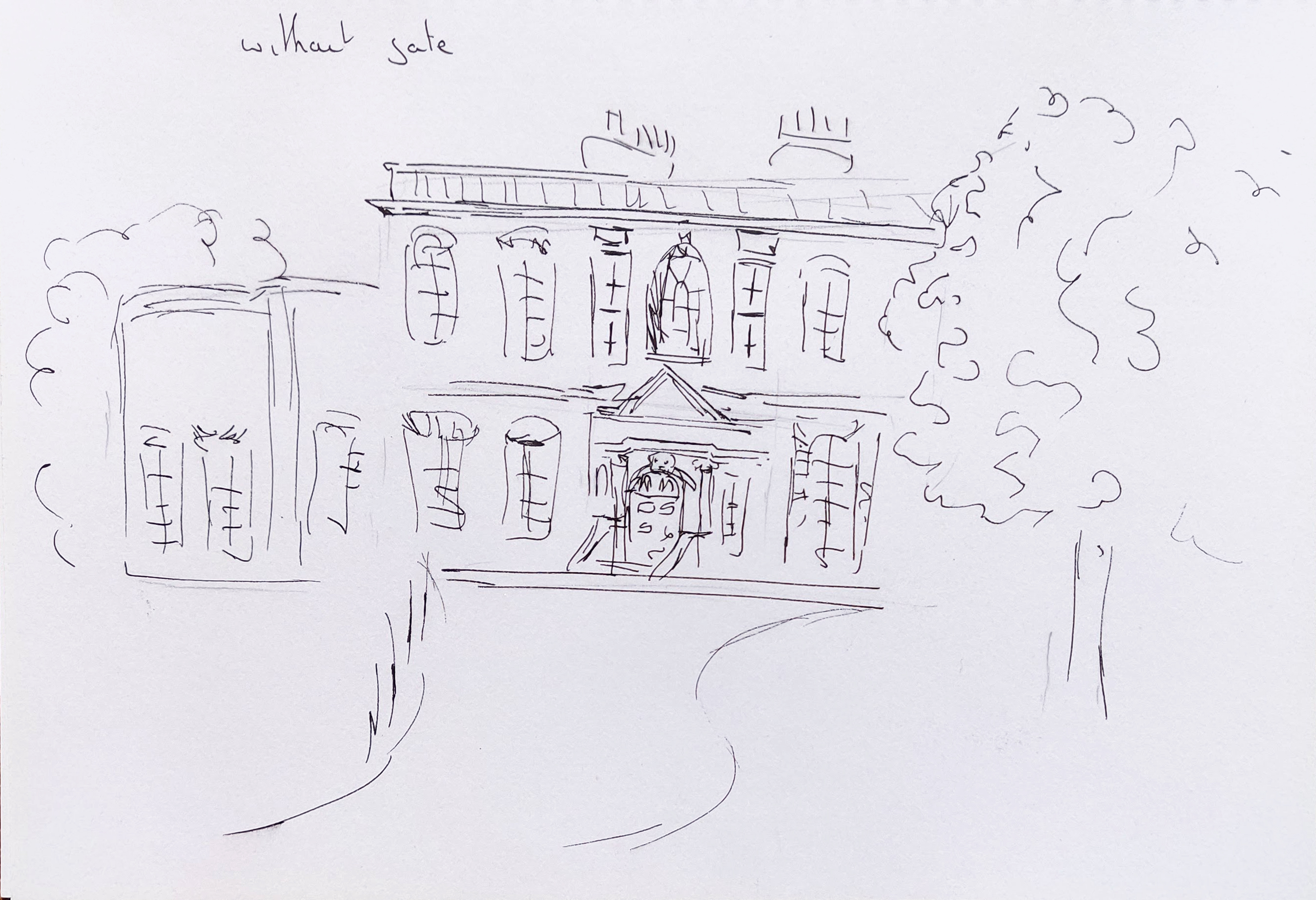
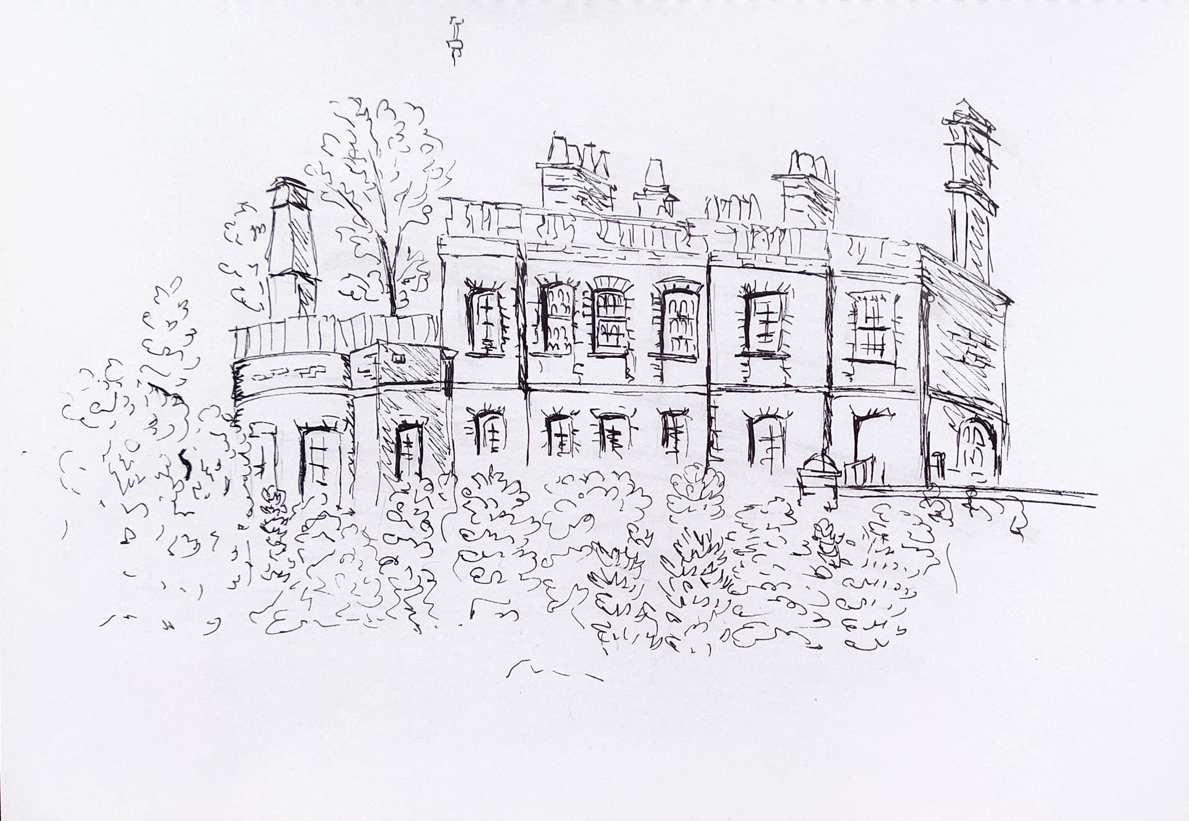
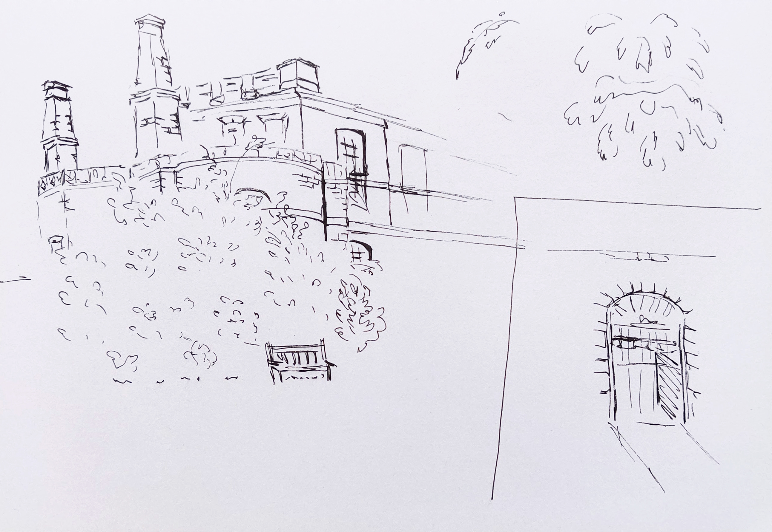
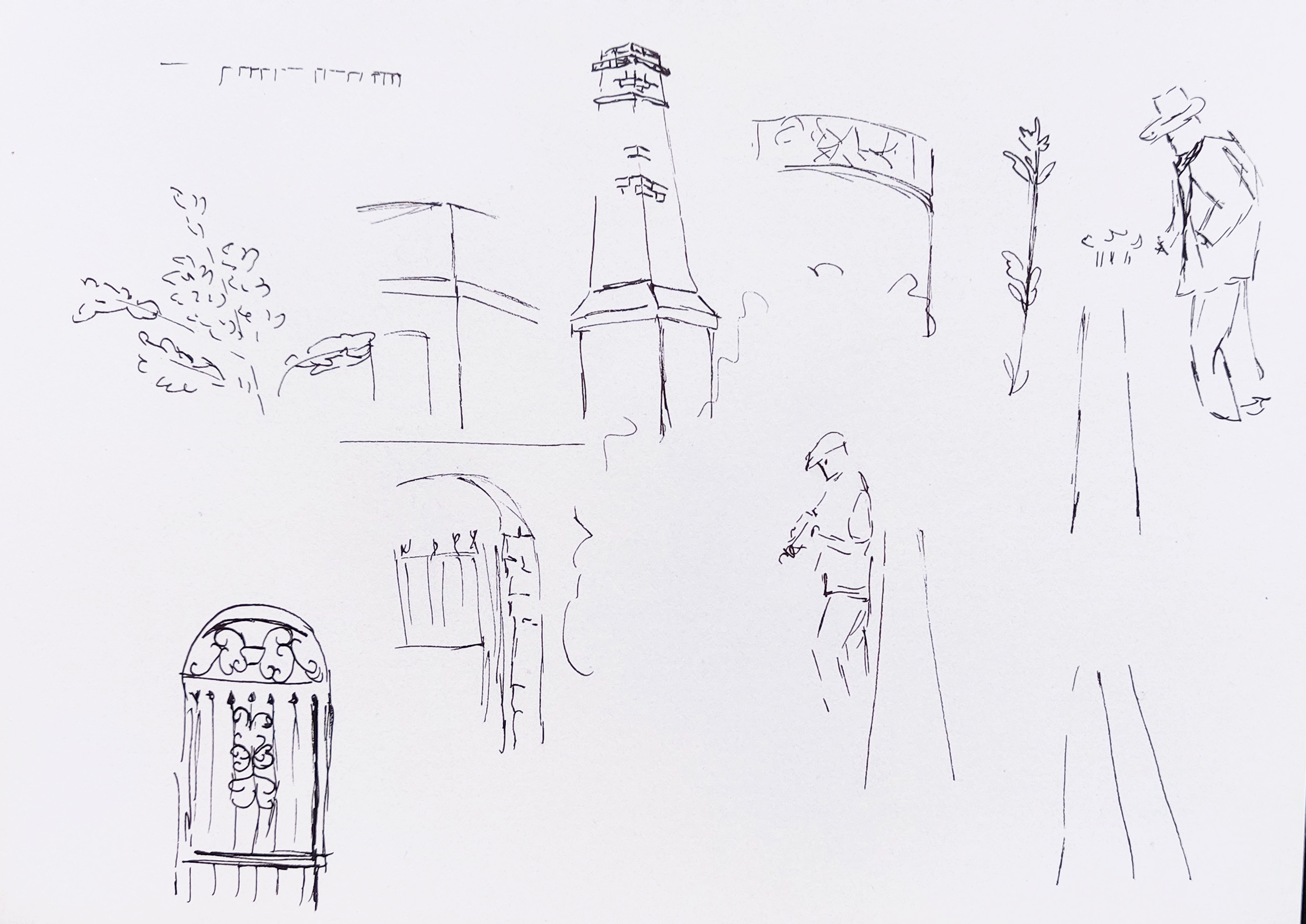
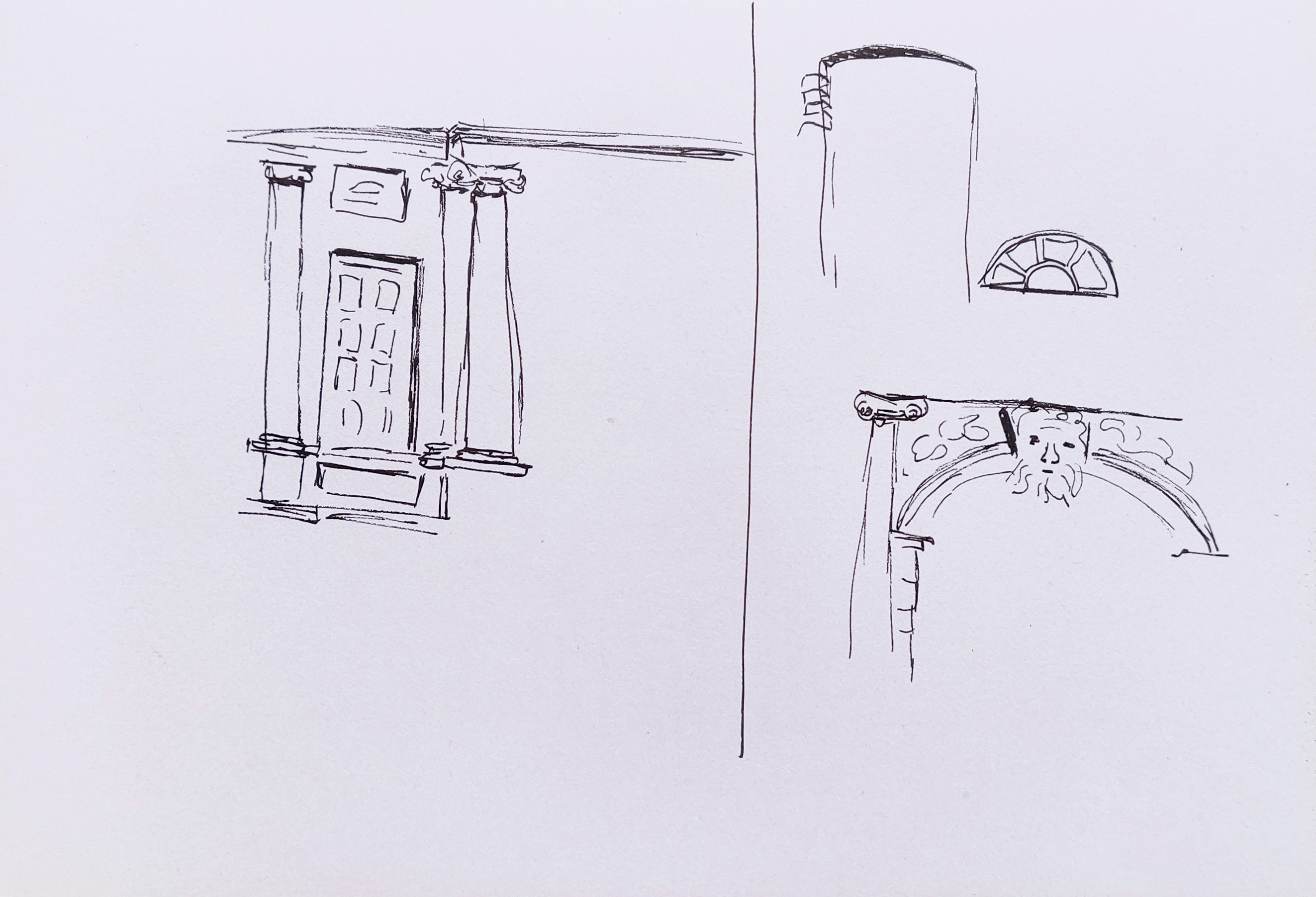
On the first day, the gate was closed as the house is not opened to the public every day but I drew some sketches in my A5 sketchbook from the front and the back of the building.

I went back when the house was opened and visited the building inside to get a feel of the place. Unfortunately, pictures were not allowed for copyrights reasons as the collection exhibited there is on loan. It also rained all day and I could not draw on location as a result.
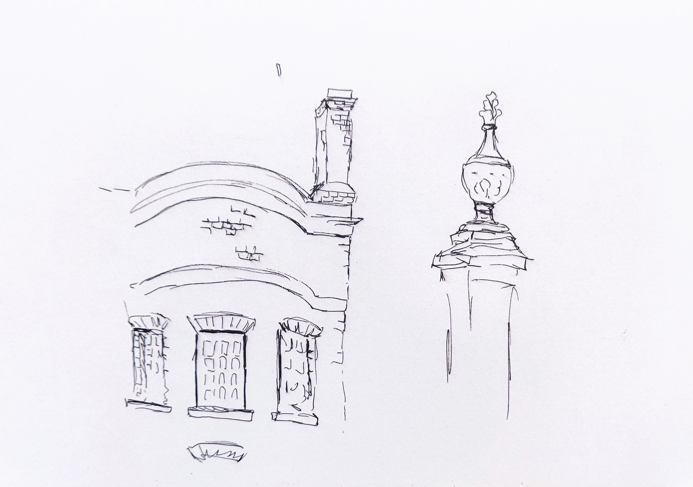
I created some more detailed sketches at home in an A4 sketchbook.

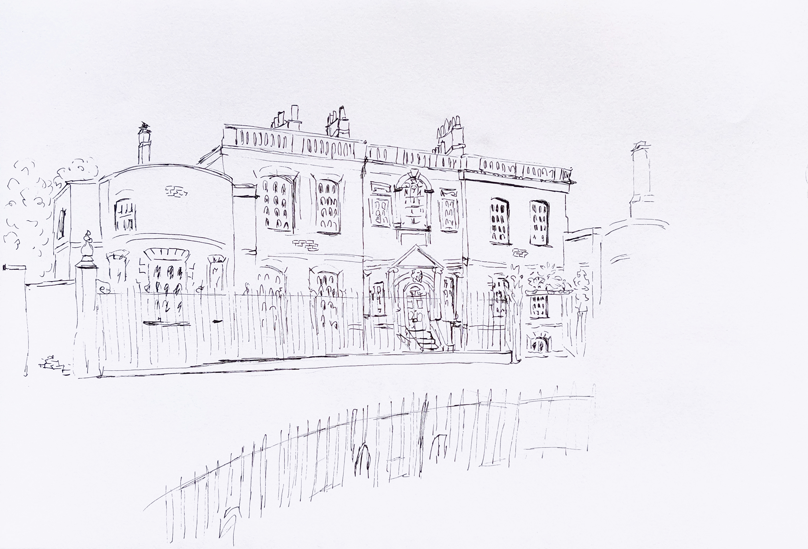
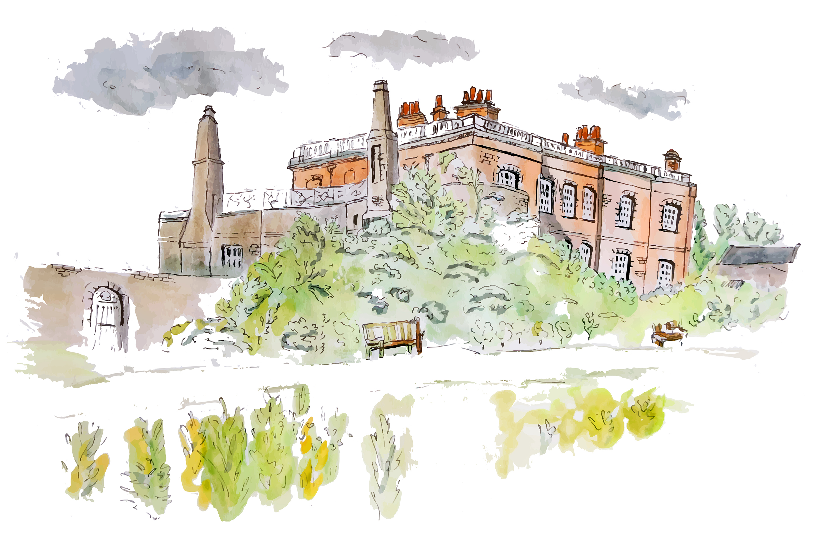
Although the front of the building is aesthetically more impressive than the back because of all the intricacies around the windows, door and gate, the view from the back was interesting because of the park and the green surrounding the building. The trees and bushes that hide part of the house make it somehow more appealing as if there is more to discover. It also places the house in nature, whereas there is a main road not far on the other side.
I chose to sketch the house from the left or right as it added perspective and made the whole drawing more dynamic.
I then took both sketches in Photoshop. With regards to the first one, I cleaned it and tried to enhance the sketch a bit by rectifying some of the colours and adding contrast.
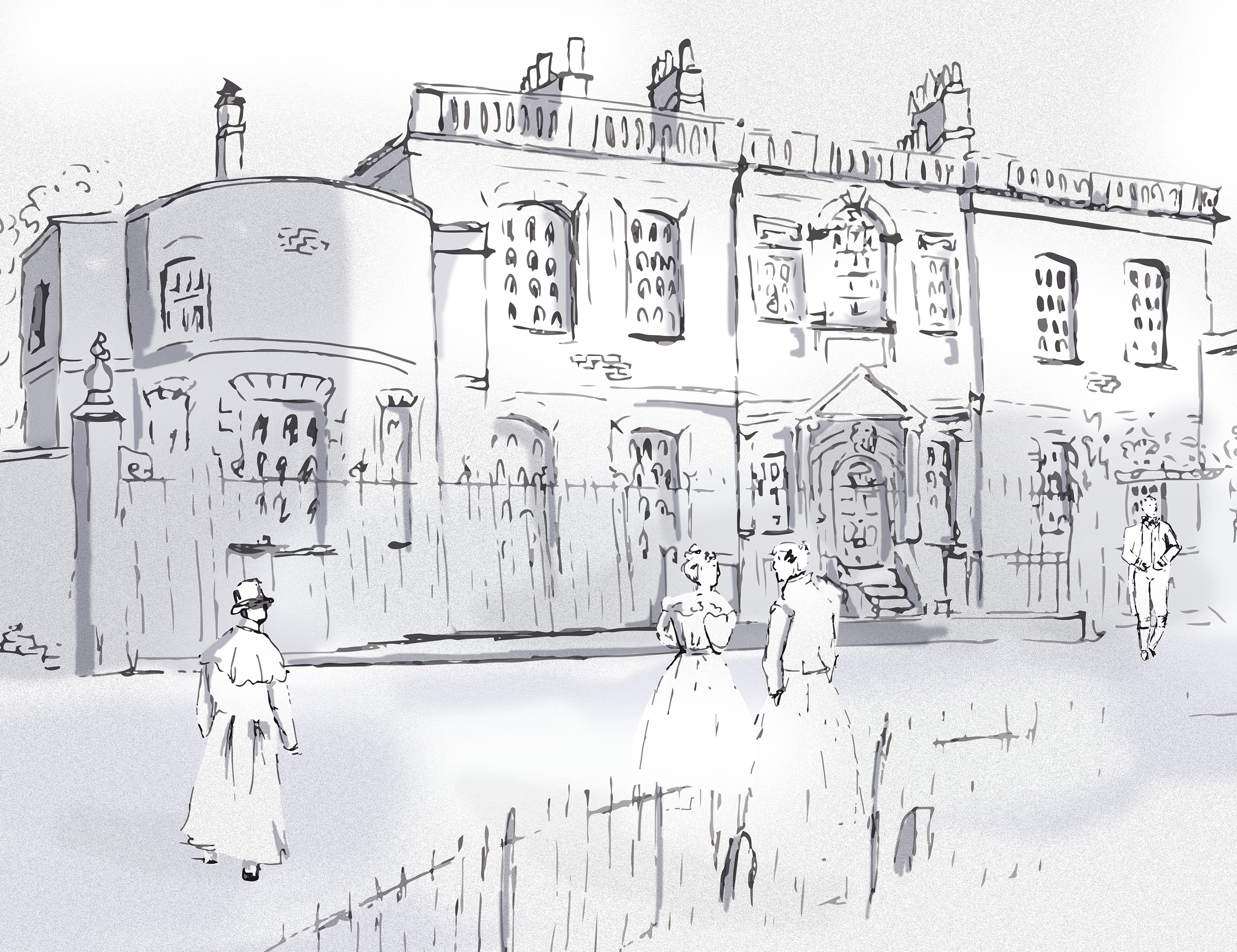
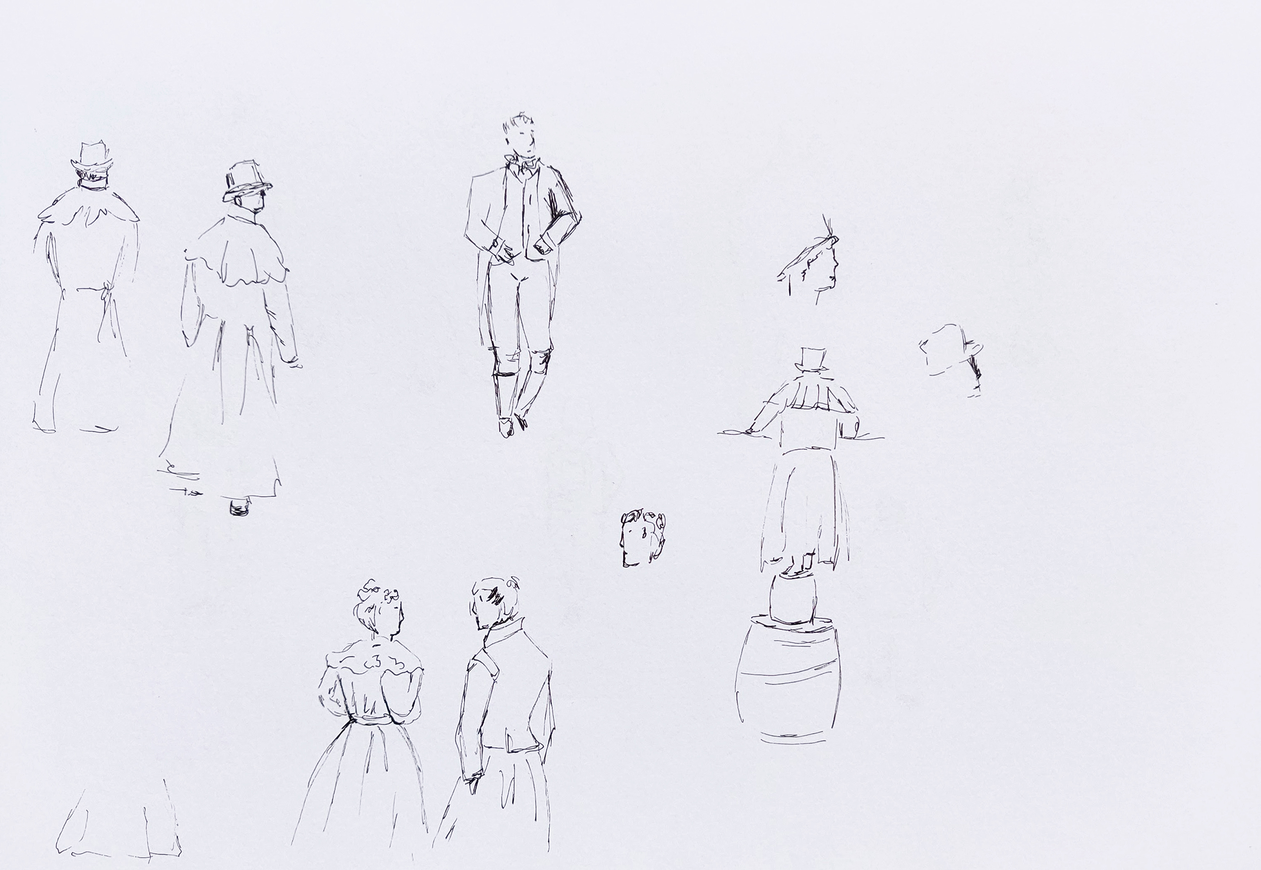
For the second one, I discovered by chance when I did some research about the house in Wikipedia (https://en.wikipedia.org/wiki/Ranger%27s_House) that it was used in the TV series Bridgerton and that probably gave me the idea of repositioning the building in the past. I created some sketches of people (some in modern time and others in Victorian times as I did not know yet how I was going to use them). As a reference for the latter, I watched some footage of Gentleman Jack on BBC iplayer. I then positioned people in period costumes in front of the house in Photoshop and added some shadows.

What went well
I enjoy sketching buildings that are a bit intricate. I find that black lines work well with older buildings.
I like how adding people changes the feel of the building. If I had opted for tourists taking photographs of the place, the message would have been different. In fact, I realise that I ignored contemporary features when I drew the place such as cars parked at the front or modern garden tools at the back.
What went not so well
Again, my sketches lack depth and are a bit flat. I tried to add some shadows digitally to understand better how to apply shadows and highlights in an illustration but I still struggle with that aspect. As I noticed again in the research I did previously about architectural buildings, strong contrasts are essential to make a building stand out.
When I applied some watercolour, I kept the colours too light and a bit bland. I am still experimenting with watercolour and when it dries, it looses some of its vibrancy.
My lines are hesitant in these sketches. I think it is due to the fact that I lacked confidence when I looked at the complexity of the building and was not assertive enough when I drew the lines.
In retrospect, there is not much contrast between the house and its surroundings. In fact, from the back of the building, the nature in the park enhances the building. It would also have been interesting to select a building on the Isle of Dogs where modern and traditional buildings are side by side.
What to take forward
I need to keep observing how artists add contrast to their work with highlights and shadows. Part of the problem is technical as I can struggle to add shadows and highlights on a drawing. I find it easier if I create an illustration in Illustrator. The other part is due to observation. Unless it is obvious and the sun shines, I still hesitate with shadows.
At times, I can still be too hesitant when I draw with a black pen and I just need to be aware of it and commit to a line and not to be afraid of making mistakes.
Keeping practicing with watercolour is a good way to improve my knowledge of how to apply colours as well as contrast.
Edits
After reading my tutor’s feedback, I decided to experiment more with the idea of mixing the past and present. At first, I used one of the sketches I made and digitally added contemporary characters (from other exercises) in one version and characters from the past in another.
I then wondered what would happened if I mixed both. In the end, I created two additional versions. In one of the images (#3), the characters dressed in period clothing could be actors on a film set for instance while the people taking a picture indicate that the scene takes place in the present. In the last image, the characters in period clothing are semi transparent, a bit like ghosts as if the past and present are superimposed. In historical locations, it can be quite natural to try to imagine how things would have been in the past and the last image is inspired from that.
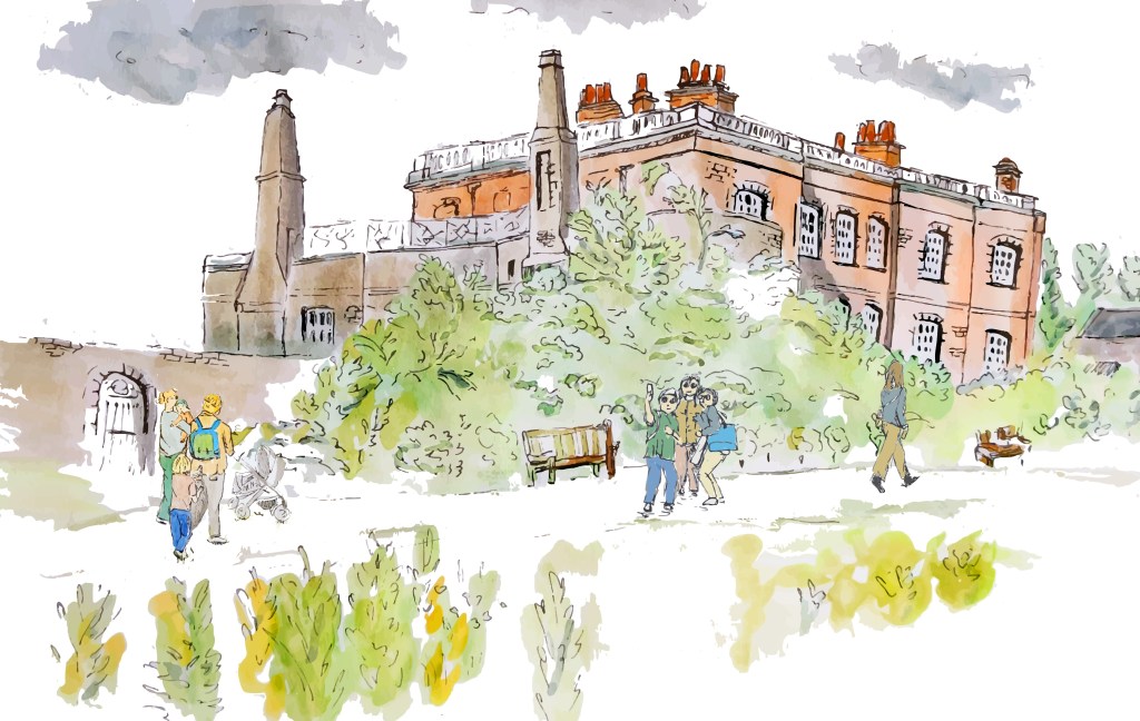
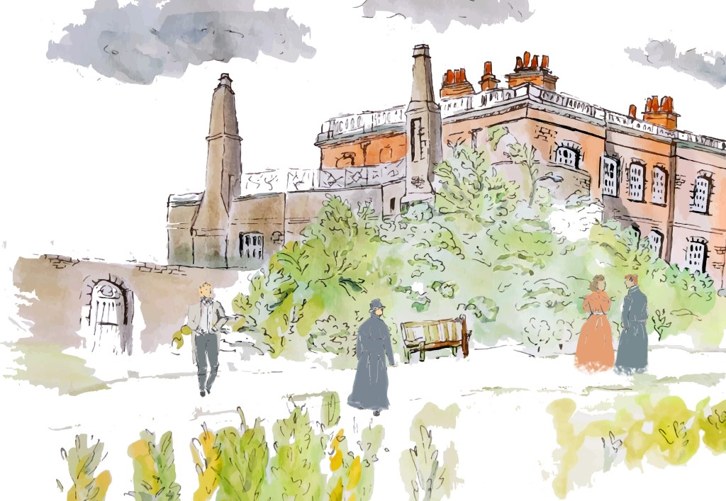
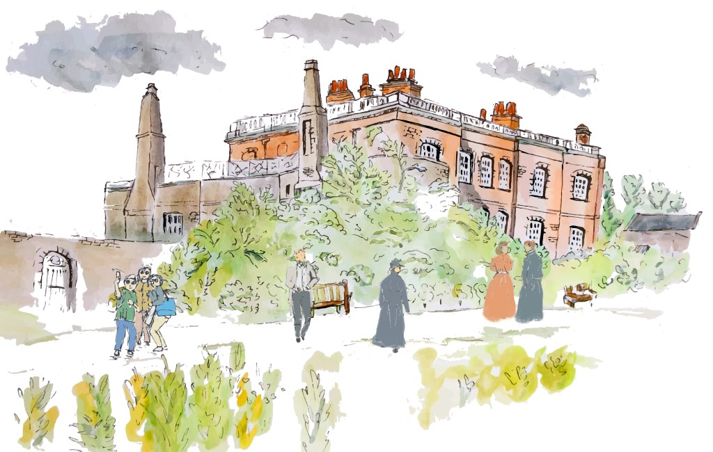
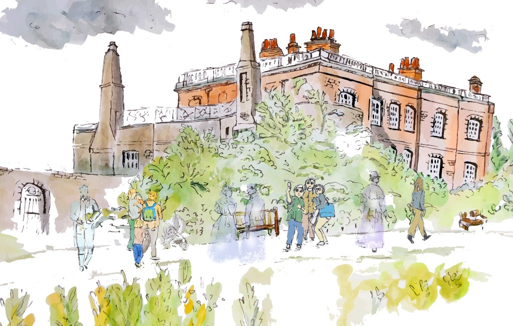
These images are not finished illustrations as they are sketches digitally manipulated. However, this experiment was very interesting as it shows how a sketch can be used as a source of inspiration to tell different stories.