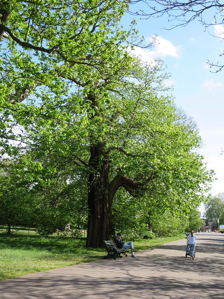
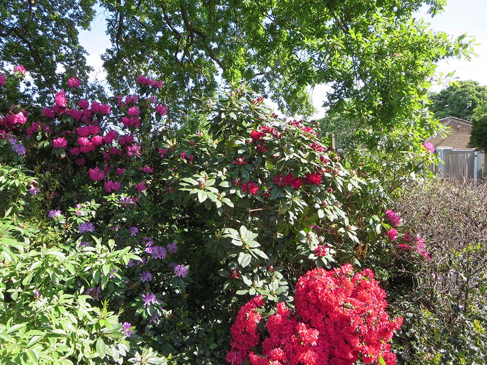
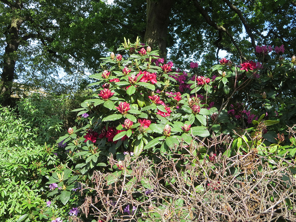
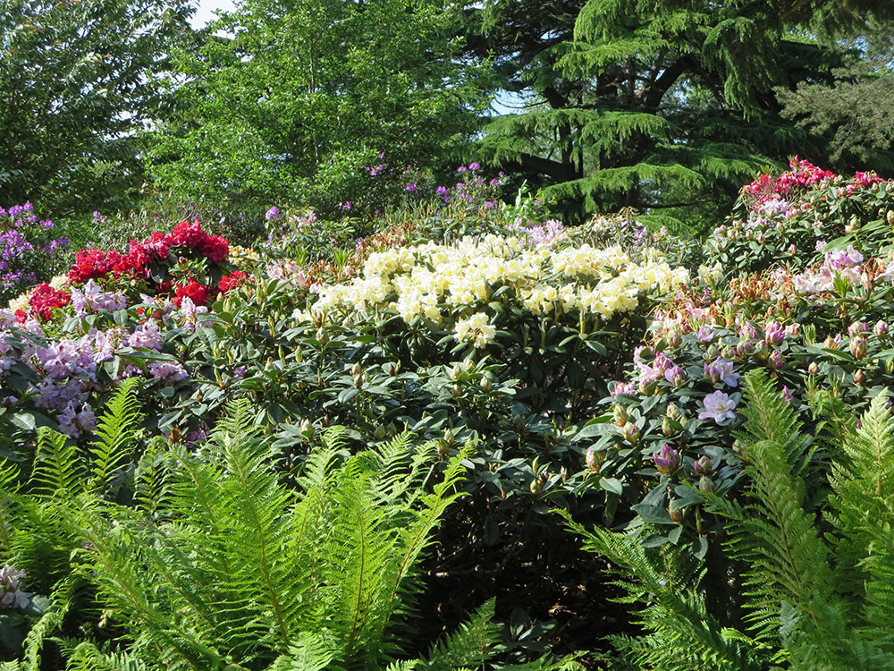
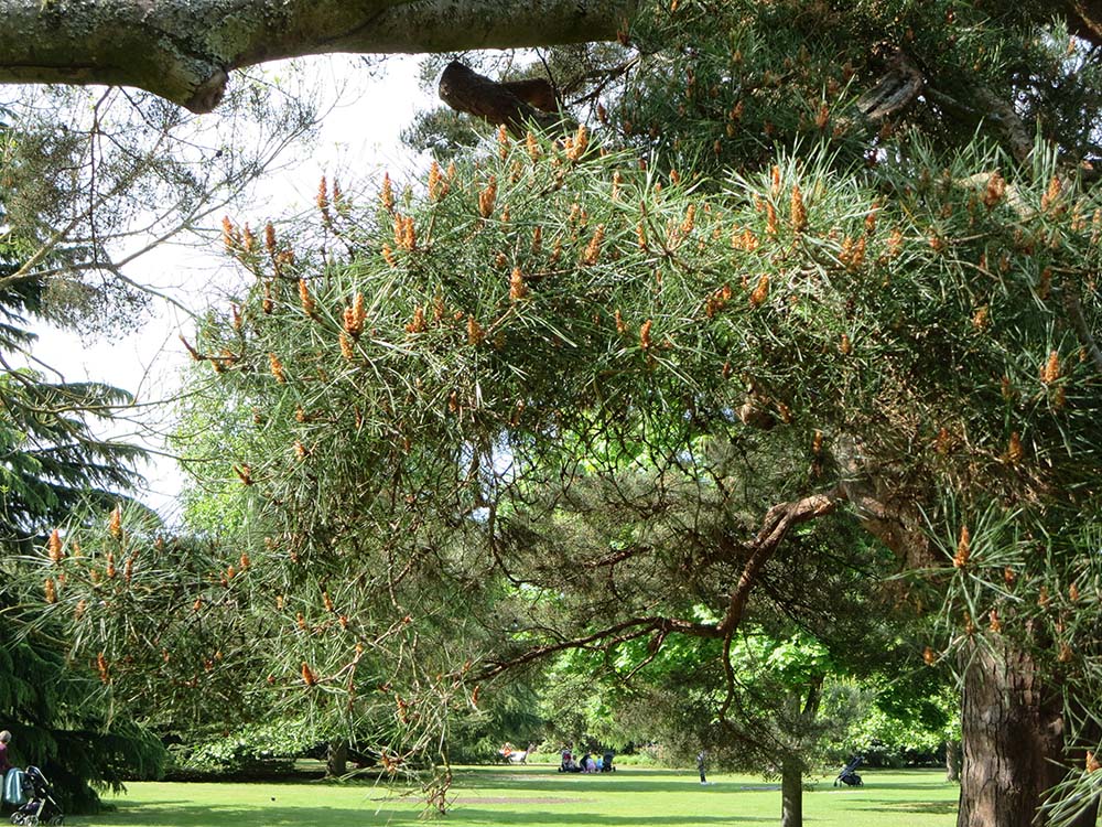
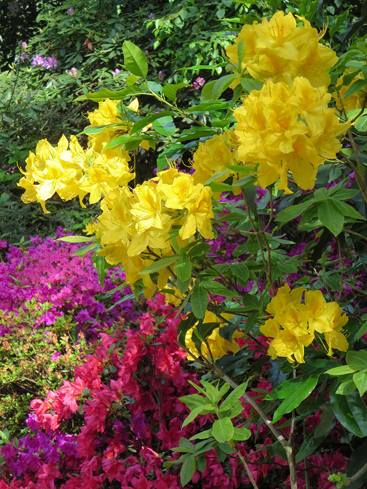
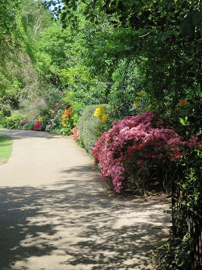
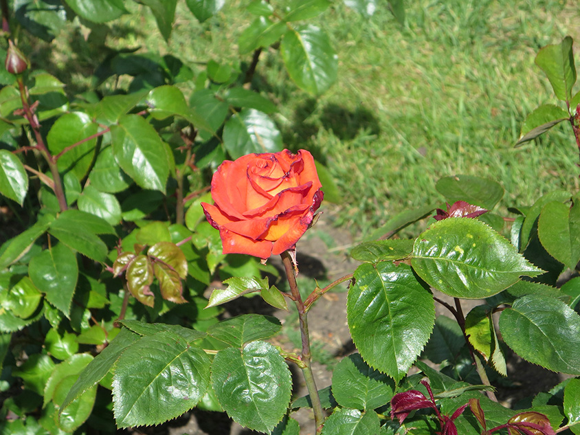
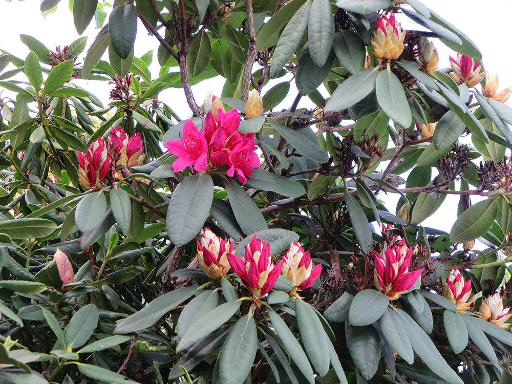
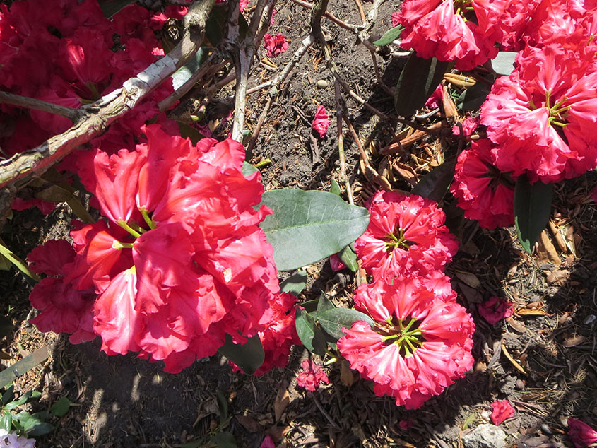
For this exercise, I went to Greenwich park for some inspiration. I was lucky as this was the right time of the year to observe flowers.
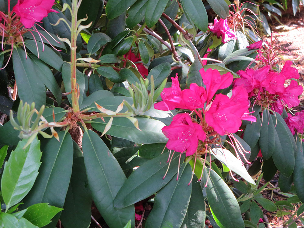
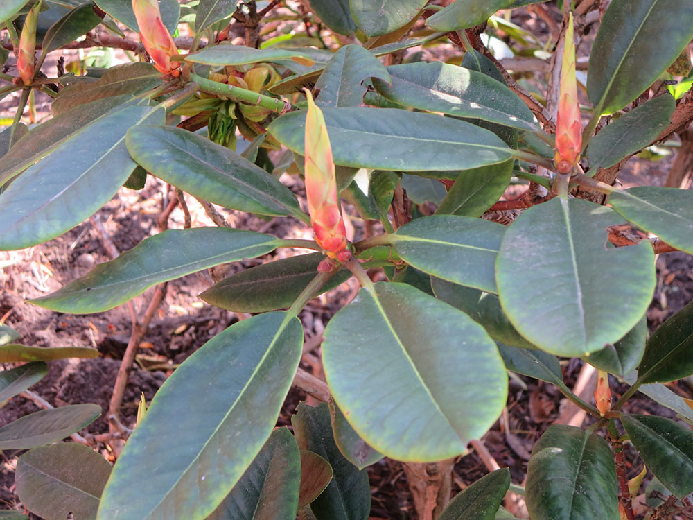
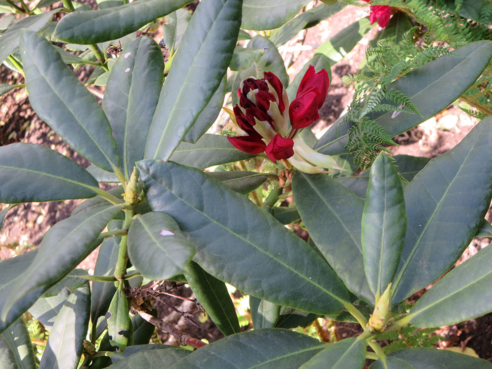
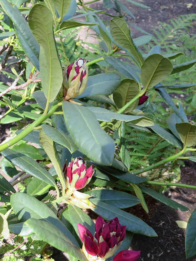
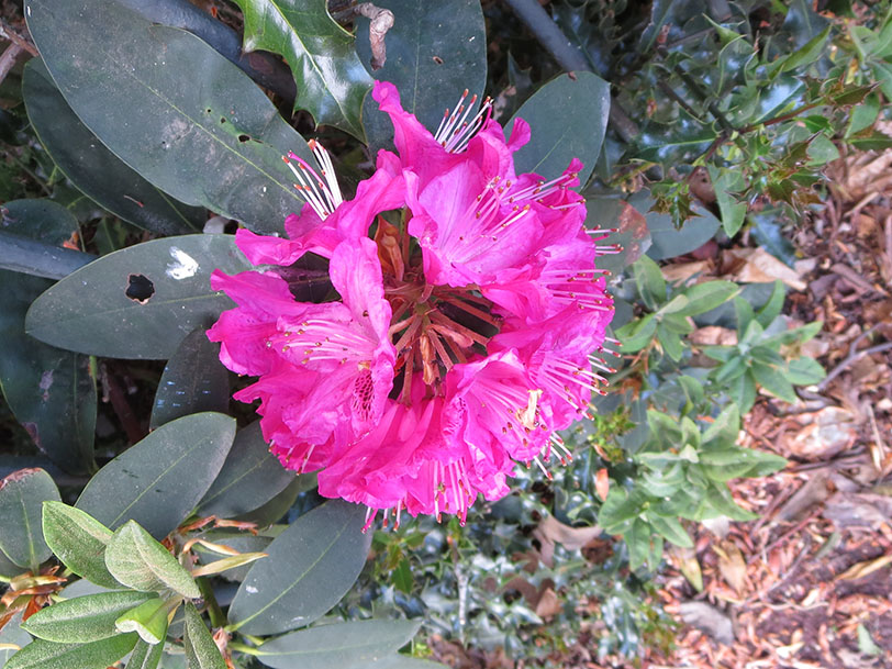
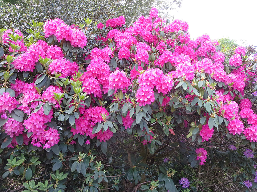
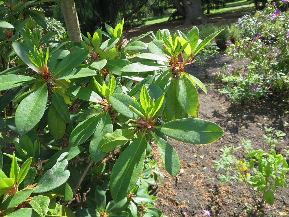
I took some photos to keep as reference. Below are some of them.


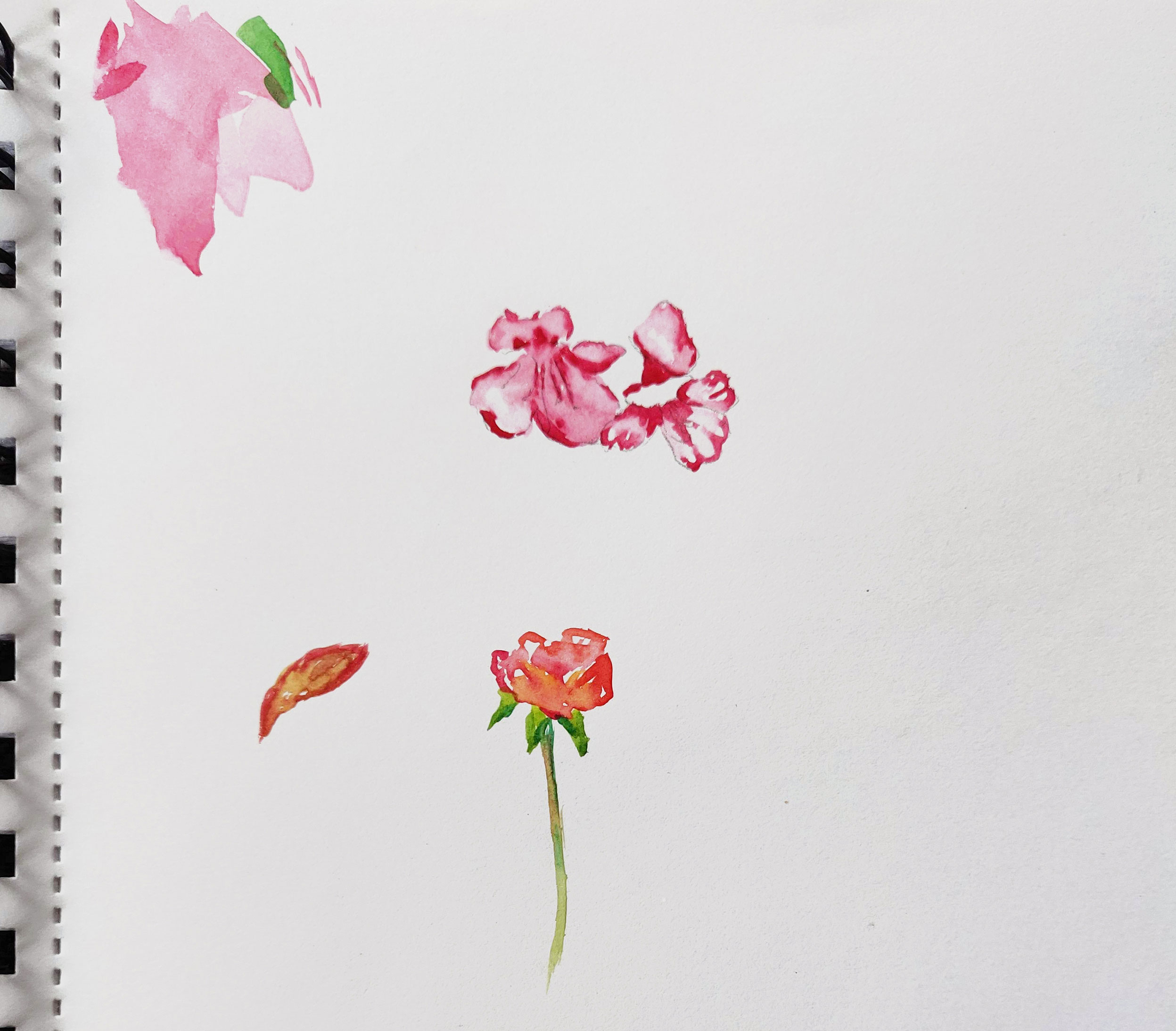
I then experimented with watercolour paint in the park but, as I could not sit anywhere, I found it difficult to select a flower or a plant and draw it in details.
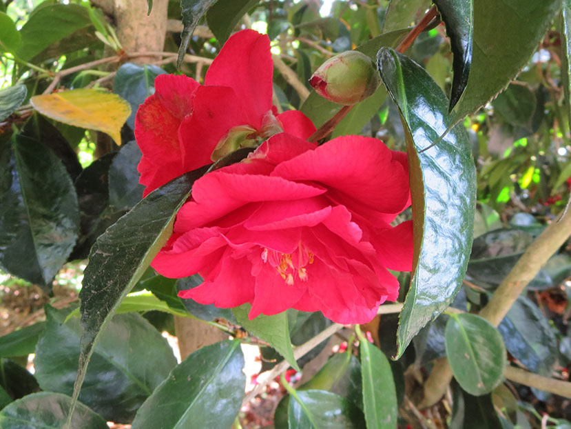
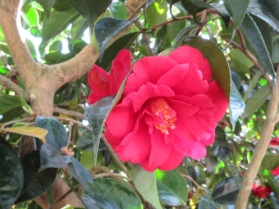
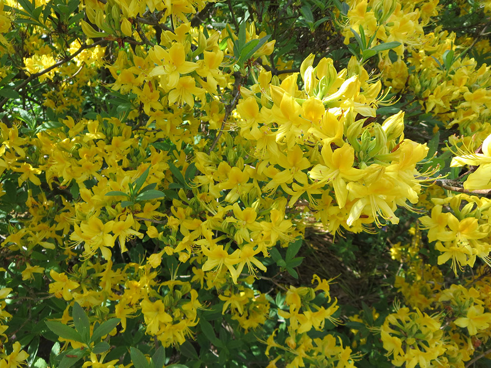
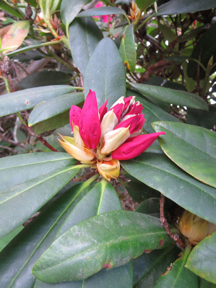
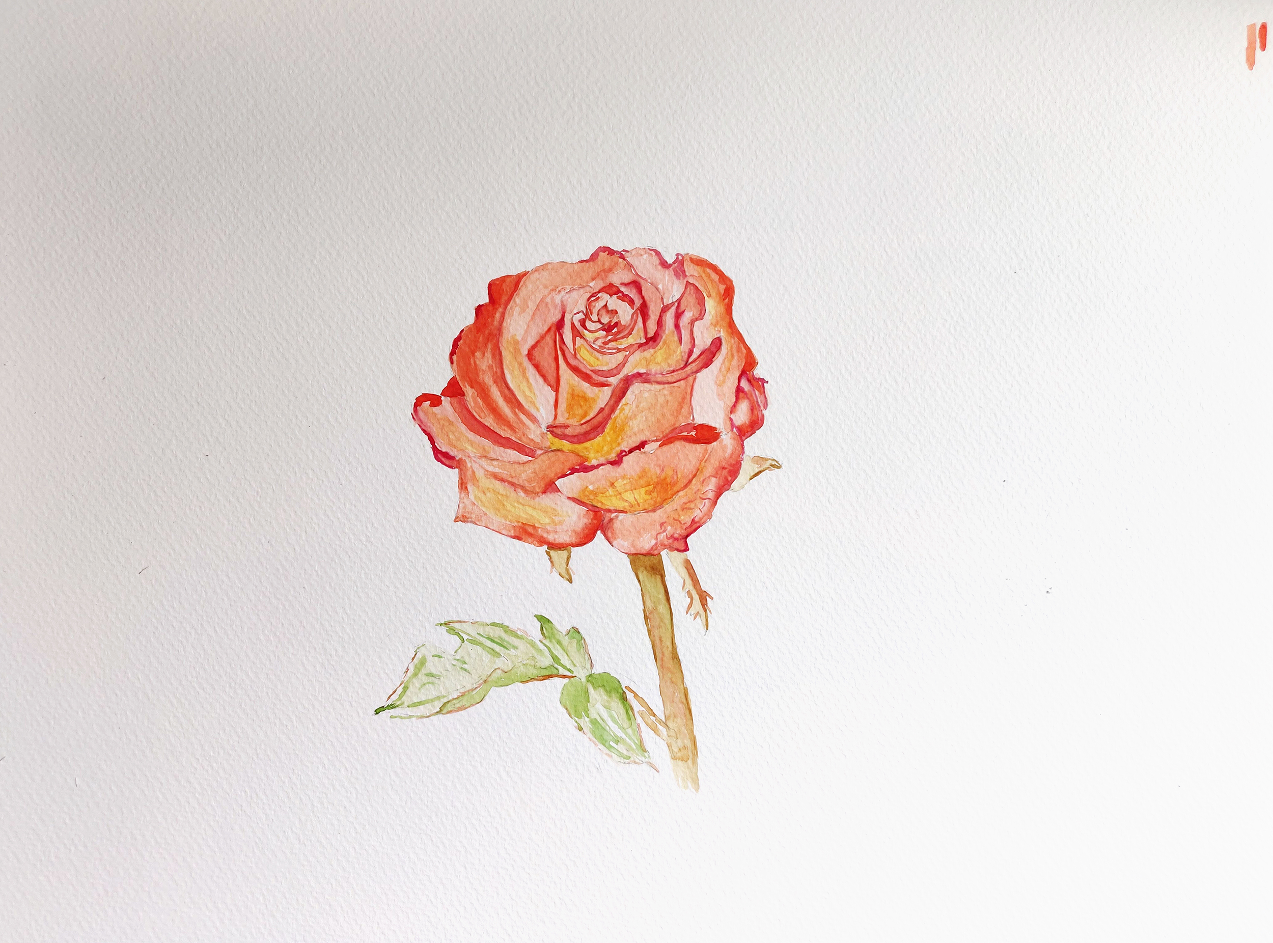
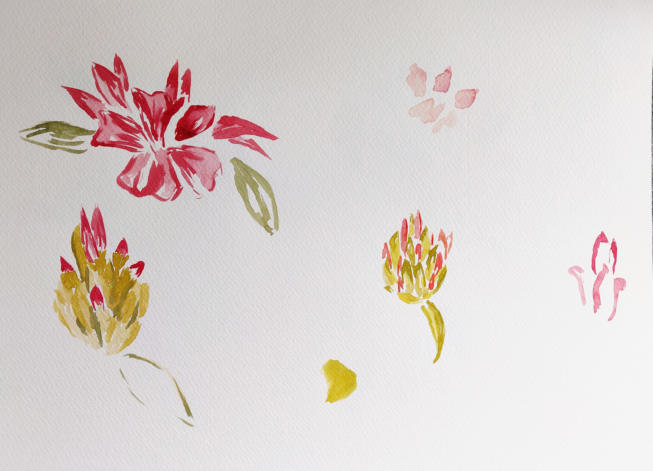
I therefore decided to try at home and used A3 sheets of paper. I first painted a rose in watercolour. Although it was an interesting experiment and I like the transition between the yellow and orange/red, the result does not really work. The transition between the different shades is not realistic. I then tried with another plant I saw a lot in Greenwich (see photo below). Unfortunately, I could not find the name of the plant but I like how it looks as the burgeons turn into flowers. For this drawing, I first used a black pen and then added colours with watercolour paint.
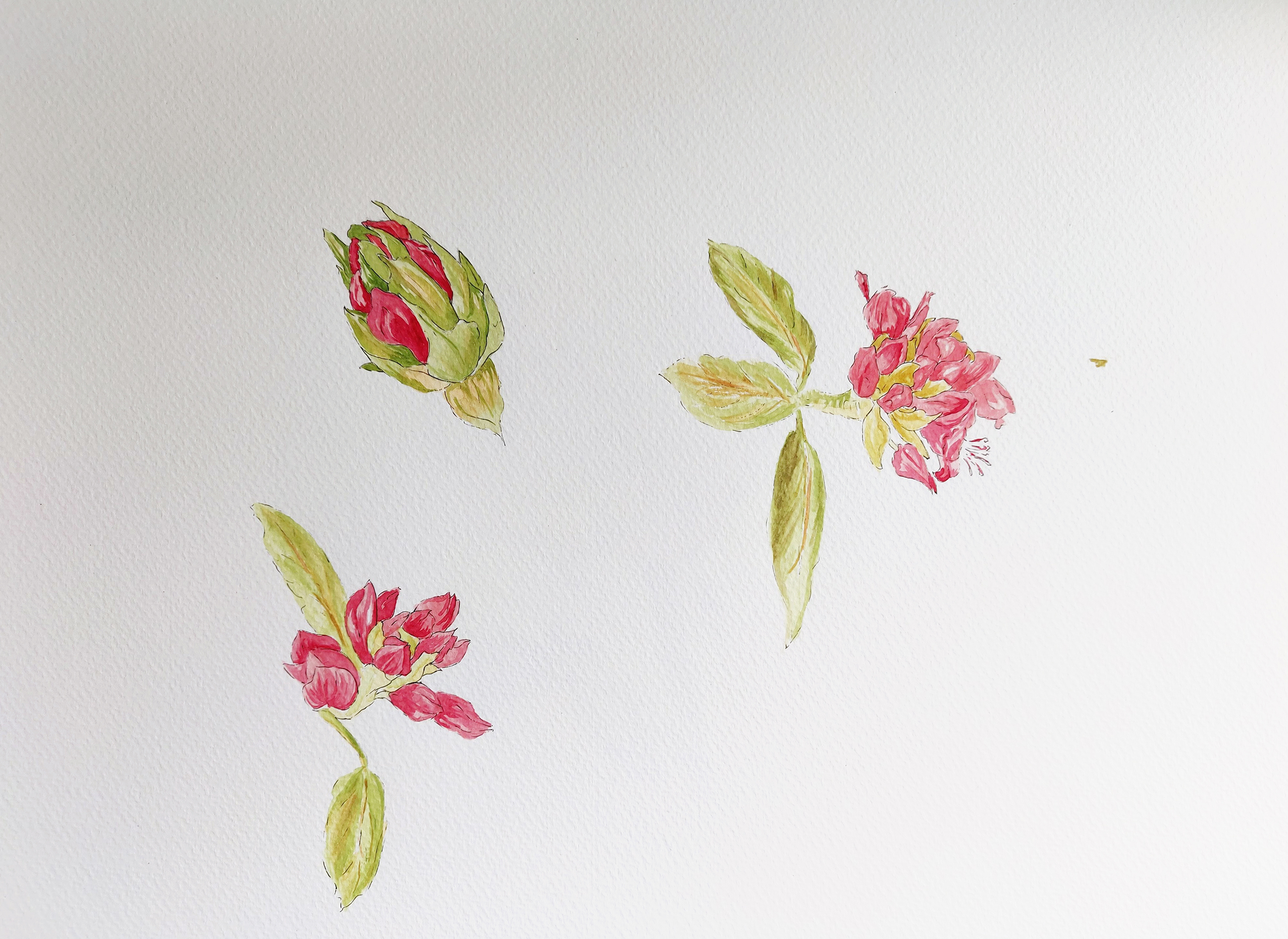
I was happier with the second experiment. I particularly like the burgeon on the top left. I tried to add some contrast between the darker and lighter areas but I probably could have used darker shades for the shadows.
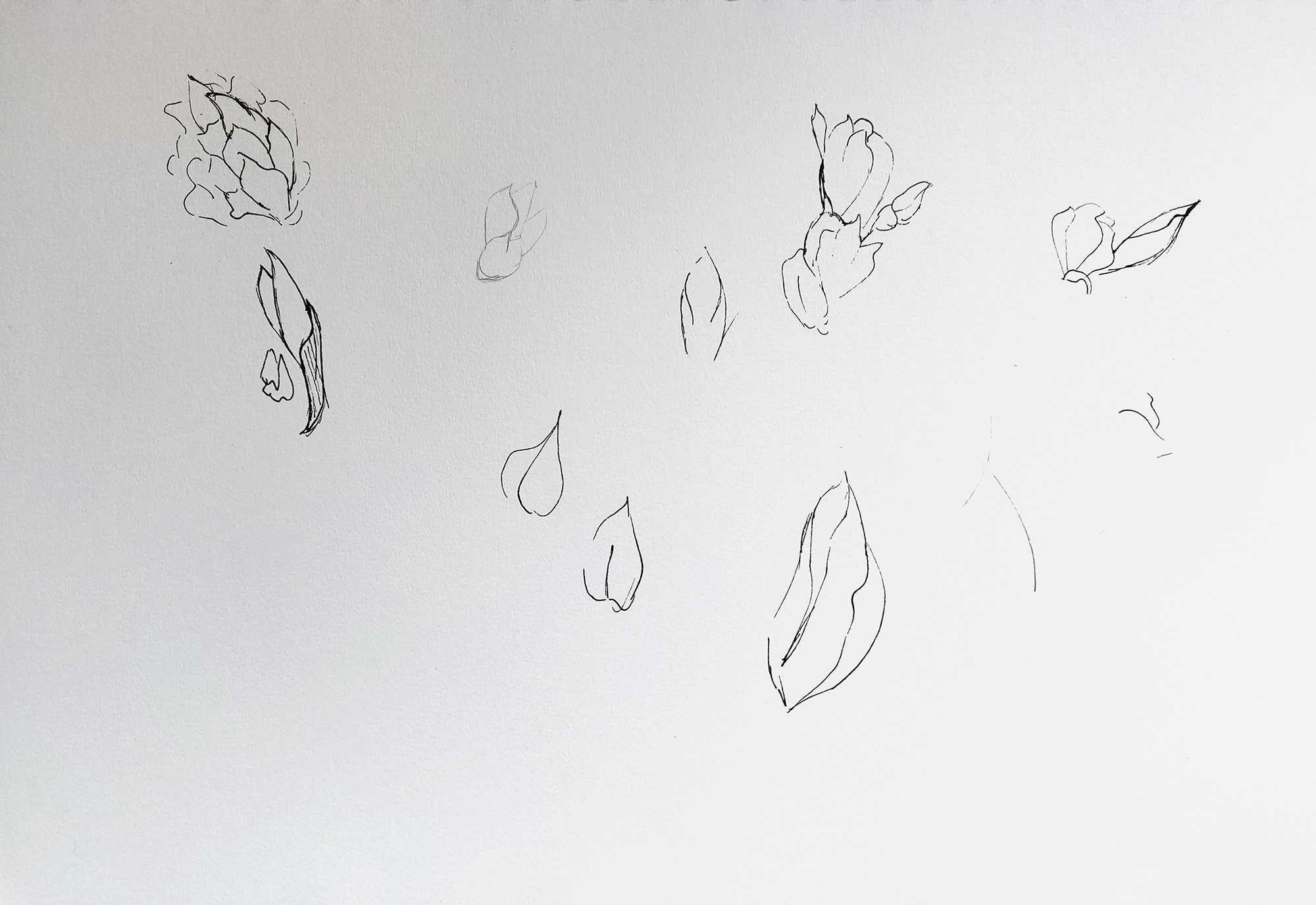
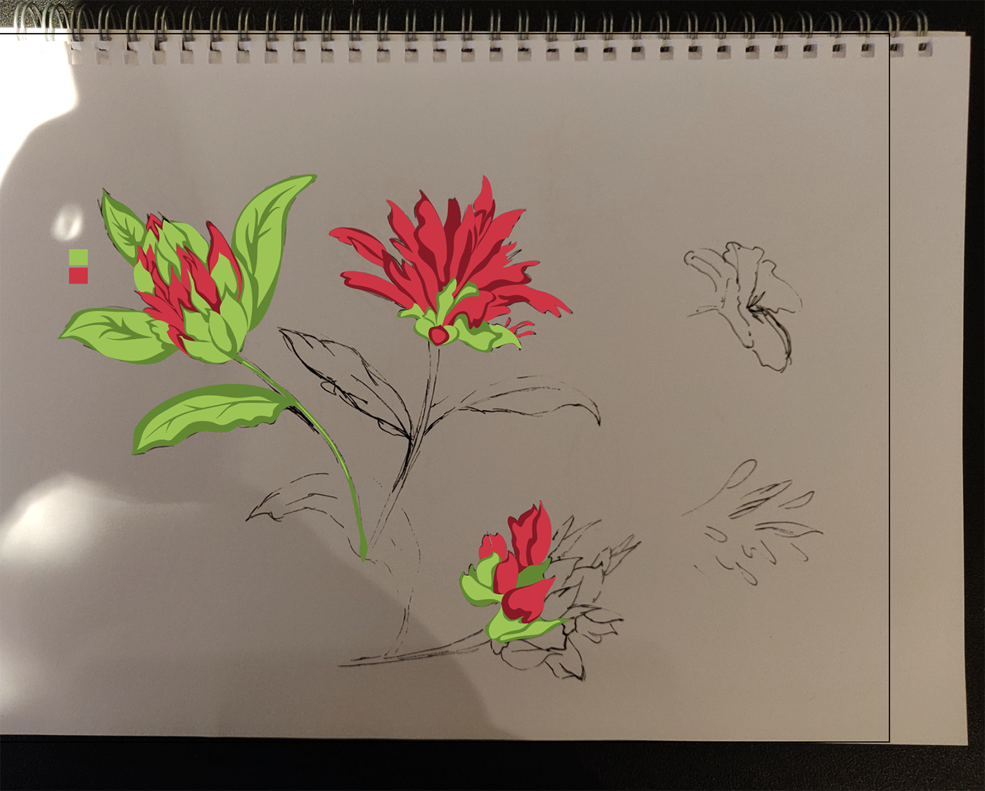
I then looked at ways to draw the plant in a more stylised way. I revisited the board I had created on Pinterest when I did some research on botanical illustration.
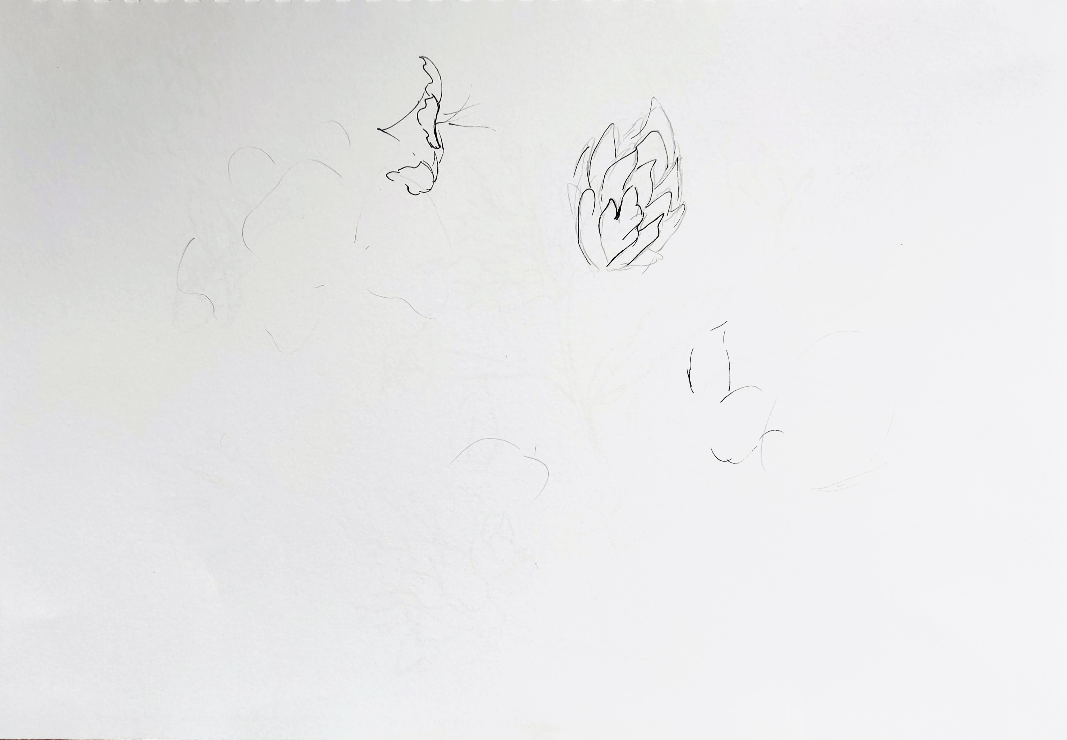
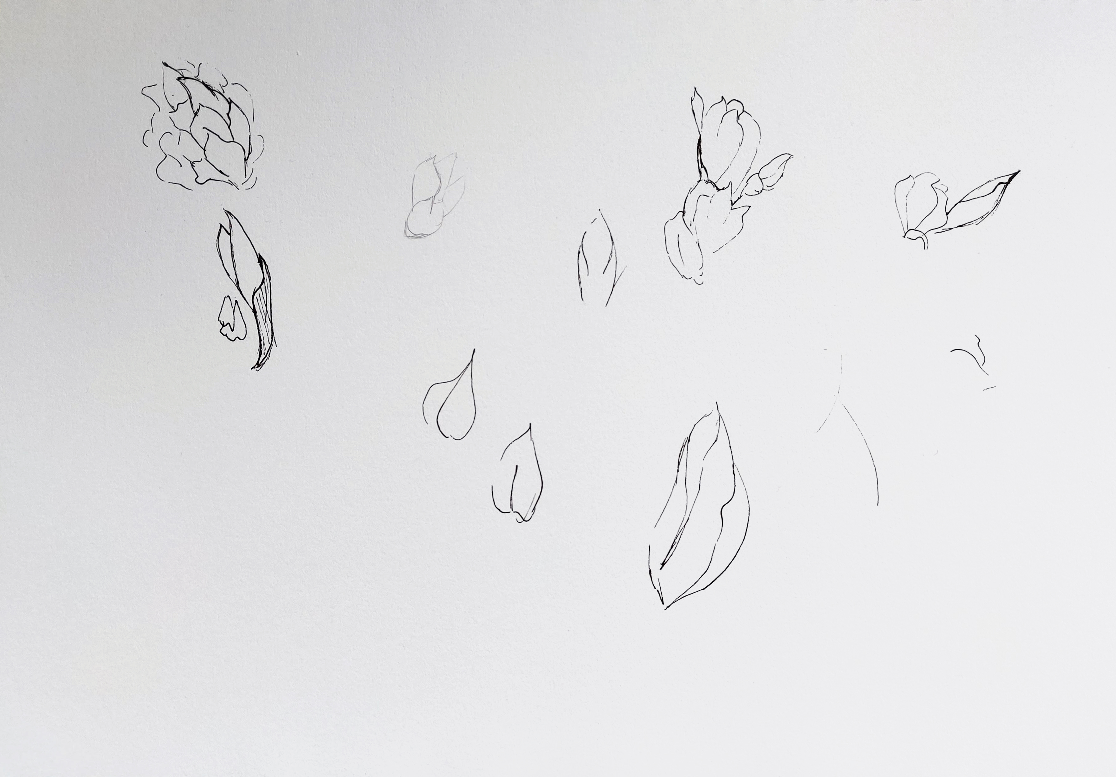
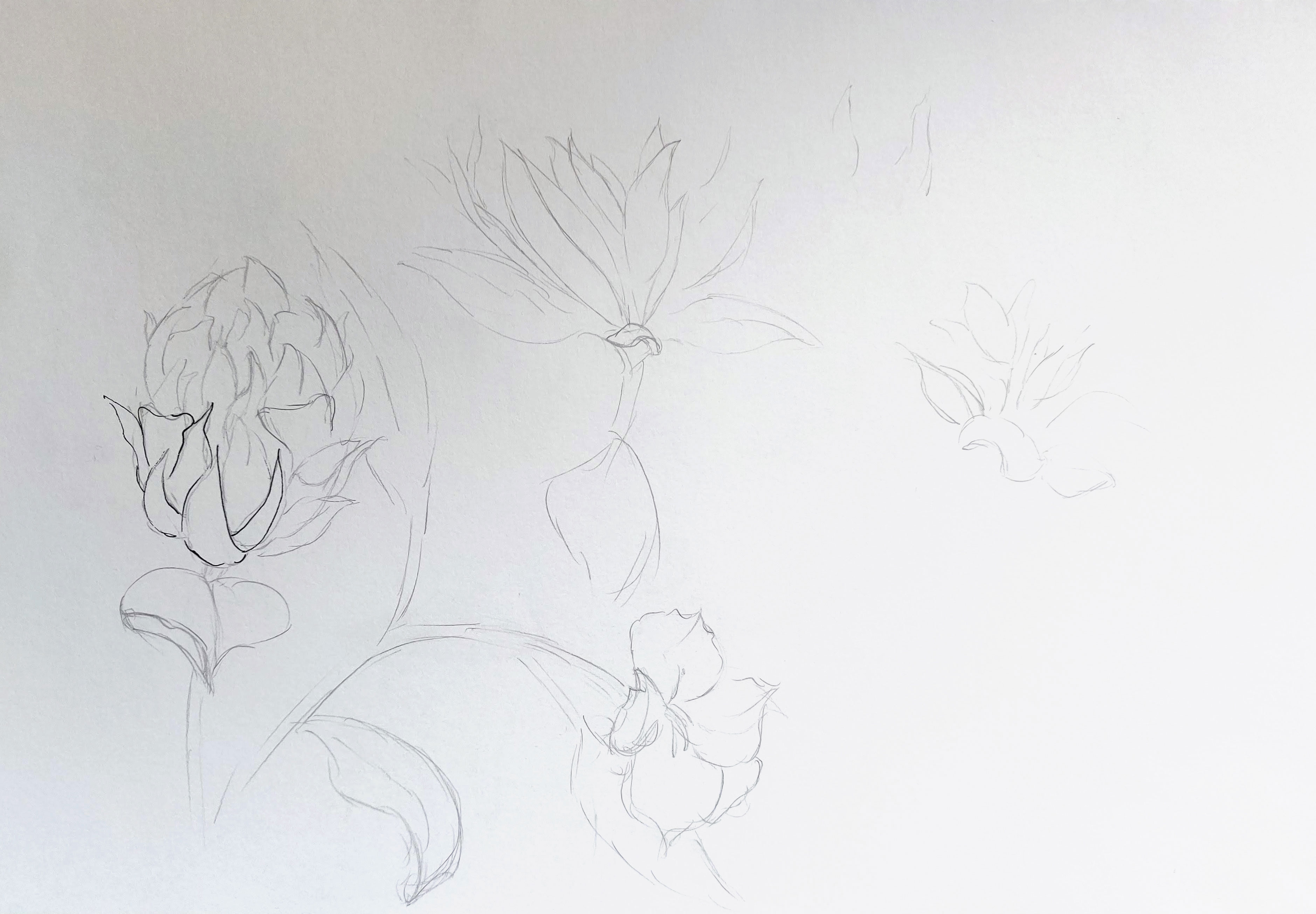
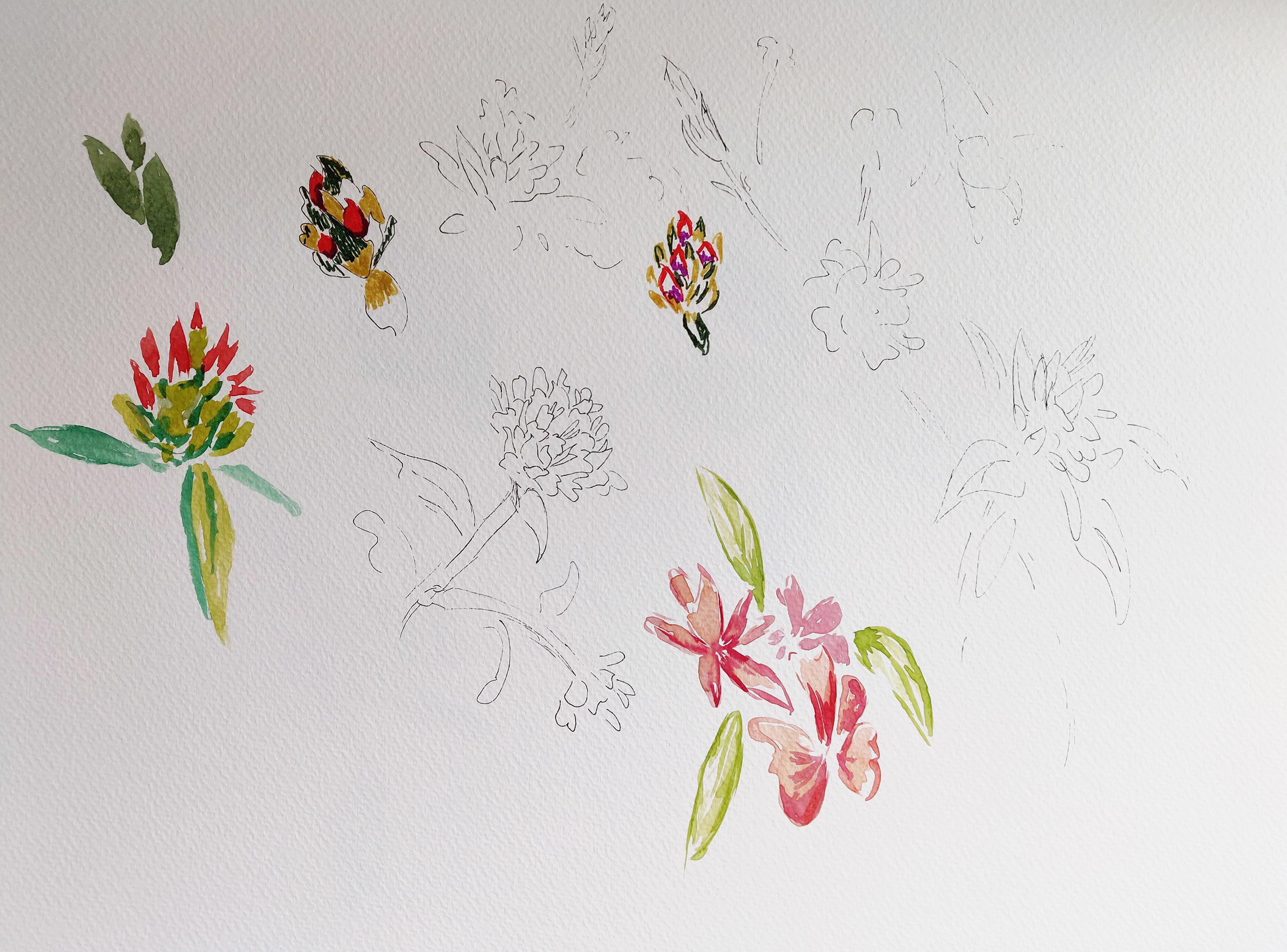
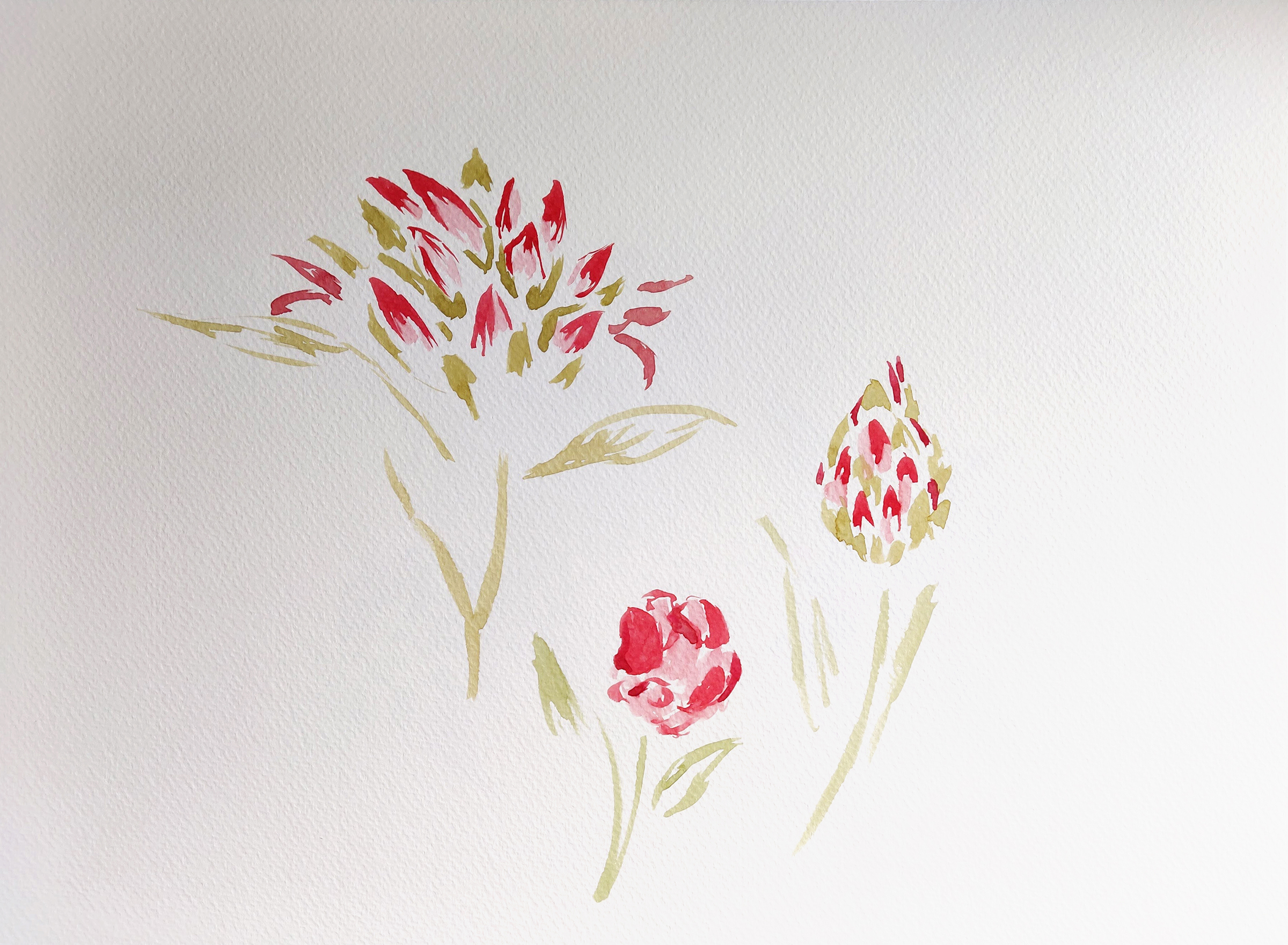
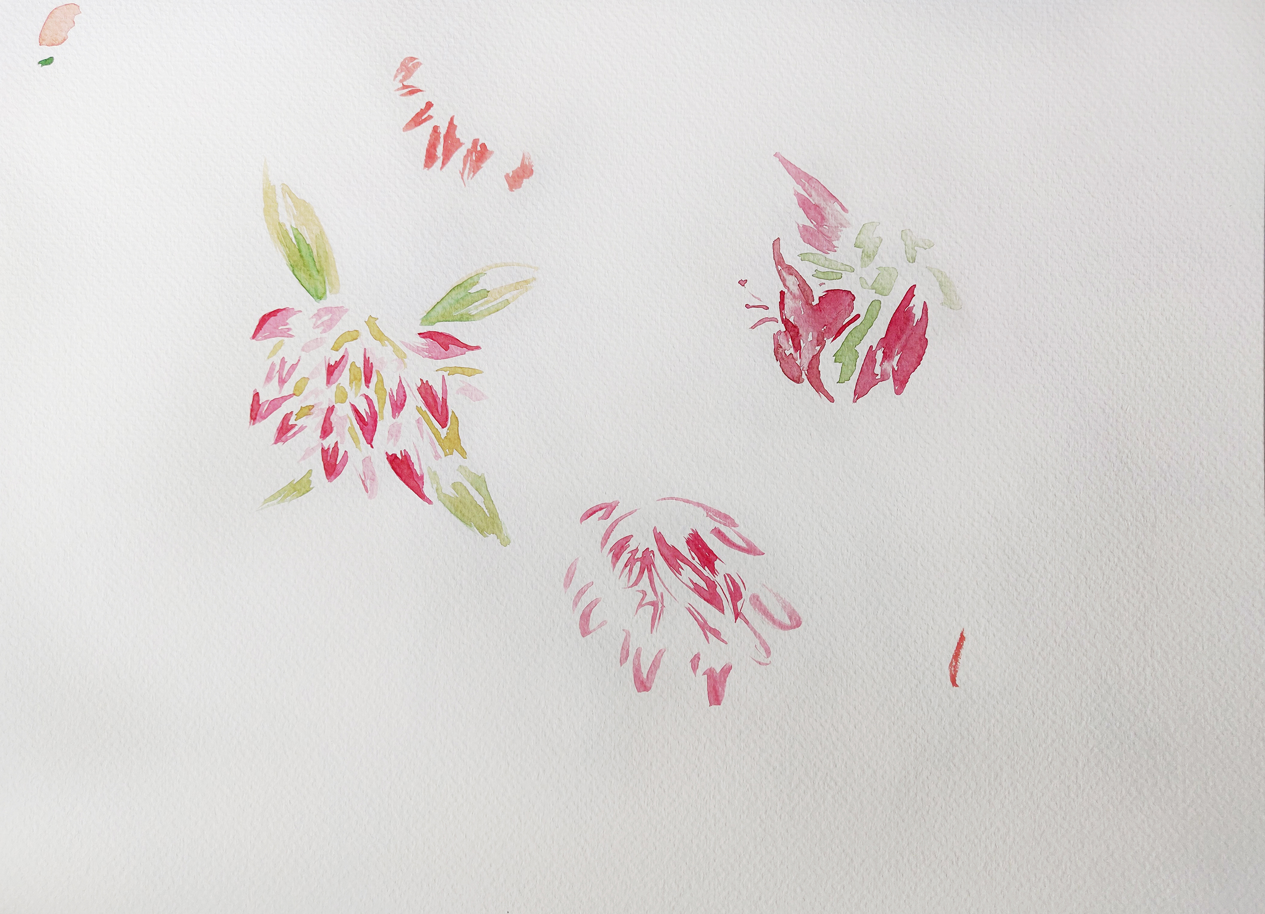
I first played with some ideas in an A4 sketchbook with a black pen, then with watercolour on A3 paper. I tried to draw freely to see what would happen.

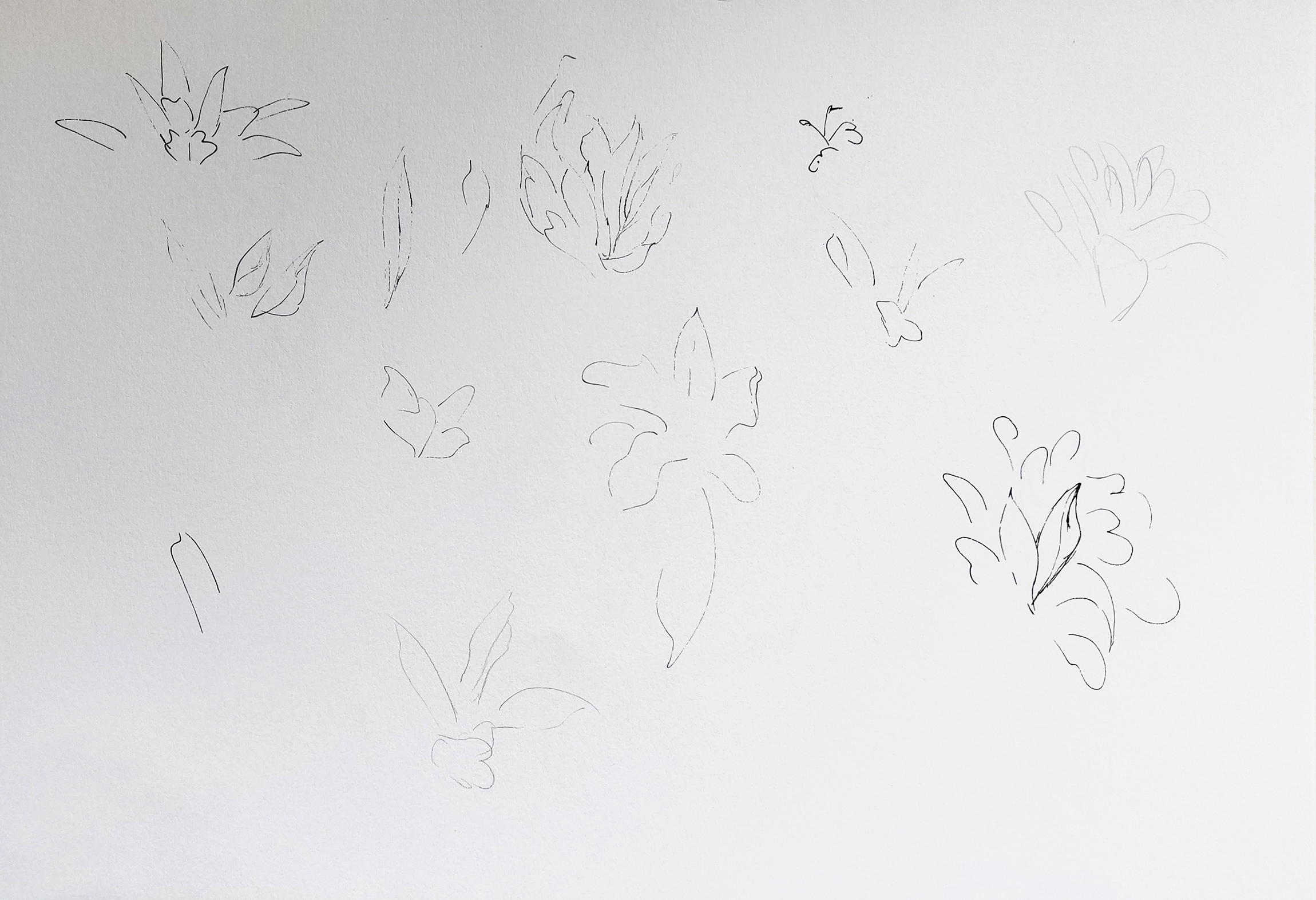
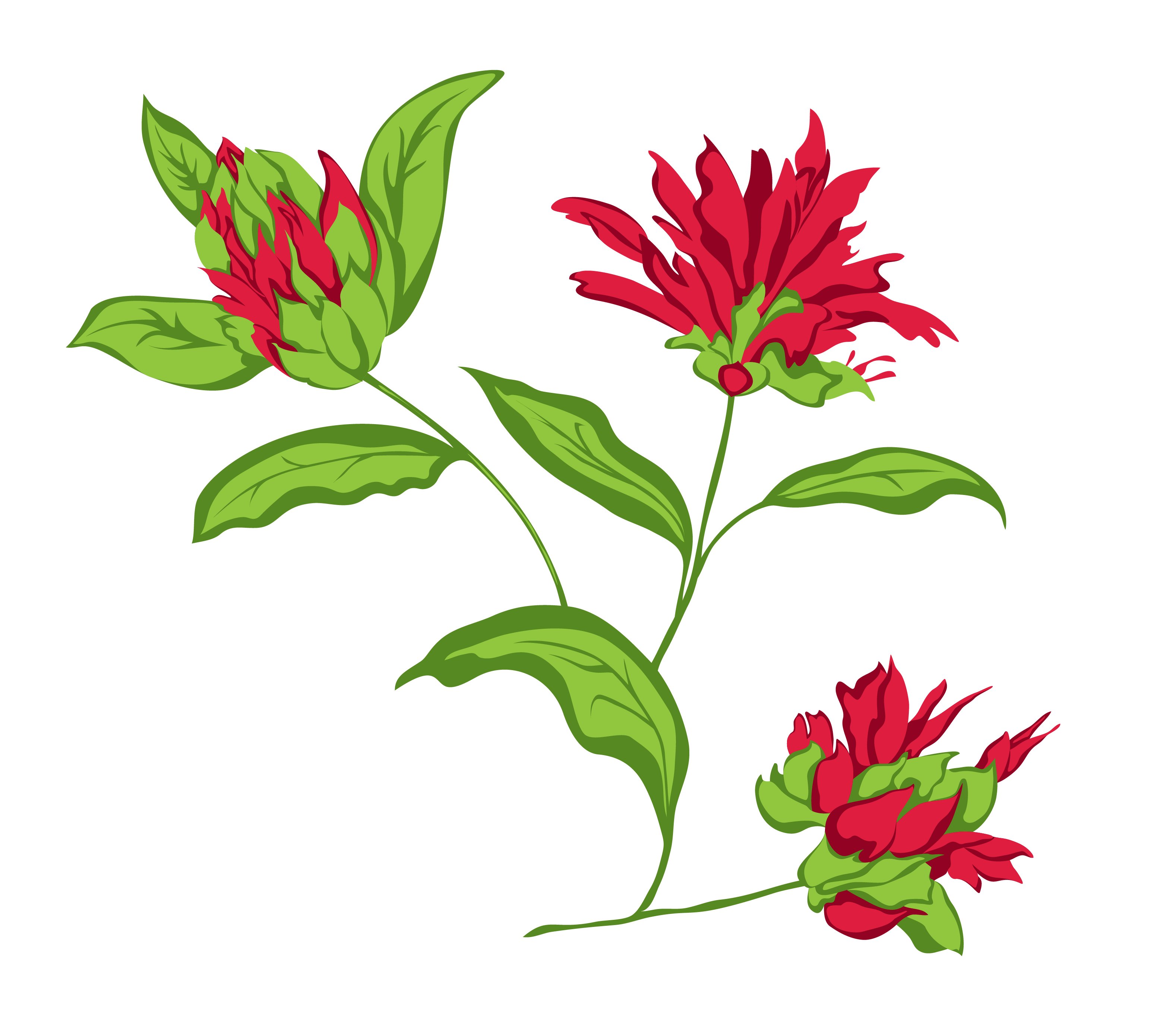
From there, I took some of the flowers I drew with the black fine liner and tried to create an illustration in Illustrator based on these shapes. This is the work in progress and the final result.
This gave me the idea of creating some patterns. I first tried with the version created in Illustrator and then with the simplified flowers and leaves I painted in watercolour (after cleaning the sketches with the help of Illustrator and Photoshop).
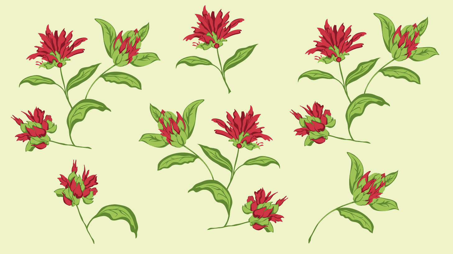
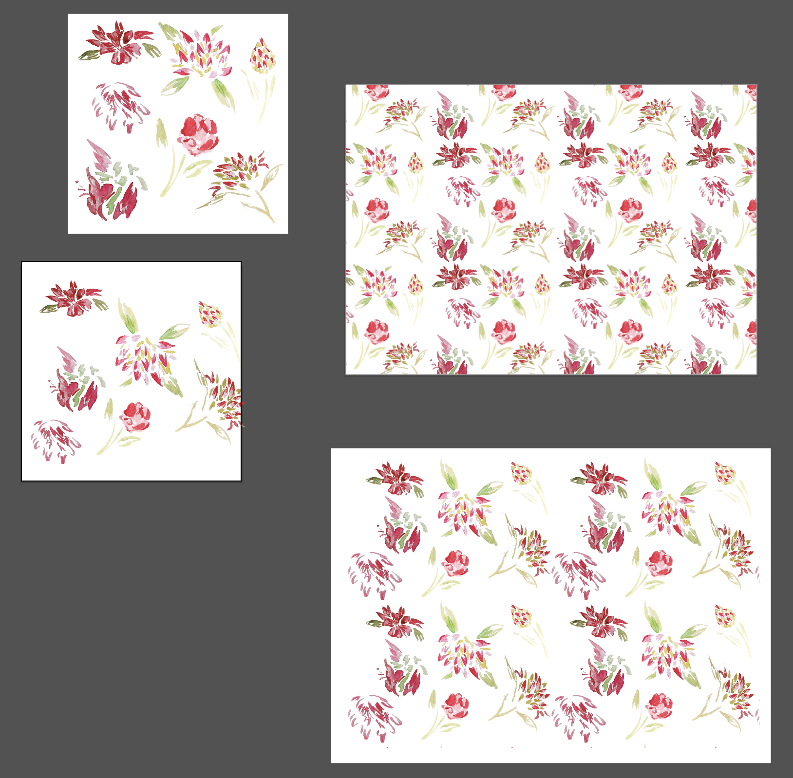
I created a cushion mock up with both patterns to see how they would work.


What I learned from this exercise
I enjoy drawing flowers and I found out that experimenting both with accurate representations of flowers and stylised shapes can give interesting outcomes.
What I could have done better
The Illustrator version is a bit flat. It is not always easy to keep the same dynamic as the original sketch when recreating the shapes in Illustrator. It might also have helped to have an extra shade of green and red (lighter) to add more contrast. I wanted to keep a very small colour palette but a few more tones might have made the whole more interesting.
When I tried to represent flowers with watercolour, I could not see how to use the quick sketches at first. Looking at the pattern I created, I am however wondering if it would have been worth pushing the experiment further to develop some of these sketches.
What to take forward
Flowers are a very interesting subject and I would like to keep experimenting with various ways to represent different plants and foliage.
