I really like patterns and have a few books on the subject with examples of wallpapers, fabrics, etc. I find William Morris’ designs particularly interesting both for their intricacy and harmony.
I revisited these books to see how the illustrators play with the idea of flatness and how they sometimes introduce depth.
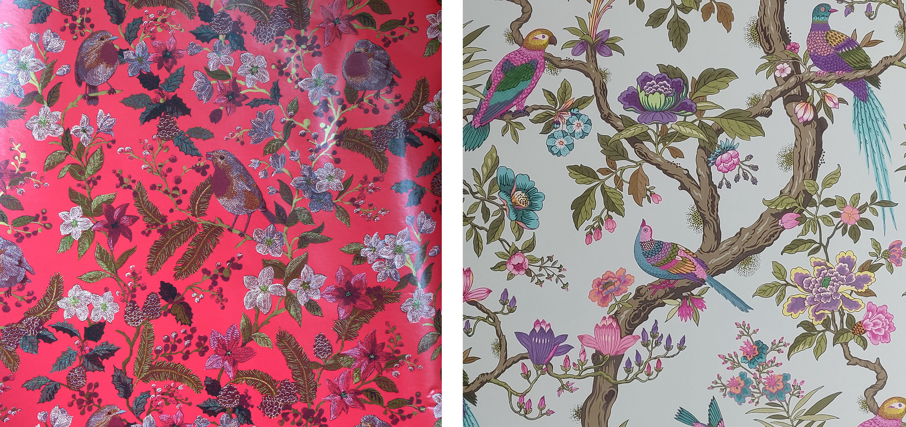
I tend to gather examples when I notice patterns I like. Below is a sample of a Christmas wrapping paper and some wallpaper I noticed in a hotel in Bruges.
I also created a Pinterest board.
I noticed that many illustrators play with perspective and proportions, at times distorting both. Some elements in a pattern can correspond to one viewpoint and other elements to another viewpoint for instance. In a sense, realism is not necessarily the objective. The different items need to work well together aesthetically to create a harmonious pattern.
They often stylise the subject(s) of the illustrations. This is often the case for illustrations of flowers and foliage or animals. It sometimes implies a simplification of the shapes (e.g. Josef Hillerbrand) but that is not always true. Some stylised patterns can be intricate such as the patterns designed by Anna Maria Garthwaite or William Morris for instance.
Some artists use different types of mark making such as dots or repetitive lines to highlight the intricacies and depth of the design and to create texture.
Layering patterns can help to create some depth. In that case, the tones of the pattern underneath tend not to contrast much with the background and merge with it. I have noticed this in some of William Morris’ designs.
Illustrators are often very creative with colours when creating designs for wallpaper or fabrics and again the general aesthetic is more important than realism. The sample of wallpaper I photographed in Bruges is a good example. The colours are unrealistic as well as the flowers and birds. In fact, completely different types of flowers grow from the same branch. However, a lot is borrowed from reality. The position and proportion of the birds and the way the flowers grow from the branches. Maybe it is this combination of realism and fantasy that makes it work.
Sources:
Evans (2008). Pattern design : a period design sourcebook. London: The National Trust.
V&A (2020). V & A pattern. Spitalfields silks. London: V&A Publishing.
Ros Byam Shaw and V&A (2018). Spectrum : heritage patterns and colours. London: Thames & Hudson.
