Questions as preparation for this assignment
What have you enjoyed doing the most, or the least, and why?
I thought this part was an interesting continuation of the unit “Illustration sketchbooks”, and I was getting more confident as I kept sketching.
I enjoyed experimenting with different themes as they can complement each other (like drawing people in traditional costumes in front of a period house). I like the idea of using reportage illustrations in other areas. They can be manipulated and transformed to tell a story.
My favourite chapters were probably botanical, architecture and fashion illustrations.
I struggled with sketching on location. However, I enjoy it when I am in a comfortable position and can take my time. I also find it very useful as it gives me a different perspective and helps to create more detailed sketches at home afterwards.
Which pieces of work do you feel have been your most successful and why?
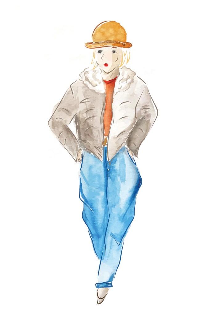
I like the final images I created as part of fashion illustration. I had drawn some very fast sketches on location. I then designed some stylised versions partly from memory and partly from the sketches, concentrating more on the attitude of the character than the exact representation of the person.
I was also happy with the line and wash sketches I created on one of my journeys. Even though from a technical point of view, I struggled to add shadows in some places, I made a conscious effort to address that aspect instead of creating a flat drawing.
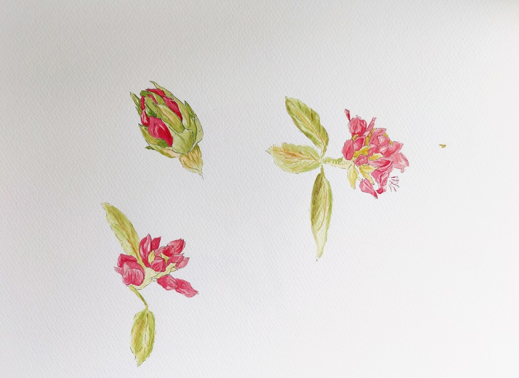
I thought that the detailed representation of a plant with black lines and watercolour worked well.
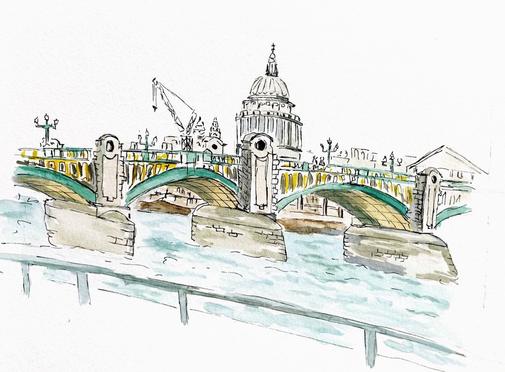
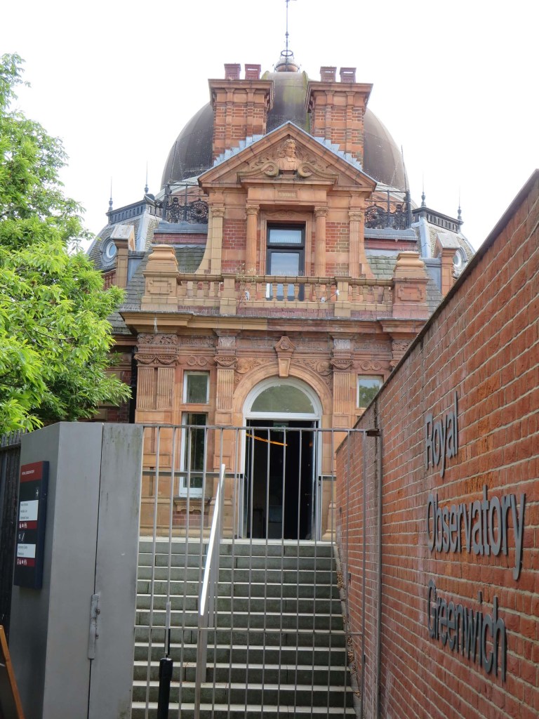
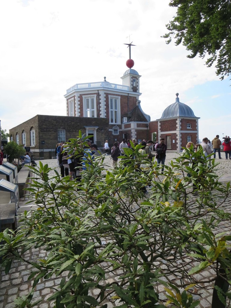
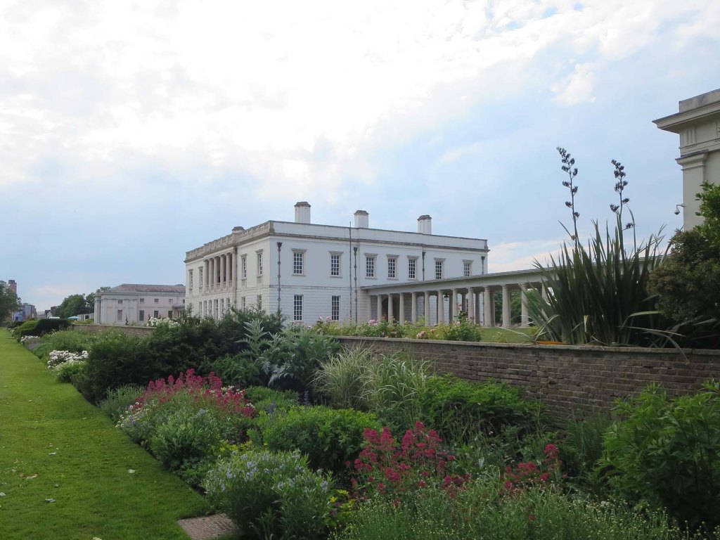
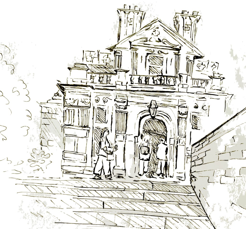
Although I need to practice more to sketch complex buildings with more assertive lines, I enjoyed drawing the Ranger’s House in Greenwich.
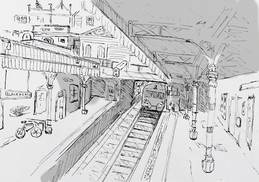
The station of Blackheath with all its intricacies and perspective was also an interesting place to sketch.

Have these exercises helped you to think about things in new ways or try out new ways of working? What have they been and how has your viewpoint changed?
On several occasions, I started an exercise by creating fast sketches without worrying too much about the outcome and this has been very helpful. This is something I was doing systematically at the end. When I started this section, I hesitated a lot before starting every sketch.
Experimenting with the creation of stylised versions (fashion illustration and botanical illustration) after having drawn multiple sketches gave me the opportunity to reach different outcomes.
These exercises have also helped me in general to develop my practice further, trying to add some depth and dynamic in my drawings.
If there’s one area you would like to develop further, what is it?
I like drawing flowers and plants and create patterns with foliage.
This also has given me the confidence to draw everything from a complex building to a train station or people in the street. I would like to combine all these aspects together.
Assignment two
The brief
- Commissioned by the local tourist board
- Create reportage illustrations
- Base illustrations on real people and places
- Capture a sense of place through drawing from life
- Illustrations should portray vitality and life (people at a destination, engaging with activities or enjoying the view)
- Create between three and five pieces of work with at least one in colour.
Questions
Where
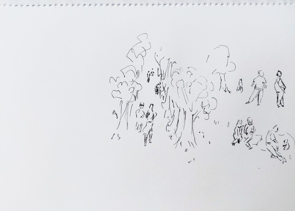
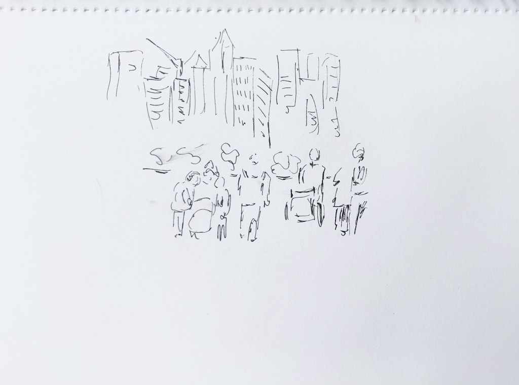
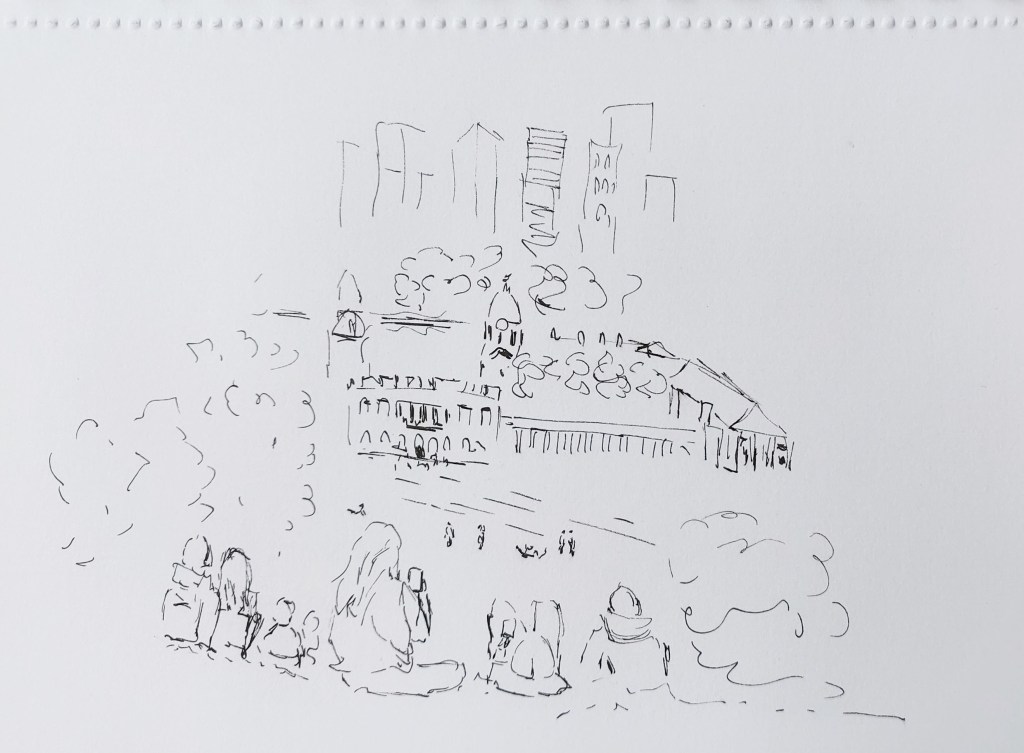
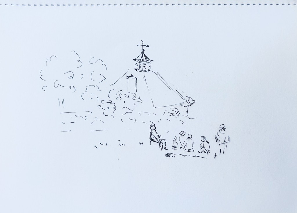
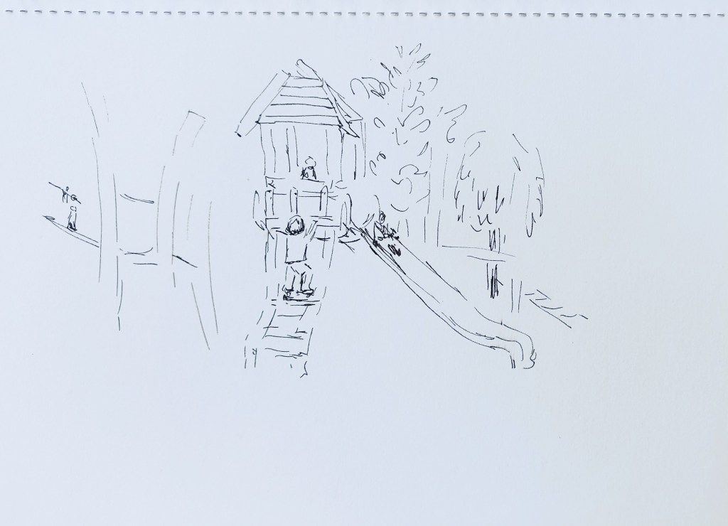
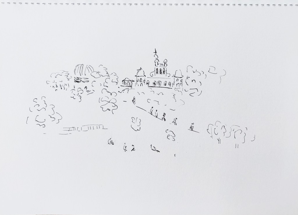
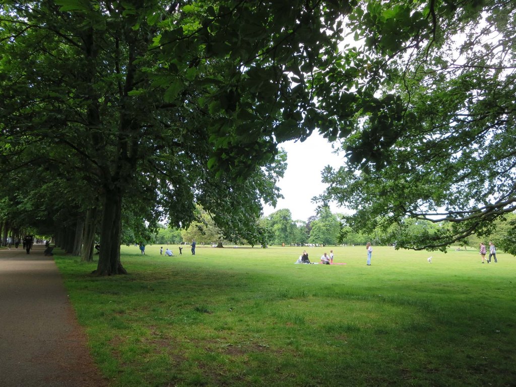
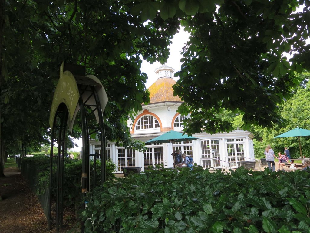
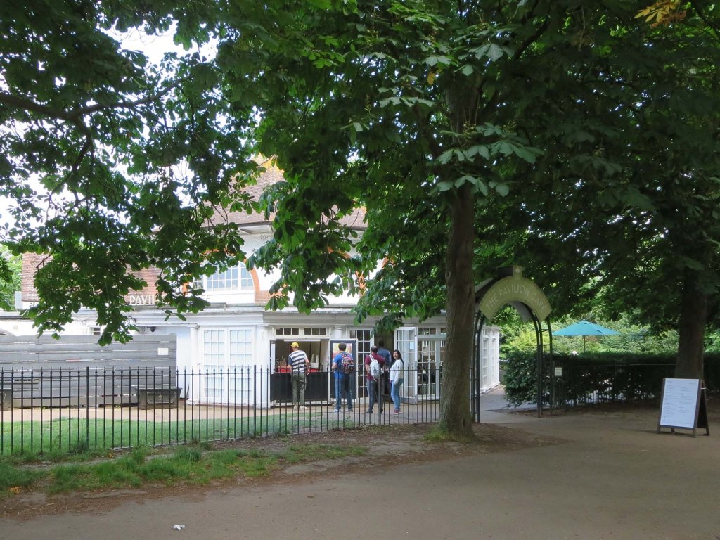
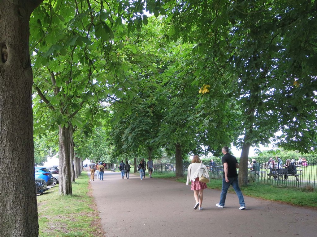
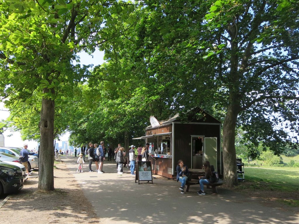
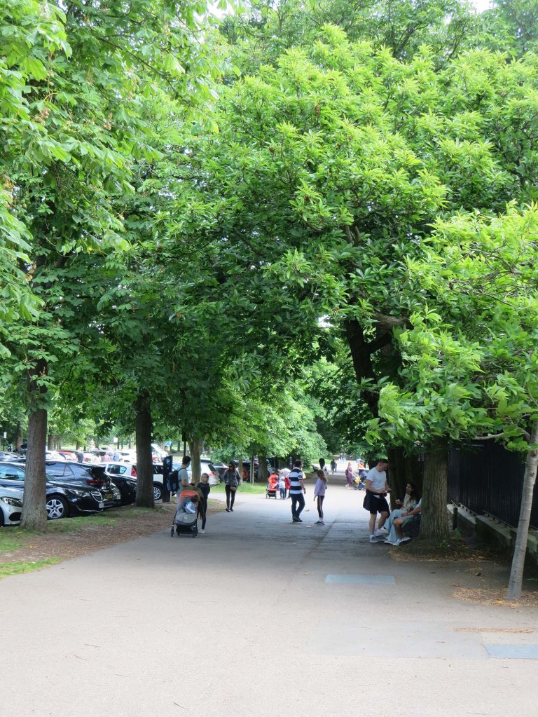
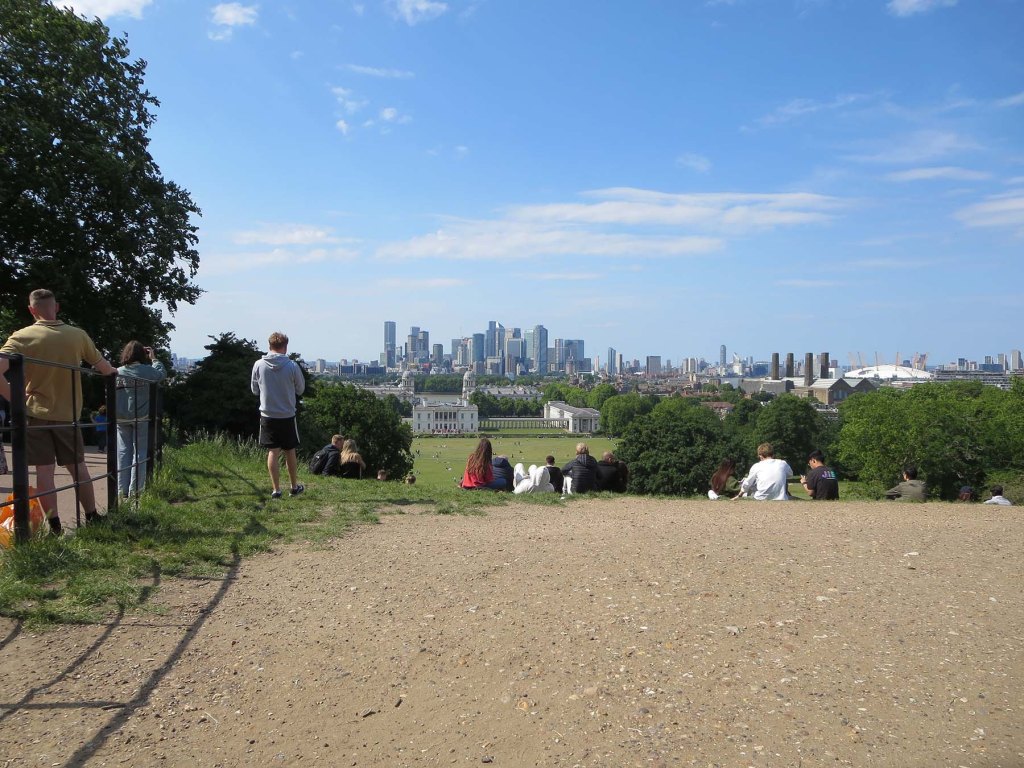
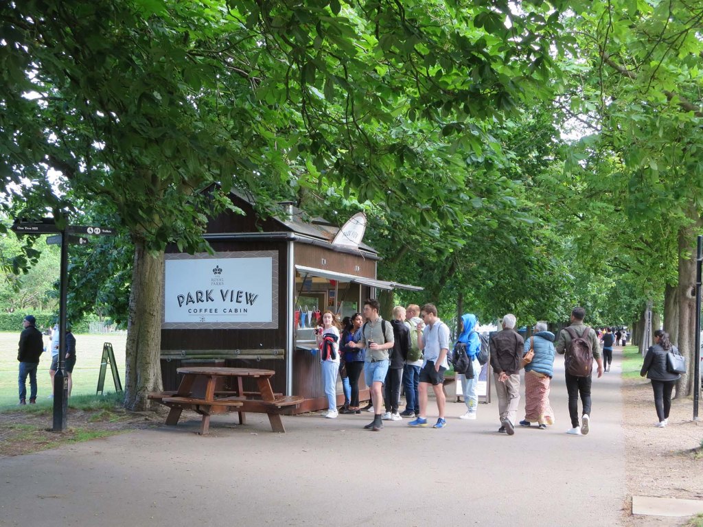
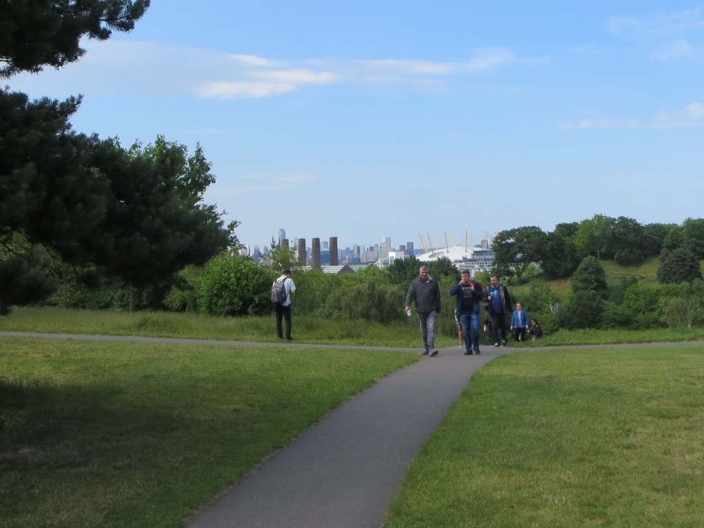
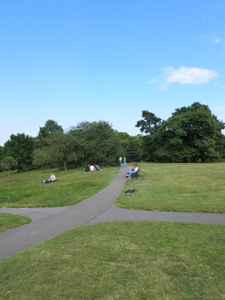
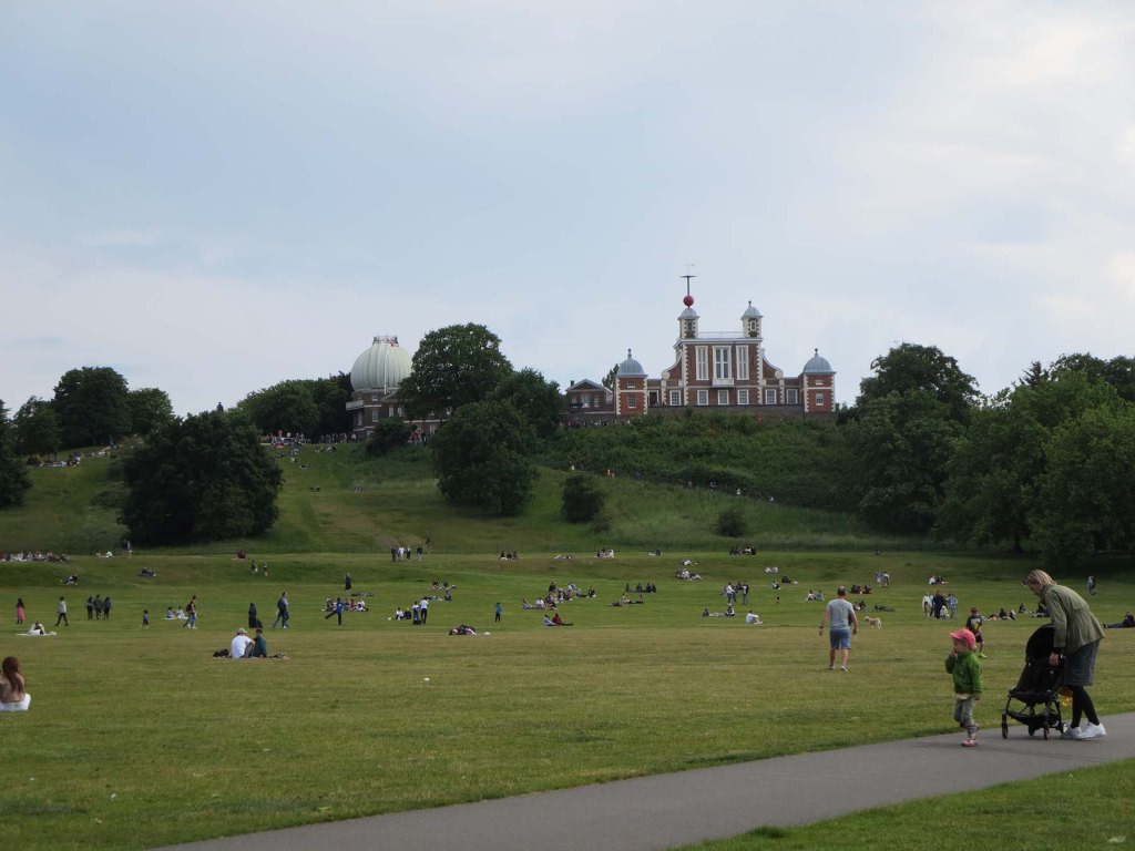
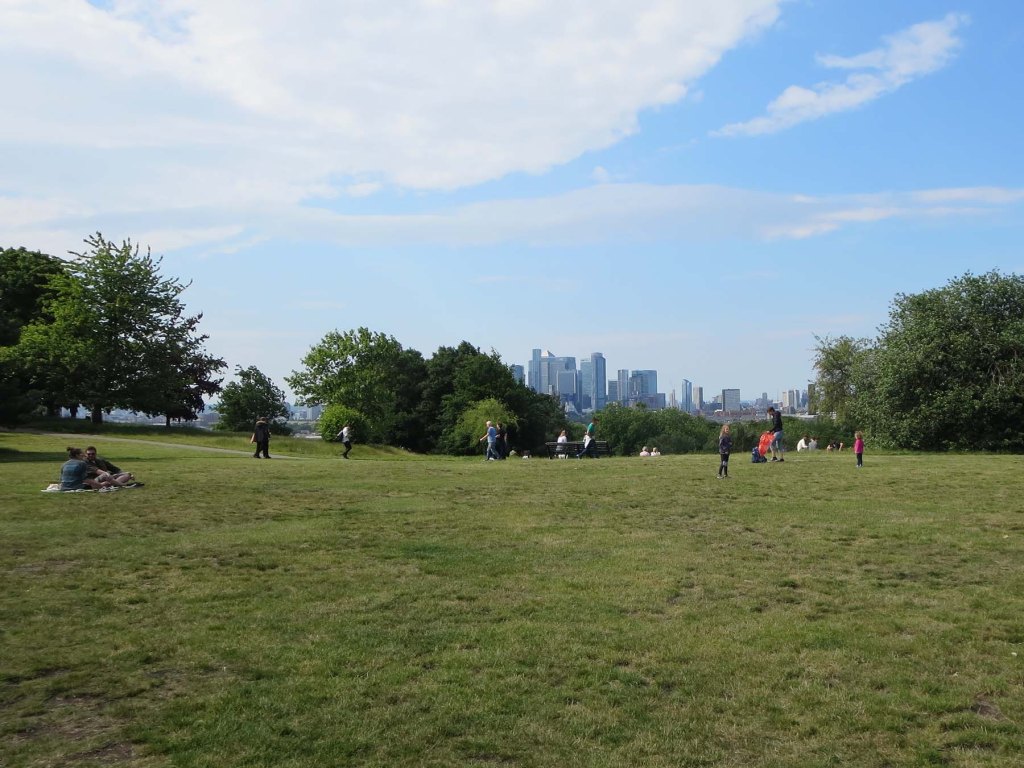
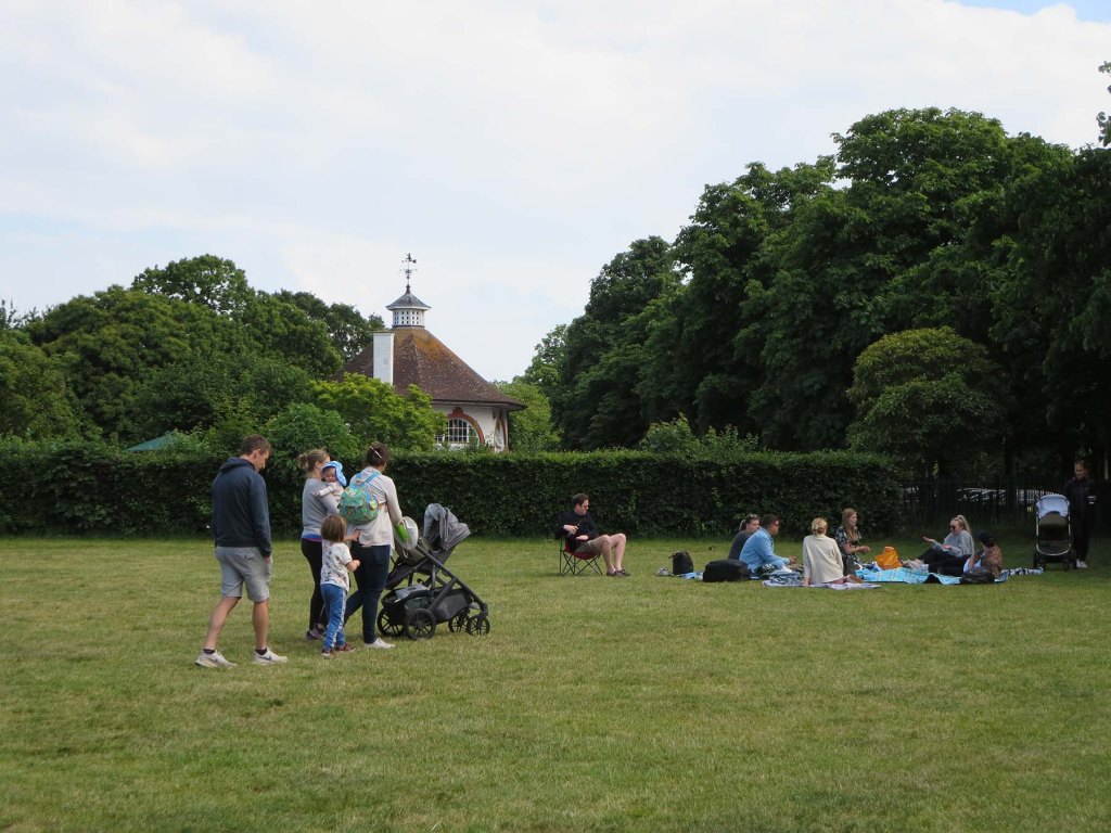
For this exercise, I chose Greenwich Park on a Sunday as I knew it would be busy.
Style
At that stage, I looked for some inspiration and was particularly interested in some illustrators who created images around that theme:
Alex Green: https://www.alexgreen-illustration.co.uk/
Owen Mathers: https://www.owenmathers.co.uk/travel-illustrations
Hennie Haworth: https://www.henniehaworth.co.uk/ (I noticed her work many times in the travel section of the Guardian)
Michael Storrings: www.storrings.com/myart/
https://www.digitalartsonline.co.uk/features/illustration/27-travel-illustration-tips-techniques/
These illustrators tend to have a hand-drawn style that I thought would work well for this brief.
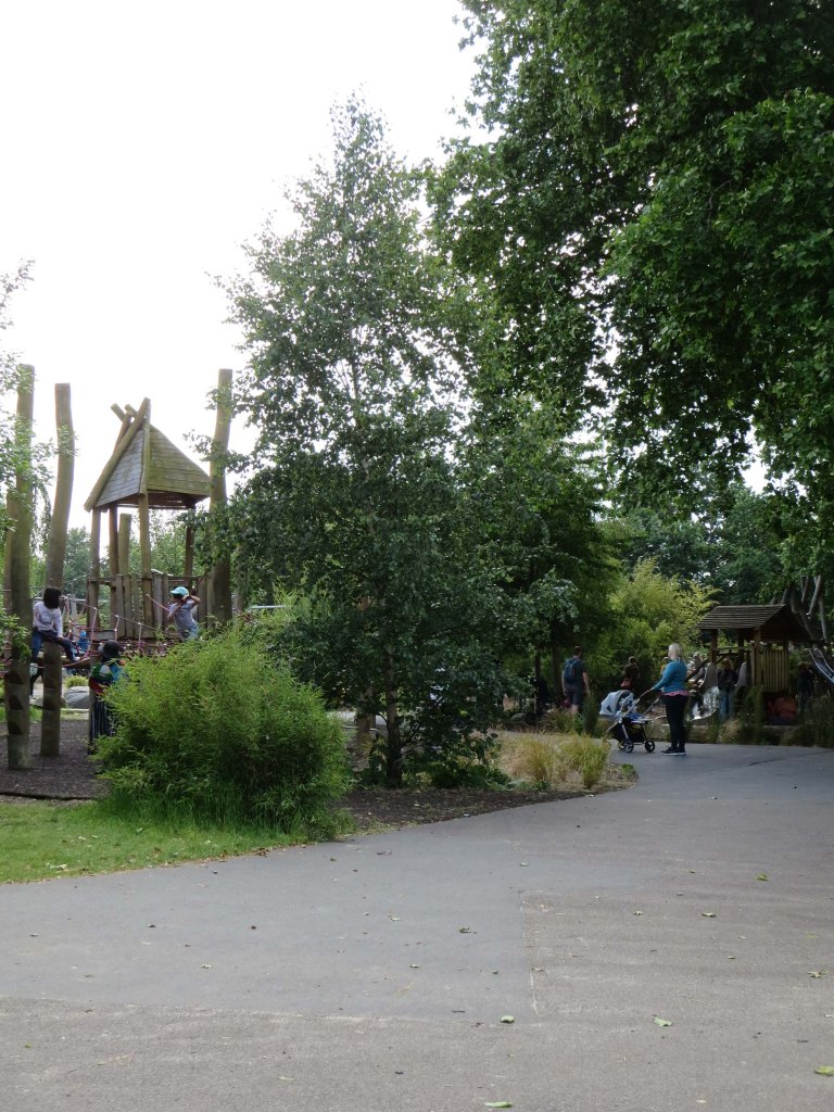
I then went to Greenwich Park to experience the place and draw some sketches in my A5 sketchbook.

I also took some photos.


I used my A4 sketchbook to create thumbnails while looking at my pictures and sketches. I wondered how I could combine different situations in one illustration.

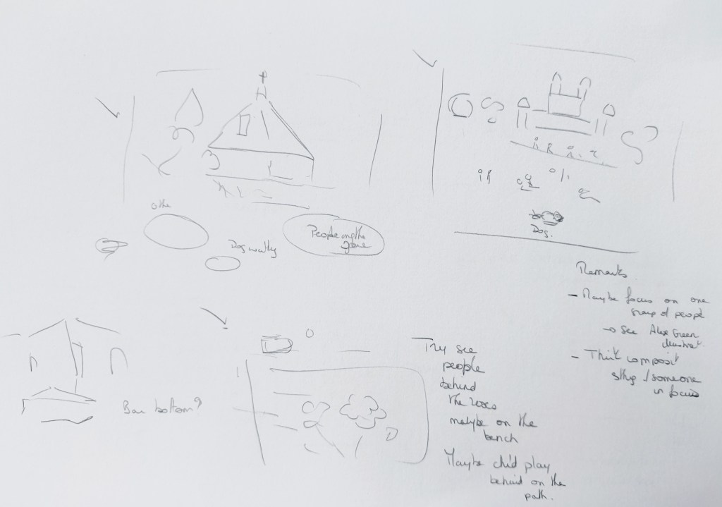
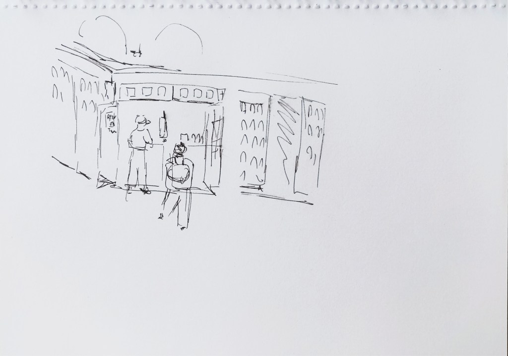
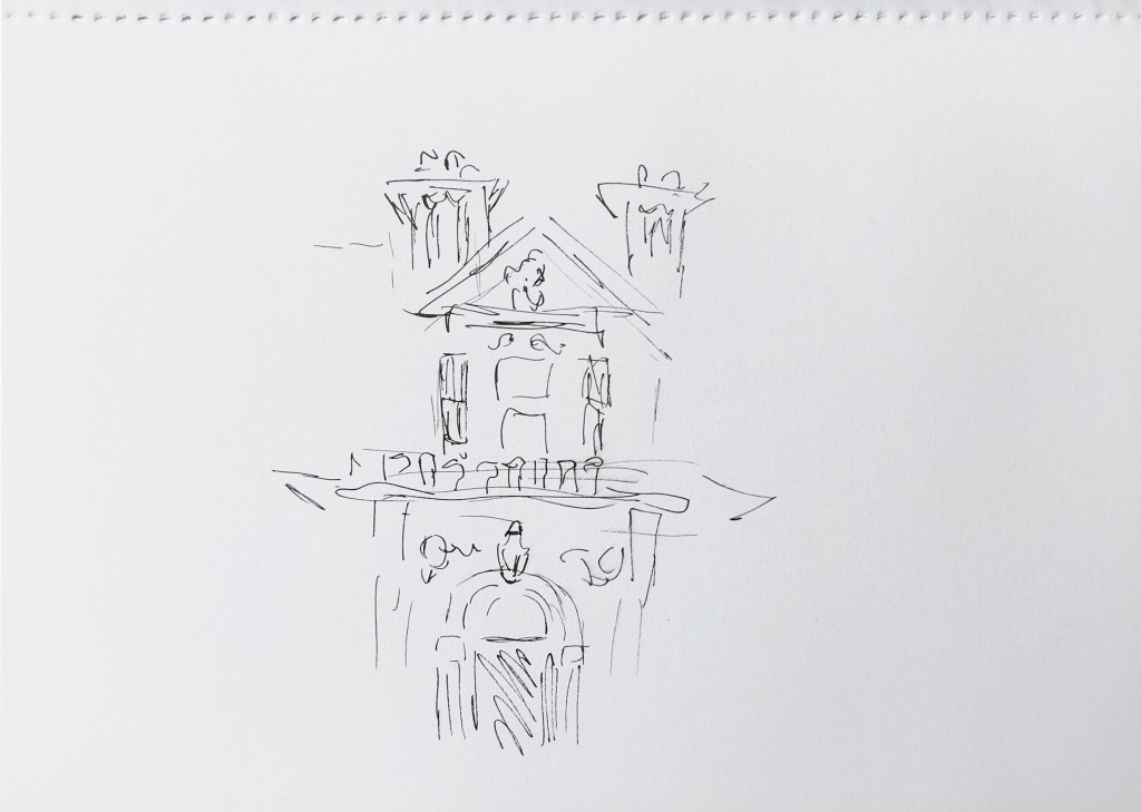
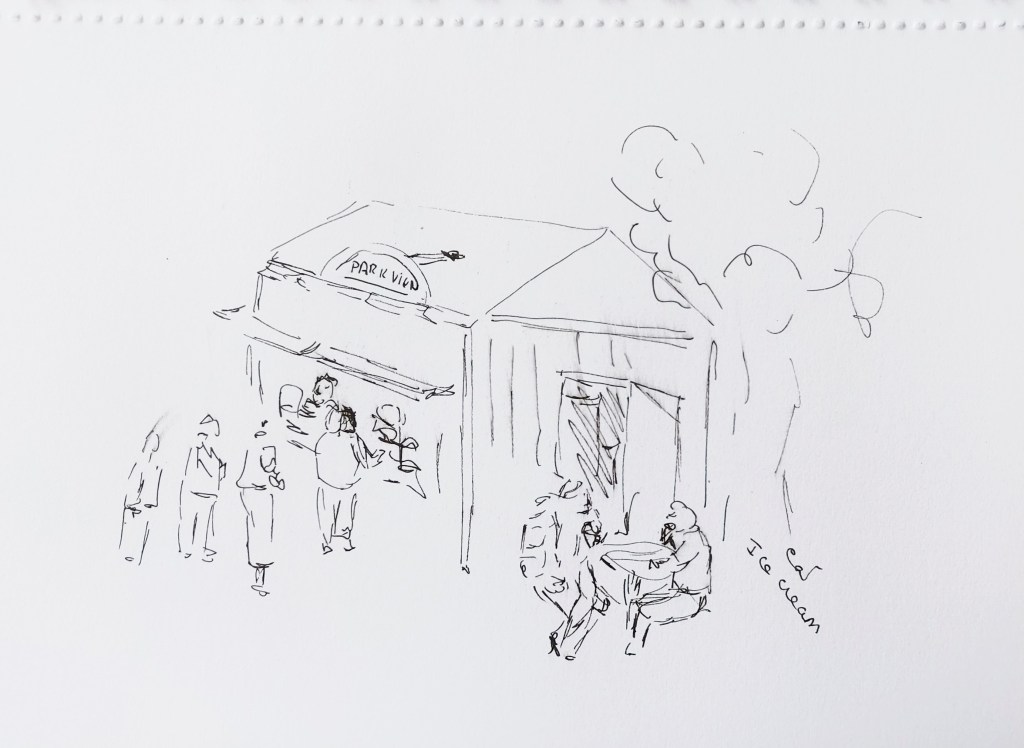
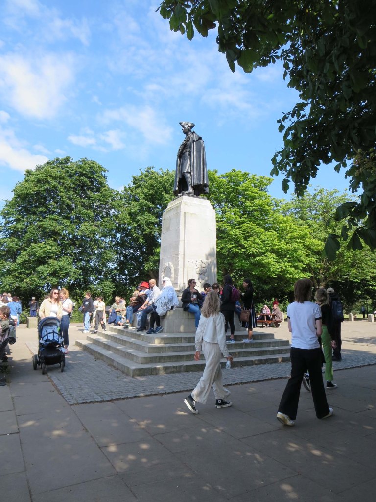
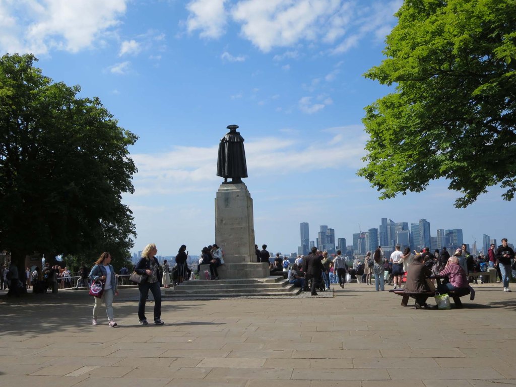
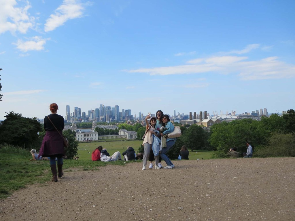
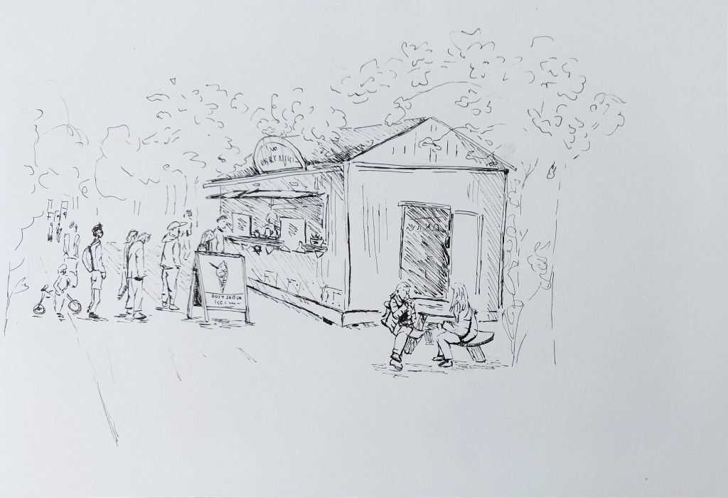
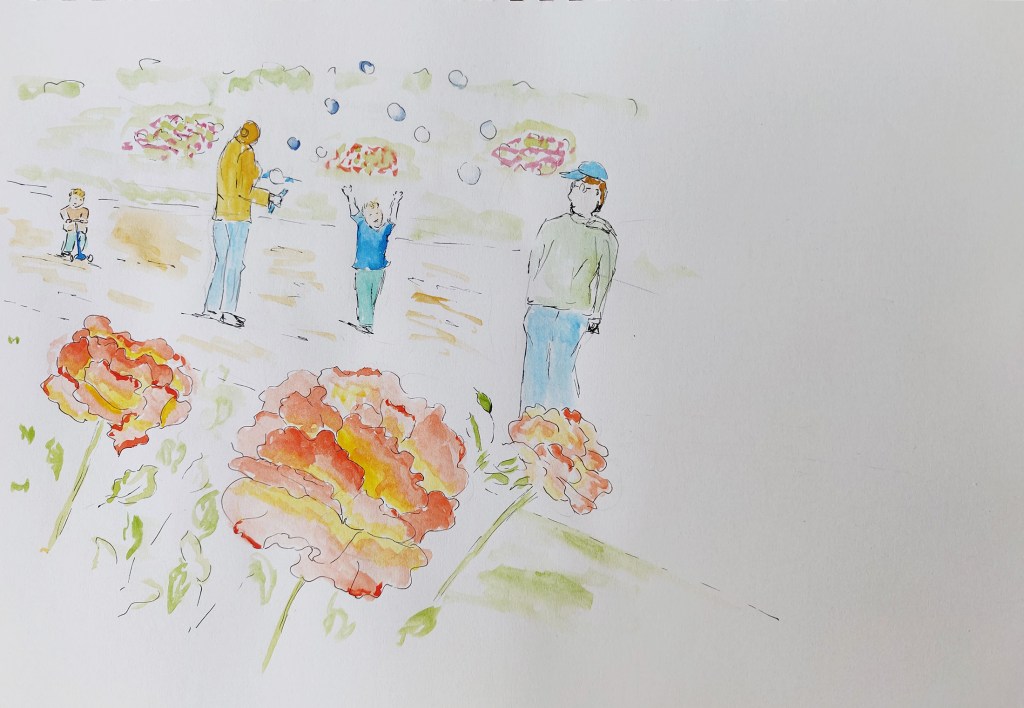
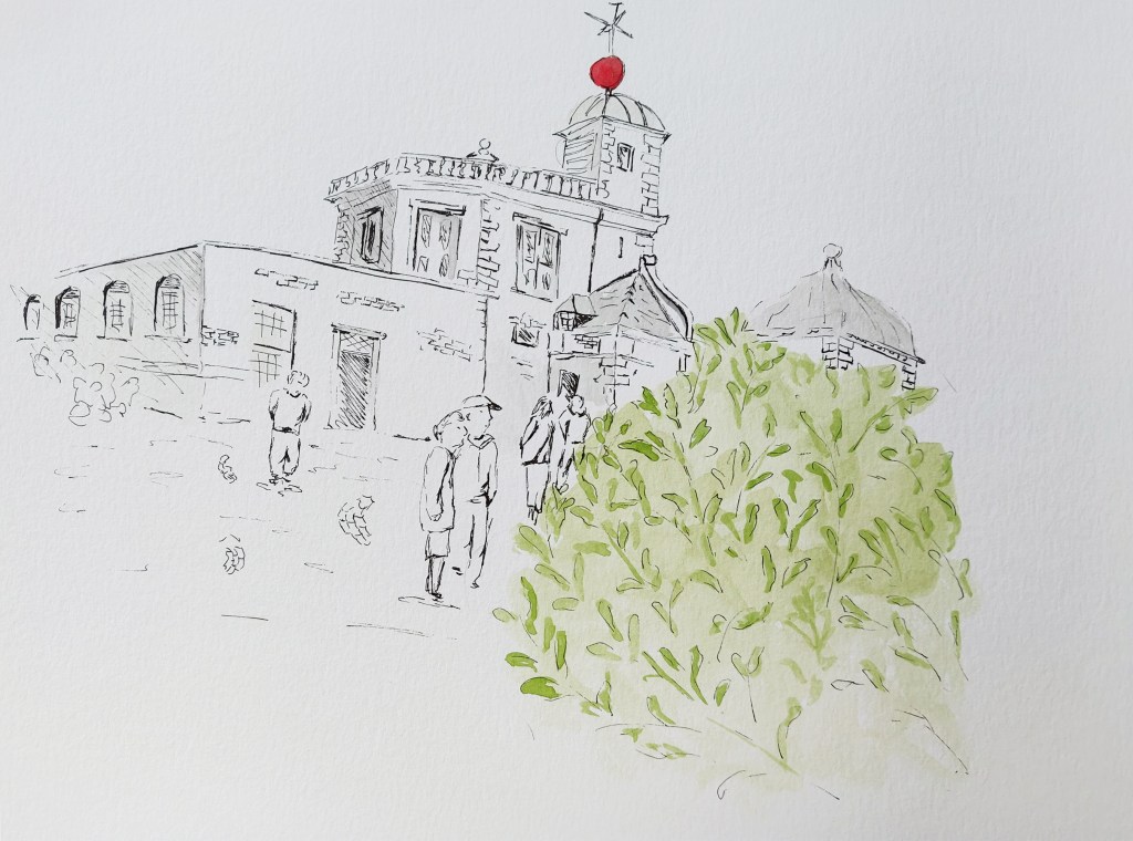
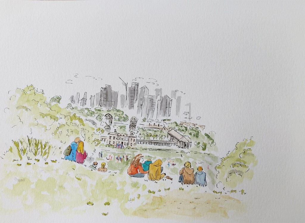
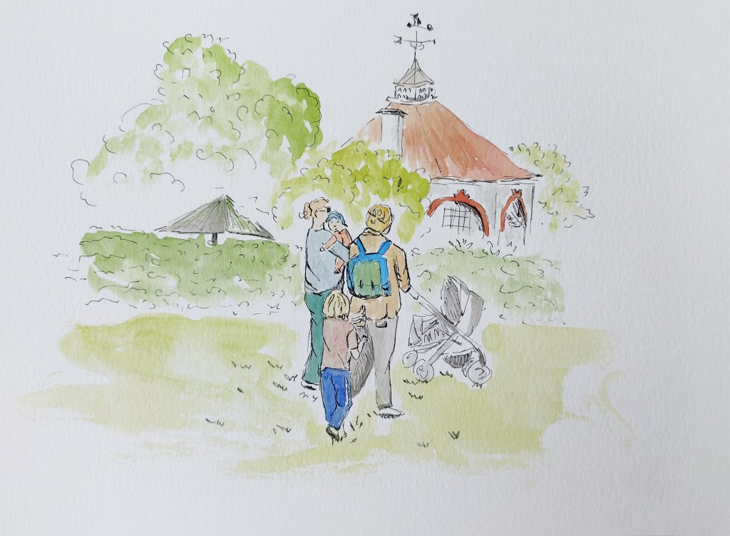
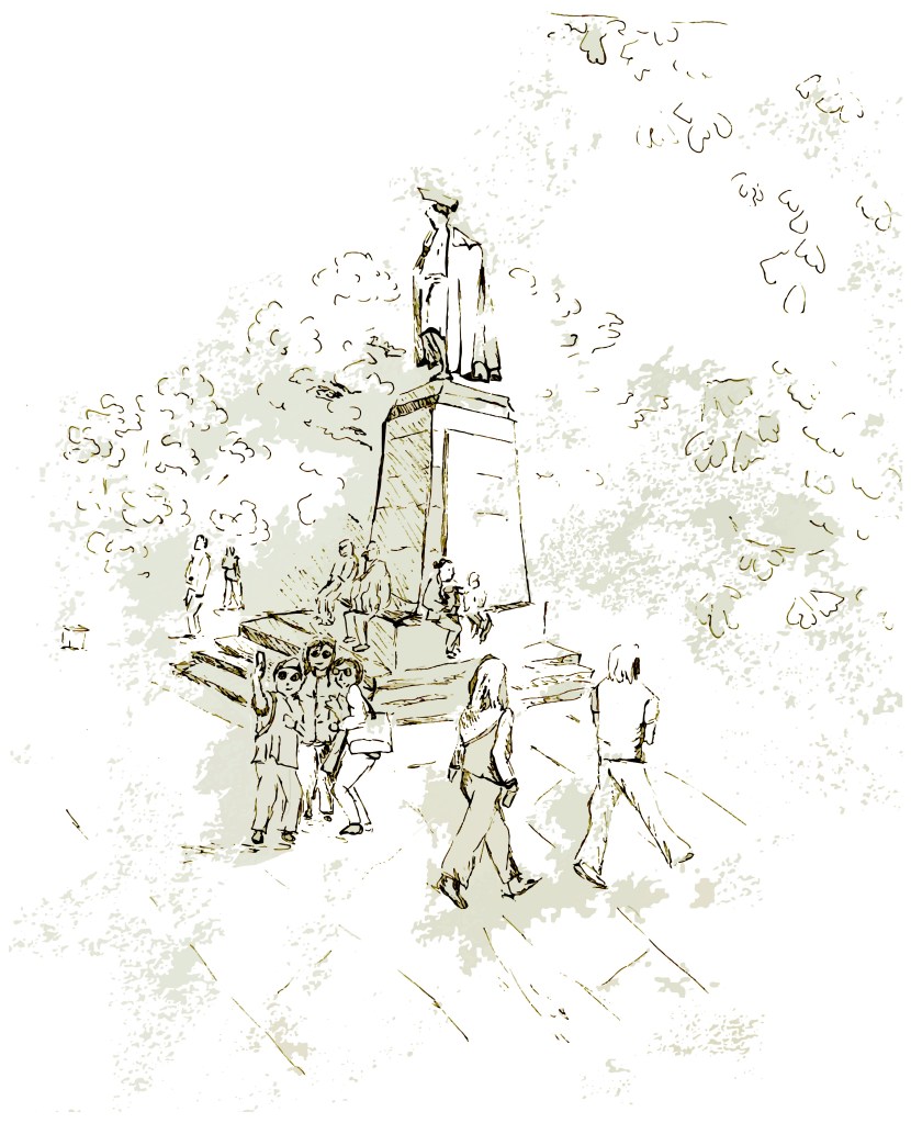
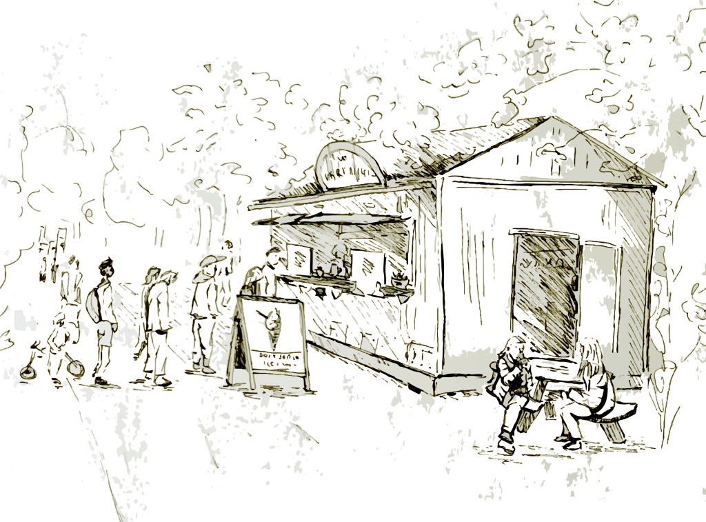
I then created more sketches in black and white. I chose places I liked and in some cases used other references to add people. For instance, the three ladies taking a selfie were in a different part of the park but I thought they would add life to the scene with the statue. I liked the building that is part of the observatory but it was not very busy at the time so I added people from different locations.


I created more sketches where I added watercolour. The first one does not really work but the intention was to focus on the roses with people behind.
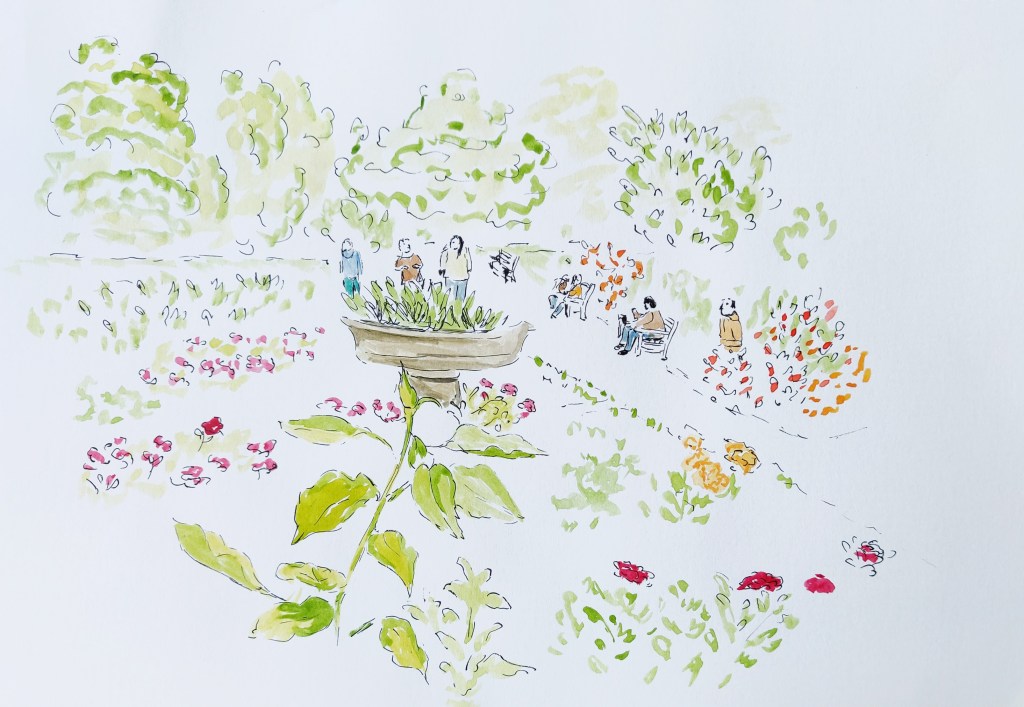
I then took my favourite illustrations and manipulated them digitally (Mix of Photoshop and Illustrator). In the case of the black and white illustrations, I kept some of the texture of the paper to create irregular shapes that evoke shadows and foliage. I added a bit of a burn effect in Photoshop. I also changed the scale of some elements. For instance, in the original drawing, I drew the three ladies in front of the statue smaller than they should have been, so I rectified this.

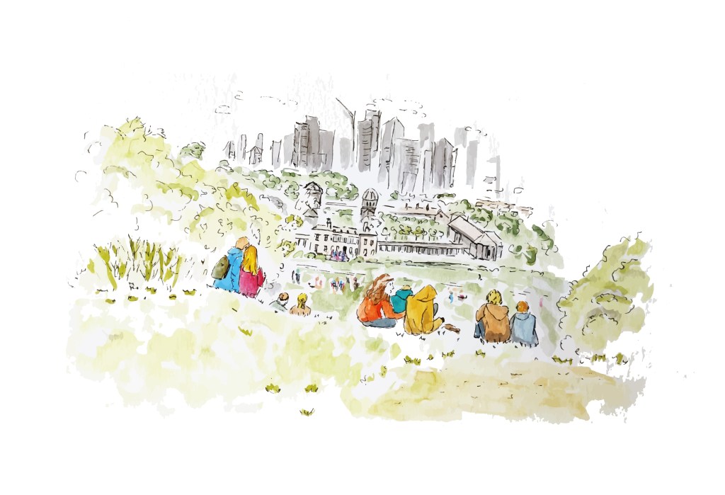
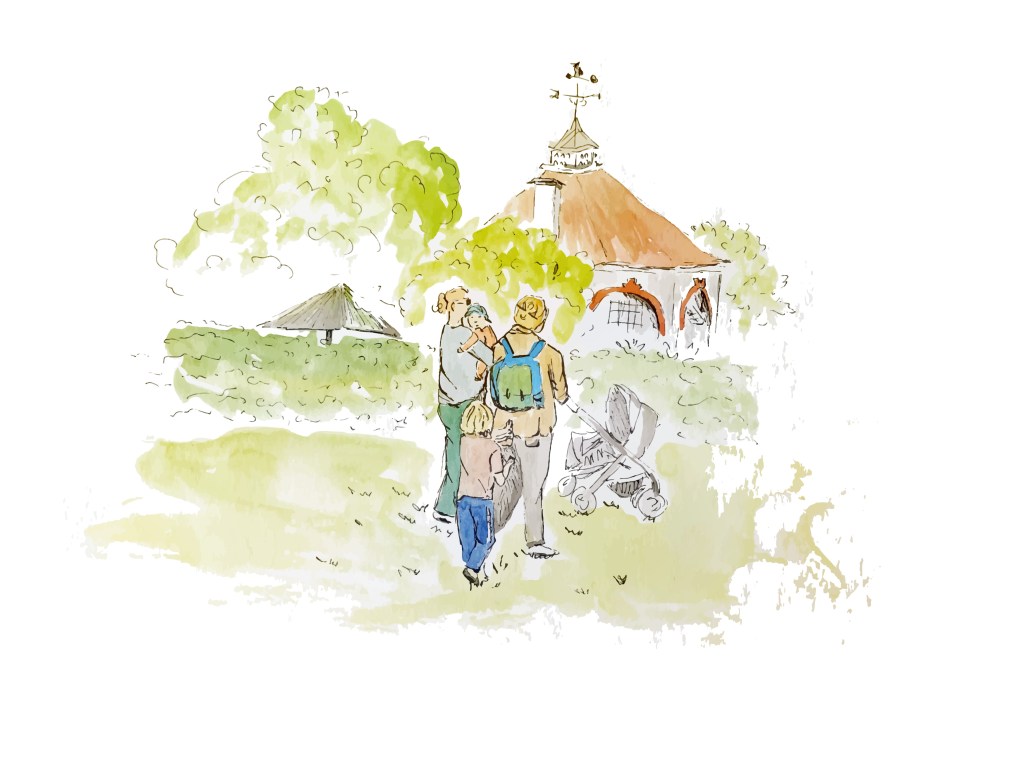
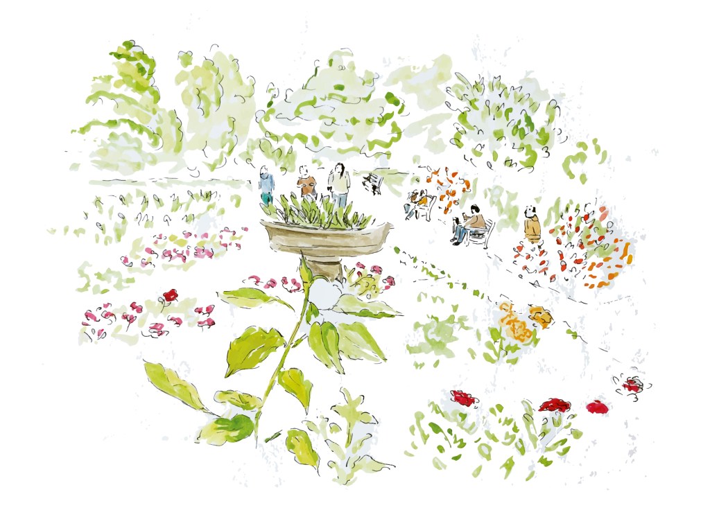
I kept the five following illustrations as my final illustrations.
What went well
This time I was more comfortable sketching on location even if I completed the more detailed sketches at home. The circumstances made it easier as the weather was nice and I could sit everywhere on the grass.
I enjoyed manipulating the sketches in Illustrator and Photoshop and liked the final versions, particularly the black and white images.
What I have learned from this exercise
I tried to put into practice what I learned in previous exercises, including how to draw buildings and people and combine different elements in the same image.
What to take forward
With every exercise, my confidence increased. The main things I would like to take forward are not to hesitate and just draw, focus on the depth of an illustration and not only the lines and shapes and be more assertive with every line.
Assessment criteria
- Demonstration of technical and visual skills – materials, techniques, observational skills, visual awareness, design and compositional skills
- I have worked at improving the contrast in my sketches and this is something I intend to focus on in the future
- In this section, I have used watercolour a lot and found that it is a good media to experience with colours
- Quality of outcome – content, application of knowledge, presentation of work in a coherent manner, discernment, conceptualisation of thoughts, communication of ideas
- I still focus on my learning log and try to communicate my observations clearly.
- Demonstration of creativity – imagination, experimentation, invention, development of a personal voice
- I enjoyed experimenting to create illustrations from sketches using Photoshop and Illustrator.
- At times, exploring other avenues freely without focussing too much on a given outcome from the start has enabled me to consider new methods to create an illustration.
- I have noticed that I am more comfortable with certain media and styles such as line and wash or vector images created in Illustrator. I would like to improve on my technique in these areas while exploring other options.
- Context reflection – research, critical thinking (learning logs and, for second and third level courses, critical reviews and essays).
- The research points in this section have been very helpful as they encouraged me to make a habit of doing the necessary research before embarking on a brief.
Edits
After reading my tutor’s feedback, I decided to add some colour to the three final black and white sketches in order to add some context such as the weather, the light and energy of the place at the time.
Here are the three sketches next to the original. I added the colours in Photoshop:

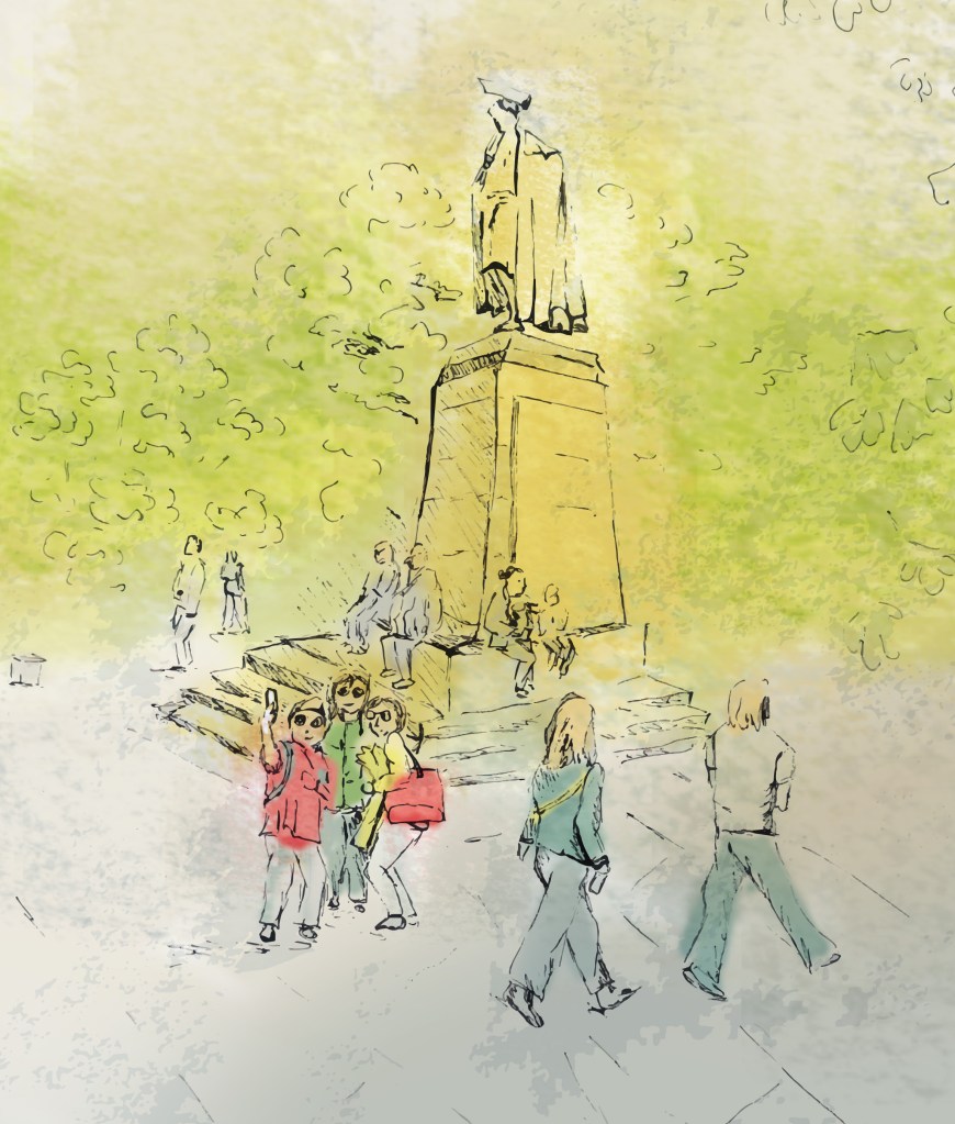

I struggled to add the right amount of colour, especially for the second image. However, I can see how colour can add some energy to the sketches and convey a completely different feel. It can also be an opportunity to use a more vibrant colour to highlight a particular element in the image.
