The brief
- Turn a short story into a mini graphic novel;
- Aim to work over two or three pages only;
- Design a cover that includes the name of the short story, the author’s detail and your own.
Research: differences between graphic novels and comics
I first looked into the differences between graphic novels and comics as there seems to be an overlap and I still was not entirely sure of the distinction between both. I read several articles online (including https://www.masterclass.com/articles/learn-the-difference-between-graphic-novels-and-comics and https://askanydifference.com/difference-between-graphic-novel-and-comic-with-table/).
I learned that graphic novels are usually longer and tell a full story. They tend to contain more text alongside the illustrations and dialogues to explain what is happening.
I also found an interesting article in the Guardian about the winner of the Observer/Faber graphic short story prize with a good example of a short graphic novel: https://www.theguardian.com/books/ng-interactive/2022/nov/20/graphic-short-story-midnight-feast-by-rebecca-jones.
Size
I opted for an A4 portrait format as this is a standard size for this type of publications.
Choice of story
I first considered a short story I found on the following website: https://americanliterature.com/author/guy-de-maupassant/short-story/a-fathers-confession. The story was written by Guy de Maupassant at the end of the nineteenth Century. I went as far as creating thumbnails, sketching the main characters and researching a style that would work well with the story. Unfortunately, when I started sketching the various scenes, I realised that this story was far too complex to be told successfully over 2 or 3 pages.
I then looked at graphic novels I had researched before to see how much happens in 2 or 3 pages and realised that the story would have to be much shorter.
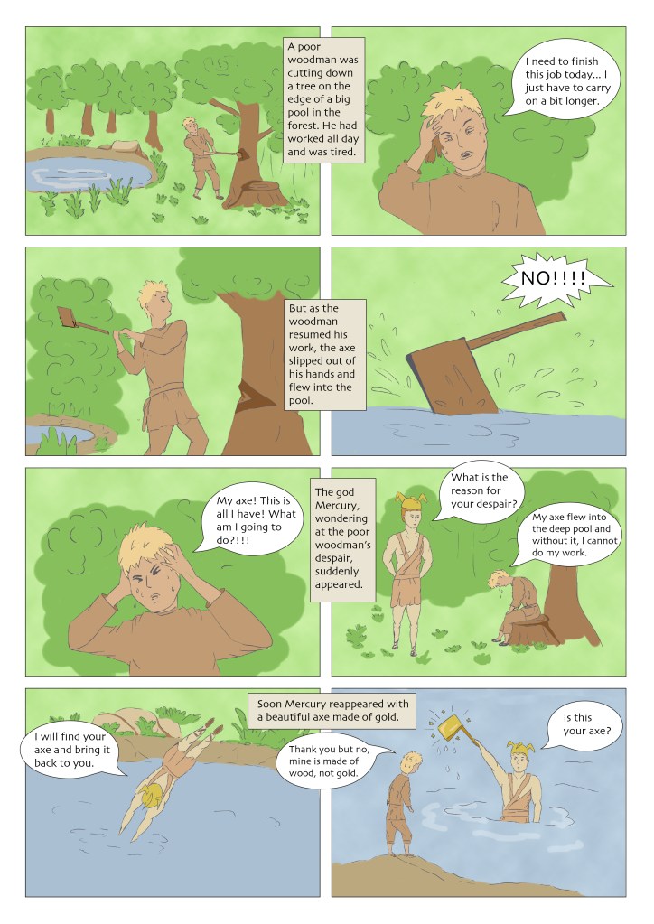
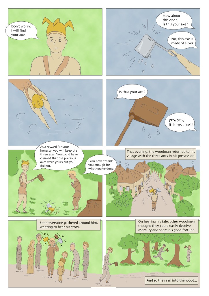
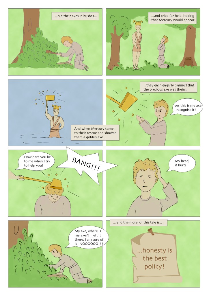
In the end, I selected one of Aesop’s fables that is a bit longer than others but manageable in this context: Mercury and the Woodman. I used the version found in the following website: https://read.gov/aesop/102.html.
I did some research on the god Mercury and found that he was always represented with a golden helmet. I also wanted to exaggerate the fact that gods in mythology are usually represented with a lot of muscles and are supposed to illustrate an idea of human perfection.
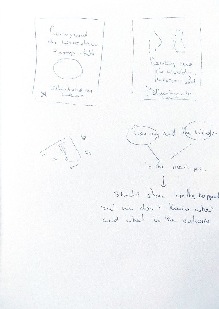
I used my sketchbook to define the characters and the structure of the novel.
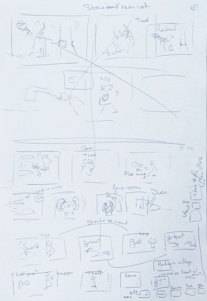


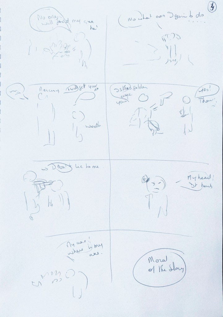

I then sketched the different scenes in Procreate.
This is the work in progress for the first two pages:
Once I was happy with the sketches, I worked with Illustrator and Photoshop to put all the pages together, colour the sketches and add the dialogues. I selected a simple colour palette and opted for natural colours as this tale depicts a time before manufacture and people would have used natural resources for all their needs. I tried to consider the composition of every frame and, for instance, I zoomed on the characters to highlight intense emotions.
I chose a typeface (Skya) that suggests handwritten letters. However, it is also a typeface that does not stand out too much so as not to draw attention away from the illustrations.
Cover page
I found an article in the Guardian containing many examples of cover pages for graphic novels: https://www.theguardian.com/culture/gallery/2011/oct/30/ten-best-graphic-novels-in-pictures.
First I thought of creating a new sketch for the cover page but when I looked at the sketches I had created, I really liked the idea of Mercury and the woodman in the same frame when they meet for the first time. I took that frame and modify it so that it would work for the cover page. I removed all the background as I wanted the emphasis to be on both characters:
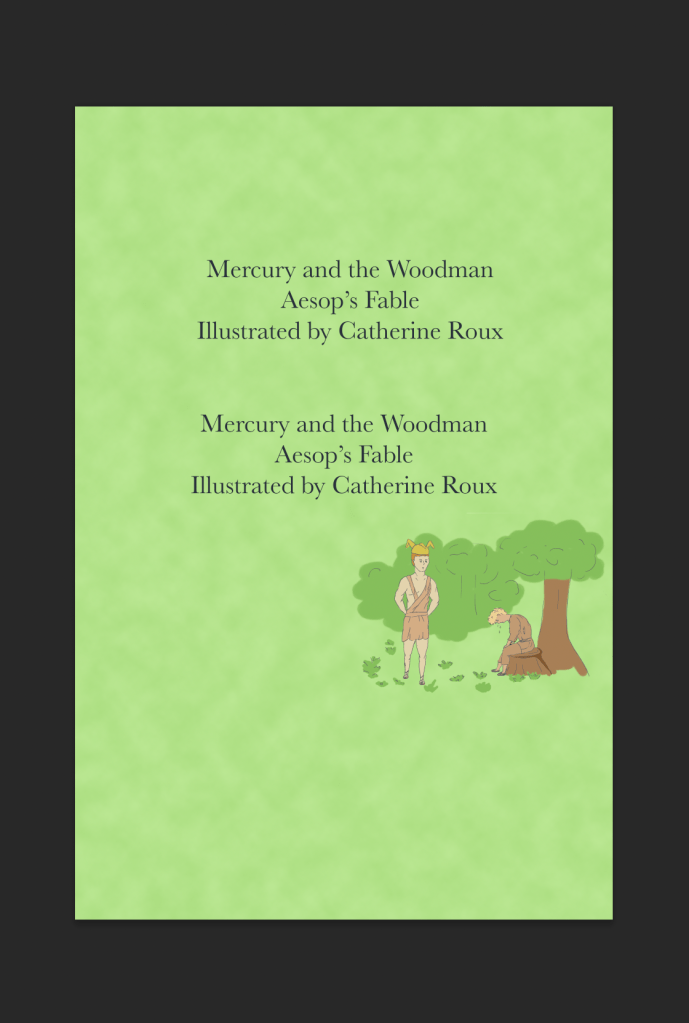
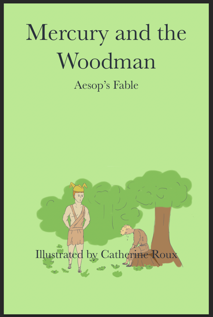
This is the final version:
For the cover page, I wanted a typeface that would be different from the other pages as it is not about dialogues. A serif typeface seemed an obvious choice for an ancient tale. I tried a few but kept Baskerville as I find that it is a well balanced typeface that has a traditional look.
I did not want the cover page to be too busy and liked the idea of the two characters standing out at the centre of the page. Their encounter illustrates the heading (Mercury and the Woodman) and indicates that something has just happened as the woodman is distressed; yet it does not reveal anything about the story.
Here are all the pages together:
What went well
I feel that the story I eventually decided to illustrate worked well on three pages. It meant that I could use some frames to emphasise some parts of the story, such as the one when the woodman has just been hit by the axe.
There is always a temptation to use more colours but again, in restrospect, a limited palette works well, although I wonder if I could have used stronger colours.
Deciding in advance what each frame would contain by creating thumbnails really helped to structure the story properly.
Challenges
The main challenge was to keep some consistency in the sketches throughout the story, more particularly with the character’s faces and expressions. This is particularly true when drawing faces from different angles and with different expressions. I am not sure I have achieved this with the character who tries to trick Mercury at the end of the story.
What I have learned from converting a story into a graphic novel
Initially I opted for a story that was too long and I had to pause and reflect on the way a graphic novel works. If the pace is too fast, there is no space to create suspense, comedy or any other emotion as every frame has to describe a given situation.
I also realised that I could take some liberty in the way I wanted to tell the story. In fact, scripts inspired from books often take some liberty with the text if it helps with the dynamic of a film or a play as the rhythm has to be completely different.
I enjoyed finding ways to illustrate certain parts, especially the moment when the woodmen all try to play the same trick on Mercury. I also chose to illustrate the woodman complaining about the fact that his head hurts to add some comedy and hint at the fact that the blow was not that serious.
Assessment Criteria
Demonstration of technical and visual skills – materials, techniques, observational skills, visual awareness, design and compositional skills
In part three, I have had to concentrate on creating characters that needed to be consistent throughout a story. This was both interesting and challenging as a slight difference in the length of a chin or lines more or less rounded can make a character look very different.
I have learned new skills when I tried to create some animation. It gave me the opportunity to reflect on movements and how a small gesture will affect the entire body.
Quality of outcome – content, application of knowledge, presentation of work in a coherent manner, discernment, conceptualisation of thoughts, communication of ideas
I try to keep my learning log organised. I have also made an effort to capture the work in progress as, sometimes, when I worked digitally in the past, I forgot to keep intermediary versions of my work.
Demonstration of creativity – imagination, experimentation, invention, development of a personal voice
I looked at the pieces I created side by side and realised that I tend to go for a certain style. I prefer funny characters and bright colours although I also like black and white illustrations. I often use black lines and watercolour or digital colouring.
Context reflection – research, critical thinking (learning logs and, for second and third level courses, critical reviews and essays).
I find the research points very useful as they help me to concentrate on certain aspects of the research.
In this part, I have had the opportunity to reflect on anthropormophia when I drew some of the animal characters and I would like to develop this further as part of the critical review.
Edits
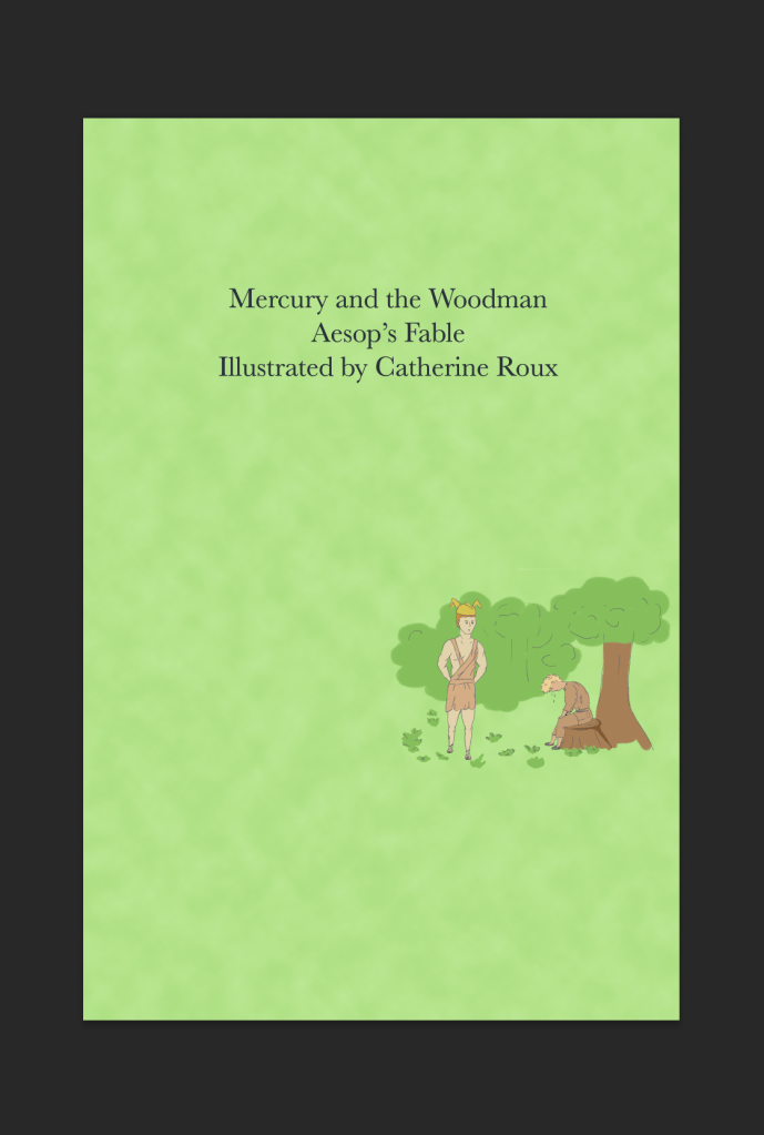
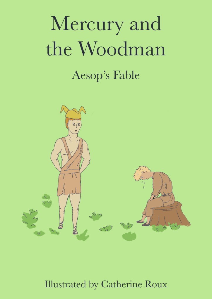
After reading my tutor’s feedback, I tried to experiment with the cover page and add more leaves and branches around the characters to frame the scene.
Here are a few of the versions I created next to the original one.
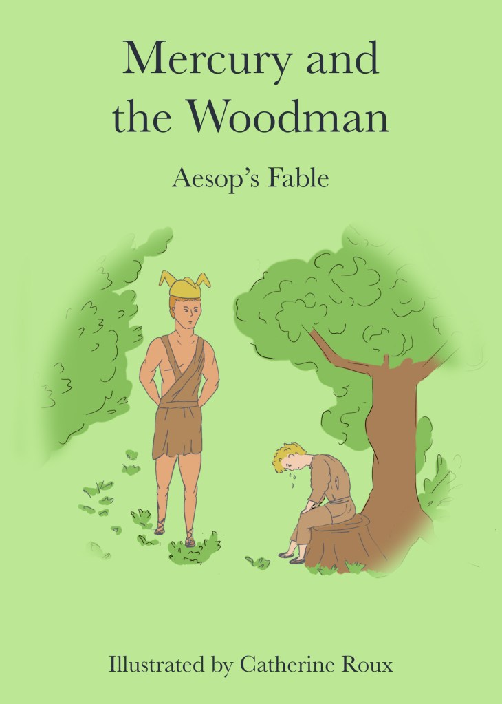
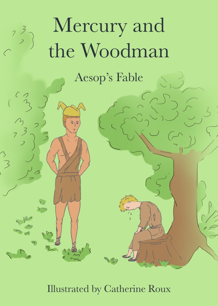
I think that the last one is the most successful. The vegetation frames not only the characters but also the heading and subheading. However, I am not sure I succeeded in getting the right amount of detail around the characters.
