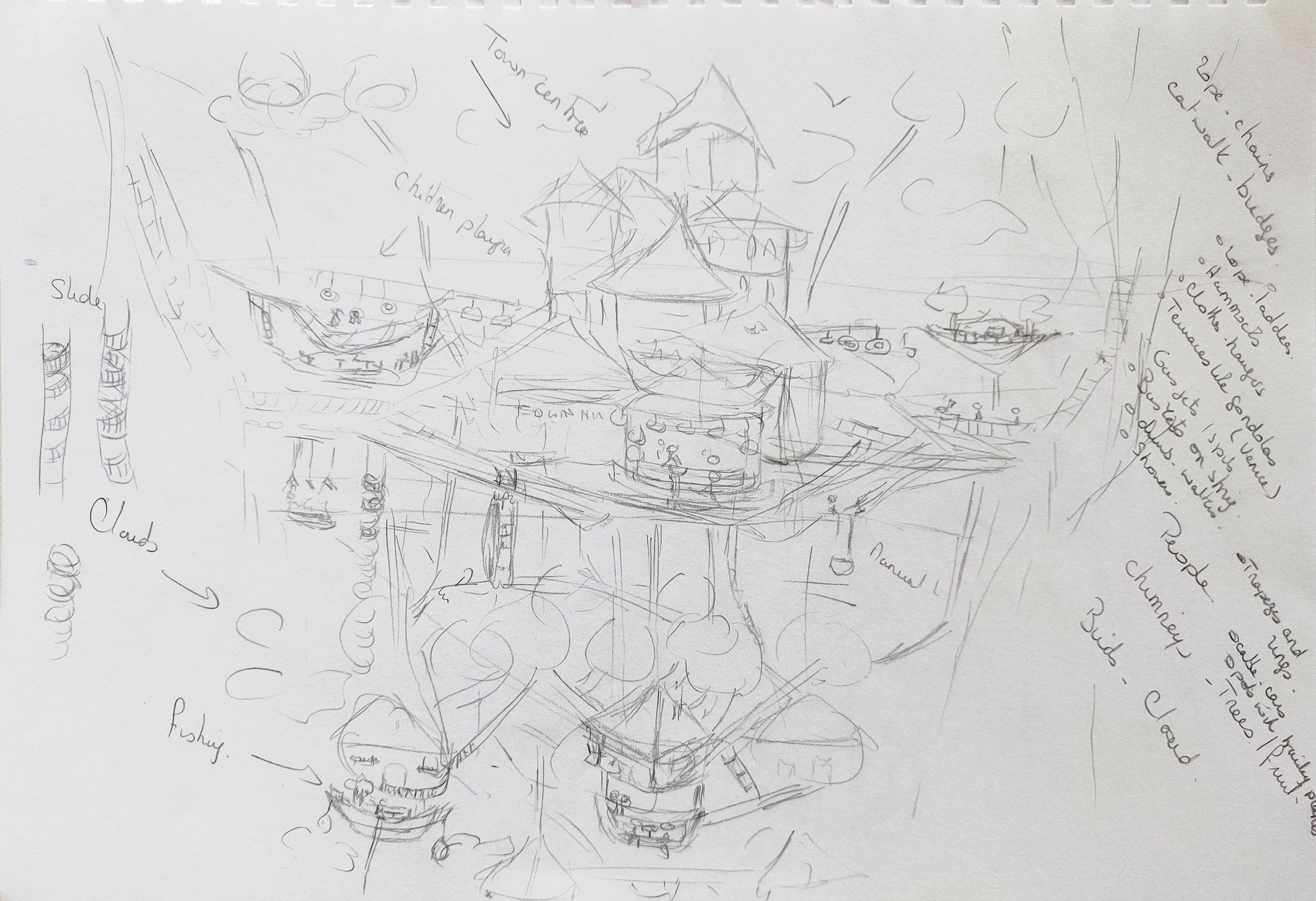
I approached this brief a bit differently than I would normally. Once I had read the description of the city, I wanted to explore the images that the words conveyed before doing any research as I did not want to be influenced by previous illustrations on the subject. I therefore started by writing ideas in my sketchbook and doodling little sketches inspired by Italo Calvino’s description.
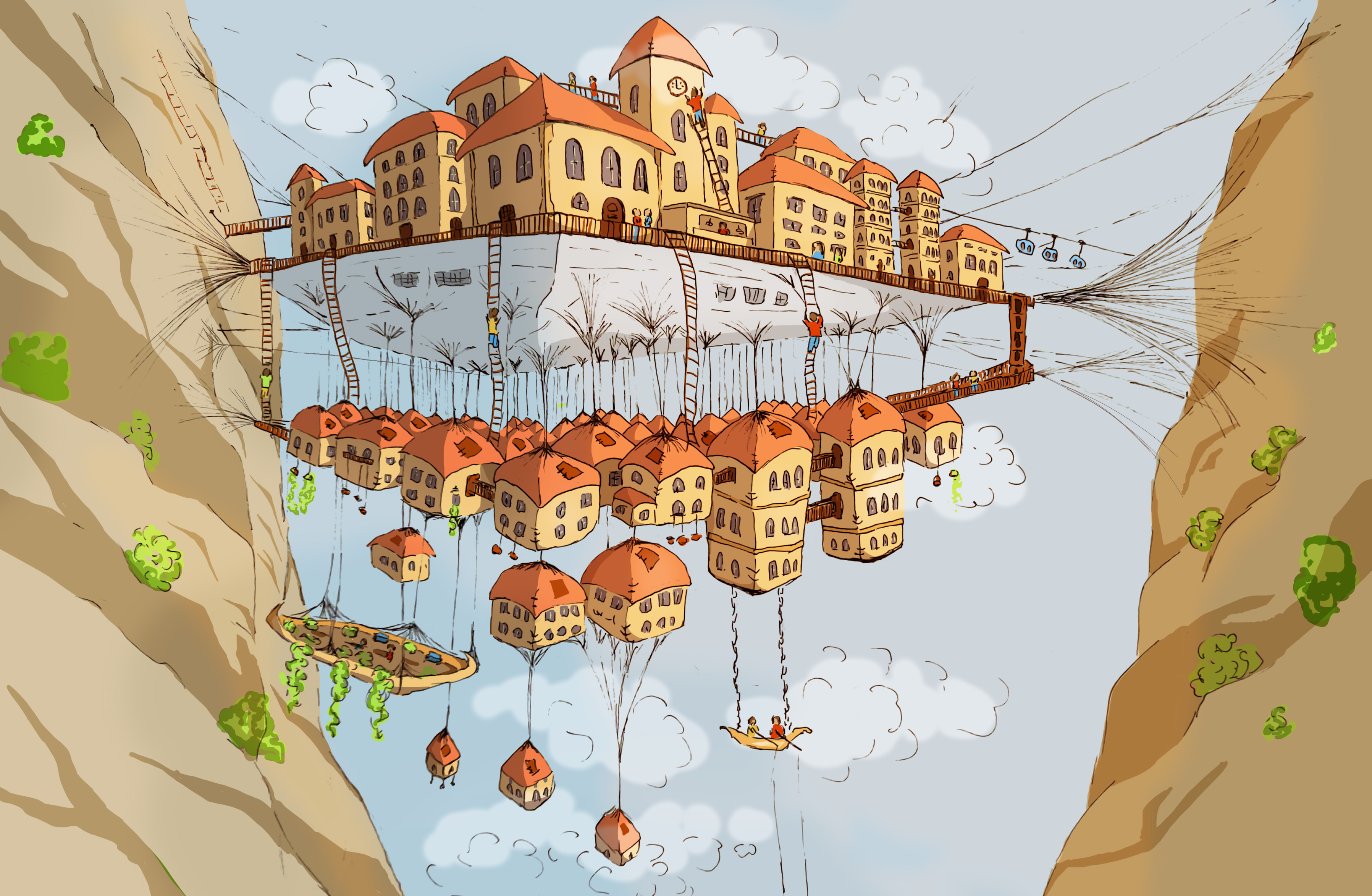
The depiction is rich with details and gives the impression of a busy city full of life and maybe quite organic in the way it was built and I wanted to illustrate that.
Once I had an idea of how I would imagine the scene, I reflected on the research I needed to carry out.
Research about the novel “Invisible Cities”
A summary of the book can be found on Wikipedia: https://en.wikipedia.org/wiki/Invisible_Cities
One paragraph in particular is very significant: “In one key exchange in the middle of the book, Kublai prods Polo to tell him of the one city he has never mentioned directly—his hometown. Polo’s response: “Every time I describe a city I am saying something about Venice.”” There is a reference to gondolas in the description of Octavia. I revisited some photos I took of Venice and googled Venice to look at more images to have that city in mind as I created the illustration.
What has been done before
I used Google images again to find illustrations of Octavia. It was interesting to see that the description had been interpreted in many different ways. At the same time, the illustrations I found were different from what I had imagined when I read the extract from the book.
Research on sketches and illustrations of cities
I created a Pinterest board with sketches of cities.
I also looked at two books in the collection “The Urban Sketching Handbook” that contain many urban sketches (see bibliography at the end).
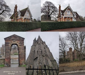
Perspective
I took pictures of buildings around me from different viewpoints and paid attention to the perspective. Here are a few examples:
Dimensions of the illustration
As no dimensions were mentioned in the brief, I decided to use an entire A4 sketchbook page.
I also researched other details such as cliffs and gorges for instance.
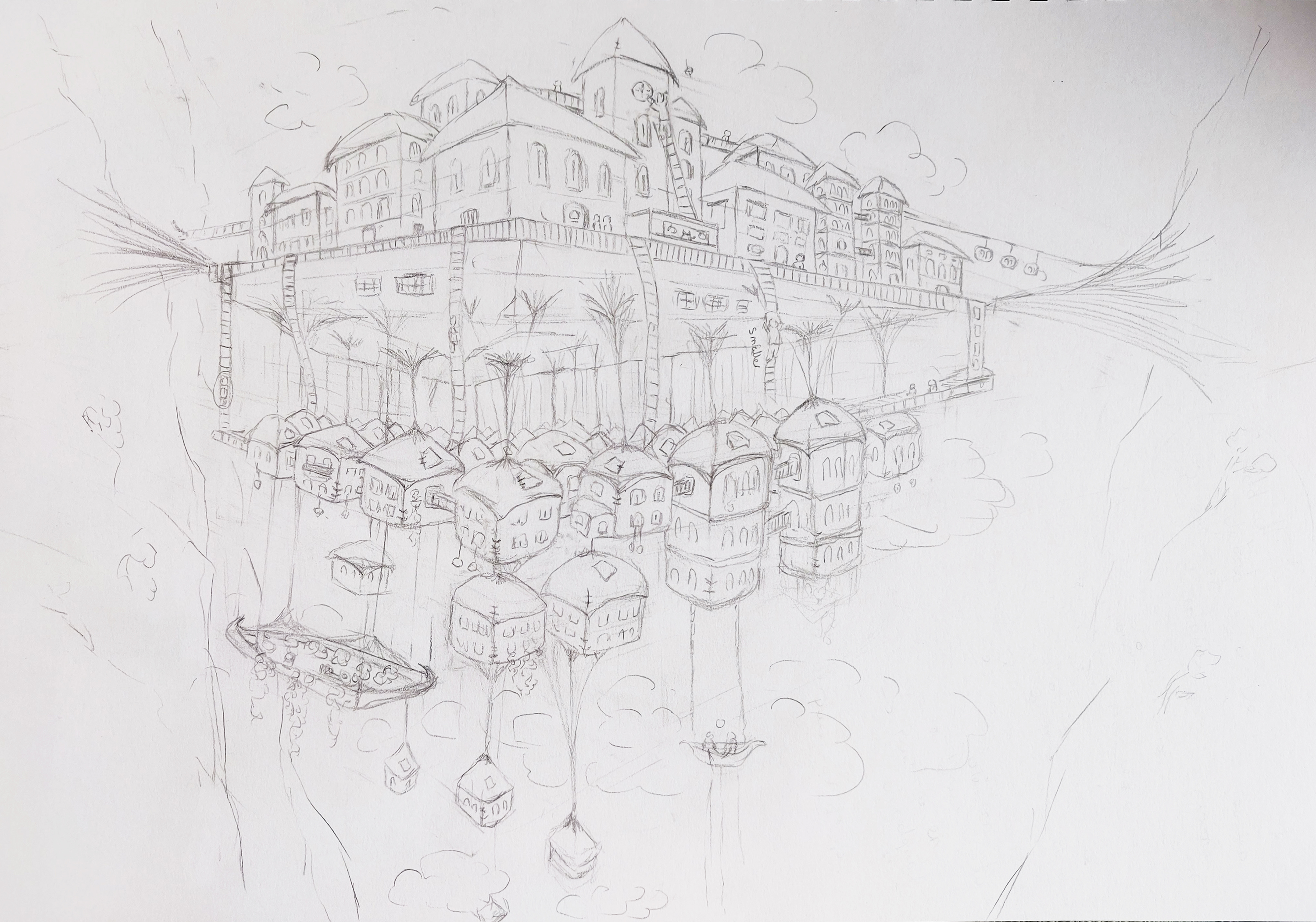
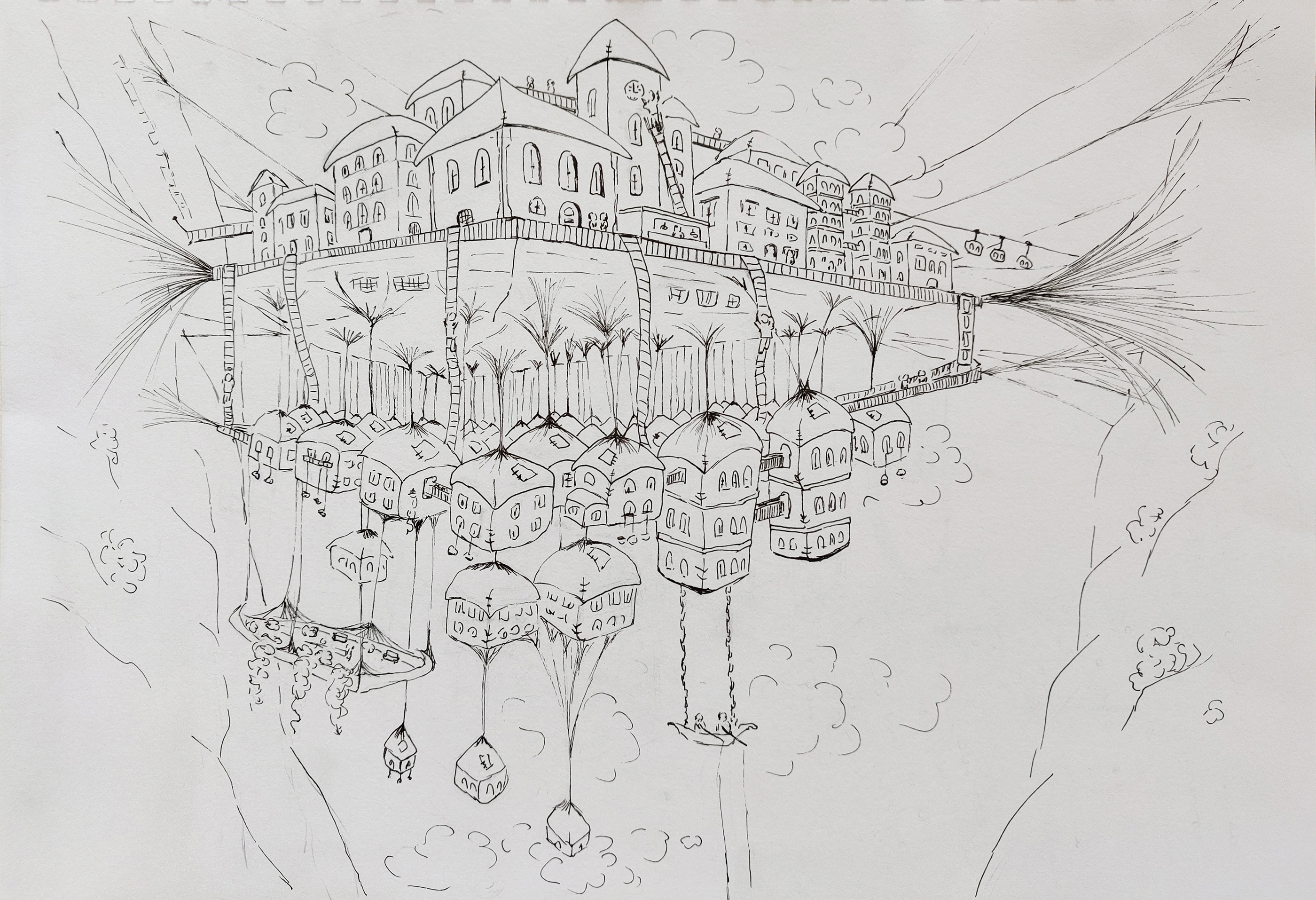
All along, I used my sketchbook, going back and forth at times, looking at how to illustrate a house that would look like a sack for instance and trying to illustrate the city from different points of view:
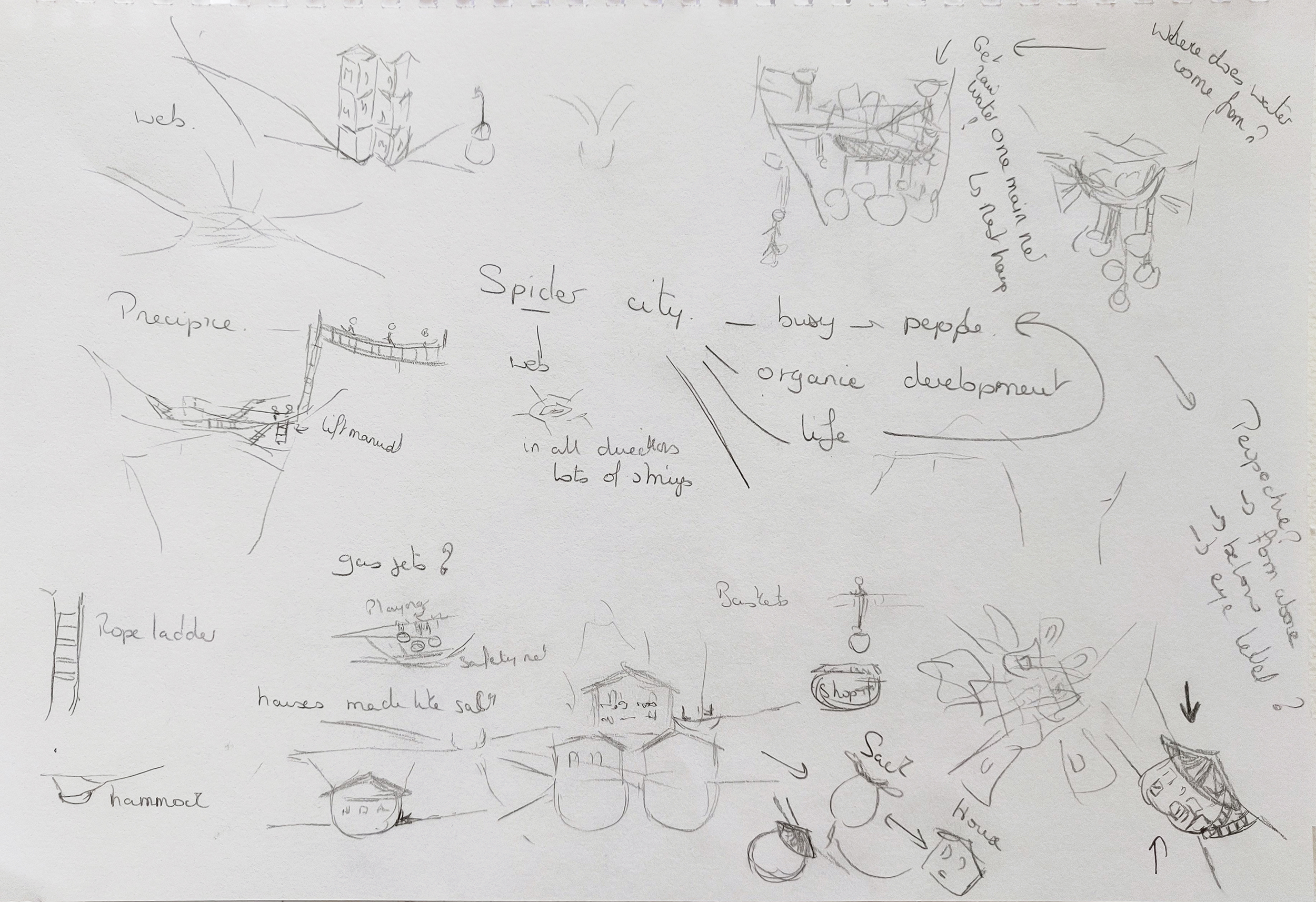
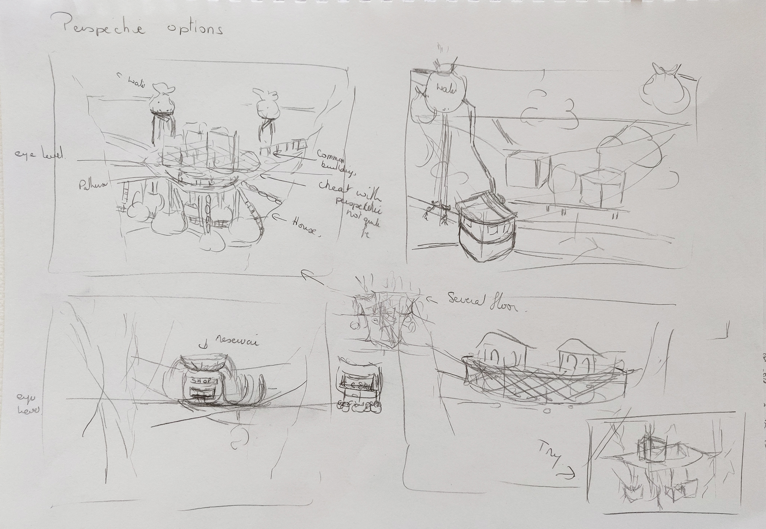
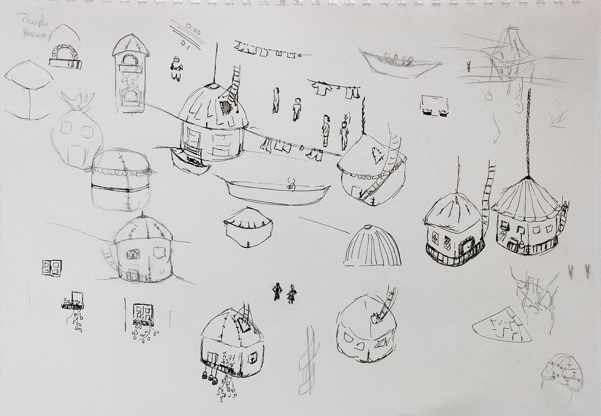
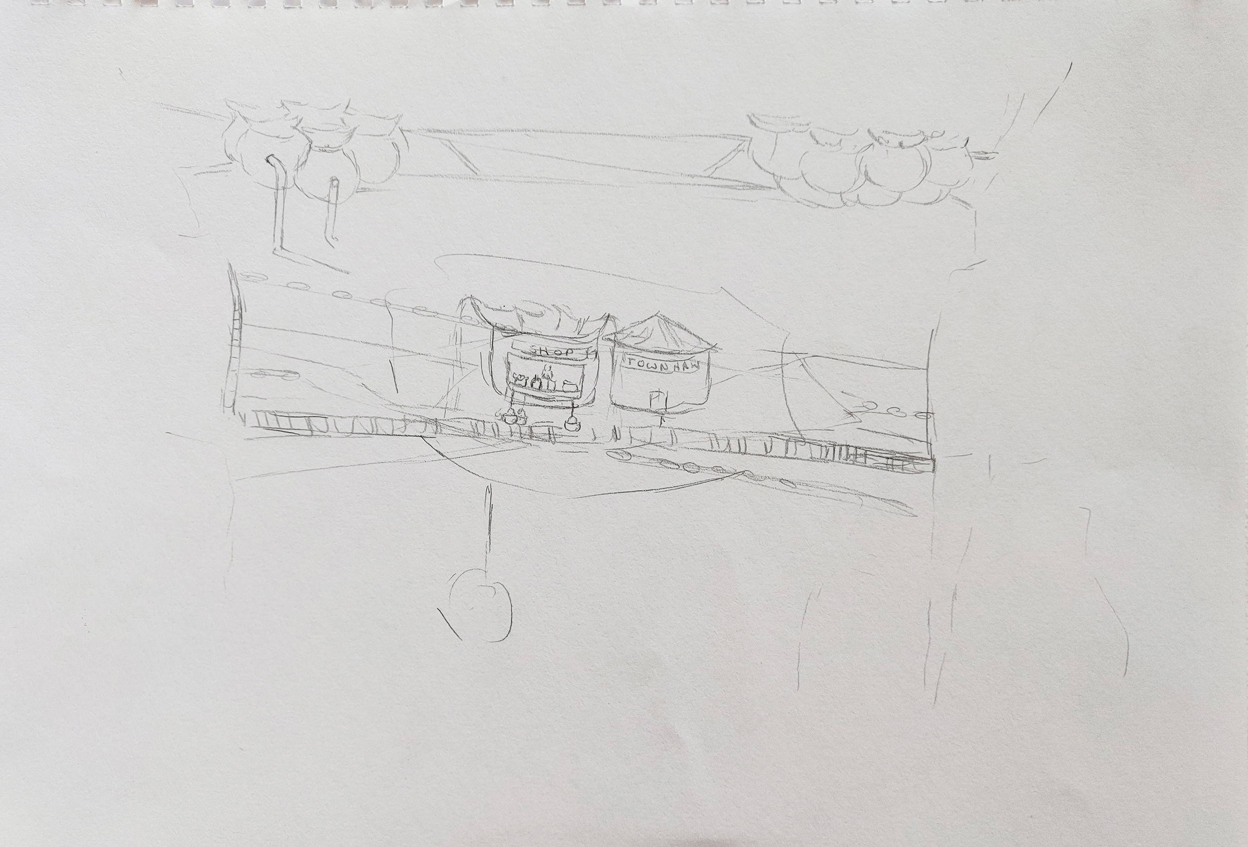
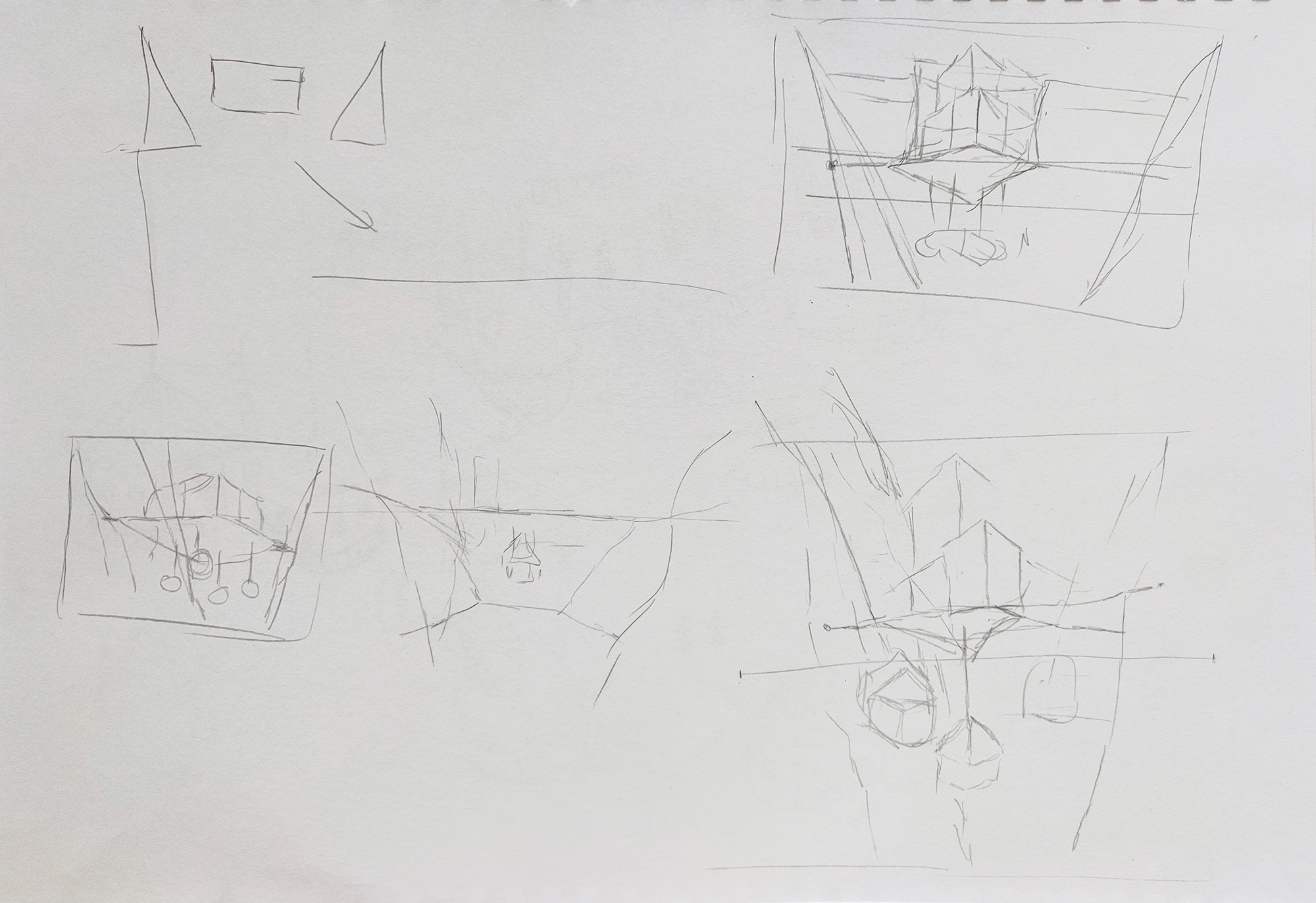
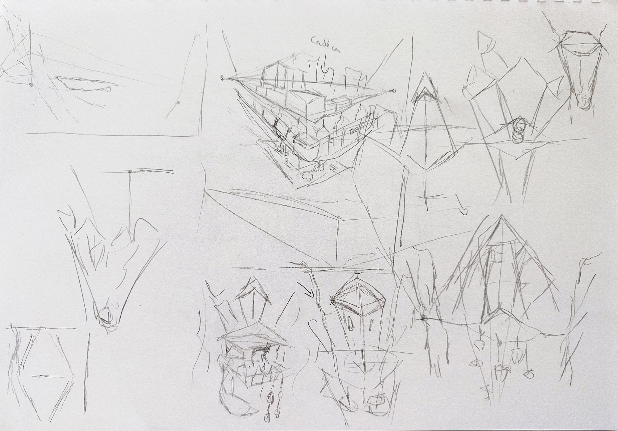
I created a few sketches of the city:
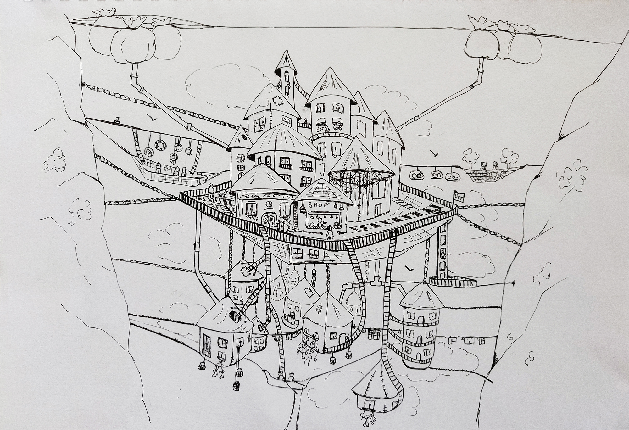
I was happy with the last sketch and used a black fine liner to make the lines permanent:
Initially I was thinking of using watercolour but I changed my mind and wanted to see if I could render the sketch in Photoshop.
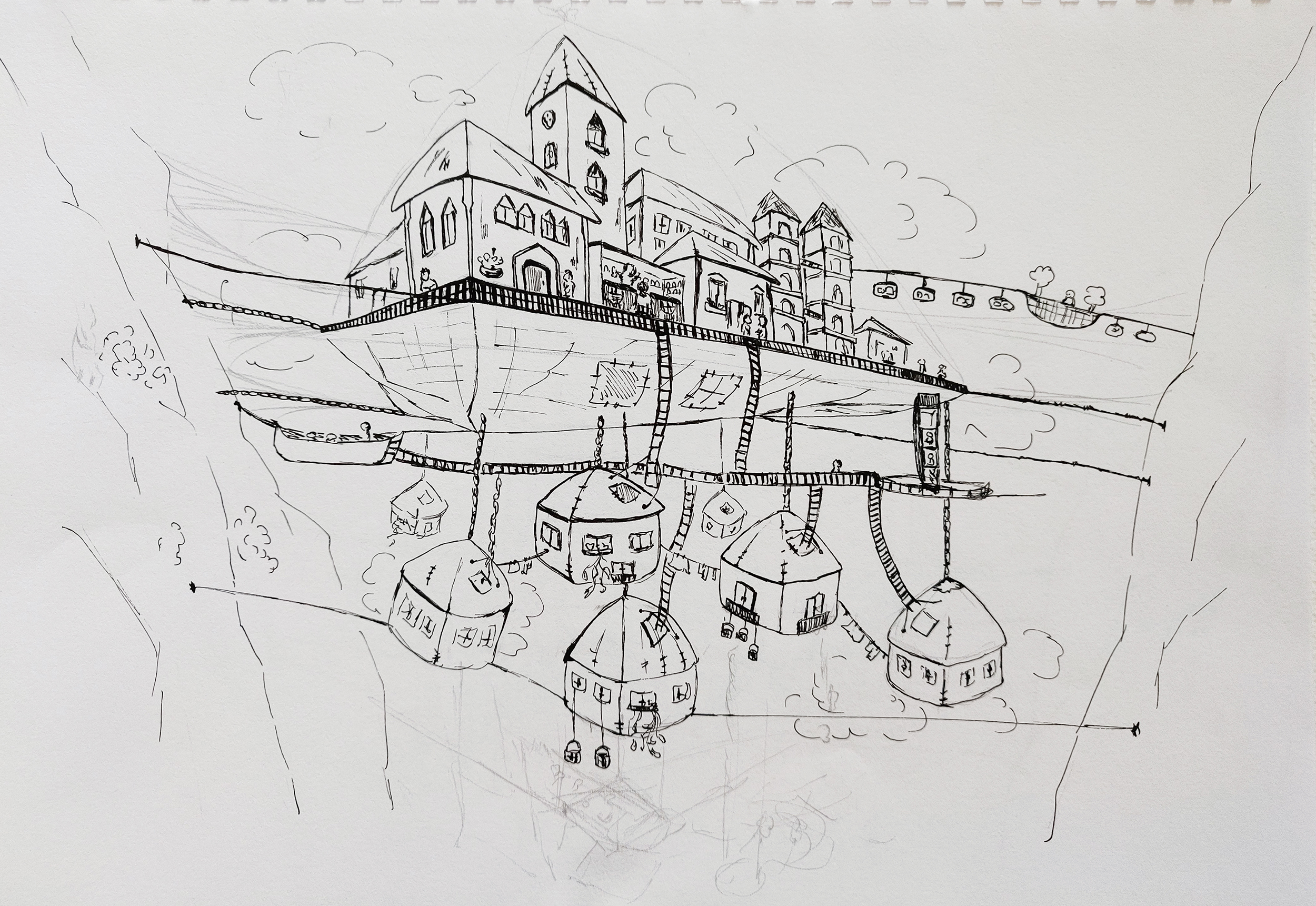
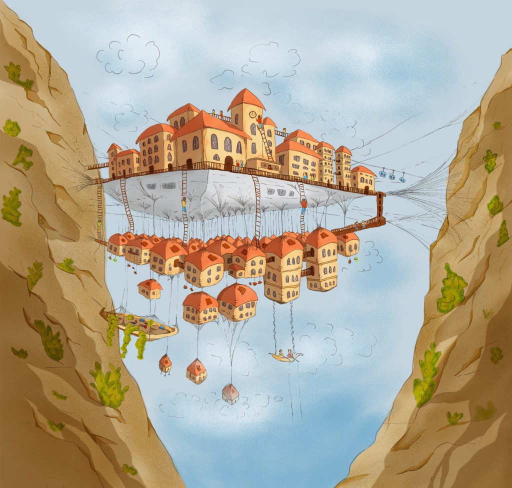
I then tried a different ratio and added more sky at the top to see if the composition would work better:
I think it helps to add a bit of sky as otherwise, it feels as if the picture has been cropped at the top. I also cropped some of the cliff on the right so that we have to guess that the cliff is there. I thought it might add to the sense of peril.
I chose a view point slightly below the top of the net, so that some of the city would be above and some below to add some depth and drama and to show how the city is layered. I also opted for a view at an angle to make the composition more interesting and dynamic, as opposed to one of my previous sketches. I like the vertical depth.
I also decided to keep a simple colour palette to start with, knowing that I could always add different colours/tones if I changed my mind. However, I thought that the simple palette worked well and decided to keep it like that.
I am also quite pleased with the contrast between the parts in the shade and the parts of the city in the light. The contrast adds depth to the image.
Several illustrators have influenced me for this piece: I like the way Suhita Shirodkar (http://www.suhitasketch.com/sketches) or Paul Wang (https://paulartsg.wixsite.com/paulwang/europe-2018) sketch busy cities. I also like the illustrations of Hennie Haworth (https://www.henniehaworth.co.uk/category/buildings) often published in the travel section of the Guardian.
I included more details in the initial sketches such as clothes that are hanging to dry, water tanks, … and wondered if I should have kept some of these details.
It might have been a good idea to do the sketch on a much larger page as it would have been easier to draw some details, even if the finished illustration ended up being smaller. Although adding all the details included in the description might have been too much, a few elements could have added life to the whole illustration.
Assessment Criteria
- Demonstration of technical and visual skills – materials, techniques, observational skills, visual awareness, design and compositional skills
- In part 1 of this course, I explored different traditional and digital techniques mixing media such as watercolour, Photoshop and Illustrator. For the illustration of Octavia, I took inspiration from one of the illustrations I created for the Exercise “Mixing and matching” and turned a traditional sketch into a digital illustration.
- I was inspired by illustrators I discovered through some research and observation.
- Quality of outcome – content, application of knowledge, presentation of work in a coherent manner, discernment, conceptualisation of thoughts, communication of ideas
- I try to keep my learning log well organised and communicate my approach clearly.
- I used the knowledge I acquired through some of the exercises to create the illustration of assignment 1: I created a clear and limited colour palette and stuck to it to see if this approach would help me to achieve more coherence with the use of colours and I think it did. I also built on the skills I acquired regarding drawing in perspective to draw the city.
- Demonstration of creativity – imagination, experimentation, invention, development of a personal voice
- I enjoyed the opportunity to experiment with materials, techniques, colours and perspectives through the different exercises.
- I created several sketches for this assignment to experiment with different viewpoints until I was satisfied and tried to use my sketchbook to explore several avenues.
- This experimentation has helped me to find a style I enjoy (an illustration using a mix of traditional and digital media)
- Context reflection – research, critical thinking (learning logs and, for second and third level courses, critical reviews and essays).
- I tried to critique my work in order to understand what works and what does not and what I could do differently.
- I keep wondering if I have asked the right questions when I analyse a brief in order to carry out the necessary research. For this assignment, I noticed the area of my research was diverse from sketches of cities to the story of the book or the way perspective works.
Edits
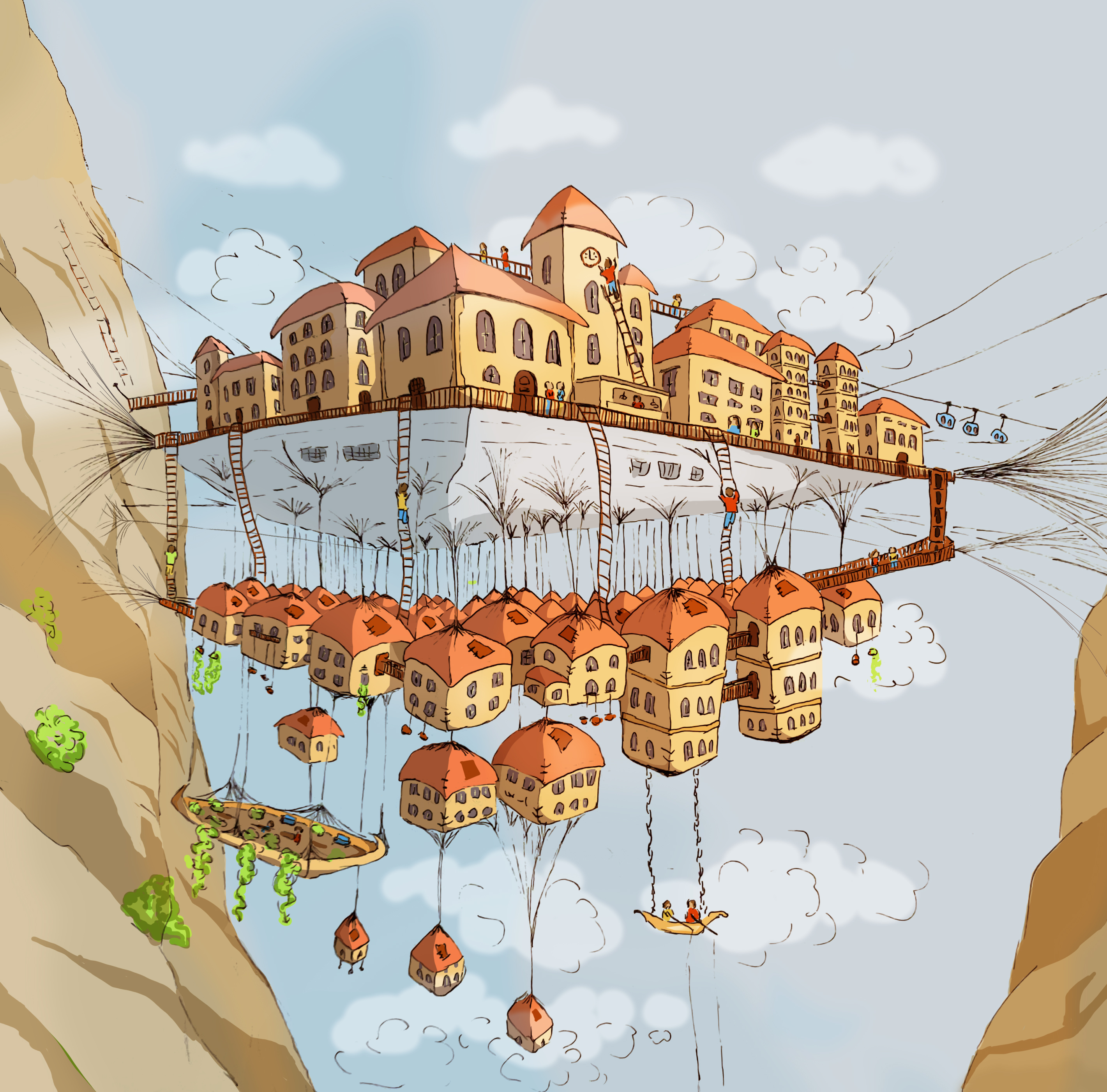
Following my tutor’s feedback, I decided to revisit my work. The illustration was a bit flat and, as suggested by my tutor, I wanted to add more texture and details.
I first drew more details on the cliffs. I used Procreate for this before importing the layer back in Photoshop.
I painted more dramatic shadows on the rocks and the vegetation in Photoshop as well as some grainy texture. The texture has an orange tint on the houses to add warmth. I changed the colours and contrast of the sky to convey the feeling that the city is in the middle of the clouds.
I also lowered the opacity of the original sketch to have a better balance between the black lines and the colours.
I tried a few compositions side by side and opted for a composition that shows more of the surroundings (the cliffs and the sky above and below) in order to add context to the position of the city and make it look more dramatic. Below is the new version (on the left) next to the previous one (on the right).
I feel that these changes have added depth and interest to the illustration as a whole.

Bibliography:
Bower, S. (2020). The urban sketching handbook : 101 sketching tips. Beverly: Quarry Books.
Blaukopf, S. (2019). Working with color : techniques for using watercolor and color media on the go. Beverly, Ma: Quarry Books.
