After reading the brief, I decided to first explore ideas around the statement “You are here” as this was a very open brief and I needed to explore different avenues before deciding in which direction I wanted to go.
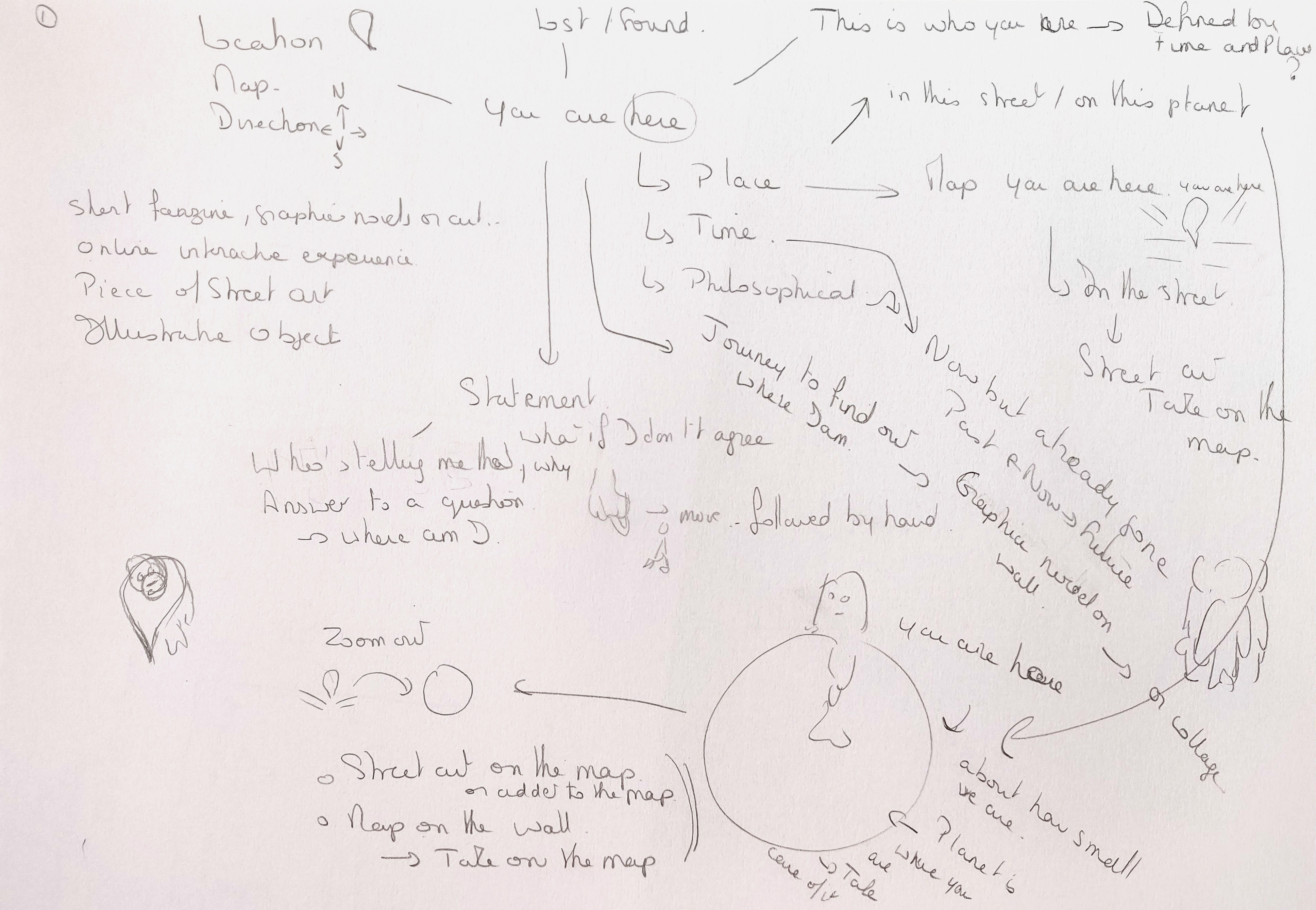
My favourite ideas were around the maps we often find in tourist places with the statement “You are here”. These maps are often a bit confusing and people can be seen trying to orientate themselves to know where to actually go.
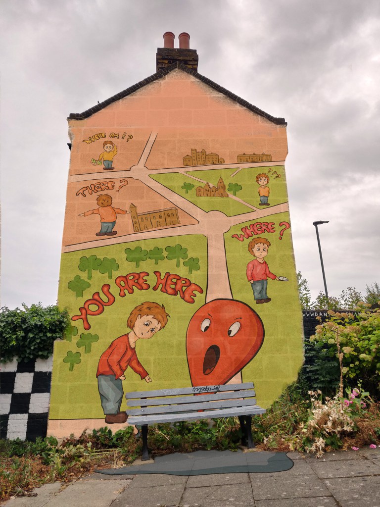
I decided to create some street art that would somehow be based on this concept to either convey a message or be a funny story.
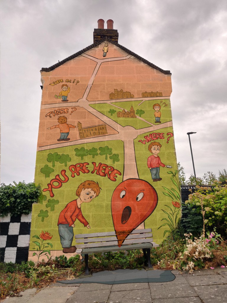
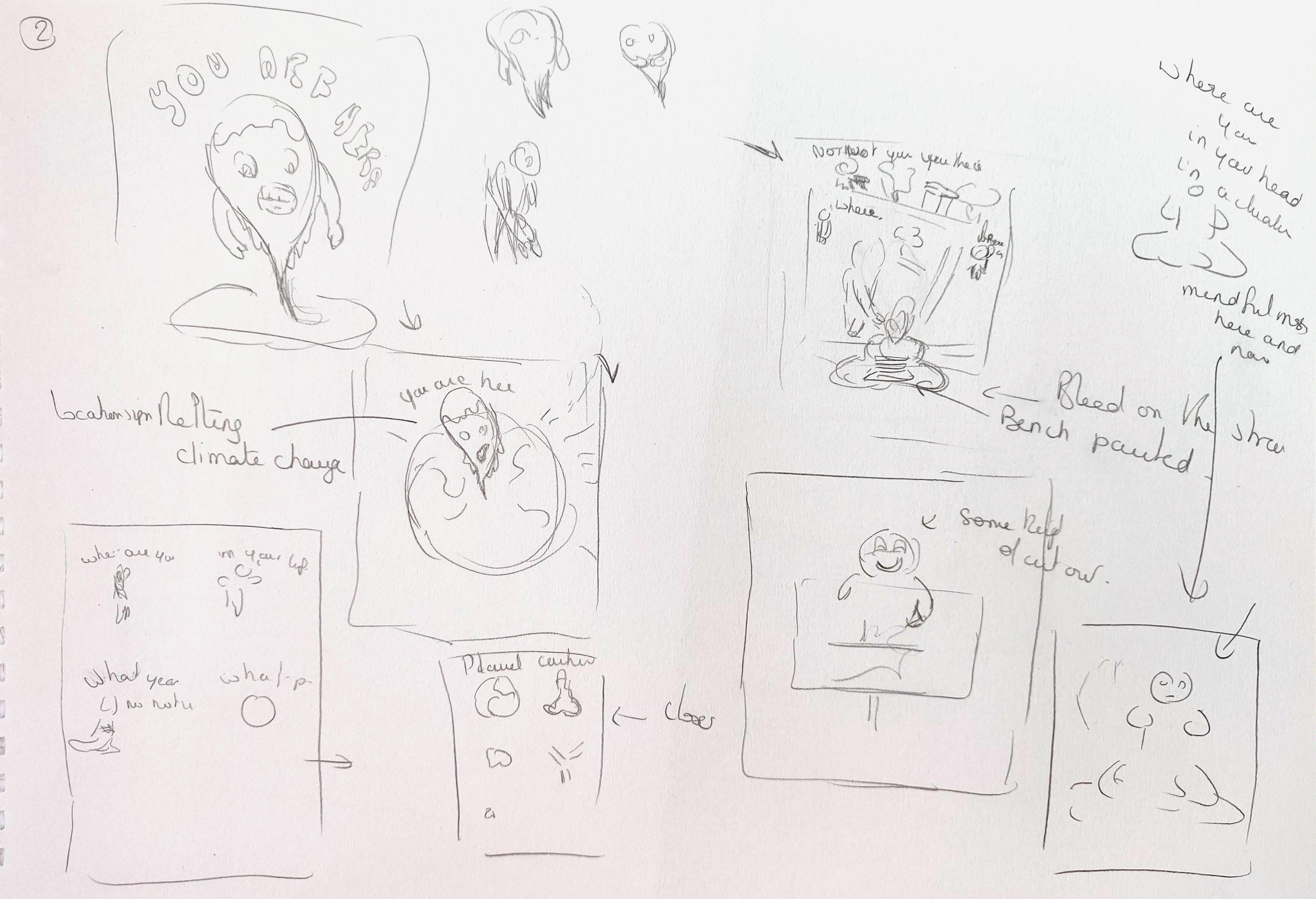
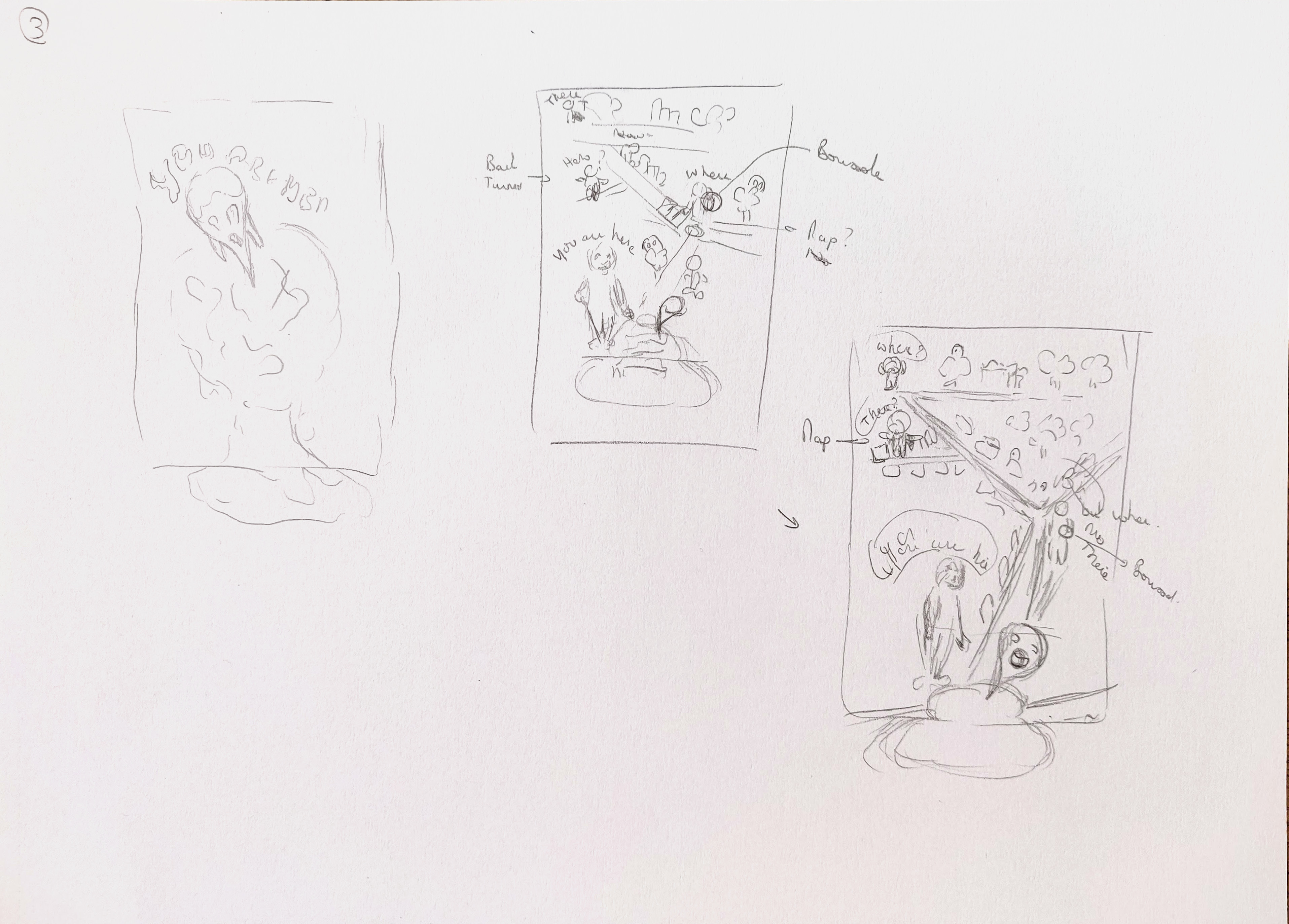
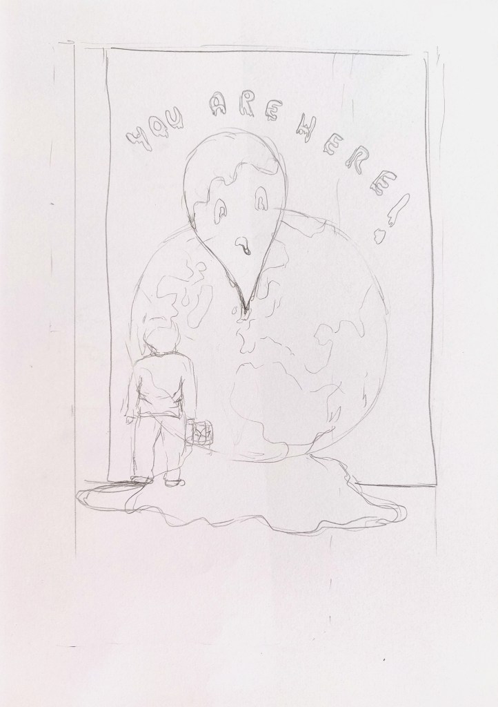
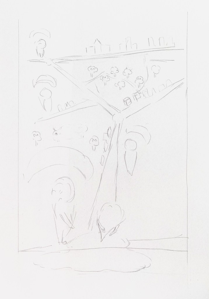
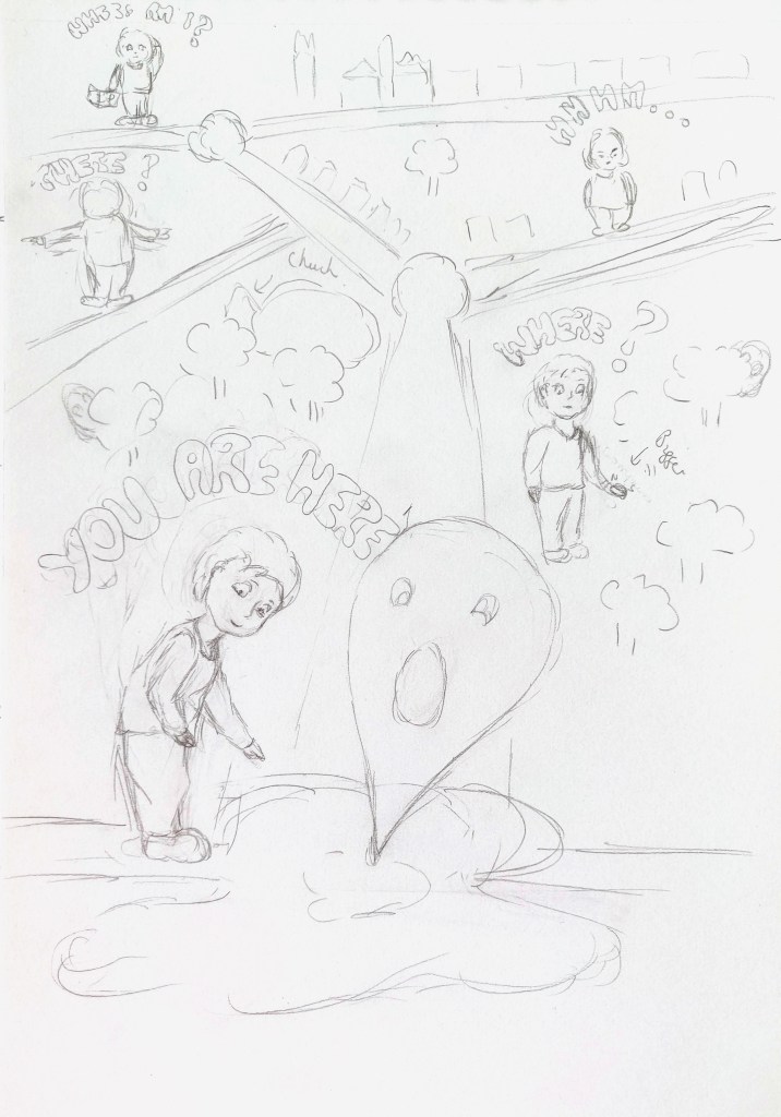
I explored two options further. The first one (see below on the left) illustrates someone in front of the planet that is melting with the message (the letters would be melting as well) saying “You are here”. The other option (middle and right) is a character travelling around this map wondering what is going on and where is “Here”.
I looked at some photos I had taken in the park of one of these maps and checked in Google Images as well to look at the style of this type of infographics.
I like both options but thought the second option would be a better opportunity to apply my skills as the composition is more complex, so I opted for that one.
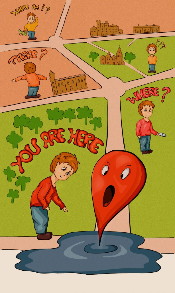
The audience would be everyone as it would be on a wall in the street. The colour palette should be bright and cheerful as it is meant to make people smile.
I used a picture I had taken of a wall with some street art and estimated that the ratio of the illustration would be approximately 1.5 (I did some research on the height of such a wall and guessed that it would be over 5 meters).
Regarding the style, I wanted to define early what I wanted to achieve and stick to my original idea. I checked again the examples of street art I had gathered for a previous exercise including a website with good examples (https://www.luckysophie.com/2022/05/ou-voir-du-street-art-a-marseille.html). I also looked at techniques I had explored as part of a course (Udemy) about the different ways to colour illustrations in Photoshop. I decided to have black lines (of various weights) and solid shadows and highlights as I thought this would work well in that context and graffitis and street art pieces are often created in that cartoony style.
I used the sketch to develop the illustration on the iPad Pro. This is my work in progress.
I then added a bit of texture in the background and lower the saturation of the colours in Photoshop.
I created a mock up to see how it would work on a wall.
What went well
I like the evolution of the colours for the characters’ shirts and the text. It goes from yellow to red as we get closer to the answer.
I wanted the illustration to carry on the ground with the ellipse that is supposed to indicate the location turning into a puddle.
I am happy with the composition and how it tells a story with the character getting bigger and closer.
Challenges
I found it a bit challenging to adapt the illustration to the wall to create a mock up because of the foliage around that I wanted to keep. It was also difficult to estimate the correct size properly.
Although I like certain aspects of the colour palette, it was too bright and colours might have been too saturated and maybe too “primary”. I need to experiment further with colours as I feel the whole lacks harmony.
Assessment Criteria
Demonstration of technical and visual skills – materials, techniques, observational skills, visual awareness, design and compositional skills
This section was both challenging and interesting as it explores so many different fields where illustrations can be used and I have learned a lot about different techniques (such as working with paper), different contexts (such as political satire or street art) and surfaces that can be used. All these parameters have an impact on the choices of the illustrator, adding some challenges that can also offer opportunities. This is true with the use of patterns on ceramics or using a large surface for a piece of street art for instance.
Quality of outcome – content, application of knowledge, presentation of work in a coherent manner, discernment, conceptualisation of thoughts, communication of ideas
I constantly try to improve the way I critique my own work to understand what works and what does not in my illustrations.
Demonstration of creativity – imagination, experimentation, invention, development of a personal voice
Because of all the areas covered in this section, this has been a real opportunity to explore different avenues. For instance, I had not really tried to create an illustration about political satire or experimented with caricatures before. At the same time, I notice more and more how I tend to go for a certain style, often colourful but not always. I am also more attracted by certain themes such as nature, animals or funny characters.
Context reflection – research, critical thinking (learning logs and, for second and third level courses, critical reviews and essays).
A lot of research was needed as I had to explore different areas of illustration. Guided by the research points in the course, I feel that I have learned a lot including how to create pixellated illustrations or the different techniques to create illustrations with paper.
Edits
After reading my tutor’s feedback, I looked at how the illustration could interact more with its surroundings.
I added a character at the top who seems to look at the roof. I also drew some flowers at the bottom to mix with the natural vegetation and painted the bench to be part of the whole illustration.
I think that the interaction with the surroundings helps to make the image more dynamic.