The previous exercise confirmed what I had already noticed regarding my portfolio. The pieces I have created so far do not necessarily represent all my skills and are not always relevant to the direction I want to pursue.
In June last year, I created a portfolio in a particular context. I work in desktop publishing in the financial industry and I needed a portfolio that would showcase my digital skills with Illustrator, Photoshop and to a certain extent, After Effects. I used pieces I had at the time including some work I created for the option “Core Graphic Design” (https://catherineillustrationblog.wordpress.com/graphic-design-1-core-concepts/). However, I wanted to update this portfolio with pieces that would be more relevant in that sector. I thought this assignment would be the perfect opportunity for a self-directed project that would enable me to create a new series of vector illustrations. They could be used to make my portfolio more professional and more coherent.
Before deciding on a brief, I needed to do more research.
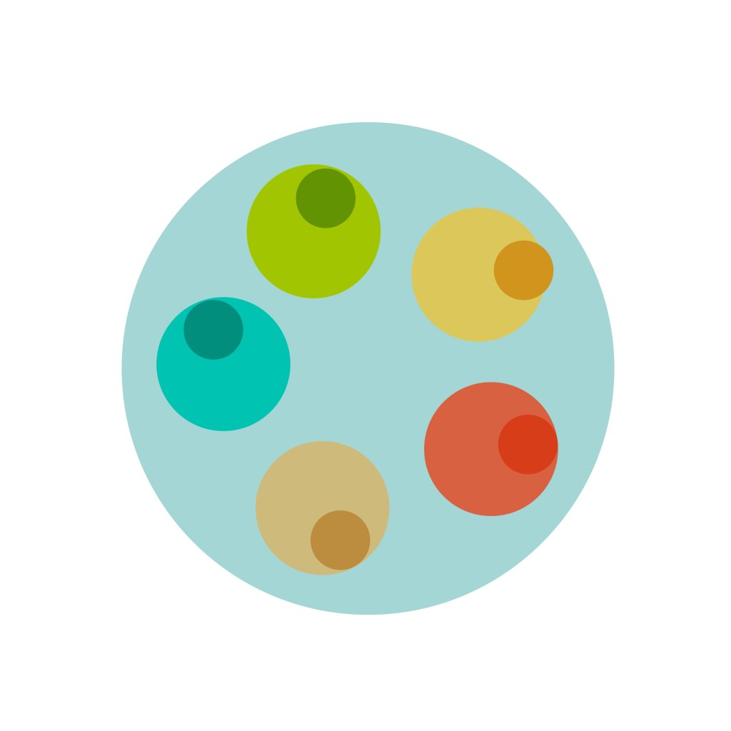
Vector illustrations used by companies on their report and other published material
I looked at the type of illustration used by companies and the current trends and themes. Illustrations are very popular nowadays alongside photography and infographics to illustrate company reports and other documents as well as websites.
When I did some research in that field, some clear trends emerged: People are drawn with distorted bodies such as very long arms for instance. They often have no facial features to illustrate the universality of the message. The illustrations tend to be simplified. In fact, they have a lot of similarities with editorial illustrations and rely on symbols and metaphors as well. Contrast is also important as these illustrations can be viewed at different scales.
The images do not always have a background so that text can be added around them.
They can have an advantage over photography as they can illustrate a very particular point. Anything can be drawn, even something that does not exist.
Many companies will use stock images (Shutterstock, etc.) but they sometimes prefer something unique or an image that illustrates their products.
I found many sources online on this subject (see sources at the bottom of the page).
My work so far
I then looked at my illustrations and tried to understand how my style could be applied in that context. I enjoy using different tools to create illustrations but one style I like is vector illustrations with solid shapes to create highlights and shadows. I concentrated on vector illustrations I had created in the past and analysed them to understand what worked and what did not. For instance, I noticed that they often lacked fluidity and movement. I knew that I needed to focus more on the initial sketches and keep the dynamic of the original drawings when I rendered the illustrations in Illustrator.
Other illustrators
I also looked at the work of illustrators I like and tried to understand why the illustrations work.
I gathered examples in Pinterest.
Once I had a clearer idea of the images I wanted to create and the style I wanted to achieve, I needed to narrow the brief.
I needed a theme for these illustrations that would be relevant to most businesses and I thought that values such as sustainability and diversity are universal.
This is the brief and the rationale I sent to my tutor to ensure that I was going in the right direction.
The Brief
Create between 6 and 9 illustrations around the following message:
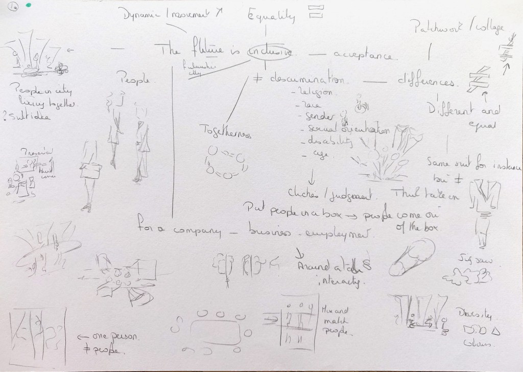
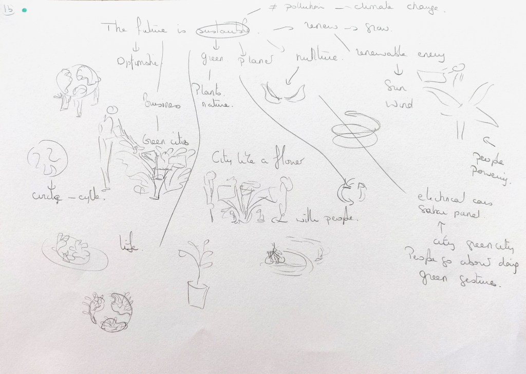
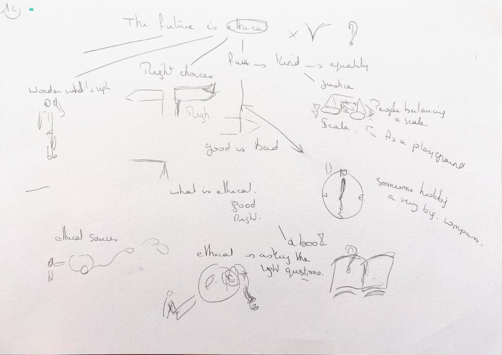
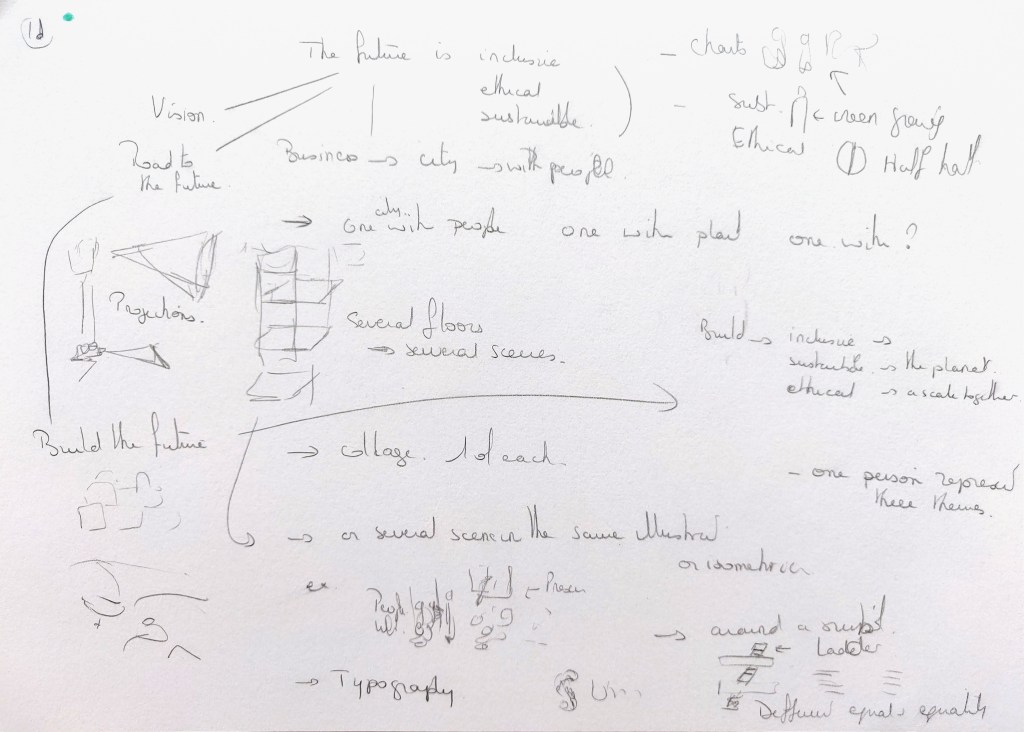
“The future is : Inclusive, Sustainable, Ethical.”
These illustrations will be vector illustrations that can be resized and be used to enhance the company’s documentation including a website and a sustainability report about the values and objectives of the company.
The colours should reflect the positive message.
The audience would include the company’s shareholders, business partners and clients.
The Rationale
After some research on illustrations used by companies to promote their brand, I would like to create dynamic vector illustrations around themes that are more and more important in business: diversity, sustainability and ethics in general. I am considering exploring these themes through metaphors and possibly collages of different elements.
The goal is to create a series of illustrations that work well together but could also work separately. This could be around the same colour palette or 3 colour palettes that complement each other.
The number of illustrations (6 to 9) would depend on their complexity. I might create some smaller illustrations that complement bigger ones.
Execution
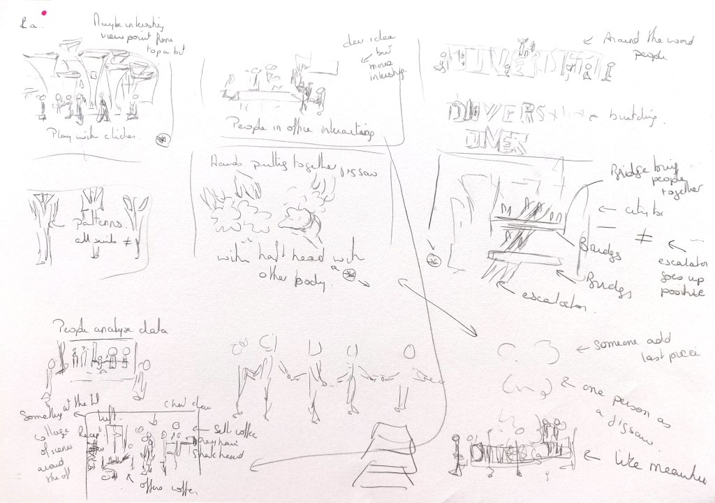
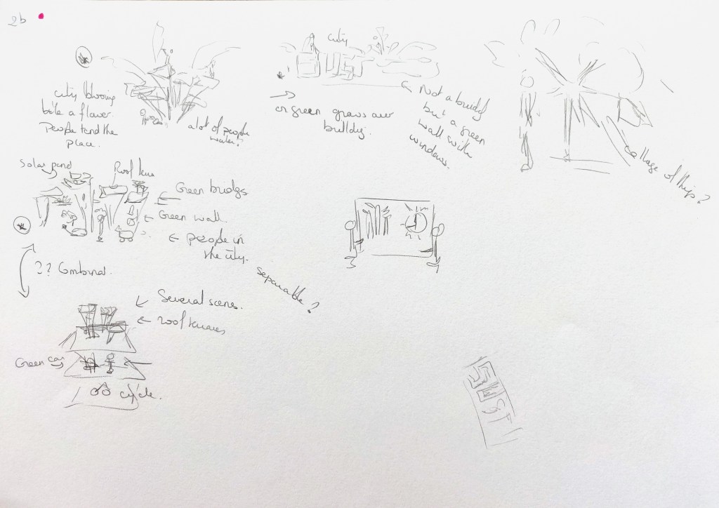
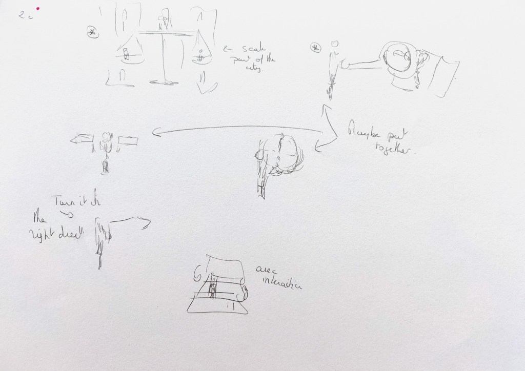
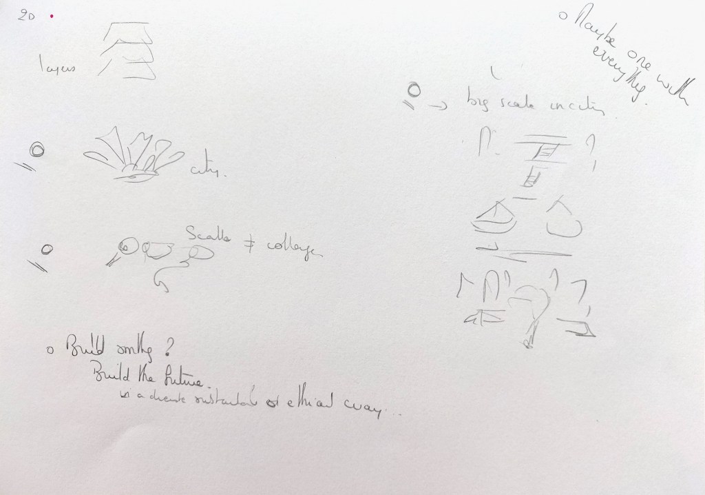
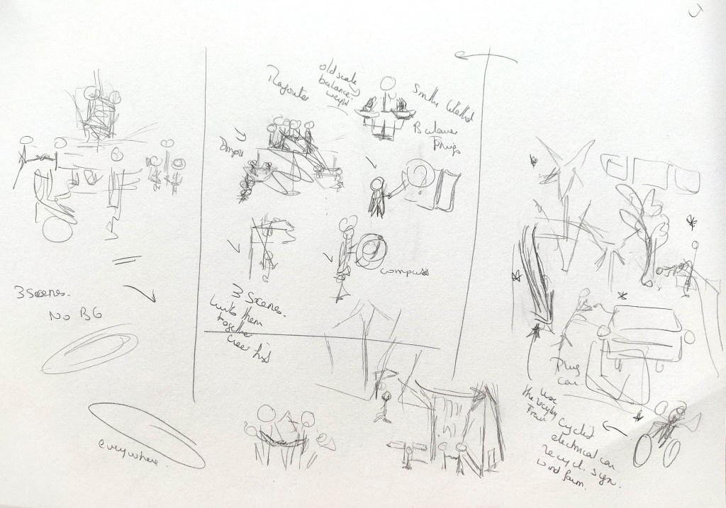
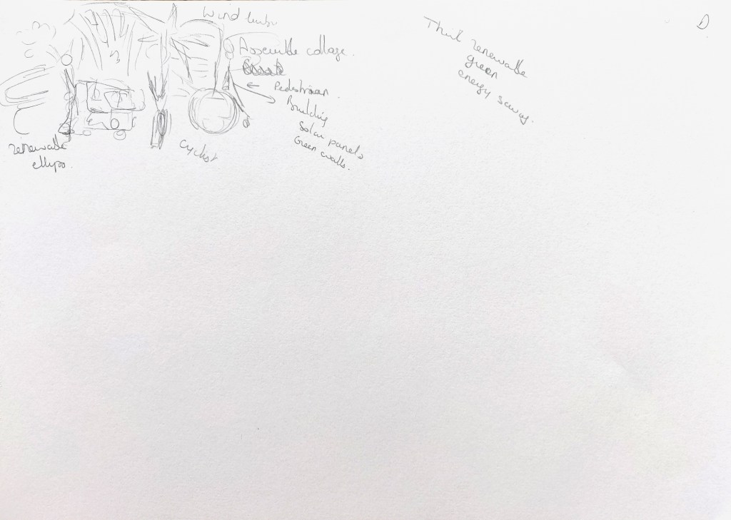
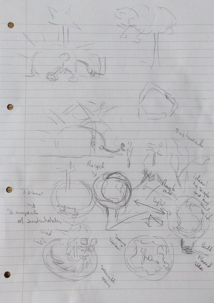
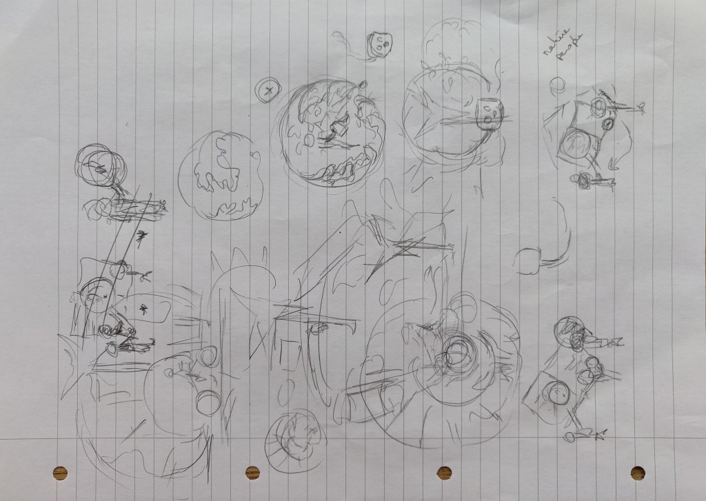
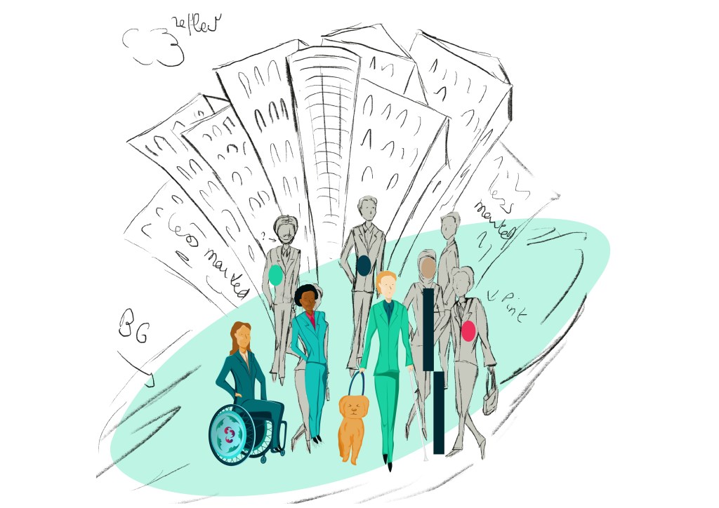
I then explored ideas in my sketchbook. This was not a linear process as I kept going back to my sketchbook to work on the composition or explore an idea further.
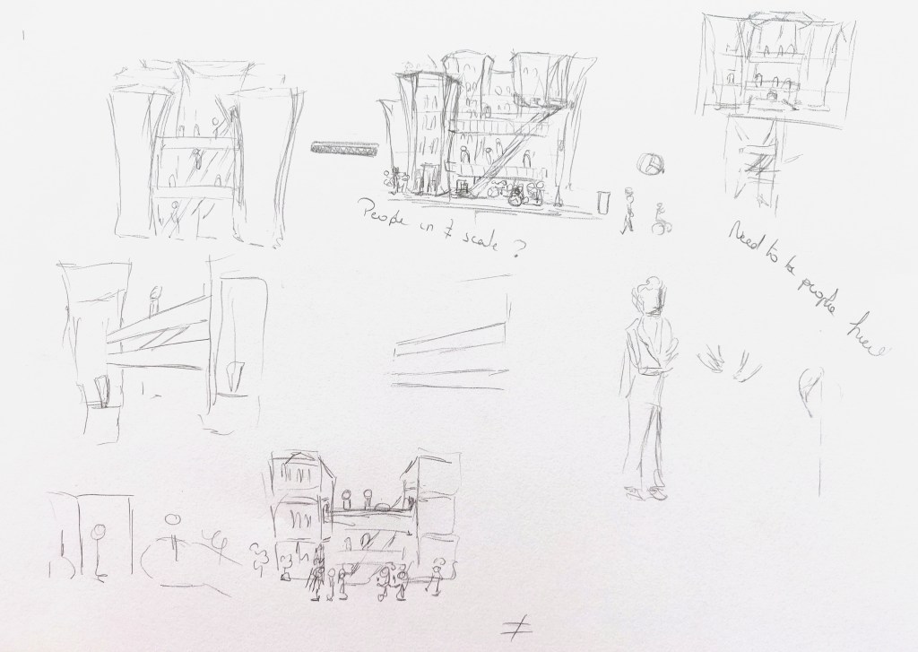
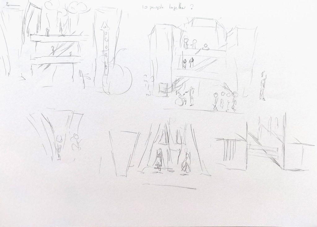

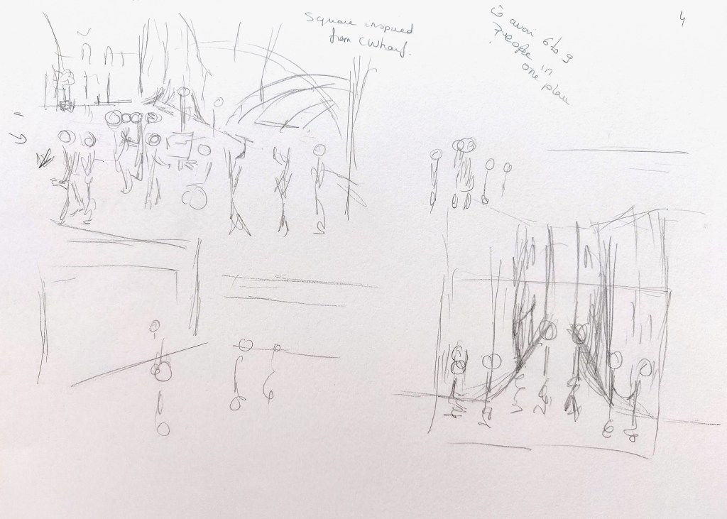
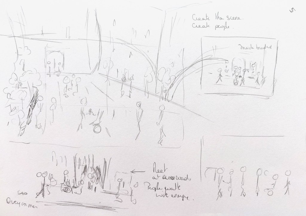


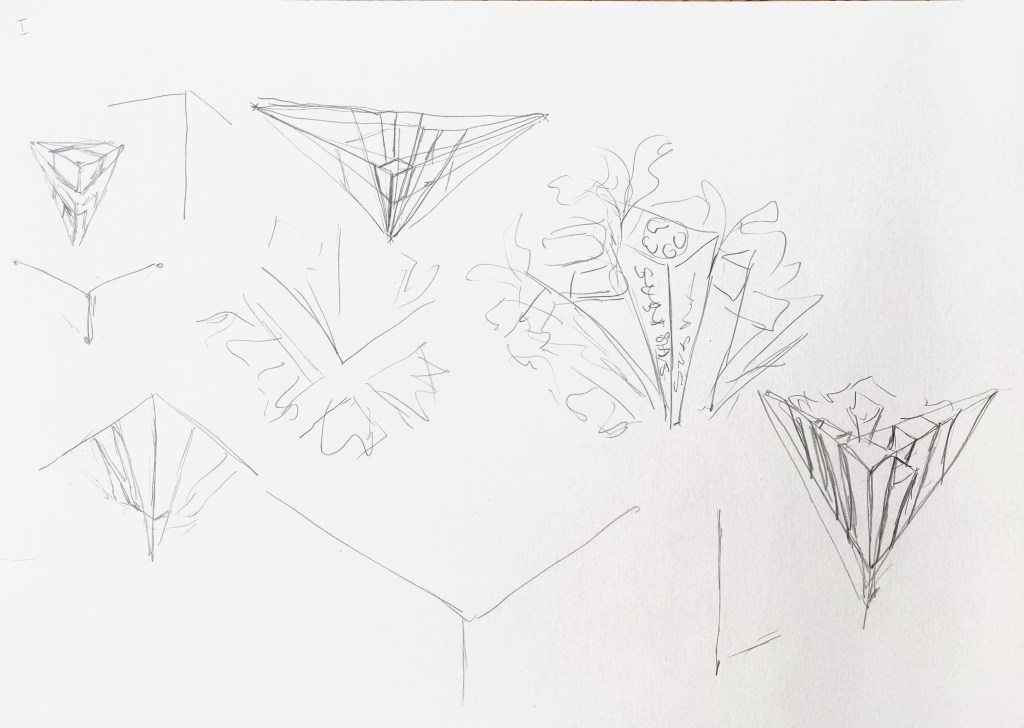
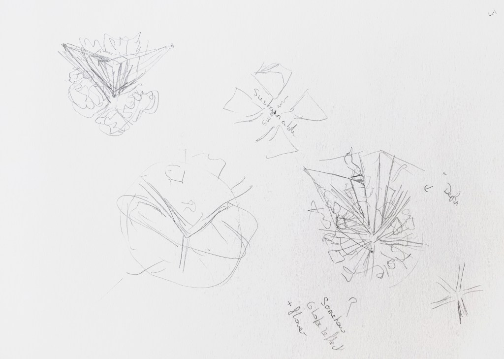
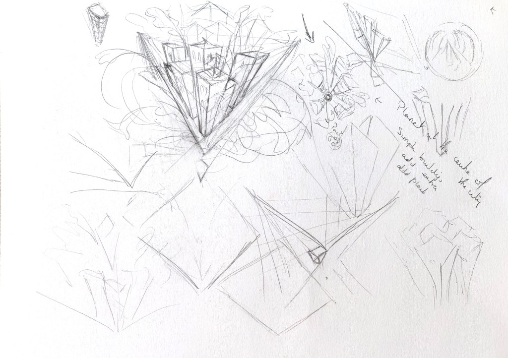
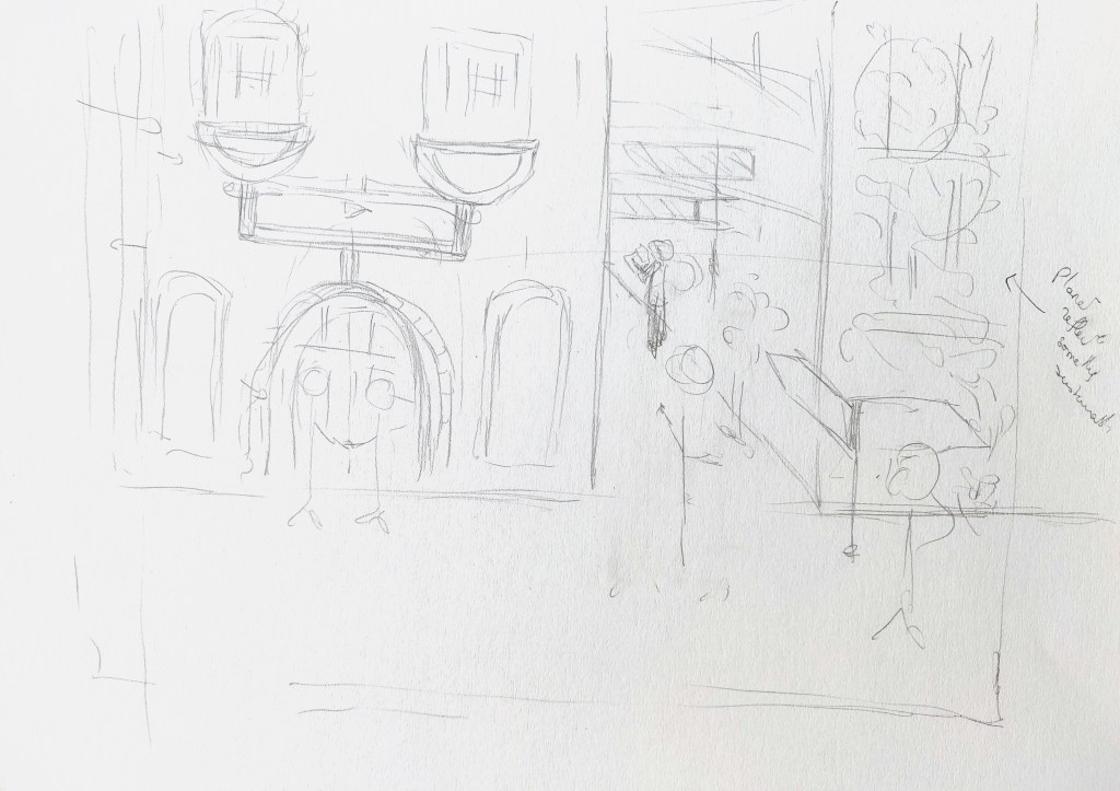

I then created some more detailed sketches in Procreate.


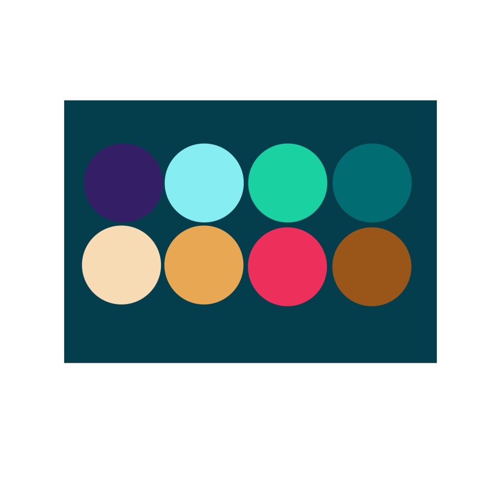
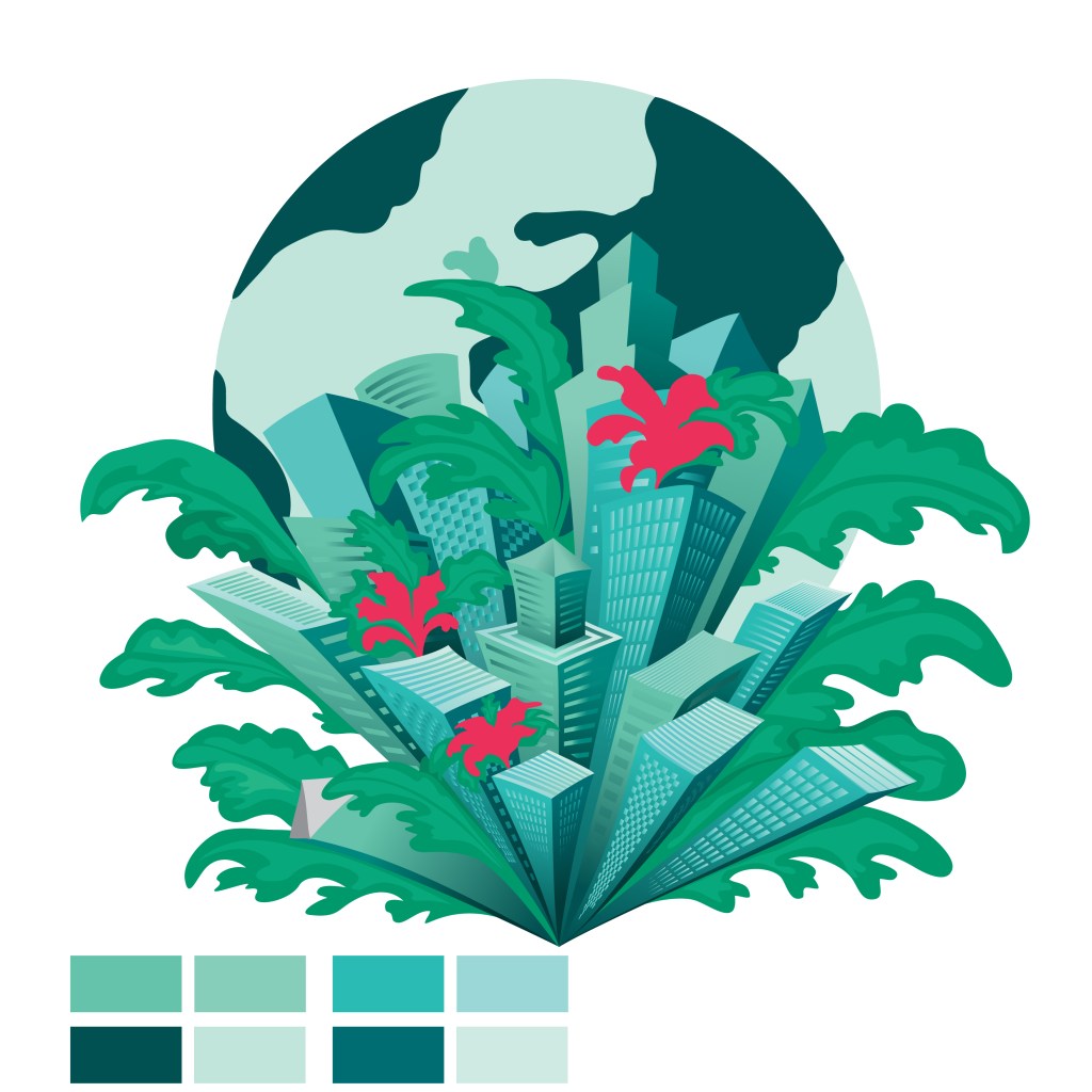
Once I was happy with the sketches, I designed a colour palette for the first three illustrations. I selected blues and greens often used in business as well as some pink as an accent colour to add some energy to the images. I chose a second palette for the other illustrations with slightly more muted colours as an alternative.
Here is my work in progress and some experimentation as well as the two colour palettes.
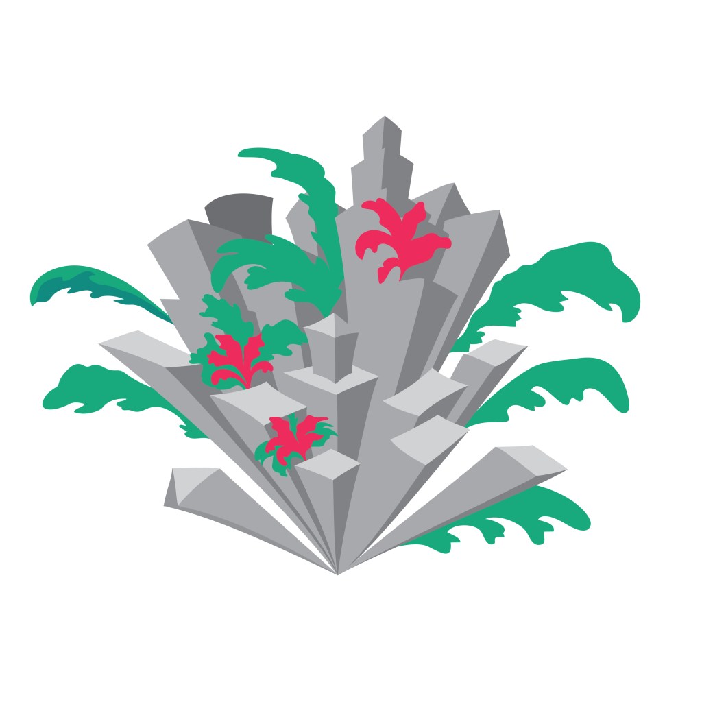

Once I had created all my illustrations, I put them in Photoshop and converted them to black and white images to check the contrast as this is often something I have some issues with. I also checked the illustrations at different scales as this can help with the composition. I then made the necessary adjustments.
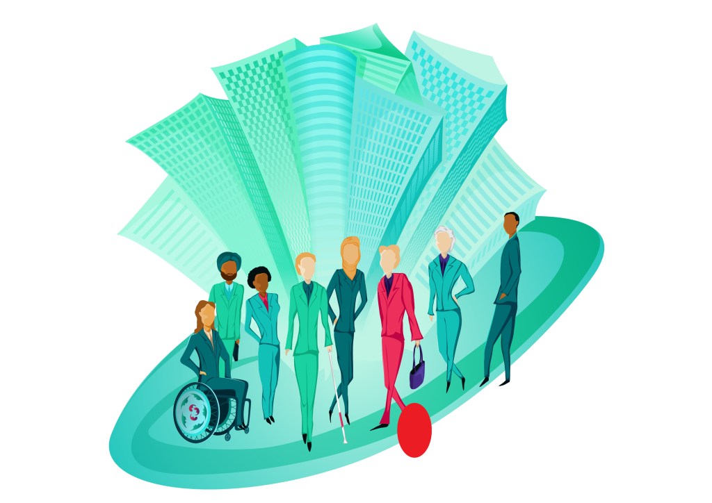
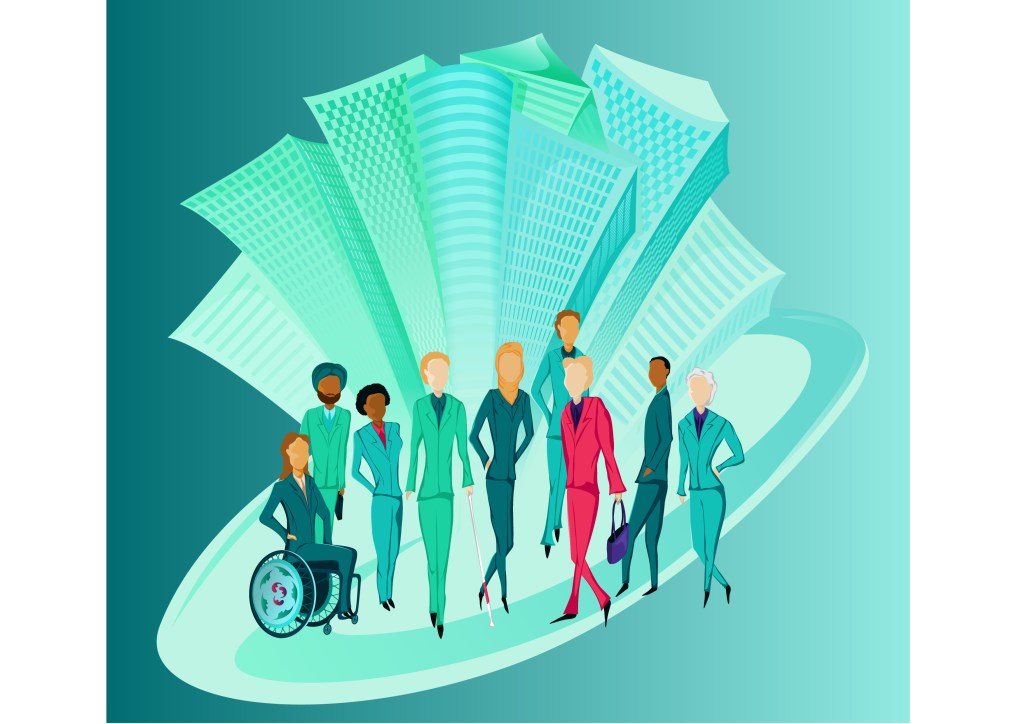
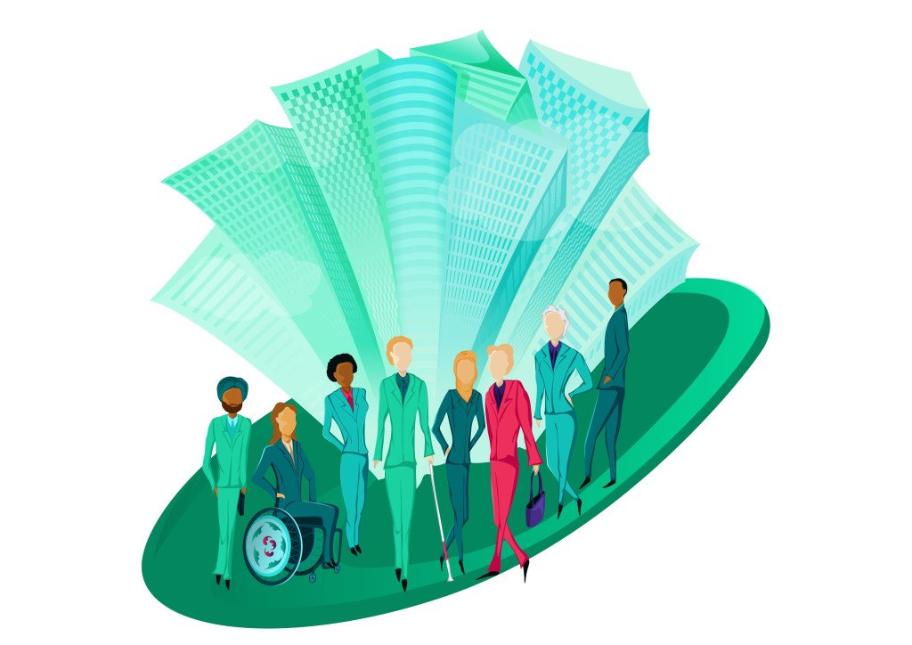
Here are the four illustrations with the first colour palette. The last image is a variation of the first illustration.
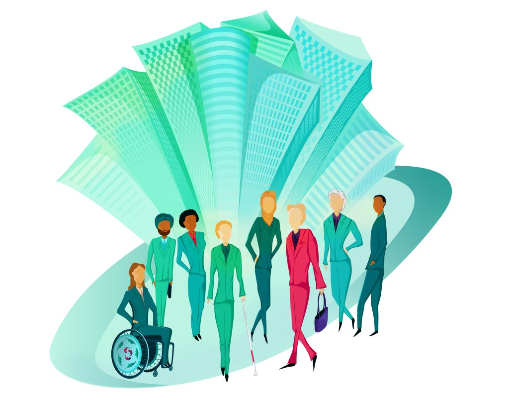

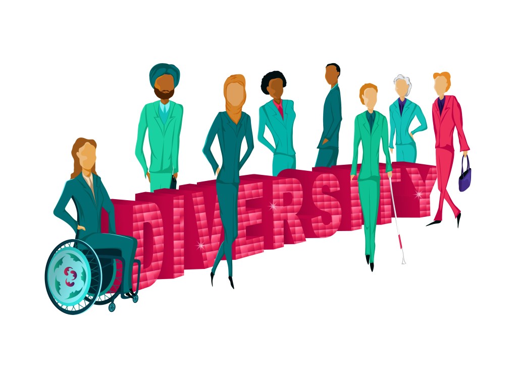
I chose to have a city in the first two illustrations as the message is about diversity and sustainability in business.
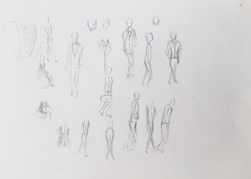
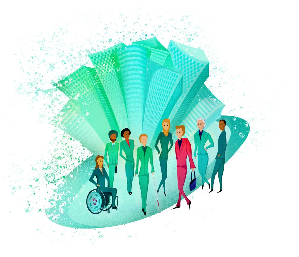
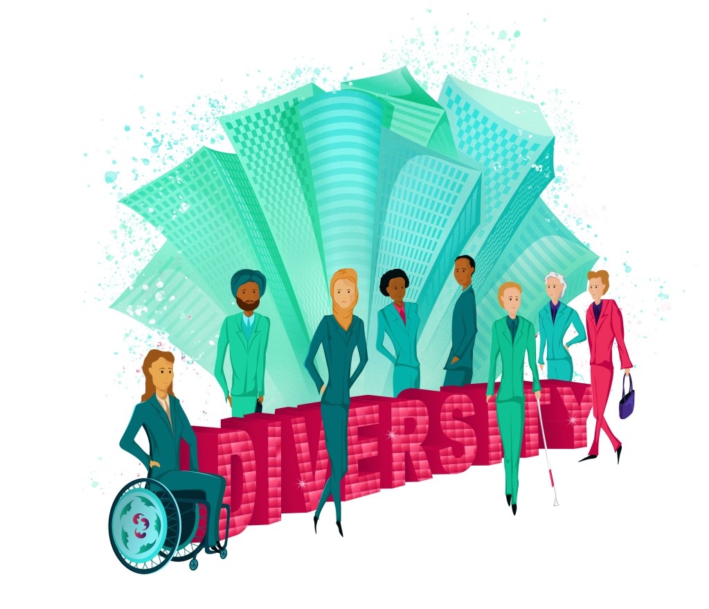
In the first illustration, the characters are posing a bit like models on a catwalk to show diversity as a positive and something to be proud of. For the wheel of the wheelchair, I was inspired by the work of an illustrator I had come across in the past who designs illustrations to personalise wheelchairs (www.brwnpaperbag.com/2017/08/03/izzy-wheels-illustrated-spoke-guards/). When I drew the characters, I took my inspiration from some sketches I created for the exercise “Fashion illustration”. I liked the idea of distorted characters that would have very fluid shapes to give a sense of movement. That’s why they are elongated like this.
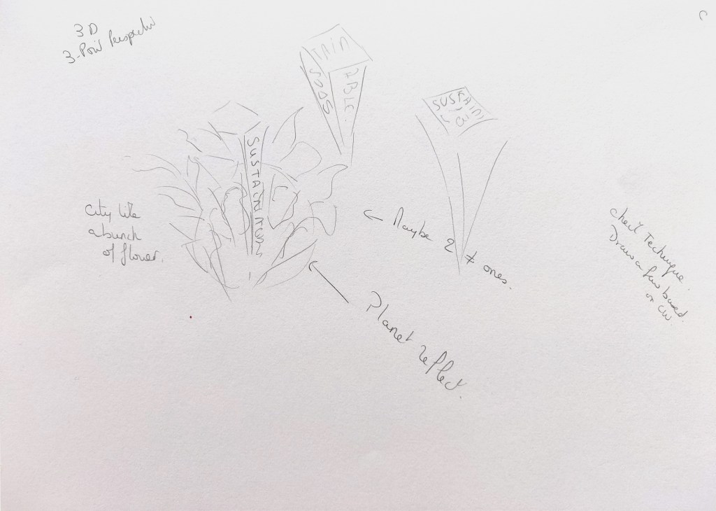
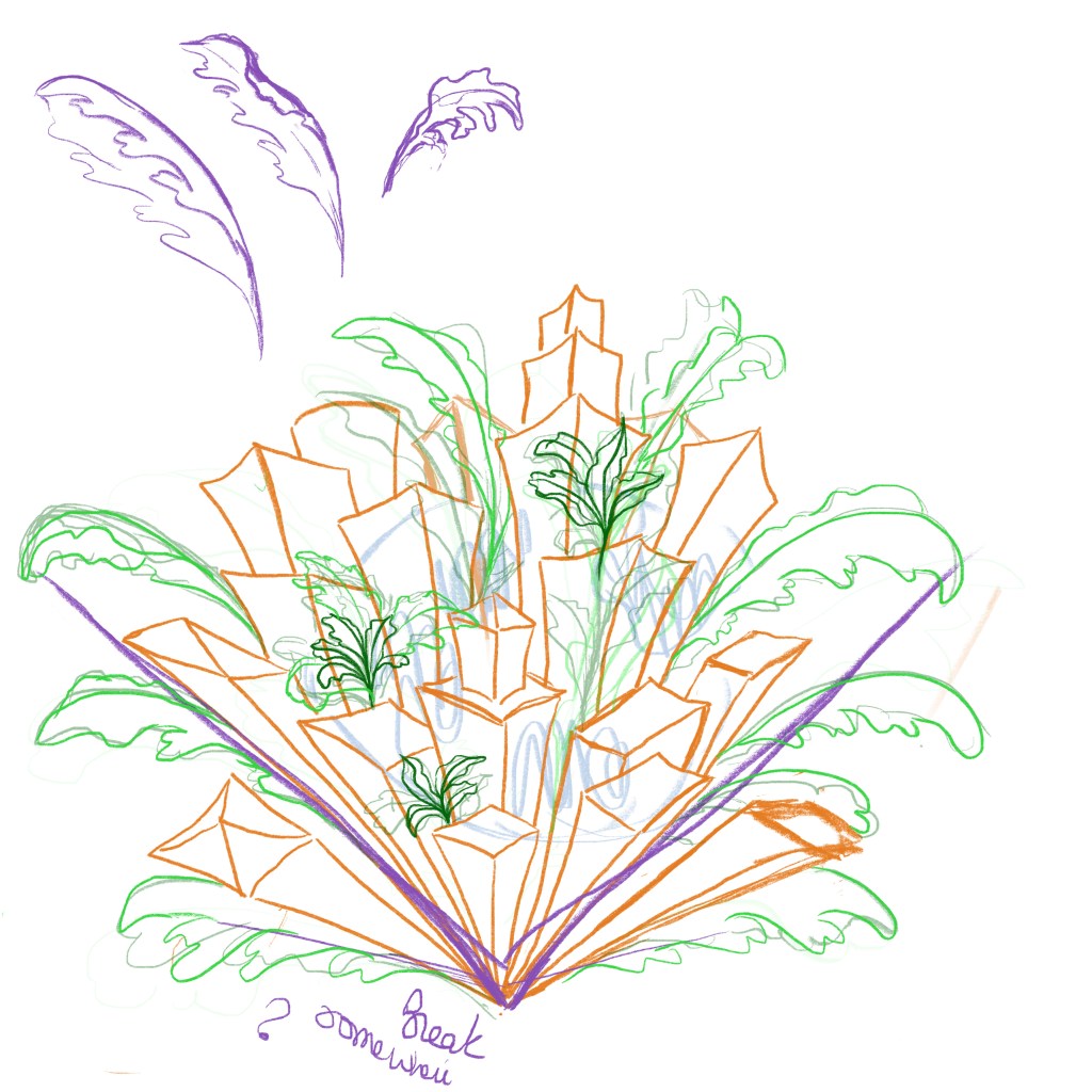
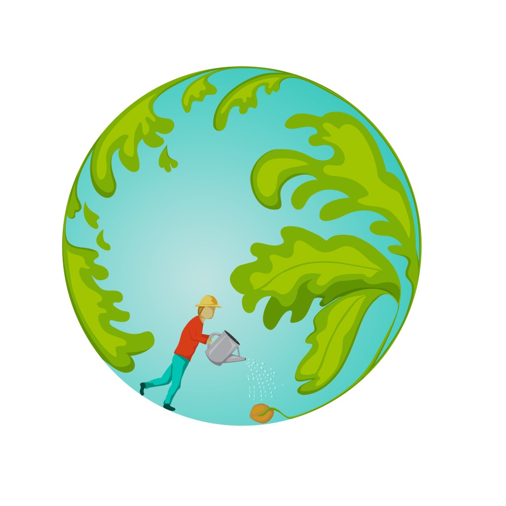
The second illustration is like a bunch of flowers with the city in the middle to illustrate how nature and people would need to cohabit in harmony.
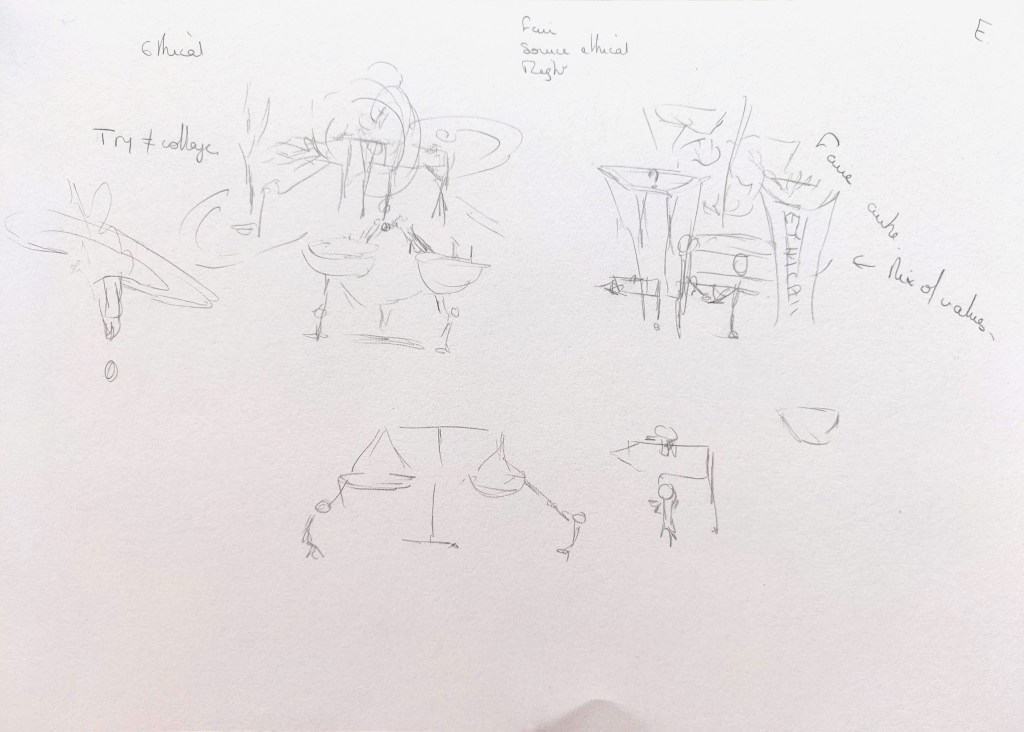
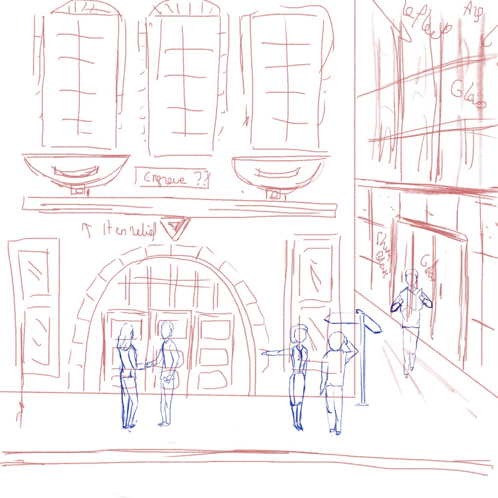
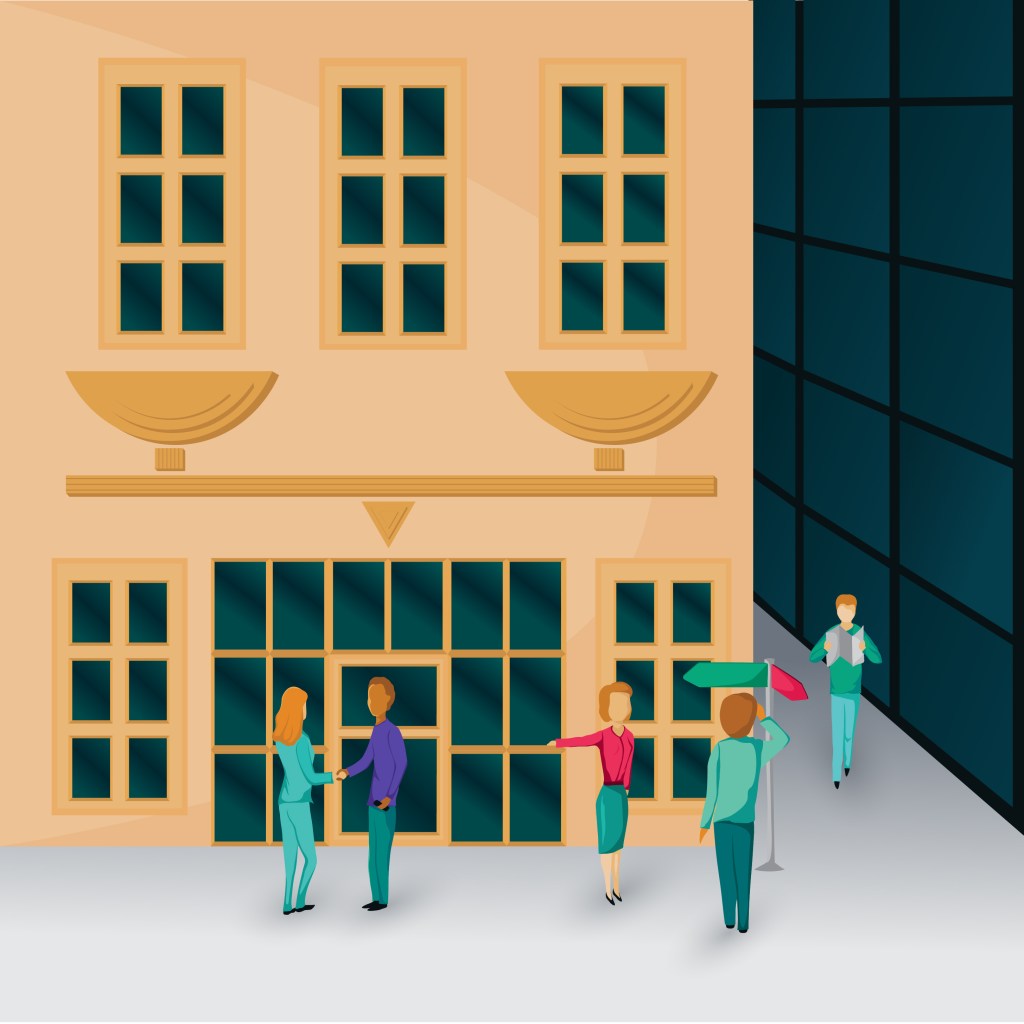
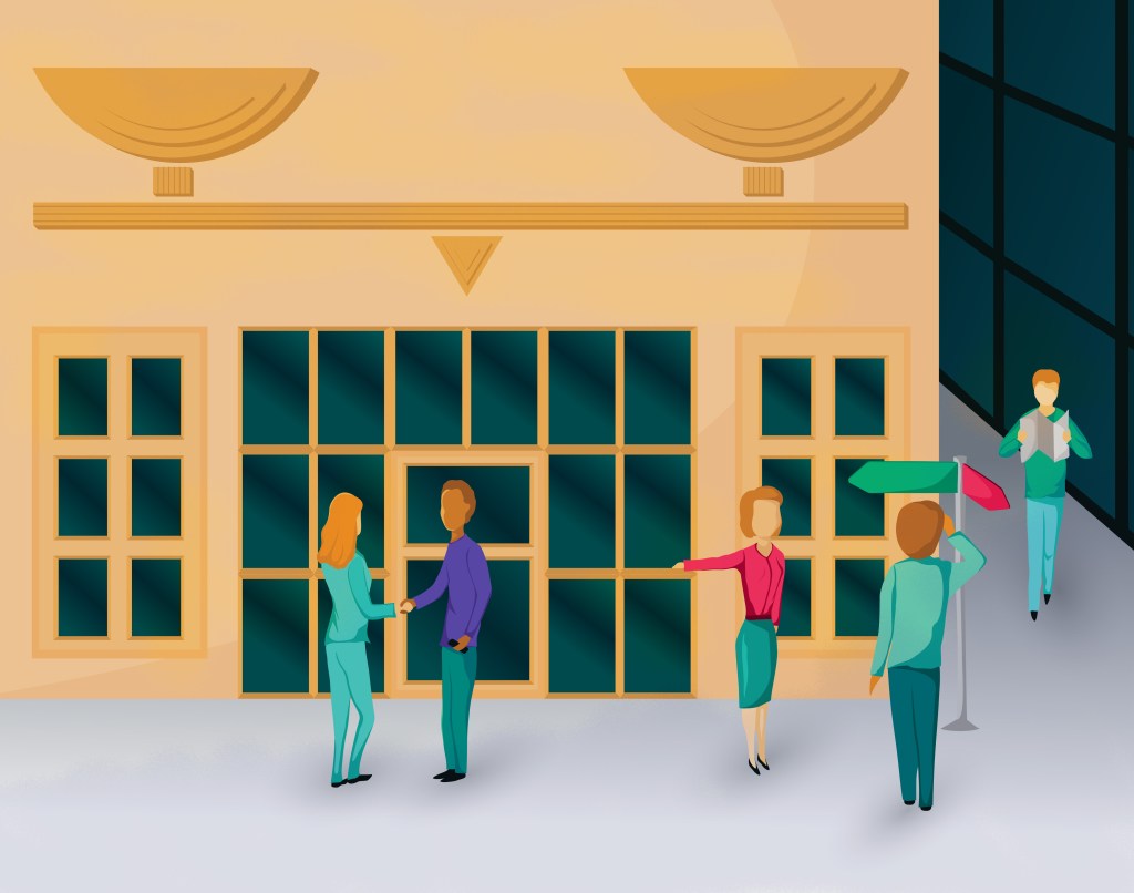
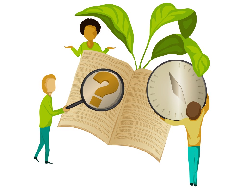
The third illustration does not work so well. Initially the composition worked better but I had to crop the image because the characters were a bit lost. The idea is that there is a scale that represents fairness above the door of the building in something like an Art Deco style. Two people are shaking hands, another one is showing the right direction to illustrate the idea of taking the right decision. However, I am not sure that it could easily be understood without any explanation.
I then created some more simple illustrations.
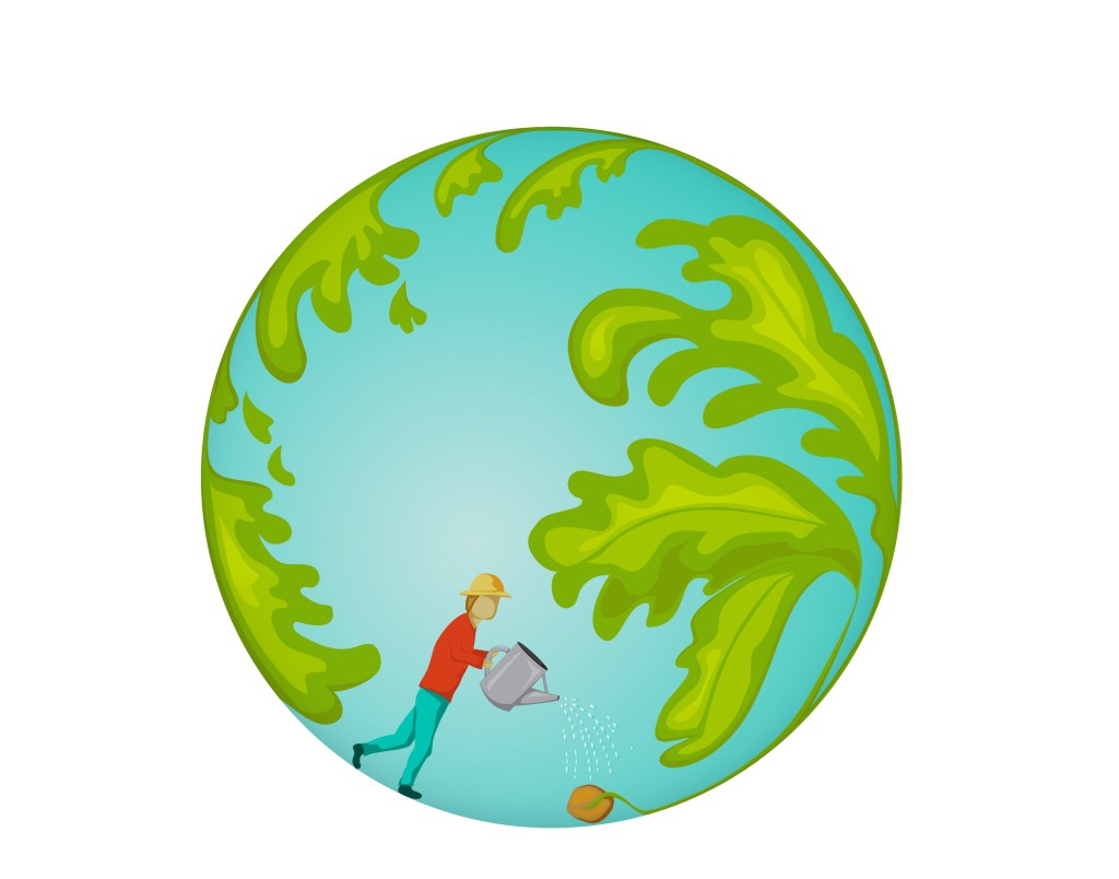
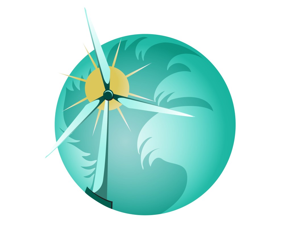
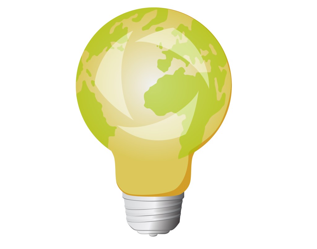
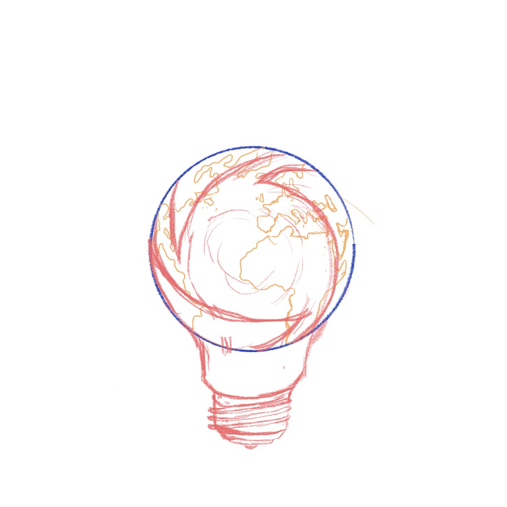
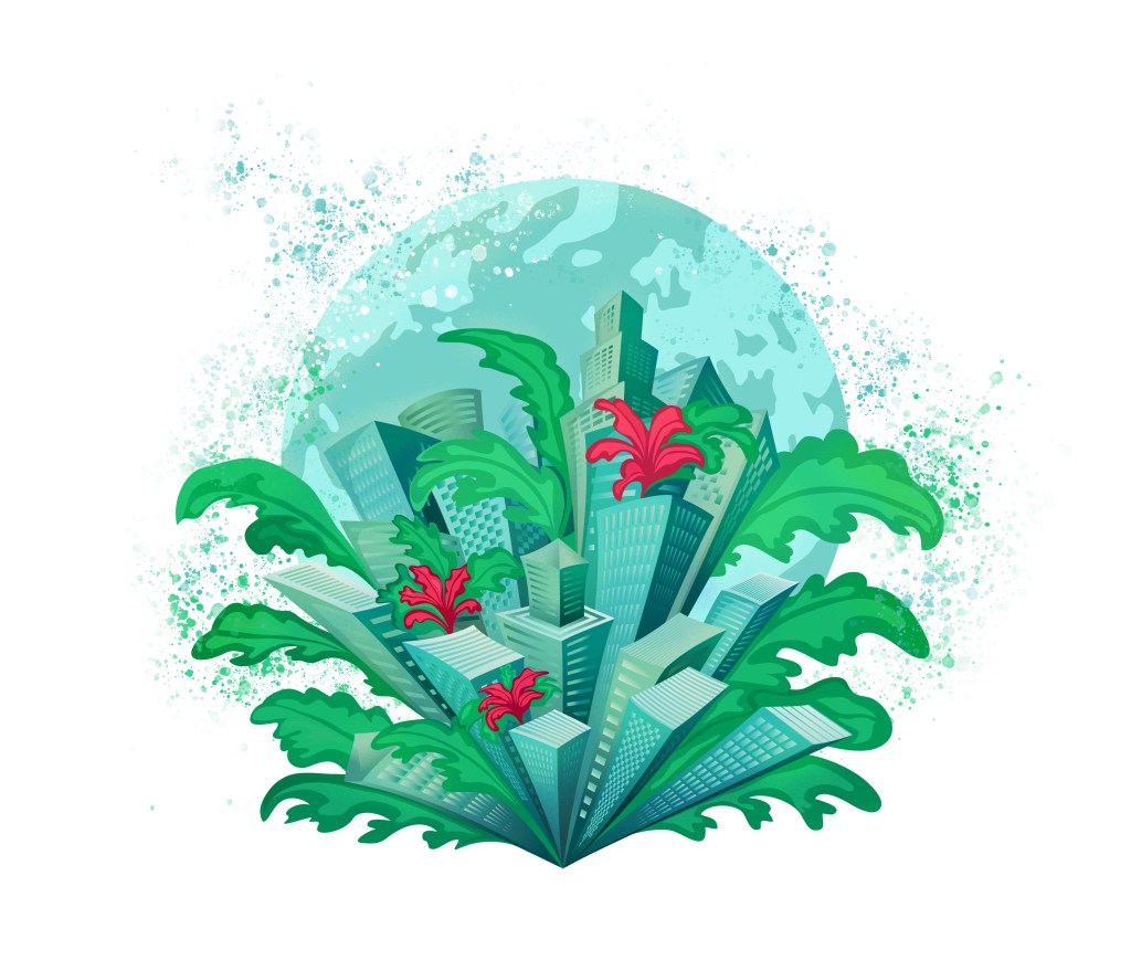
The first three are meant to work together and represent several aspects of sustainability. The concept of the planet has been used a lot in that context for obvious reasons but I tried to create some images in my own style.
The last one is a collage around the idea of ethical values.
Portfolio
Finally, I created a portfolio including a few slides in InDesign to illustrate the relevance of the illustrations and how they could be used in a presentation or a report: https://catherinerouxoca.myportfolio.com/
Conclusion
I tried to focus on the composition when I created these illustrations. However, I was not successful with the composition in the third image above. It might be a good idea to use the characters but somehow rework the background.
I have made some progress regarding the dynamic in the illustrations and think that the characters have kept some fluidity and there is a sense of movement in the finished product.
I have added some contrast especially in the second illustration but I do not know if this is enough. It is also a bit difficult to make the right decision after looking at an illustration for a long time. I have also added a bit of texture on the first three but, again, it does not really show.
I like the colour palette but wonder if I should have used more “earthy” colours to evoke sustainability (a bit more like the second colour palette). I guess it would depend on the client.
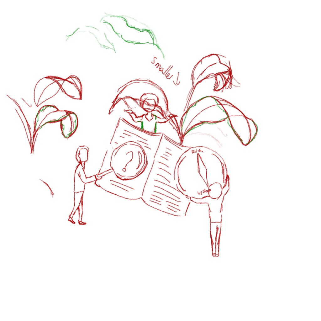
I have enjoyed playing with symbols and scales with the plants bigger than the city or the compass bigger than the character holding it. I dismissed some obvious symbols from the start such as holding hands because they had been used before. However, with popular themes that have already been the subject of many illustrations, it might be a better approach to embrace these symbols and wonder how to do something different with them.
The first two images work well together but the third one looks too different. It is partly the composition and partly the use of gradients in the first two. The characters are also drawn in a slightly different style. The three planet are meant to work together but there is something about the first one that is somehow different and I might need to make some changes with the leaves.
I think these illustrations are a good start for a portfolio. However, it probably would be a good idea to revisit my work after some time with a fresh eye to make some adjustments. I could also add different pages on my portfolio that would contain some of my sketches for instance. I am also thinking of developing further the slides I created as examples with some more infographics to combine with the illustrations.
Assessment Criteria
Demonstration of technical and visual skills – materials, techniques, observational skills, visual awareness, design and compositional skills
This part of the course has been a good opportunity to use all the skills I have acquired so far and focus on composition and contrast.
Quality of outcome – content, application of knowledge, presentation of work in a coherent manner, discernment, conceptualisation of thoughts, communication of ideas
I have tried to create a finished product with a set of illustrations that convey a message.
Demonstration of creativity – imagination, experimentation, invention, development of a personal voice
The assignment has enabled me to focus on a type of illustration I particularly like creating. However, I have also learned that I enjoy other styles and I am still hesitating regarding the direction I would like to pursue.
Context reflection – research, critical thinking (learning logs and, for second and third level courses, critical reviews and essays).
This part has taught me a lot about my working process. I have made sure that I did the necessary research for the assignment before starting the illustrations so that I could create a coherent set of images.
Edits
After reading my tutor’s feedback, I wanted to experiment further with some of the images I had created.
One suggestion was to add some features or equivalent to the characters’ faces. I tried to play with shadows to suggest the features but I could not get the outcome I wanted. I then decided to add very simple shapes so that the images could be seen on different scales. Too many details does not work when the images are small. Although I had decided not to draw features on faces to add the idea of universality, it probably needed some details as faceless people can be seen as a bit confusing and strange.
As suggested, I also experimented with texture and, in a sense, the spatter effect adds the hint of a background and some movement at the same time. It gives a more finished look to the illustrations. I also tried to improve the contrast slightly in some places, so that the characters stand out better.
Below are the new versions next to the original ones.
Sources:
https://www.awwwards.com/30-examples-of-illustration-styles-in-web-design.html
https://www.awwwards.com/websites/illustration/
https://graphicmama.com/blog/websites-with-illustrations/
https://graphicmama.com/blog/graphic-design-trends-2020/
https://graphicmama.com/blog/top-character-design-trends-for-2019/
http://www.drawer.design/blog/illustrations-trends-2021/
Regarding reports with illustrations:
https://www.creativebloq.com/inspiration/how-to-use-images-more-effectively-in-annual-reports
